Los gráficos de donut, también conocidos como gráficos de anillos, son una alternativa a los gráficos de sectores.
Conjunto de datos de muestra
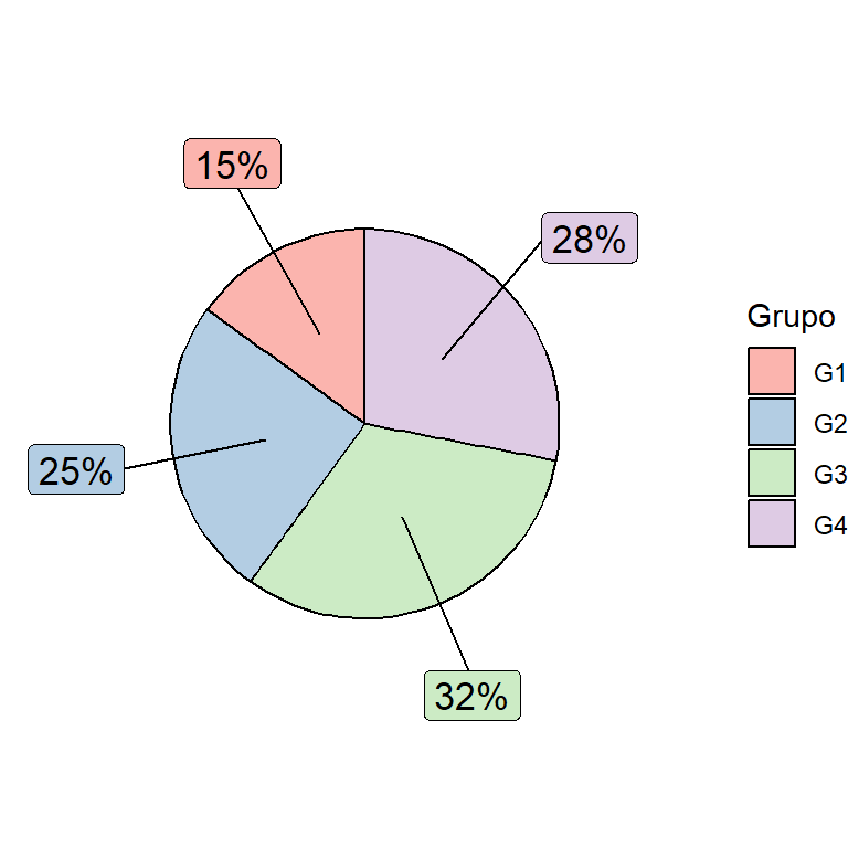
El siguiente data frame será usado en los siguientes ejemplos.
df <- data.frame(value = c(10, 30, 32, 28),
                 group = paste0("G", 1:4))
Gráfico de donut básico
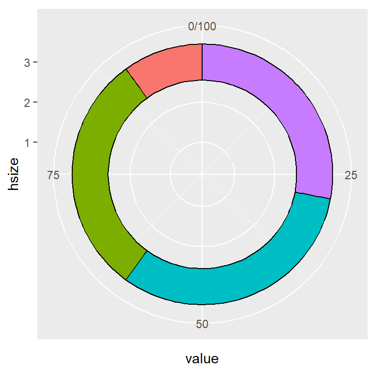
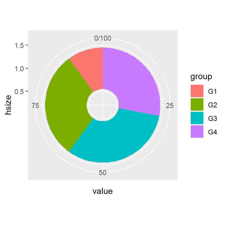
Un gráfico de donut o de anillos se puede crear usando geom_col, coord_polar(theta = "y") y estableciendo los límites del eje X con xlim de la siguiente manera.
# install.packages("ggplot2")
# install.packages("dplyr")
library(ggplot2)
library(dplyr)

# Incrementa el valor para hacer el centro más grande
# Reduce el valor para hacer el centro más pequeño
hsize <- 4

df <- df %>%
  mutate(x = hsize)

ggplot(df, aes(x = hsize, y = value, fill = group)) +
  geom_col() +
  coord_polar(theta = "y") +
  xlim(c(0.2, hsize + 0.5))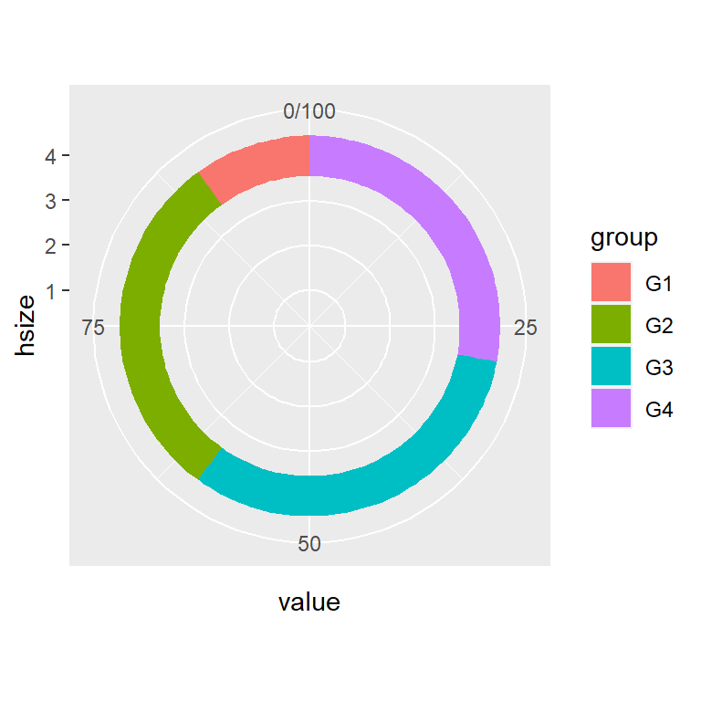
Tamaño del agujero central
Hemos desarrollado el código anterior de tal modo que puedes cambiar el tamaño del agujero del centro con hsize. Cuanto mayor sea el valor mayor será el agujero. Ten en cuenta que el valor tiene que ser mayor que 0.
# install.packages("ggplot2")
# install.packages("dplyr")
library(ggplot2)
library(dplyr)

# Agujero pequeño
hsize <- 1

df <- df %>%
  mutate(x = hsize)

ggplot(df, aes(x = hsize, y = value, fill = group)) +
  geom_col() +
  coord_polar(theta = "y") +
  xlim(c(0.2, hsize + 0.5))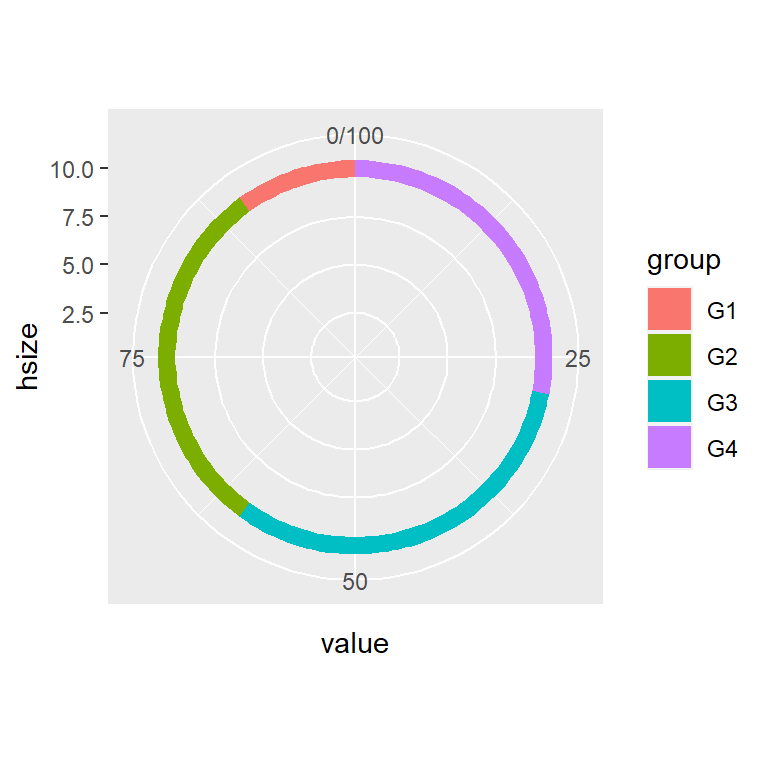
# install.packages("ggplot2")
# install.packages("dplyr")
library(ggplot2)
library(dplyr)

# Agujero grande
hsize <- 10

df <- df %>%
  mutate(x = hsize)

ggplot(df, aes(x = hsize, y = value, fill = group)) +
  geom_col() +
  coord_polar(theta = "y") +
  xlim(c(0.2, hsize + 0.5))
Añadir etiquetas
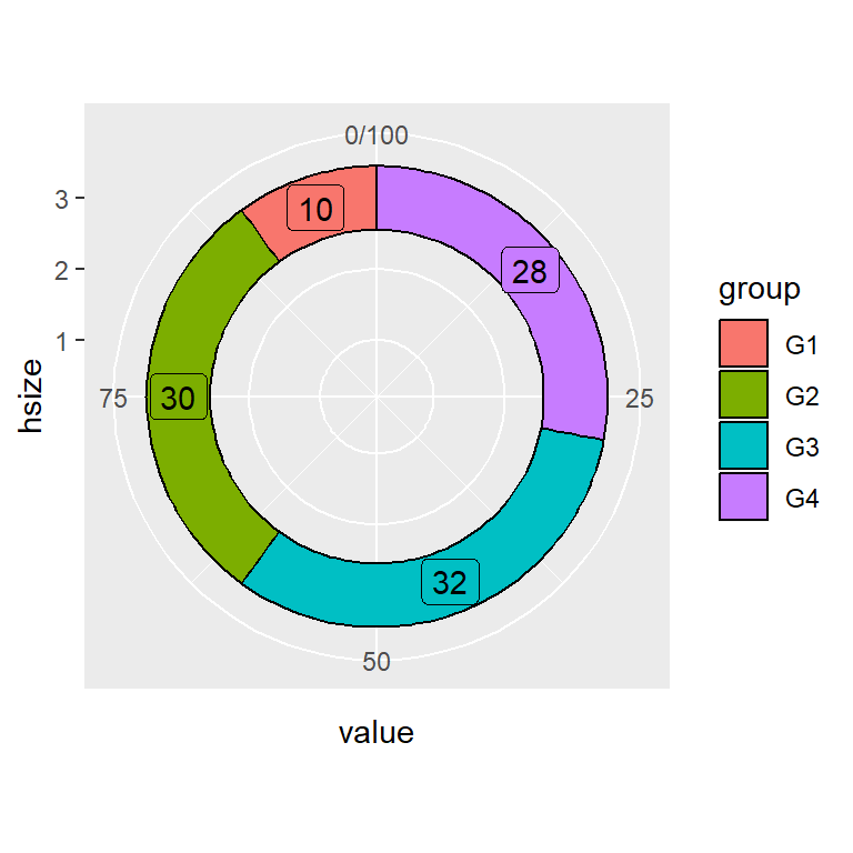
También puedes agregar etiquetas a cada porción del donut. Para ello puedes usar geom_text o geom_label, especificando la posición como se indica, de tal modo que el texto estará en el centro de cada sección. Ten en cuenta que cuando uses geom_label es recomendable usar show.legend = FALSE para que no se sobrescriba la leyenda.
# install.packages("ggplot2")
# install.packages("dplyr")
library(ggplot2)
library(dplyr)

# Tamaño del agujero central
hsize <- 3.5

df <- df %>%
  mutate(x = hsize)

ggplot(df, aes(x = hsize, y = value, fill = group)) +
  geom_col() +
  geom_text(aes(label = value),
            position = position_stack(vjust = 0.5)) +
  coord_polar(theta = "y") +
  xlim(c(0.2, hsize + 0.5))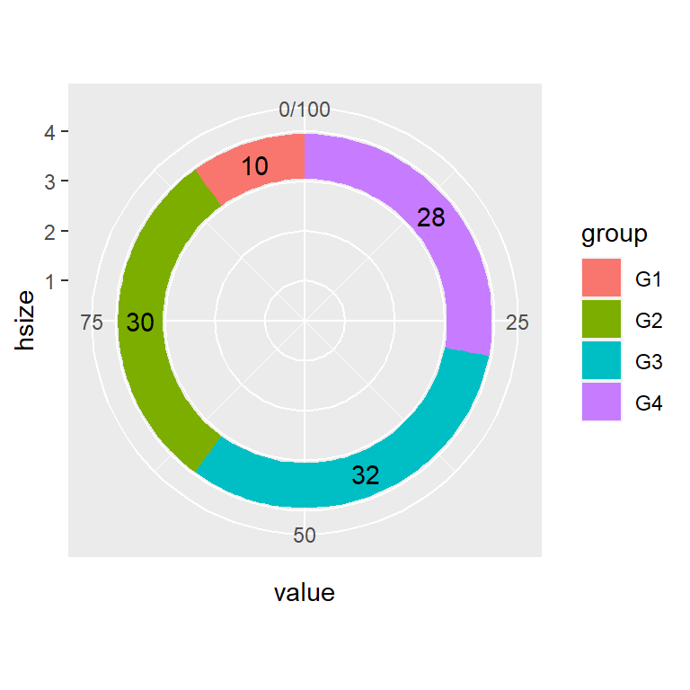
# install.packages("ggplot2")
# install.packages("dplyr")
library(ggplot2)
library(dplyr)

# Tamaño del agujero central
hsize <- 3

df <- df %>%
  mutate(x = hsize)

ggplot(df, aes(x = hsize, y = value, fill = group)) +
  geom_col() +
  geom_label(aes(label = value),
             position = position_stack(vjust = 0.5),
             show.legend = FALSE) +
  coord_polar(theta = "y") +
  xlim(c(0.2, hsize + 0.5))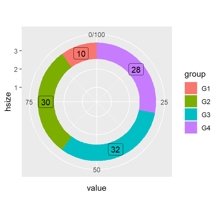
Personalización de los colores
El borde, los colores para cada sección y el tema del gráfico de donut se pueden personalizar de varias maneras. Los siguientes bloques de código y figuras muestran varios ejemplos de personalización.
Color del borde
# install.packages("ggplot2")
# install.packages("dplyr")
library(ggplot2)
library(dplyr)

# Tamaño del agujero central
hsize <- 3

df <- df %>%
  mutate(x = hsize)

ggplot(df, aes(x = hsize, y = value, fill = group)) +
  geom_col(color = "black") +
  geom_label(aes(label = value),
             position = position_stack(vjust = 0.5),
             show.legend = FALSE) +
  coord_polar(theta = "y") +
  xlim(c(0.2, hsize + 0.5))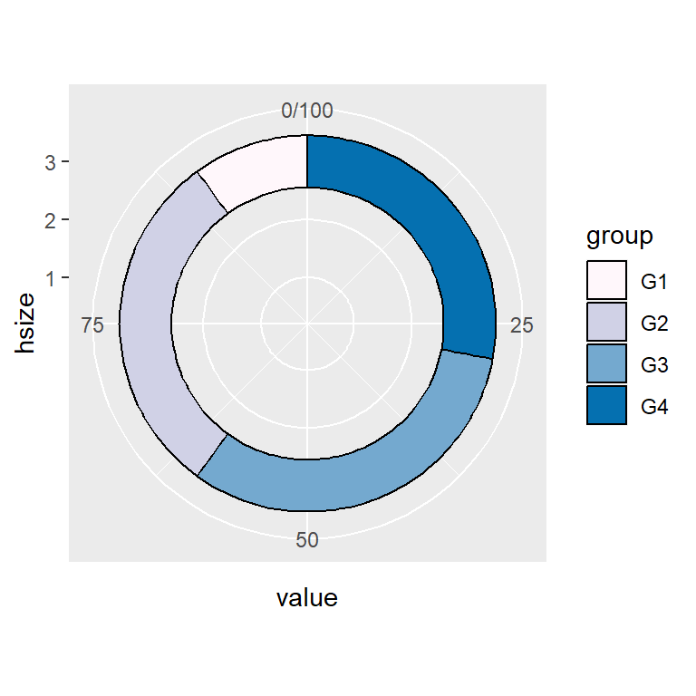
Colores personalizados
# install.packages("ggplot2")
# install.packages("dplyr")
library(ggplot2)
library(dplyr)

# Tamaño del agujero central
hsize <- 3

df <- df %>%
  mutate(x = hsize)

ggplot(df, aes(x = hsize, y = value, fill = group)) +
  geom_col(color = "black") +
  coord_polar(theta = "y") +
  scale_fill_manual(values = c("#FFF7FB", "#D0D1E6",
                               "#74A9CF", "#0570B0")) +
  xlim(c(0.2, hsize + 0.5))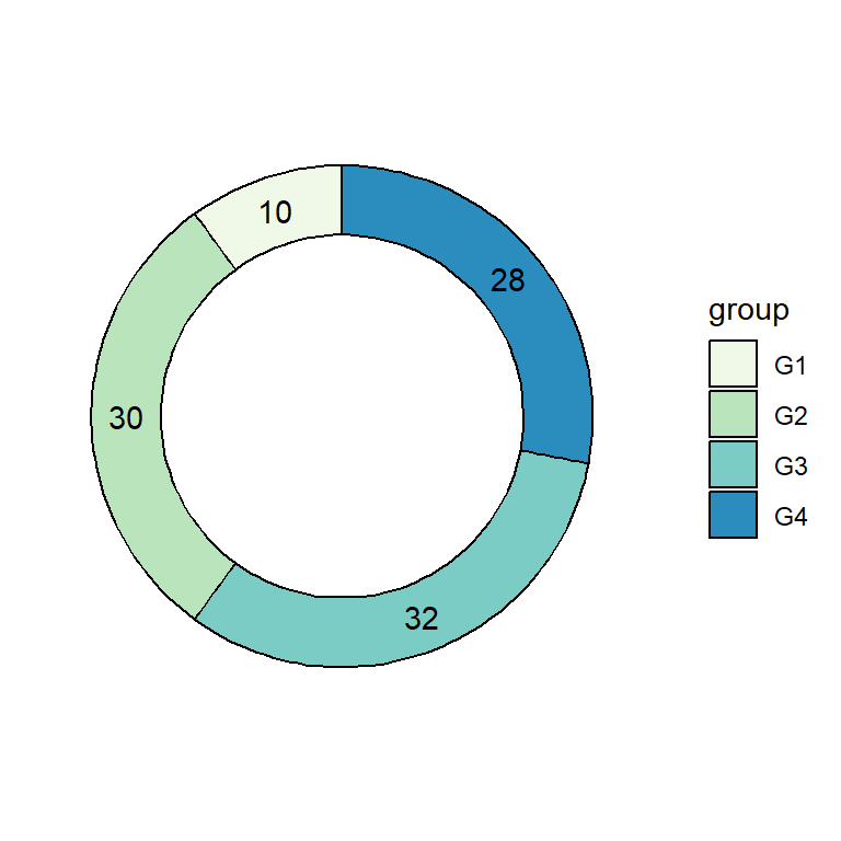
Paleta de colores y tema
# install.packages("ggplot2")
# install.packages("dplyr")
library(ggplot2)
library(dplyr)

# Tamaño del agujero central
hsize <- 3

df <- df %>%
  mutate(x = hsize)

ggplot(df, aes(x = hsize, y = value, fill = group)) +
  geom_col(color = "black") +
  geom_text(aes(label = value),
             position = position_stack(vjust = 0.5)) +
  coord_polar(theta = "y") +
  scale_fill_brewer(palette = "GnBu") +
  xlim(c(0.2, hsize + 0.5)) +
  theme(panel.background = element_rect(fill = "white"),
        panel.grid = element_blank(),
        axis.title = element_blank(),
        axis.ticks = element_blank(),
        axis.text = element_blank())
Personalización de la leyenda
Como sucede con otros gráficos de ggplot2, la leyenda se puede personalizar de varias maneras. Los siguientes códigos muestran como cambiar las etiquetas de la leyenda, el título o como eliminar la leyenda.
Etiquetas de la leyenda
# install.packages("ggplot2")
# install.packages("dplyr")
library(ggplot2)
library(dplyr)

# Tamaño del agujero central
hsize <- 3

df <- df %>%
  mutate(x = hsize)

ggplot(df, aes(x = hsize, y = value, fill = group)) +
  geom_col(color = "black") +
  coord_polar(theta = "y") +
  xlim(c(0.2, hsize + 0.5)) +
  scale_fill_discrete(labels = c("A", "B", "C", "D"))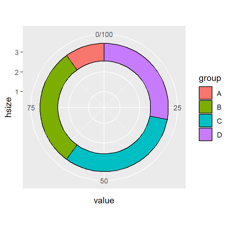
Título de la leyenda
# install.packages("ggplot2")
# install.packages("dplyr")
library(ggplot2)
library(dplyr)

# Tamaño del agujero central
hsize <- 3

df <- df %>%
  mutate(x = hsize)

ggplot(df, aes(x = hsize, y = value, fill = group)) +
  geom_col(color = "black") +
  coord_polar(theta = "y") +
  xlim(c(0.2, hsize + 0.5)) +
  guides(fill = guide_legend(title = "Título"))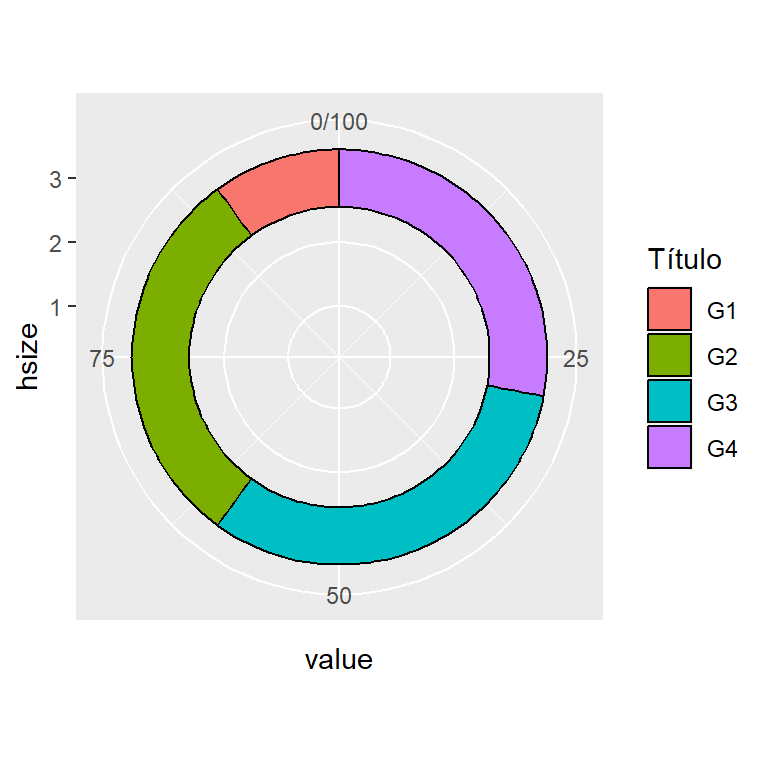
Eliminar la leyenda
# install.packages("ggplot2")
# install.packages("dplyr")
library(ggplot2)
library(dplyr)

# Tamaño del agujero central
hsize <- 3

df <- df %>%
  mutate(x = hsize)

ggplot(df, aes(x = hsize, y = value, fill = group)) +
  geom_col(color = "black") +
  coord_polar(theta = "y") +
  xlim(c(0.2, hsize + 0.5)) +
  theme(legend.position = "none")