Donut (doughnut) charts, also known as ring charts, are an alternative to pie charts and can be created in ggplot2 in a similar way.
Sample data set
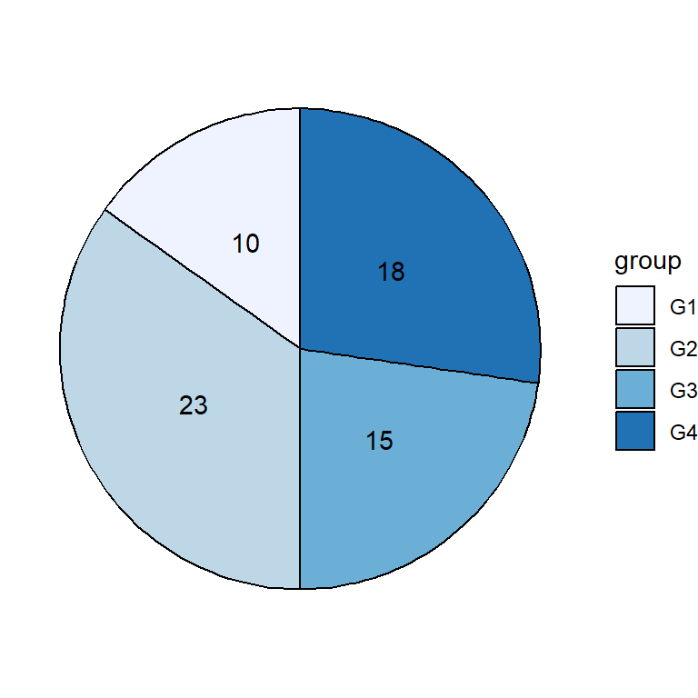
The data frame below will be used in the following examples.
df <- data.frame(value = c(10, 30, 32, 28),
                 group = paste0("G", 1:4))
Basic donut chart
A donut or ring chart can be created using geom_col, coord_polar(theta = "y") and setting a X-axis limit with xlim the following way.
# install.packages("ggplot2")
# install.packages("dplyr")
library(ggplot2)
library(dplyr)

# Increase the value to make the hole bigger
# Decrease the value to make the hole smaller
hsize <- 4

df <- df %>%
  mutate(x = hsize)

ggplot(df, aes(x = hsize, y = value, fill = group)) +
  geom_col() +
  coord_polar(theta = "y") +
  xlim(c(0.2, hsize + 0.5))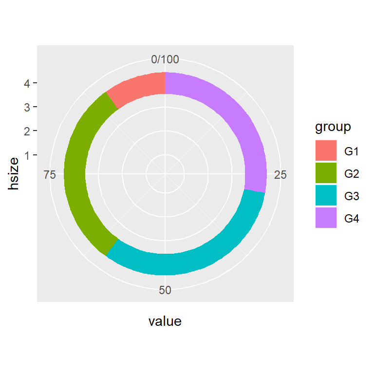
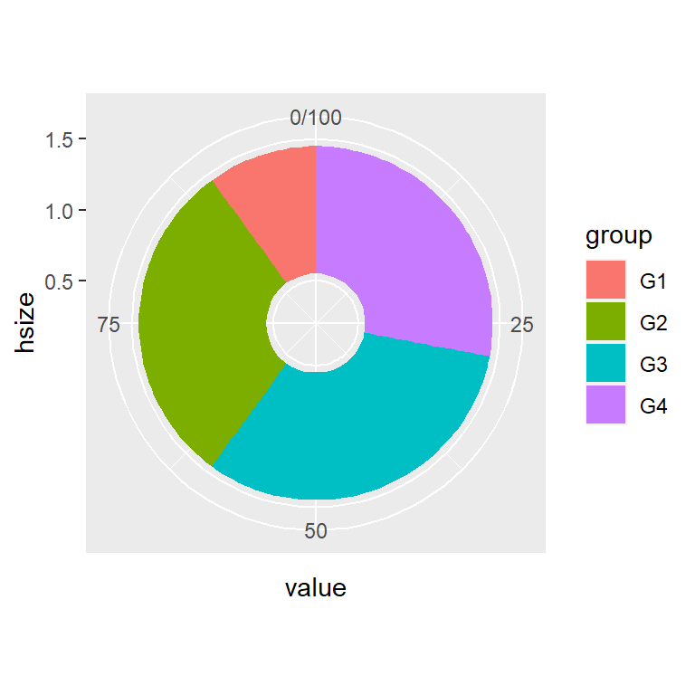
Hole size
We have developed the previous code so you can set the hole size with hsize. The bigger the value the bigger the hole size. Note that the hole size must be bigger than 0.
# install.packages("ggplot2")
# install.packages("dplyr")
library(ggplot2)
library(dplyr)

# Small hole
hsize <- 1

df <- df %>%
  mutate(x = hsize)

ggplot(df, aes(x = hsize, y = value, fill = group)) +
  geom_col() +
  coord_polar(theta = "y") +
  xlim(c(0.2, hsize + 0.5))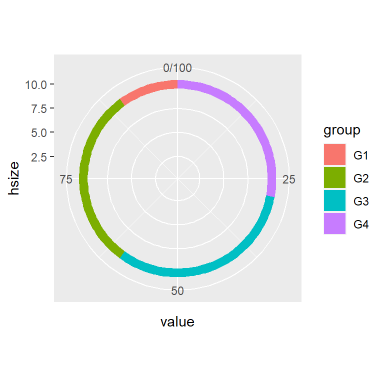
# install.packages("ggplot2")
# install.packages("dplyr")
library(ggplot2)
library(dplyr)

# Big hole
hsize <- 10

df <- df %>%
  mutate(x = hsize)

ggplot(df, aes(x = hsize, y = value, fill = group)) +
  geom_col() +
  coord_polar(theta = "y") +
  xlim(c(0.2, hsize + 0.5))
Adding labels
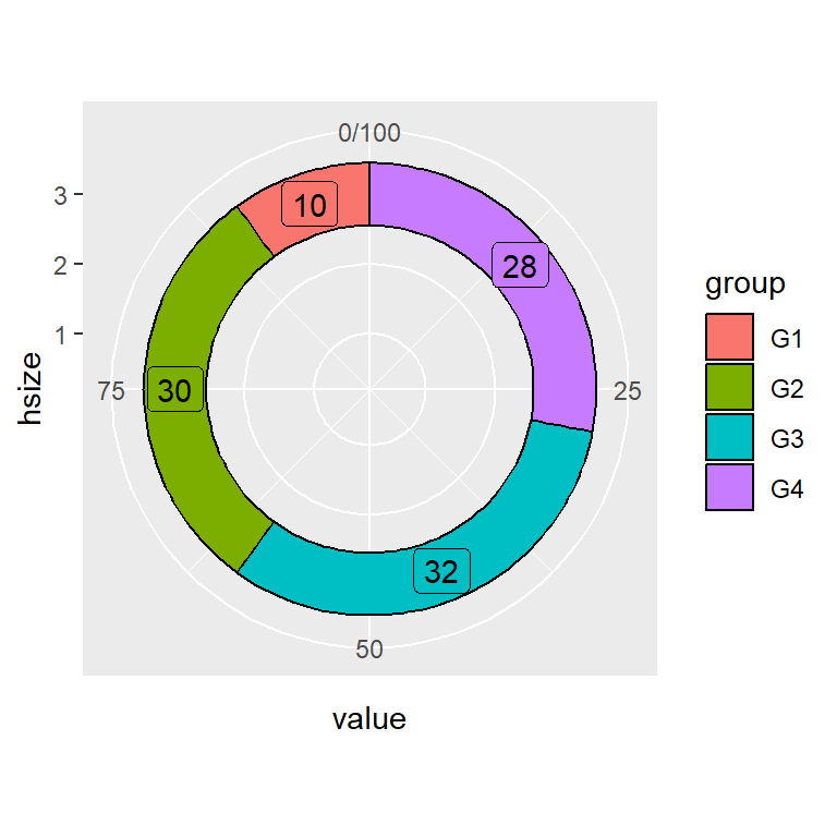
You can also add labels to each slice of the donut. For that purpose you can use geom_text or geom_label, specifying the position as follows, so the text will be in the middle of each slice. Note that when using geom_label is recommended show.legend = FALSE so the legend box will not be overridden.
# install.packages("ggplot2")
# install.packages("dplyr")
library(ggplot2)
library(dplyr)

# Hole size
hsize <- 3.5

df <- df %>%
  mutate(x = hsize)

ggplot(df, aes(x = hsize, y = value, fill = group)) +
  geom_col() +
  geom_text(aes(label = value),
            position = position_stack(vjust = 0.5)) +
  coord_polar(theta = "y") +
  xlim(c(0.2, hsize + 0.5))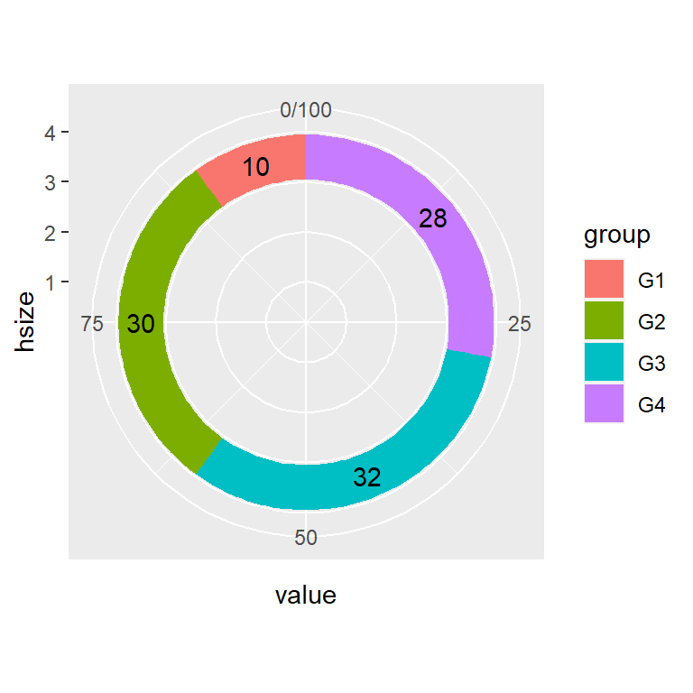
# install.packages("ggplot2")
# install.packages("dplyr")
library(ggplot2)
library(dplyr)

# Hole size
hsize <- 3

df <- df %>%
  mutate(x = hsize)

ggplot(df, aes(x = hsize, y = value, fill = group)) +
  geom_col() +
  geom_label(aes(label = value),
             position = position_stack(vjust = 0.5),
             show.legend = FALSE) +
  coord_polar(theta = "y") +
  xlim(c(0.2, hsize + 0.5))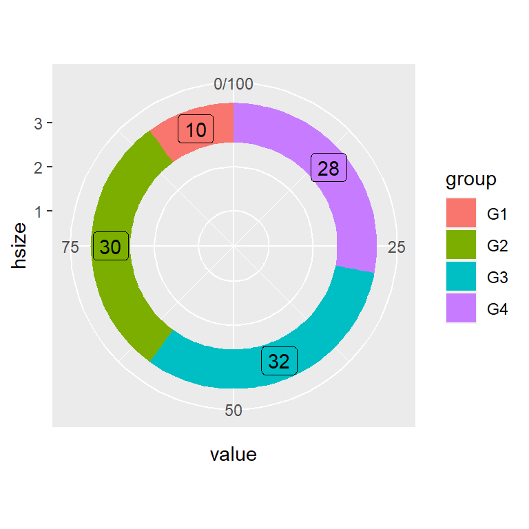
Color customization
The border, fill colors and the theme of the donut plot can be customized in several ways. The following codes and figures display some customization examples.
Border color
# install.packages("ggplot2")
# install.packages("dplyr")
library(ggplot2)
library(dplyr)

# Hole size
hsize <- 3

df <- df %>%
  mutate(x = hsize)

ggplot(df, aes(x = hsize, y = value, fill = group)) +
  geom_col(color = "black") +
  geom_label(aes(label = value),
             position = position_stack(vjust = 0.5),
             show.legend = FALSE) +
  coord_polar(theta = "y") +
  xlim(c(0.2, hsize + 0.5))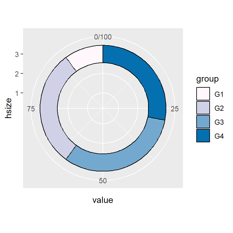
Custom colors
# install.packages("ggplot2")
# install.packages("dplyr")
library(ggplot2)
library(dplyr)

# Hole size
hsize <- 3

df <- df %>%
  mutate(x = hsize)

ggplot(df, aes(x = hsize, y = value, fill = group)) +
  geom_col(color = "black") +
  coord_polar(theta = "y") +
  scale_fill_manual(values = c("#FFF7FB", "#D0D1E6",
                               "#74A9CF", "#0570B0")) +
  xlim(c(0.2, hsize + 0.5))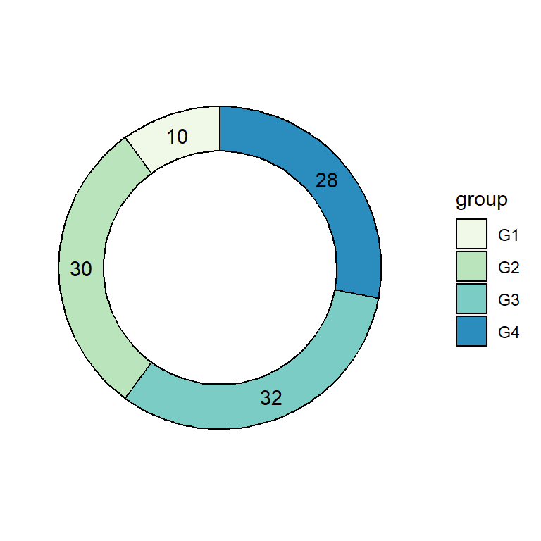
Color palette and theme
# install.packages("ggplot2")
# install.packages("dplyr")
library(ggplot2)
library(dplyr)

# Hole size
hsize <- 3

df <- df %>%
  mutate(x = hsize)

ggplot(df, aes(x = hsize, y = value, fill = group)) +
  geom_col(color = "black") +
  geom_text(aes(label = value),
             position = position_stack(vjust = 0.5)) +
  coord_polar(theta = "y") +
  scale_fill_brewer(palette = "GnBu") +
  xlim(c(0.2, hsize + 0.5)) +
  theme(panel.background = element_rect(fill = "white"),
        panel.grid = element_blank(),
        axis.title = element_blank(),
        axis.ticks = element_blank(),
        axis.text = element_blank())
Legend customization
As in other ggplot2 plots the legend can be customized in several ways. The following codes show how to change the legend key labels, the legend title or how to get rid of the legend.
Legend key labels
# install.packages("ggplot2")
# install.packages("dplyr")
library(ggplot2)
library(dplyr)

# Hole size
hsize <- 3

df <- df %>%
  mutate(x = hsize)

ggplot(df, aes(x = hsize, y = value, fill = group)) +
  geom_col(color = "black") +
  coord_polar(theta = "y") +
  xlim(c(0.2, hsize + 0.5)) +
  scale_fill_discrete(labels = c("A", "B", "C", "D"))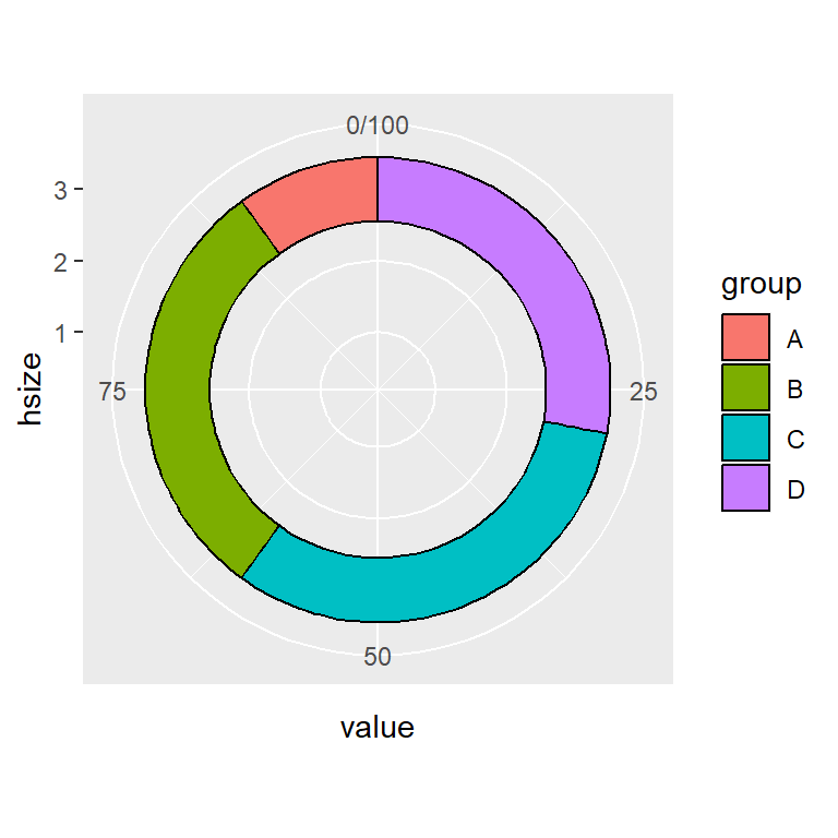
Legend title
# install.packages("ggplot2")
# install.packages("dplyr")
library(ggplot2)
library(dplyr)

# Hole size
hsize <- 3

df <- df %>%
  mutate(x = hsize)

ggplot(df, aes(x = hsize, y = value, fill = group)) +
  geom_col(color = "black") +
  coord_polar(theta = "y") +
  xlim(c(0.2, hsize + 0.5)) +
  guides(fill = guide_legend(title = "Title"))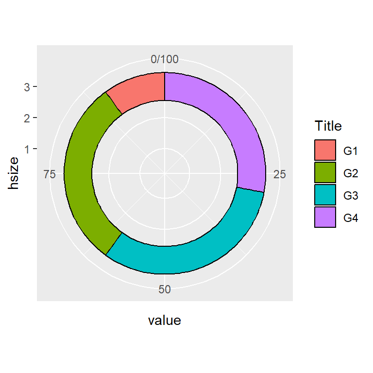
Remove legend
# install.packages("ggplot2")
# install.packages("dplyr")
library(ggplot2)
library(dplyr)

# Hole size
hsize <- 3

df <- df %>%
  mutate(x = hsize)

ggplot(df, aes(x = hsize, y = value, fill = group)) +
  geom_col(color = "black") +
  coord_polar(theta = "y") +
  xlim(c(0.2, hsize + 0.5)) +
  theme(legend.position = "none")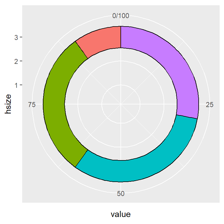

Master Statistics
Learn statistics from the basics to advanced techniques, clearly explained
Go to site