We are going to use the data of the code above on the following examples:
# Reproducible data
set.seed(1)
x <- runif(100, min = -5, max = 5)
y <- x ^ 3 + rnorm(100, mean = 0, sd = 5)
X and Y axis labels
The default axis labels will depend on the function you are using, e.g. plot function will use the names of the input data, boxplot won’t show any axis labels by default and hist will show the name of the variable on the X-axis and “Frequency” or “Density” on the Y-axis, depending on the type of the histogram.
Default plot
For illustration purposes we are going to use the plot function but the examples are extensible to other functions. In order to plot the data we defined before you can type:
plot(x, y, pch = 19)
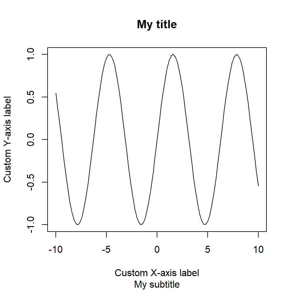
Custom axes labels
In order to change the axis labels you can specify the arguments xlab and ylab as follows:
plot(x, y, pch = 19,
     xlab = "My X-axis label",
     ylab = "My Y-axis label")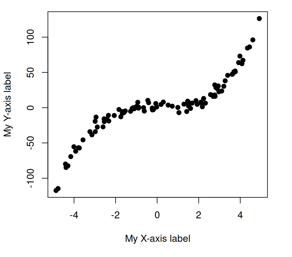
Labels color
In addition, is is possible to modify the color of the axes labels with the col.lab argument.
plot(x, y, pch = 19,
     xlab = "My X-axis label",
     ylab = "My Y-axis label",
     col.lab = 4) # Color of the labels
Remove axis labels
You can remove the axis labels with two different methods:

Option 1. Set the xlab and ylab arguments to "", NA or NULL.
# Delete labels
plot(x, y, pch = 19,
     xlab = "", # Also NA or NULL
     ylab = "") # Also NA or NULL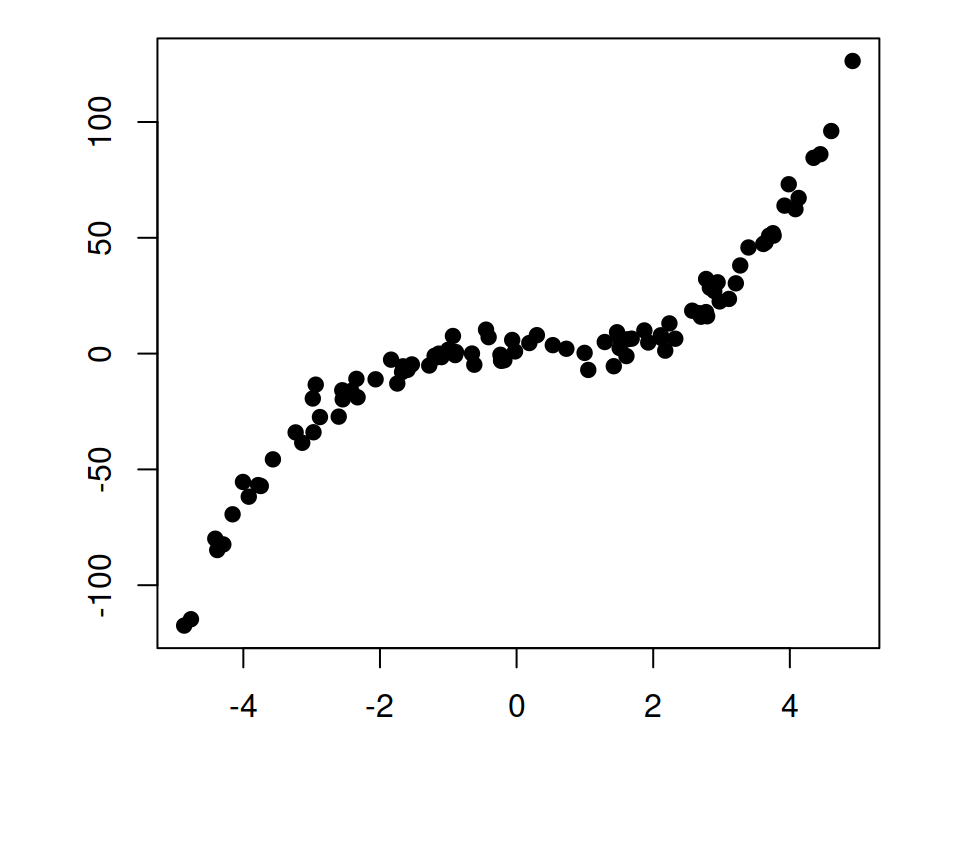
Option 2. Set the argument ann to FALSE. This will override the label names if provided.
# Equivalent
plot(x, y, pch = 19,
     xlab = "My X-axis label",
     ylab = "My Y-axis label",
     ann = FALSE)
The axis function
The axis function allows adding axes to all sides of the the current plot, with the possibility of specifying the position and the labels of the tick marks. Recall to type ?axis for further details.
| axis | Position |
|---|---|
| 1 | below |
| 2 | left |
| 3 | above |
| 4 | right |
Option 1. Set xaxt = "n" and yaxt = "n" to remove the tick labels of the plot and add the new labels with the axis function. Note that the at argument sets where to show the tick marks.
plot(x, y, pch = 19,
     xaxt = "n", yaxt = "n")

# X-axis
axis(1, at = c(-4, 0, 4))

# Y-axis
axis(2, at = c(-100, -50, 0, 50, 100))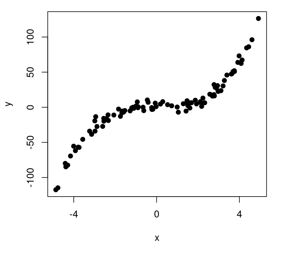
Option 2. Set axes = FALSE inside your plotting function to remove the plot box and add the new axes with the axis function.
plot(x, y, pch = 19,
     axes = FALSE)

# Add X-axis
axis(1)

# Add Y-axis
axis(2)

# You can add the plot box again
# box()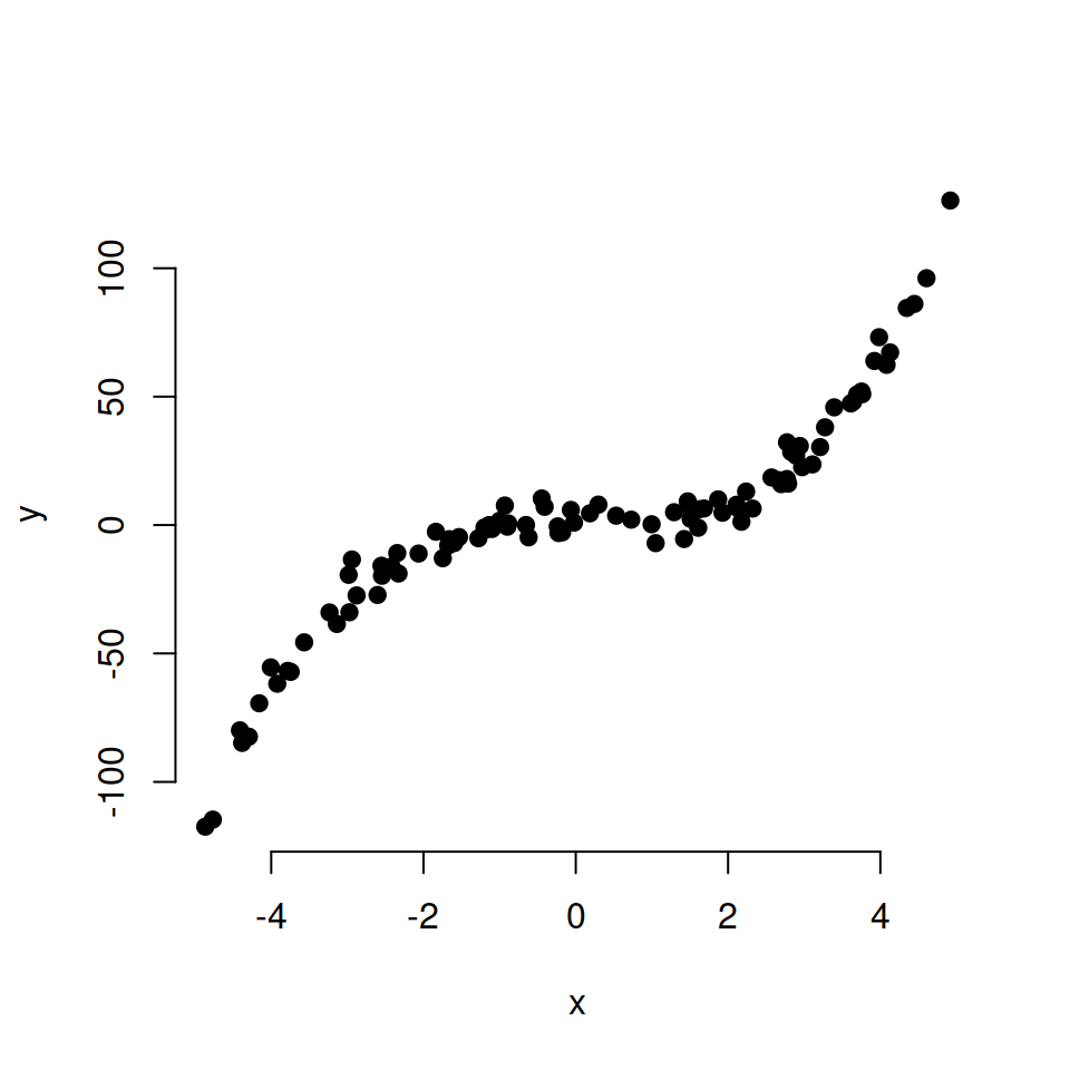
Color of the axes
You can also customize the color of the axis and the ticks with the col and col.ticks arguments.
plot(x, y, pch = 19,
     axes = FALSE)

# Add X-axis
axis(1,
     col = "blue",        # Axis line color
     col.ticks = "green", # Ticks color
     col.axis = "red")    # Labels color

# Add Y-axis
axis(2,
     col = "blue",
     col.ticks = "green",
     col.axis = "red")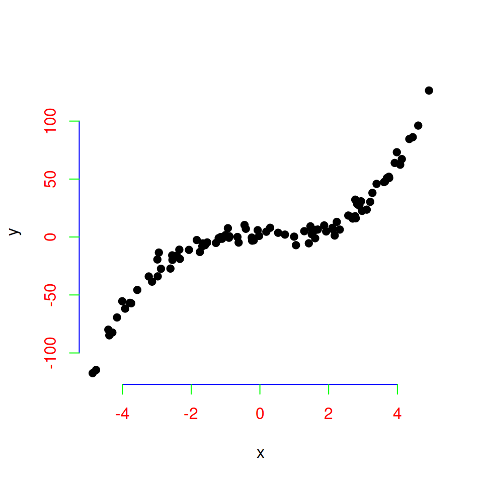
Axis tick marks
In addition to axes labels, the tick marks of each axis can be customized in different ways.
xaxp and yaxp arguments
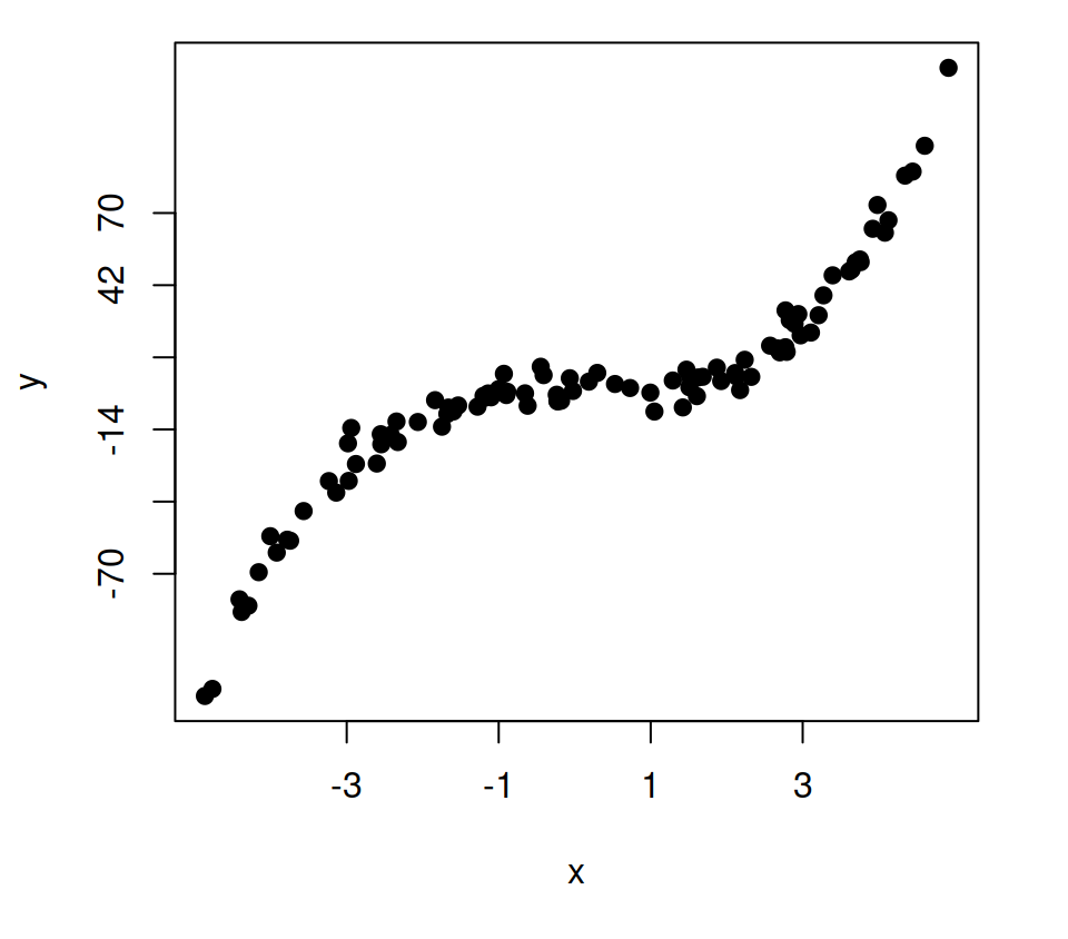
The xaxp (X-axis) and yaxp (Y-axis) arguments allow customizing where the ticks of each axis start and end and the number of regions to divide the axis specifying vectors of the form c(start, end, number_regions).
plot(x, y, pch = 19,
     xaxp = c(-3, 3, 3),
     yaxp = c(-70, 70, 5))
Minor ticks

It is possible to add minor ticks to the axes with the minor.tick function of the Hmisc library. The function will allow you to specify the tick density, the size and addition arguments to each axis.
# install.packages("Hmisc")
library(Hmisc)

plot(x, y, pch = 19)
minor.tick(nx = 2, ny = 2,   # Ticks density
           tick.ratio = 0.5) # Ticks size
Interior ticks
You can set interior ticks passing positive values to tck argument. The greater the value, the longer the ticks. Default value is tck = -0.5.
# Interior ticks
plot(x, y, pch = 19,
     tck = 0.02)
Rotate tick mark labels
It is possible to rotate the tick mark labels in several ways making use of the las argument.

Option 1. Parallel to axis (default).
plot(x, y, pch = 19,
     las = 0,
     main = "Parallel")
Option 2. Horizontal.
plot(x, y, pch = 19,
     las = 1,
     main = "Horizontal")
Option 3. Perpendicular to axis.
plot(x, y, pch = 19,
     las = 2,
     main = "Perpendicular")
Option 4. Vertical.
plot(x, y, pch = 19,
     las = 3,
     main = "Vertical")
Custom tick mark labels
The labels argument of the axis function allows customizing the tick mark labels.
# Change X-axis tick labels
plot(x, y, pch = 19, xaxt = "n")
axis(1, at = seq(round(min(x)),
                 round(max(x)), by = 1),
     labels = 1:11)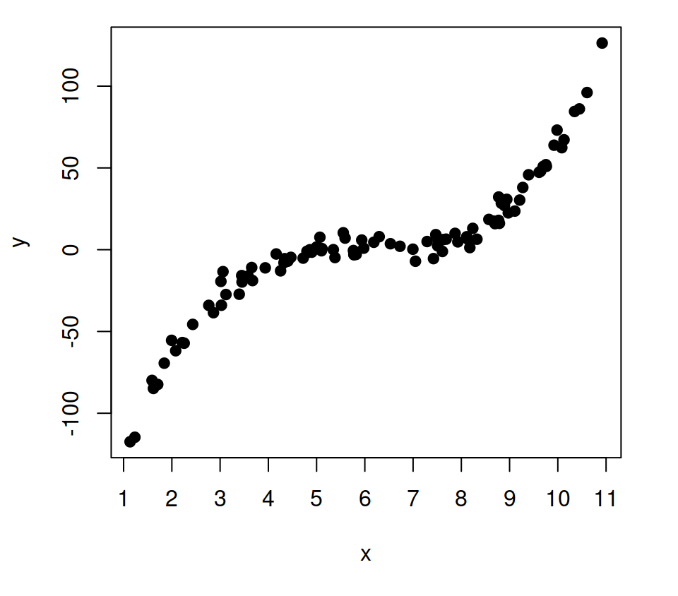
Note that you can also set texts in addition to numbers, or even expressions.
# X-axis tick labels with text
plot(x, y, pch = 19, xaxt = "n")
axis(1, at = c(-2, 2),
     labels = c("Some text", "Other text"))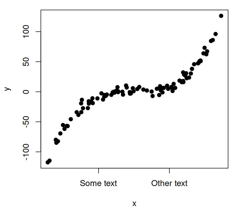
Remove tick marks
You can remove the tick marks of one of the two axis or of both at the same time setting arguments xaxt and yaxt to "".
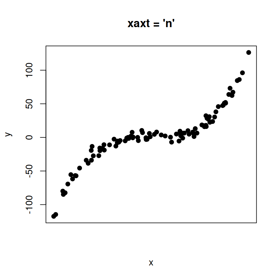
Option 1. Remove only X-axis ticks.
# Remove X axis tick labels
plot(x, y, pch = 19,
     xaxt = "n",
     main = "xaxt = 'n'")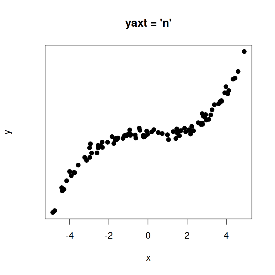
Option 2. Remove only Y-axis ticks.
# Remove Y axis tick labels
plot(x, y, pch = 19,
     yaxt = "n",
     main = "yaxt = 'n'")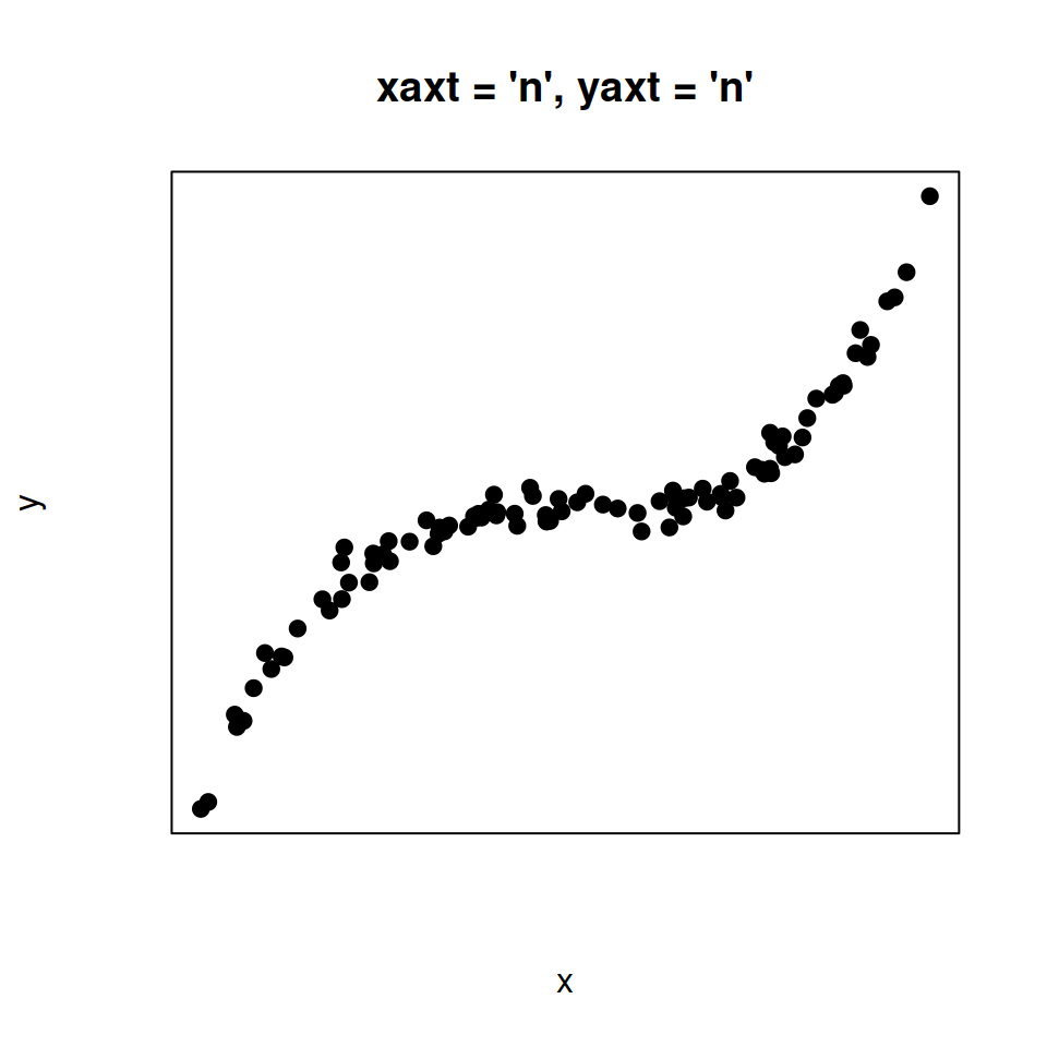
Option 3. Remove both X-axis and Y-axis ticks.
# Remove both axis tick labels
plot(x, y, pch = 19,
     yaxt = "n",
     xaxt = "n",
     main = "xaxt = 'n', yaxt = 'n'")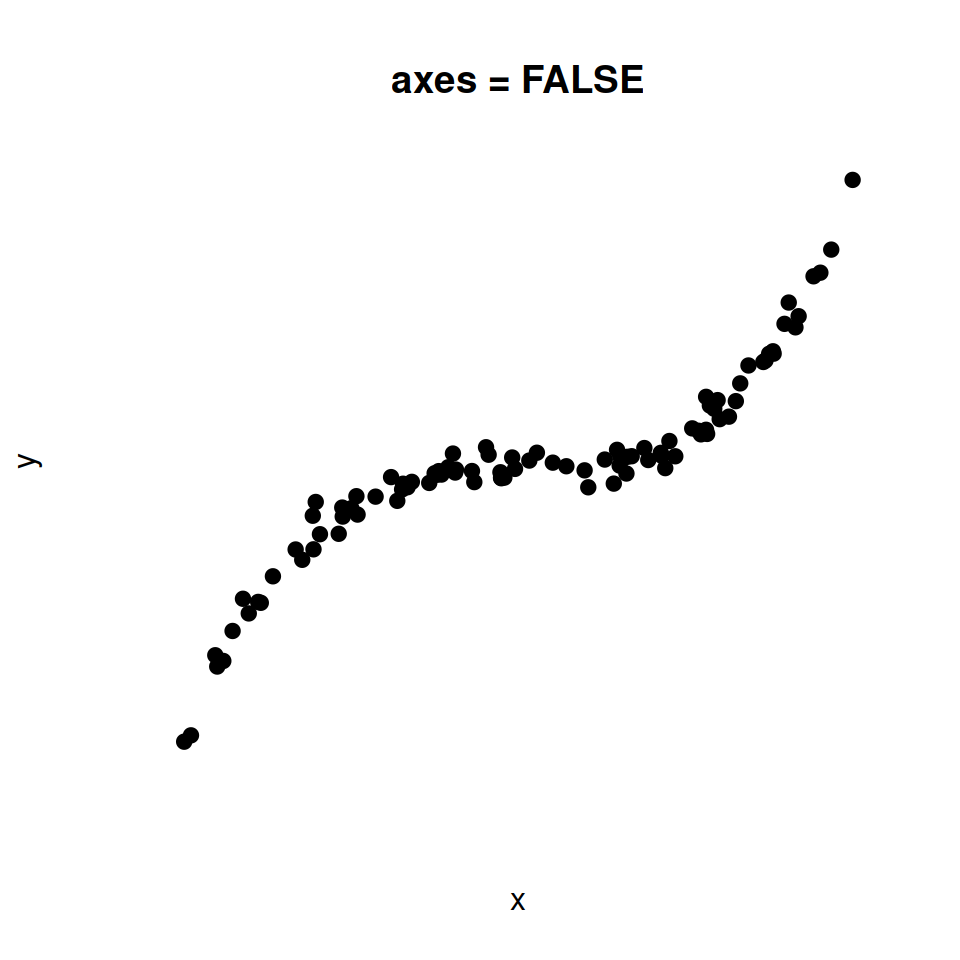
Option 4. Remove both X-axis and Y-axis ticks and the box.
# Remove axis tick labels and the box
plot(x, y, pch = 19,
     axes = FALSE,
     main = "axes = FALSE")
Axis limits
The axis limits can be customized with the xlim and ylim arguments for the X and Y axis, respectively.
# Axis limits
plot(x, y, pch = 19,
     xlim = c(0, 4),   # X-axis limits
     ylim = c(0, 100)) # Y-axis limits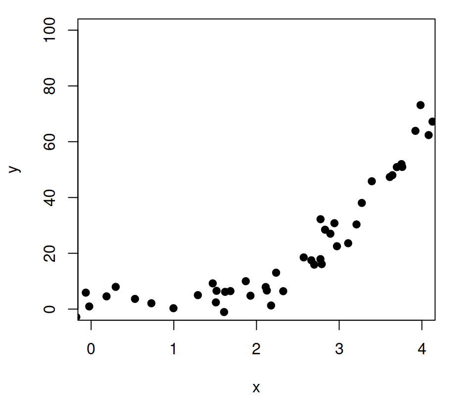
Axis scale
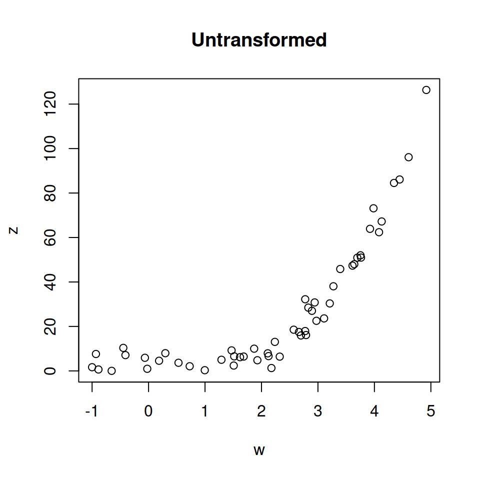
Original data.
# Positive data
w <- x[x > 0]
z <- y[y > 0]

# Default
plot(w, z,
     main = "Untransformed")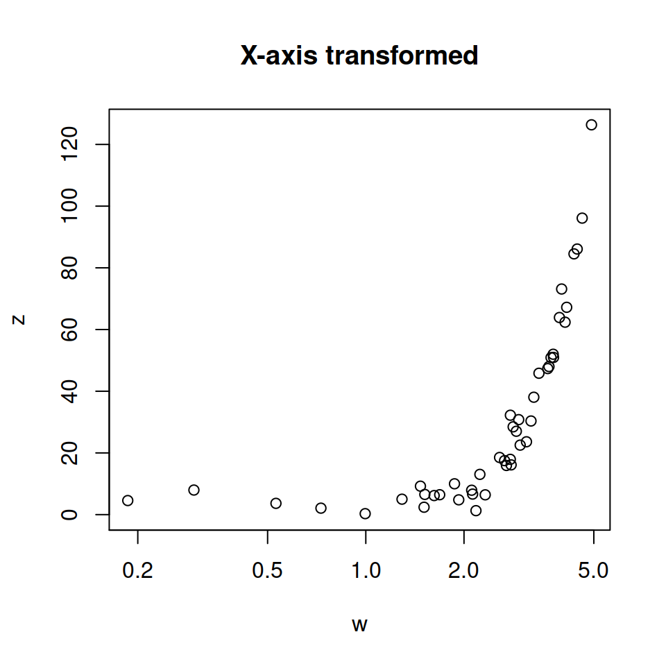
X-axis transformed.
# Log scale. X-axis
plot(w, z,
     log = "x",
     main = "X-axis transformed")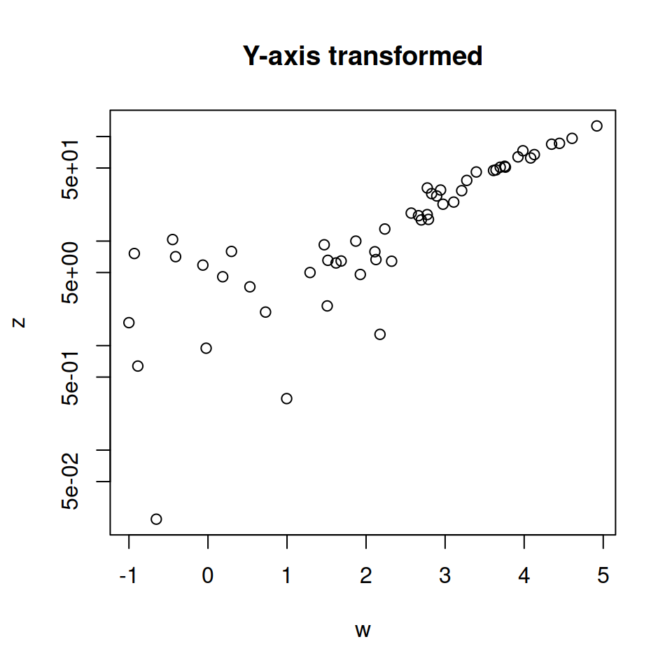
Y-axis transformed.
# Log scale. Y-axis
plot(w, z,
     log = "y",
     main = "Y-axis transformed")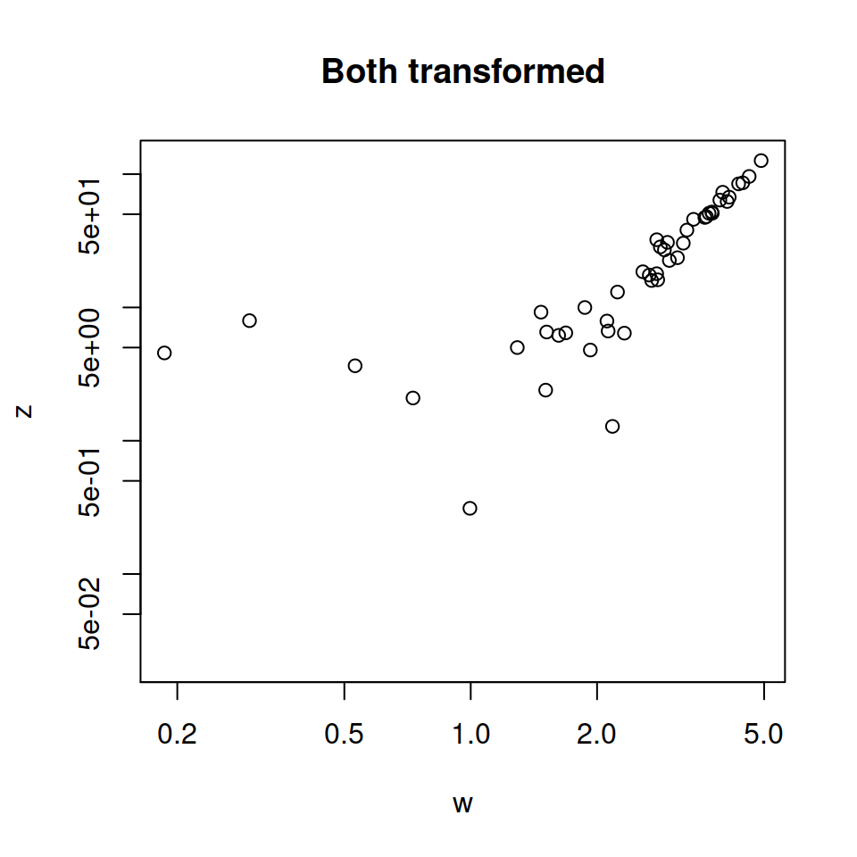
Both transformed.
# Log scale. X and Y axis
plot(w, z,
     log = "xy",
     main = "Both transformed")
Dual axis
You can join together two plots with different Y-axis scale increasing the margins of the plot, using par(new = TRUE), creating a new plot without axis or labels and setting a new axis with the axis function.
# Increase the plot margins
par(mar = c(5, 4, 4, 4) + 0.25)

# Data
plot(x, y, pch = 19, ylab = "Var 1")

# Needed to merge the plots
par(new = TRUE)

# More data
plot(x ^ 2, y ^ 2,
     col = 4, pch = 19,
     axes = FALSE, # No axes
     bty = "n",    # No box
     xlab = "", ylab = "") # No axis labels

# New axis
axis(4)
# Axis label
mtext("Var 2", side = 4, line = 3, col = 4)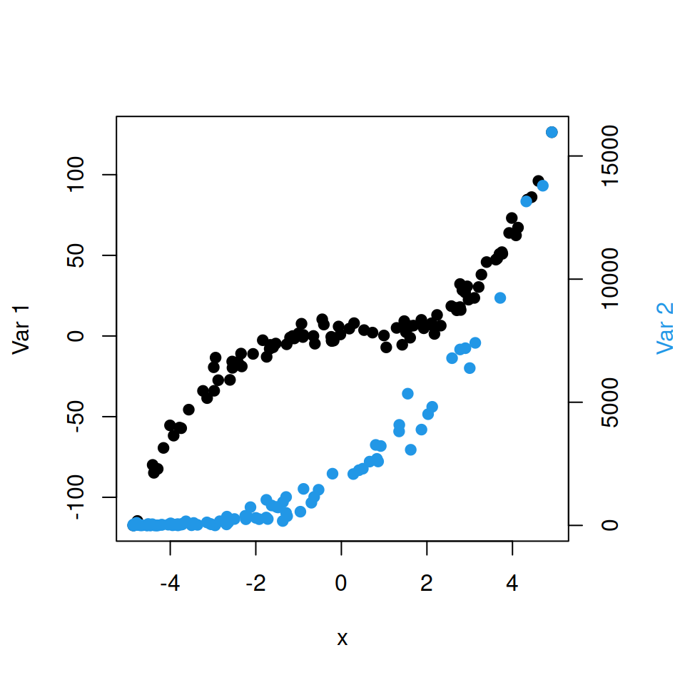

Master Statistics
Learn statistics from the basics to advanced techniques, clearly explained
Go to site