A bubble map uses proportional symbols to represent how a variable differs across different geographical areas. The symbol used is generally a circle, which diameter varies based on the variable of interest.
In this tutorial we are going to use the data provided on sf format by the giscoR package. The data used will be the number of airports of each country of the European Union in 2013.
Data extraction
In order to get the desired data from giscoR, we can use the gisco_get_countries function and specify the desired region with the region argument. The centroids of each country (the desired location of the symbols) can be computed with the st_centroid function and the airports can be obtained with the gisco_get_airports function of the package.
# install.packages("sf")
# install.packages("dplyr")
# install.packages("giscoR")

library(giscoR)
library(dplyr)
library(sf)

# CRS
epsg_code <- 3035

# Countries
EU_countries <- gisco_get_countries(region = "EU") %>%
  st_transform(epsg_code)

# Centroids for each country
symbol_pos <- st_centroid(EU_countries, of_largest_polygon = TRUE)

# Airports
airports <- gisco_get_airports(country = EU_countries$ISO3_CODE) %>%
  st_transform(epsg_code)
When working with spatial data, all the shapes should present the same Coordinate Reference System (CRS). On this example we select ETRS89-extended / LAEA Europe (EPSG code: 3035) as the CRS to be used on our map.
With the data obtained before we can create a simple map with the plot function. Note that you will need to apply the st_geometry function to the sf objects.
Airports and centroids
# Plot
plot(st_geometry(EU_countries),
     xlim = c(2200000, 7150000), # Crop the map
     ylim = c(1380000, 5500000))

# Airports
plot(st_geometry(airports), pch = 3,
     cex = 1, col = "red", add = TRUE)

# Labels position
plot(st_geometry(symbol_pos), pch = 20,
     col = "blue", add = TRUE)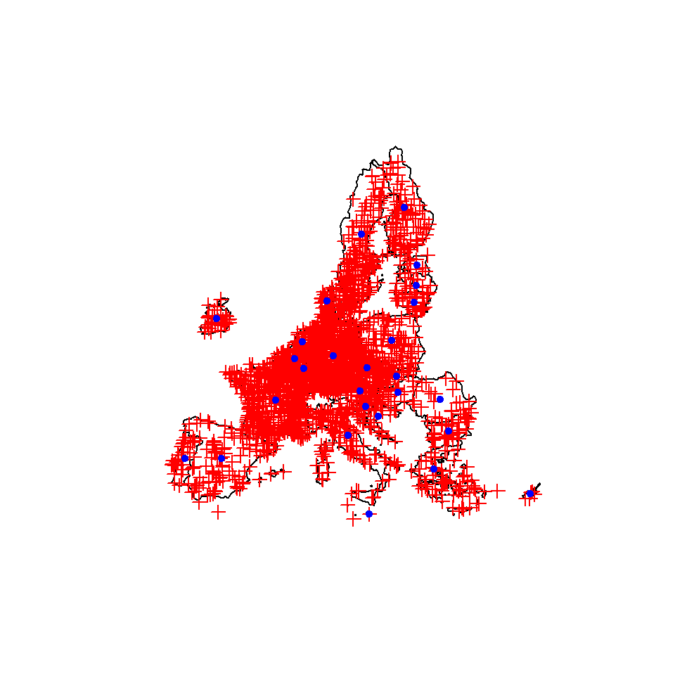
The airports are marked in red crosses while the desired location of the bubbles are presented with blue circles.
Data wrangling
After getting our data we need to attach the number of airports by country to the symbol_pos object. For that purpose, we would extract the data frame from airports using the st_drop_geometry() function:
number_airports <- airports %>%
  st_drop_geometry() %>%
  group_by(CNTR_CODE) %>%
  summarise(n = n())
Now we can join the aggregated dataset to symbol_pos:
labels_n <-
  symbol_pos %>%
  left_join(number_airports,
            by = c("CNTR_ID" = "CNTR_CODE")) %>%
  arrange(desc(n))
Note that the points would be plotted in order, so it is a good practice to sort the rows of the spatial object in descending order, so the bigger bubbles will be displayed below the small bubbles of the chart, avoiding to hide them.
Basic proportional symbol map
Given the previous data we can now create a bubble map with base R. Note that we set a filled circle as symbol (pch = 21), but you could use any other pch symbol, such as squares, crosses or triangles.
# Rescale sizes with log
labels_n$size <- log(labels_n$n / 15)

plot(st_geometry(EU_countries),
     main = "Airports by country (2013)",
     sub = gisco_attributions(),
     col = "white", border = 1,
     xlim = c(2200000, 7150000),
     ylim = c(1380000, 5500000))

plot(st_geometry(labels_n),
     pch = 21, bg = 4,    # Symbol type and color
     col = 4,             # Symbol border color
     cex = labels_n$size, # Symbol sizes
     add = TRUE)

legend("right",
       xjust = 1,
       y.intersp = 1.3,
       bty = "n",
       legend = seq(100, 500, 100),
       col = "grey20",
       pt.bg = 4,
       pt.cex = log(seq(100, 500, 100) / 15),
       pch = 21,
       title = "Airports")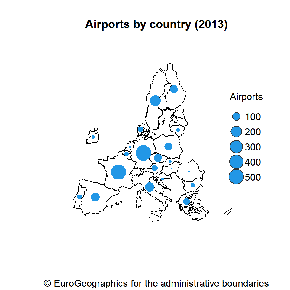
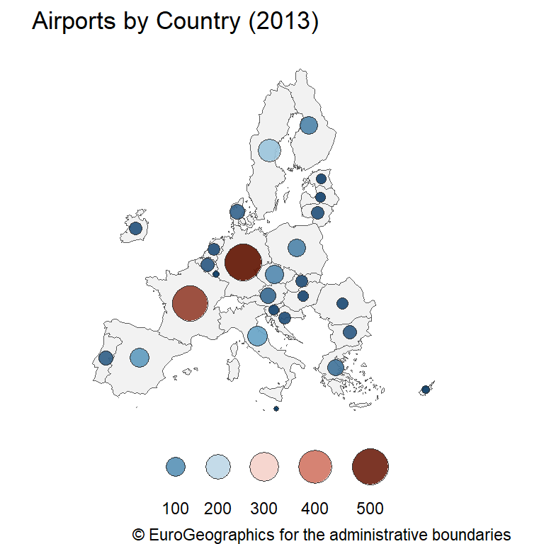
Choropleth bubble map
It is possible to combine a choropleth and a bubble map, filling the bubbles with colors based on the variable, making easier to read the map.
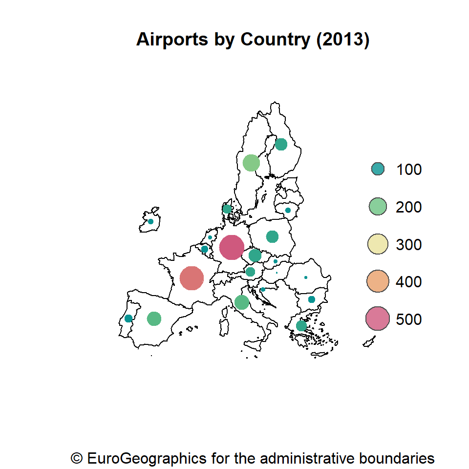
# Color palette
pal_init <- hcl.colors(5, "Temps", alpha = 0.8)
pal_ramp <- colorRampPalette(pal_init)

plot(st_geometry(EU_countries),
     col = "grey95",
     main = "Airports by Country (2013)",
     sub = gisco_attributions(),
     xlim = c(2200000, 7150000),
     ylim = c(1380000, 5500000))

plot(labels_n[, "n"],
     pch = 19,
     cex = labels_n$size, # Symbol size
     pal = pal_ramp,      # Color palette
     add = TRUE)

legend("right",
       xjust = 1,
       x.intersp = 1.3,
       y.intersp = 2,
       legend = seq(100, 500, 100),
       bty = "n",
       col = "grey30",
       pt.bg = pal_init,
       pt.cex = log(seq(100, 500, 100) / 15),
       pch = 21,
       title = "")
Master Statistics
Learn statistics from the basics to advanced techniques, clearly explained
Go to site