A cartogram is a type of map where different geographic areas are modified based on a variable associated to each of those areas. While cartograms can be visually appealing, they require a previous knowledge of the geography represented, since sizes and limits of the geographies are altered.
We would use the data included on the mapSpain package, that provides map data on sf format and an example dataset pobmun19, that includes the population of Spain by municipalty as of 2019.
Base map
In first place, we would need to get the spatial data that contains the geographical information to be used on the plot. On mapSpain, we can select the provinces, that are the second-level administrative division of the country, and visualize the object with geom_sf:
# install.packages("sf")
library(sf)
# install.packages("dplyr")
library(dplyr)
# install.packages("ggplot2")
library(ggplot2)
# install.packages("mapSpain")
library(mapSpain)
# install.packages("cartogram")
library(cartogram)

# Data
prov <- esp_get_prov() %>%
  mutate(name = prov.shortname.en) %>%
  select(name, cpro)

# Base map
ggplot(prov) +
  geom_sf()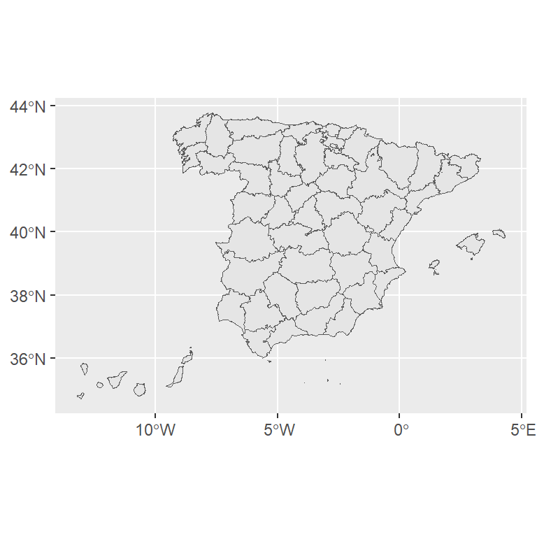
Projection
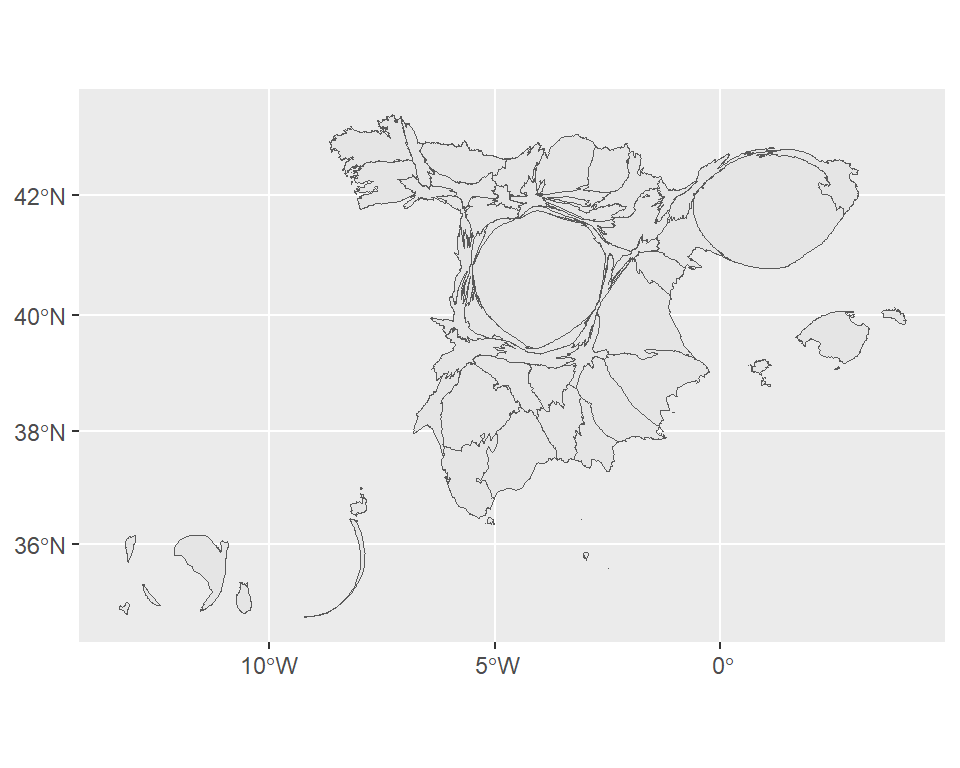
We are going to use the cartogram package, that is dedicated to this specific task. Since cartogram requires a projected sf object, we would project our map to the well-known Mercator projection (EPSG code: 3857).
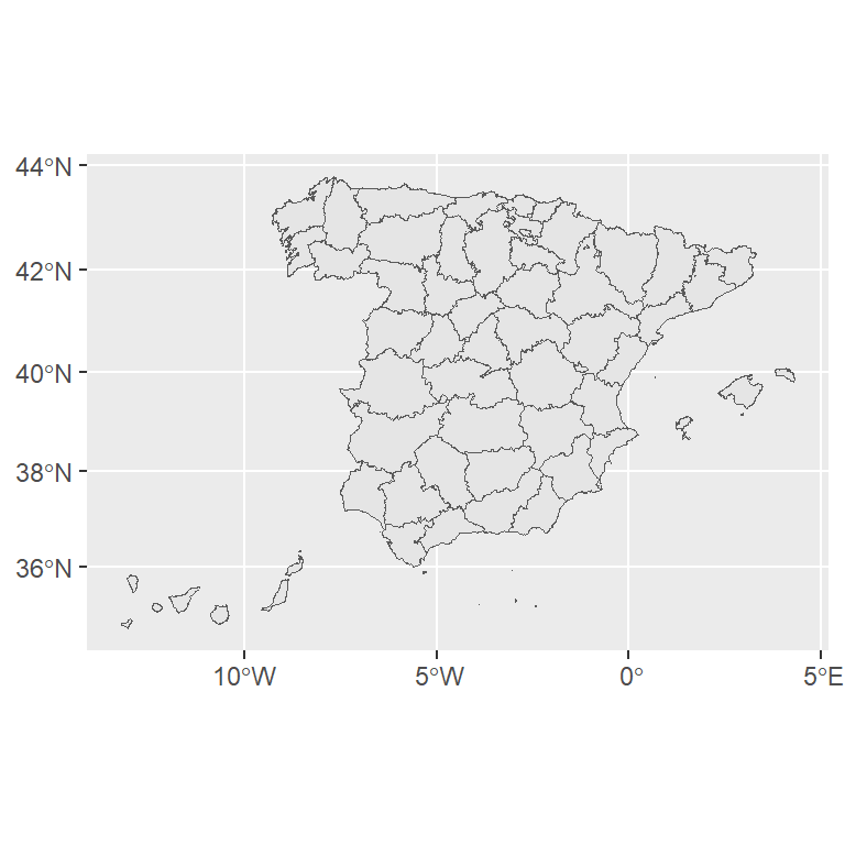
# Transform the shape
prov_3857 <- st_transform(prov, 3857)

ggplot(prov_3857) +
  geom_sf()
Join map and data
In order to create a cartogram we will need to join the statistical and the geographical data. For that purpose, as the sf objects behave as data frames, we can use the left_join function from dplyr. Since the pobmun19 dataset provides data at municipalty level, we need to aggregate this
to the province level first:
# Aggregate
pop_provinces <- mapSpain::pobmun19 %>%
  group_by(cpro) %>%
  summarise(n_pop = sum(pob19))

prov_3857_data <- prov_3857 %>%
  left_join(pop_provinces, by = c("cpro"))
After merging the data sets we would have an object with the data from mapSpain::pobmun19 and a geometry column, that includes the geographical data coordinates.
Creating and customizing cartograms in ggplot2
As a result of the previous process, we have available an sf object with the statistical data to be plotted. We can now proceed to create a contiguous cartogram with ggplot2, cartogram and sf, using the modified sf object and passing the values of interest (n_pop column) as the weight of the cartogram_cont function:
Contiguous cartogram
prov_3857_data_cartog_cont <-
  cartogram_cont(prov_3857_data,
                 weight = "n_pop")

ggplot(prov_3857_data_cartog_cont) +
  geom_sf()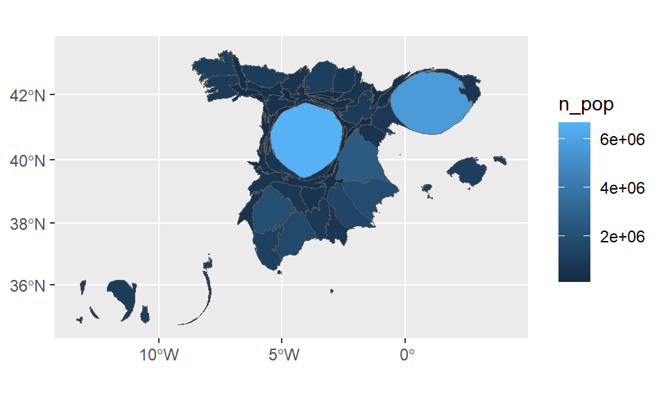
Default colors
If you also pass values of interest to the fill argument of aes you can fill the regions by color based on that variable.
ggplot(prov_3857_data_cartog_cont) +
  geom_sf(aes(fill = n_pop))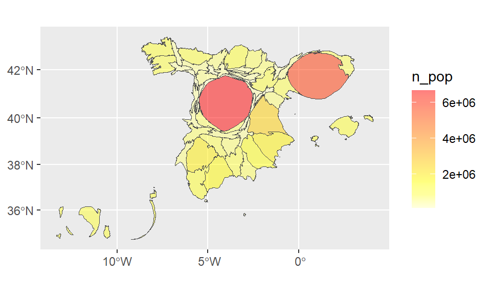
Fill color customization
Note that you can specify a custom palette using scale_fill_gradientn or an equivalent function and change the borders color with the color argument of geom_sf.
ggplot(prov_3857_data_cartog_cont) +
  geom_sf(aes(fill = n_pop), color = "gray30") +
  scale_fill_gradientn(colours = heat.colors(n = 10,
                                             alpha = 0.5,
                                             rev = TRUE))
By last, we can create a full-blown cartogram improving the legend with a custom labeller and modifying some other components, such as the theme and the legend:
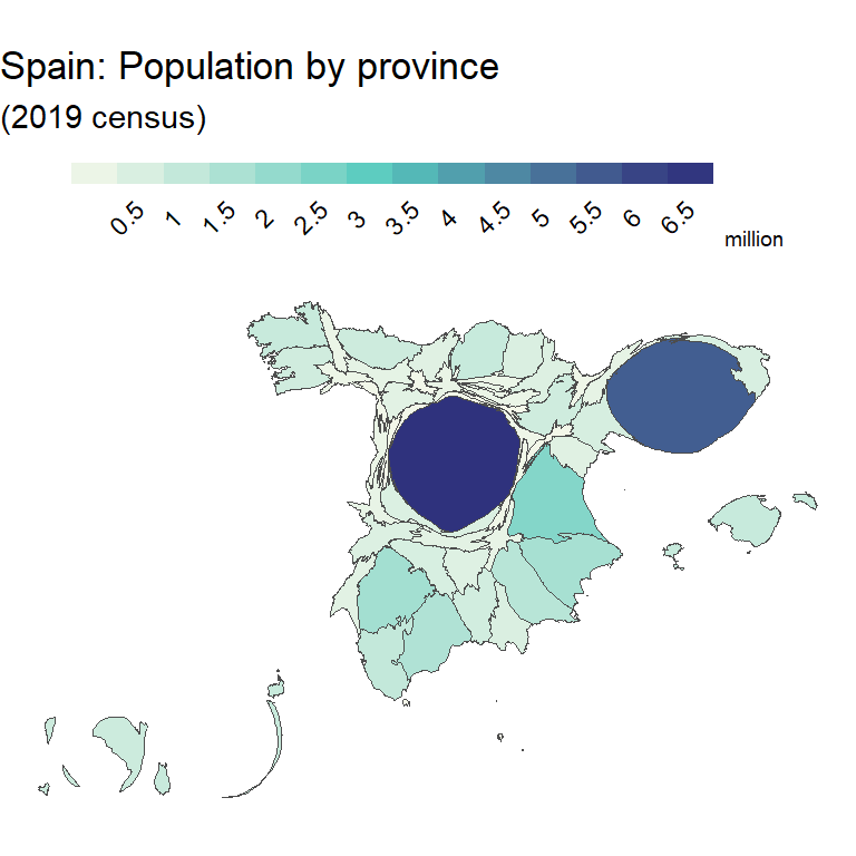
# Labeller function
label_fun <- function(breaks) {
  labels <- breaks / 1000000
  return(labels)
}

ggplot(prov_3857_data_cartog_cont) +
  geom_sf(aes(fill = n_pop), color = "gray30") +
  scale_fill_gradientn(
    colours = hcl.colors(3, "GnBu", rev = TRUE),
    labels = label_fun,
    n.breaks = 15,
    guide = guide_colorsteps(
      barwidth = 15,
      barheight = 0.5,
      title = "million",
      title.position = "right",
      title.vjust = 0.1)) +
  theme_void() +
  theme(legend.position = "top",
        legend.margin = margin(t = 10, b = 2),
        legend.title = element_text(size = 7),
        legend.text = element_text(angle = 45,
                                   margin = margin(t = 5))) +
  labs(title = "Spain: Population by province",
       subtitle = "(2019 census)")
Other cartogram types
So far, the cartogram type produced is a contiguous cartogram, where the geographies are deformed while maintaining adjacent edges. However, there are other classes of cartograms that could be produced with the cartogram package:
Non-contiguous cartograms
This type of cartogram reduces or enlarges the geographies according to a given value. While there is no deformation of the geometry of geography, sizes are modified leaving gaps among them.
In order to create a non-contiguous cartogram you can transform the prov_3857_data data set making use of the cartogram_ncont function and passing as weight the values of interest (n_pop column).
prov_3857_data_cartog_ncont <-
  cartogram_ncont(prov_3857_data,
                  weight = "n_pop")

ggplot(prov_3857_data_cartog_ncont) +
  geom_sf()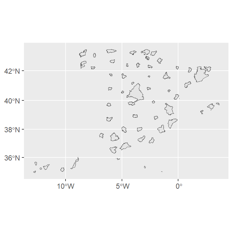
Similar to the full-blown cartogram of the previous section, if you want to create a more appealing non-contiguous cartogram you can customize the legend, the theme and other aesthetic components.
ggplot(prov_3857_data_cartog_ncont) +
  geom_sf(aes(fill = n_pop), color = "gray30") +
  scale_fill_gradientn(
    colours = hcl.colors(n = 3, "ag_Sunset", rev = TRUE),
    labels = label_fun,
    n.breaks = 15,
    guide = guide_colorsteps(
      barwidth = 15,
      barheight = 0.5,
      title = "million",
      title.position = "right",
      title.vjust = 0.1)) +
  theme_void() +
  theme(legend.position = "top",
        legend.margin = margin(t = 10, b = 2),
        legend.title = element_text(size = 7),
        legend.text = element_text(angle = 45,
                                   margin = margin(t = 5))) +
  labs(title = "Spain: Population by province",
       subtitle = "(2019 census)")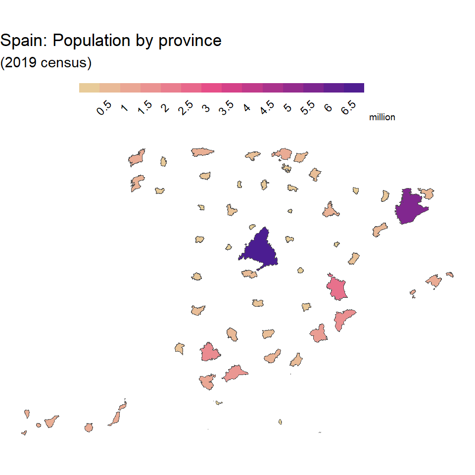
Dorling cartograms
This type of cartogram replaces the original geography with a symbol (usually a circle) with its size reduced or enlarged based on the value to be represented:
Default Dorling
In order to create a Dorling cartogram in ggplot2 pass the prov_3857_data data set to the cartogram_dorling function and pass the name of the variable of interest to the weight argument.
prov_3857_data_cartog_dorling <-
  cartogram_dorling(prov_3857_data,
                    weight = "n_pop")

ggplot(prov_3857_data_cartog_dorling) +
  geom_sf()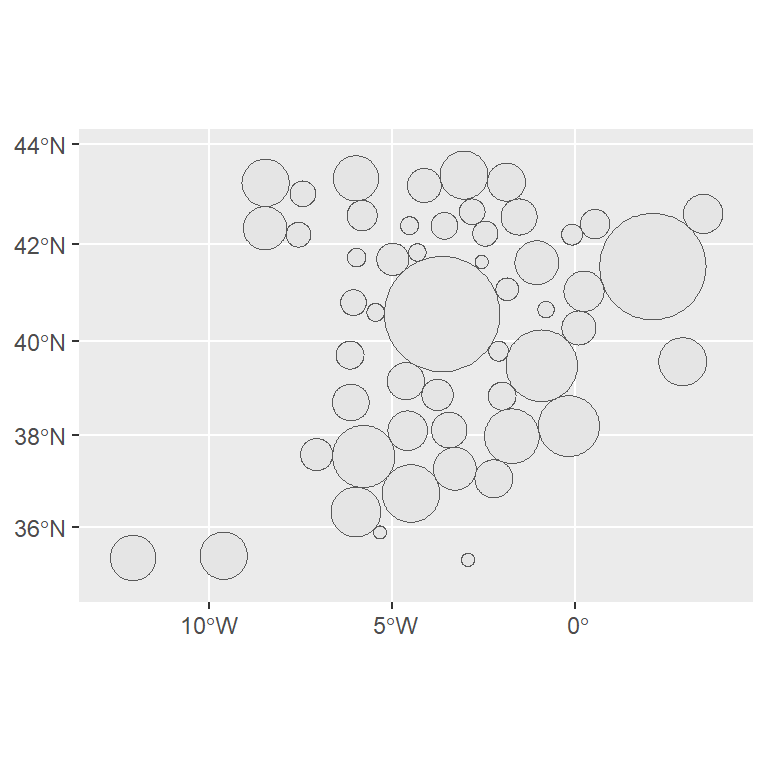
Full-blown dorling cartogram
ggplot(prov_3857_data_cartog_dorling) +
  geom_sf(aes(fill = n_pop), color = "grey50") +
  scale_fill_gradientn(
    colours = hcl.colors(3, "Zissou 1", rev = TRUE),
    labels = label_fun,
    n.breaks = 15,
    guide = guide_colorsteps(
      barwidth = 15,
      barheight = 0.5,
      title = "million",
      title.position = "right",
      title.vjust = 0.1)) +
  theme_void() +
  theme(legend.position = "top",
        legend.margin = margin(t = 10, b = 2),
        legend.title = element_text(size = 7),
        legend.text = element_text(angle = 45,
                                   margin = margin(t = 5))) +
  labs(title = "Spain: Population by province",
       subtitle = "(2019 census)")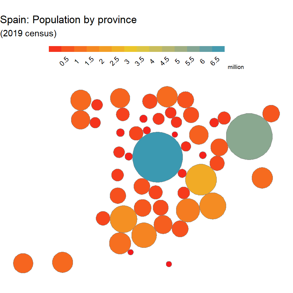

Master Statistics
Learn statistics from the basics to advanced techniques, clearly explained
Go to site