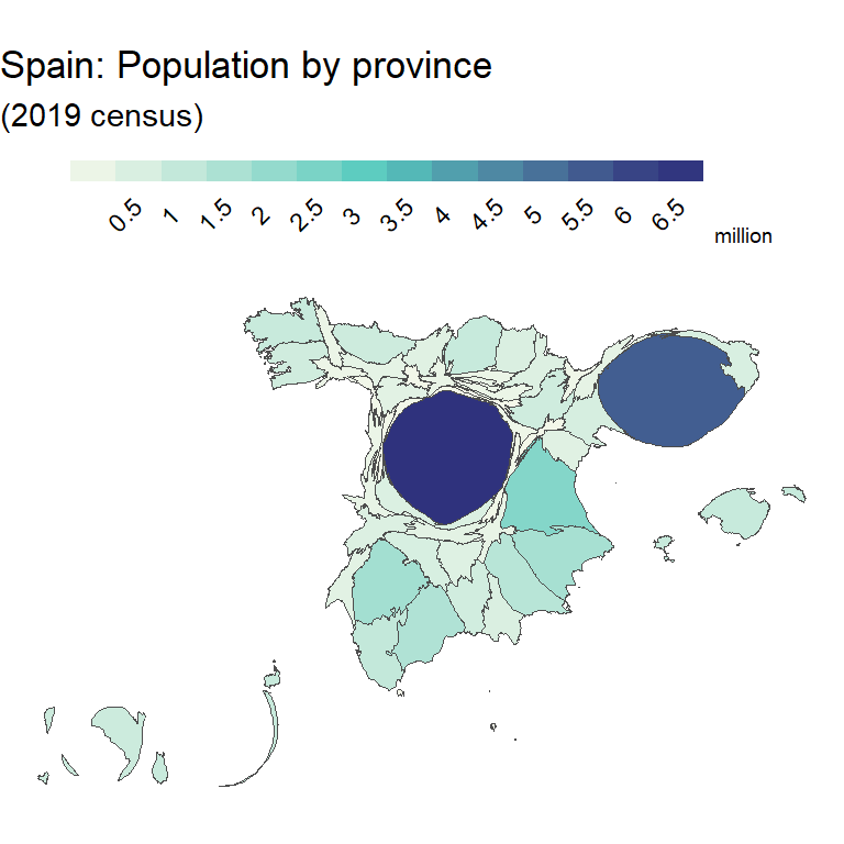
A choropleth map is a type of map where different geographic areas are colored based on a variable associated to each of those areas. A choropleth map provide an intuitive way to visualize how a specific variable (as population density, income, etc.) could vary across different geographic areas.
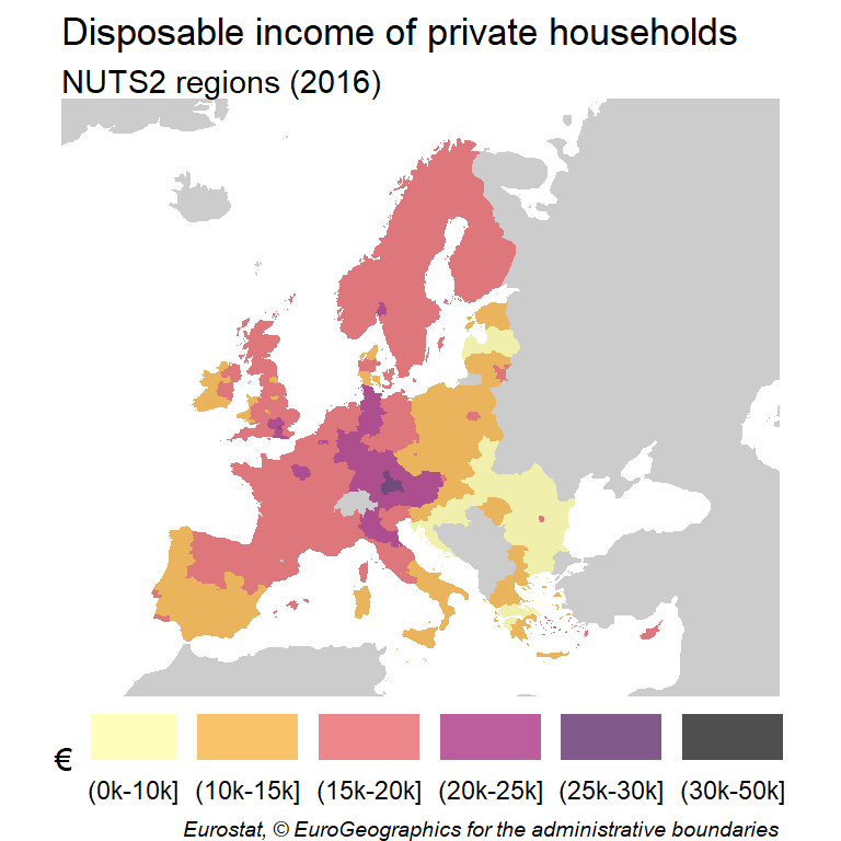
In this tutorial we will use the giscoR package to get the map data of Italy in sf format and we will use the example dataset of the same package named tgs00026, which provides the disposable income of private households at NUTS2 level. On this example, we would use the year 2013 as a reference.
Base map
In first place, we would need to get the spatial data that contains the geographical information to be used on the plot. When using giscoR, we can select the NUTS geometries with the gisco_get_nuts function and specify the country we want to plot inside the country argument. In order to plot the map we can apply the st_geometry function to our data and use the plot function.
# install.packages("sf")
library(sf)
# install.packages("dplyr")
library(dplyr)
# install.packages("giscoR")
library(giscoR)

year_ref <- 2013

nuts2_IT <- gisco_get_nuts(
  year = year_ref,
  resolution = 20,
  nuts_level = 2,
  country = "Italy") %>%
  select(NUTS_ID, NAME_LATN)

plot(st_geometry(nuts2_IT))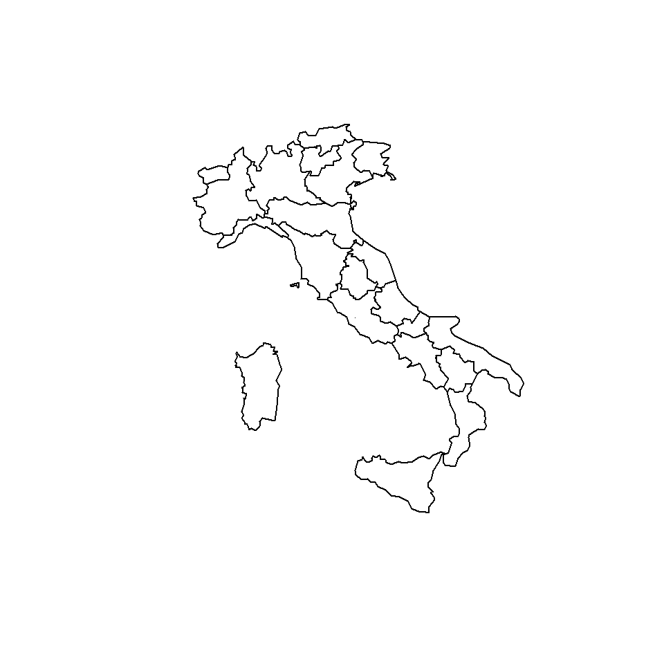
Projection
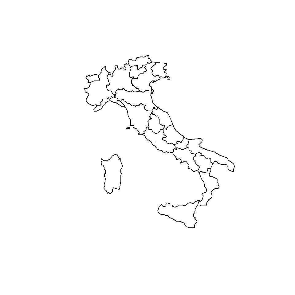
We can slightly improve the map by changing the Coordinate Reference System (CRS) to WGS 84 / UTM zone 32N (EPSG code: 32632).
# Transform the shape
nuts2_IT_32632 <- st_transform(nuts2_IT, 32632)

plot(st_geometry(nuts2_IT_32632))
Join map and data
As we geographical objects in sf behaves as data frames we can perform a left join to merge the statistical and the geographical data.
# Filter to select data from 2013
disp_income <- giscoR::tgs00026 %>%
  filter(time == year_ref) %>%
  select(-time)

nuts2_IT_32632_data <- nuts2_IT_32632 %>%
  left_join(disp_income, by = c("NUTS_ID" = "geo"))
As a result, we would have an object named nuts2_IT_32632_data containing the geographical coordinates and the disposable income of private households of Italy for each NUTS2 region (values column).
Basic choropleth map
After merging our data, we have available an sf object with the statistical data to be plotted. We can now proceed to create a basic choropleth map plotting the values column of the data frame.
The breaks argument allows you to specify a numeric vector with the actual breaks or a method. Possible methods are "fixed", "sd", "equal", "pretty", "quantile", "kmeans", "hclust", "bclust", "fisher", "jenks", "dpih" and "headtails".
plot(nuts2_IT_32632_data[, "values"],
     breaks = "jenks",
     main = "Choropleth map")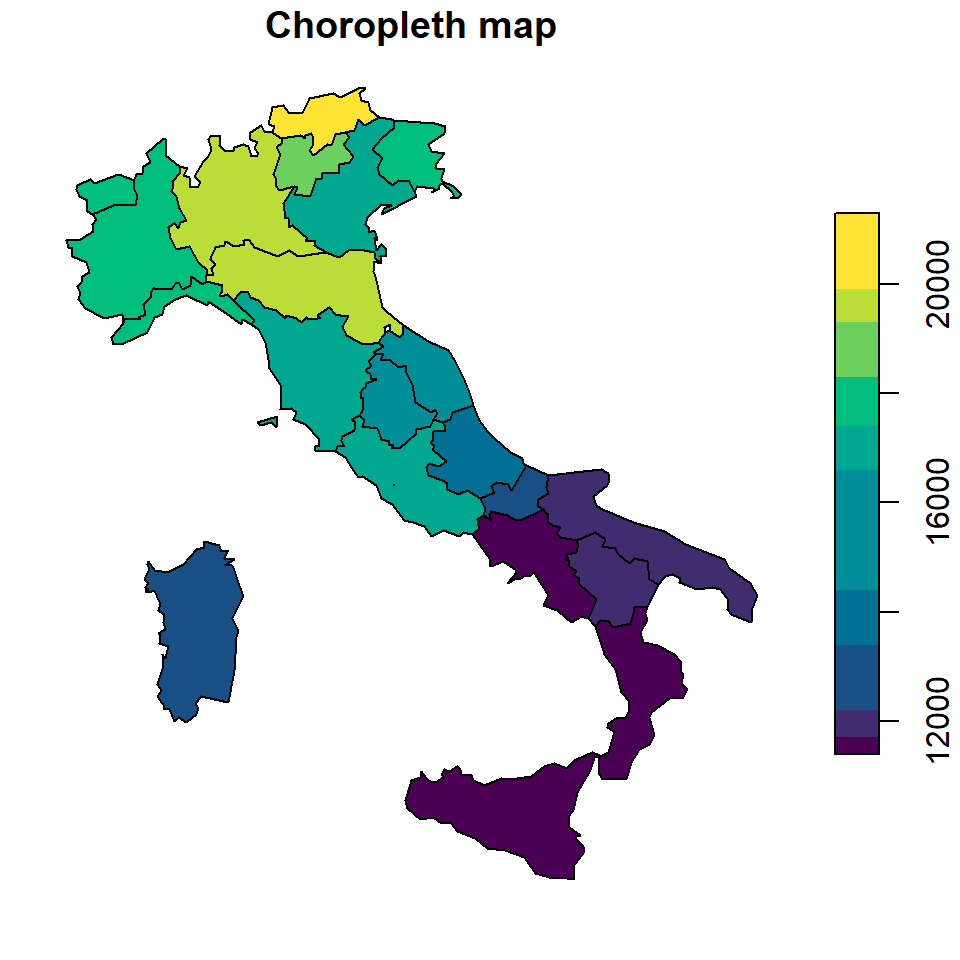
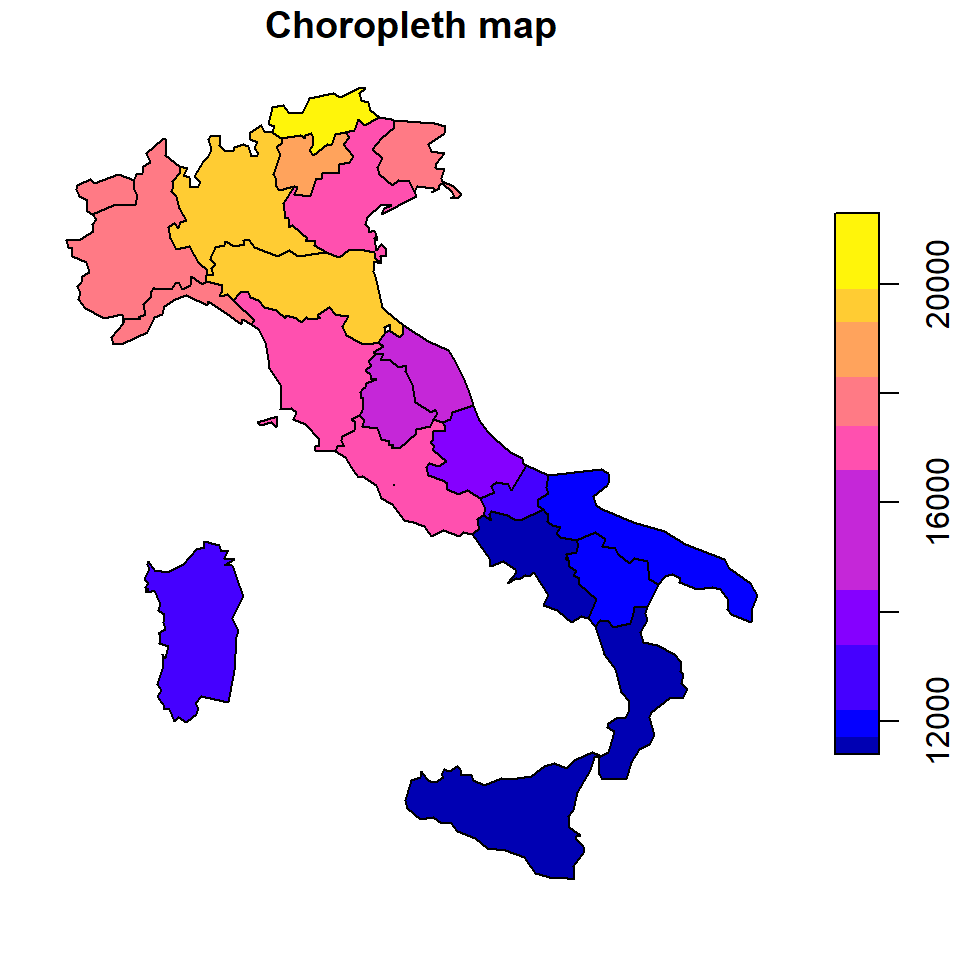
Note that with the nbreaks argument you can change the number of categories to be plotted and that you can change the color palette with pal (defaults to sf.colors).
plot(nuts2_IT_32632_data[, "values"],
     breaks = "jenks",
     nbreaks = 10,
     pal = hcl.colors(10),
     main = "Choropleth map")
Advanced choropleth map
In this section we are going to customize some features of the previous map in order to create a more advanced map. We are going to use custom breaks and colors to create a categorical map derived from the continuous disposable income data of Italy. In addition, we are going to plot also surrounding countries not included in the sample.
First, we are going to get all the countries of the world to be used as a base map.
# Get all countries and transform to the EU CRS
cntries <- gisco_get_countries(
  year = year_ref,
  resolution = 20) %>%
  st_transform(3035)

# Plot
plot(st_geometry(cntries),
     col = "grey80", border = NA,
     xlim = c(4600000, 4700000),
     ylim = c(1500000, 2600000))
Now, we can start preparing the choropleth overlay. We start by cleaning the data and creating the discrete categories making use of the cut function. We also prepare here the labels to be included on the legend of the map.
# Clean NAs from  initial dataset
nuts2_IT_32632_data_clean <- nuts2_IT_32632_data %>%
  filter(!is.na(values))

# Create breaks and discretize values
br <- c(10, 12, 14, 16, 18, 20) * 1000

nuts2_IT_32632_data_clean$disp_income <-
  cut(nuts2_IT_32632_data_clean$values,
      breaks = br, dig.lab = 5)

# Create custom labels - e.g. (0k-10k]
labs <- c(10, 12, 14, 16, 18, 20)
labs_plot <- paste0("(", labs[1:5], "k-", labs[2:6], "k]")
Finally, we choose the Spectral palette included on the hcl.colors function and proceed to create the final map, merging the base map, overlaying the Italy map and adding a legend:
# Palette
pal <- hcl.colors(6, "Spectral", rev = TRUE, alpha = 0.75)

# Base plot
plot(st_geometry(cntries),
  col = "grey80",
  border = NA,
  xlim = c(4600000, 4700000),
  ylim = c(1500000, 2600000),
  main = "Disposable income of private households")
mtext("Italy NUTS2 regions (2013)", side = 3, adj = 0)

# Overlay
plot(st_transform(nuts2_IT_32632_data_clean[, "disp_income"],
                  crs = 3035), # Transform to the European CRS
  border = NA,
  pal = pal,
  categorical = TRUE,
  add = TRUE)

# Legend
legend(x = "topright",
       title = "€/household",
       cex = 0.9,
       bty = "n",
       inset = 0.02,
       y.intersp = 1.5,
       legend = labs_plot,
       fill = pal)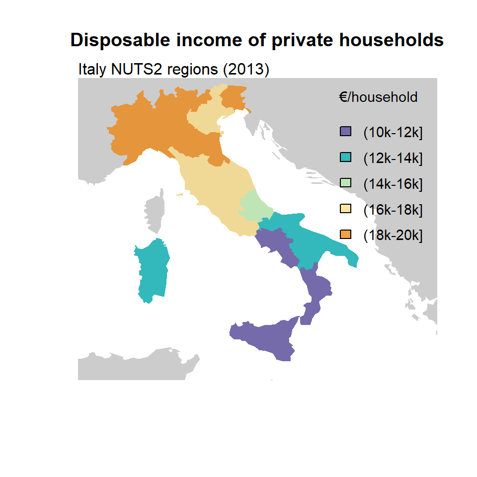

Master Statistics
Learn statistics from the basics to advanced techniques, clearly explained
Go to site