Sample data
The following data frame contains three normal distributions with different mean and standard deviation separated by group. This data will be used in all the examples of this tutorial.
# Data
set.seed(5)
x <- c(rnorm(200, mean = -2, 1.5),
       rnorm(200, mean = 0, sd = 1),
       rnorm(200, mean = 2, 1.5))
group <- c(rep("A", 200), rep("B", 200), rep("C", 200))
df <- data.frame(x, group)
Density plot by group with geom_density
In order to create a density plot by group in ggplot you need to input the numerical variable and specify the grouping variable in color (or colour) argument inside aes and use geom_density function.
# install.packages("ggplot2")
library(ggplot2)

# Basic density plot in ggplot2
ggplot(df, aes(x = x, colour = group)) +
  geom_density()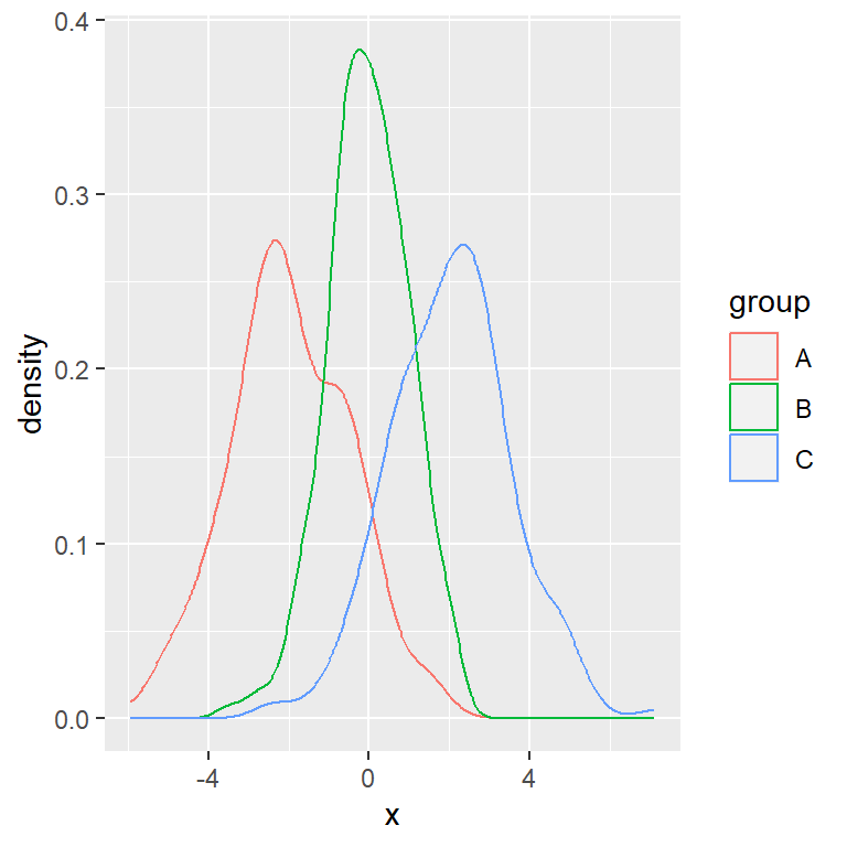
The default color palette for the lines can be customized with scale_color_manual (or scale_color_brewer, for instance). You can also change the width and line type of the curves with lwd and linetype, respectively.
# install.packages("ggplot2")
library(ggplot2)

cols <- c("#F76D5E", "#FFFFBF", "#72D8FF")

# Basic density plot in ggplot2
ggplot(df, aes(x = x, colour = group)) +
  geom_density(lwd = 1.2, linetype = 1) +
  scale_color_manual(values = cols)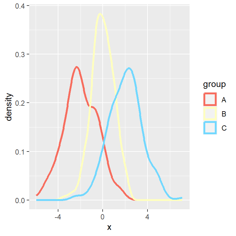
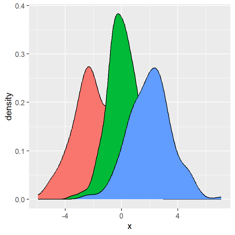
Fill the density areas

If you also set the categorical variable to fill inside aes the areas under the curves will be filled with a color. Note that you can remove colour = group or set a custom color if you don’t want to color the lines by group.
# install.packages("ggplot2")
library(ggplot2)

# Basic density plot in ggplot2
ggplot(df, aes(x = x, colour = group, fill = group)) +
  geom_density()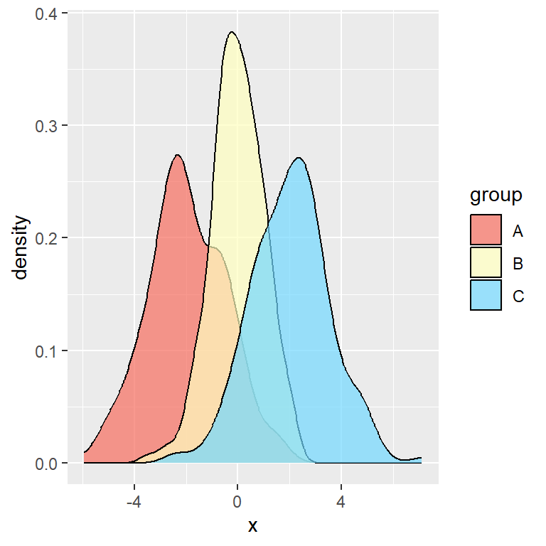
Transparency and custom colors
You can modify the transparency of the areas with the alpha argument of geom_density and set custom colors with scale_fill_manual.
# install.packages("ggplot2")
library(ggplot2)

cols <- c("#F76D5E", "#FFFFBF", "#72D8FF")

# Basic density plot in ggplot2
ggplot(df, aes(x = x, fill = group)) +
  geom_density(alpha = 0.7) +
  scale_fill_manual(values = cols)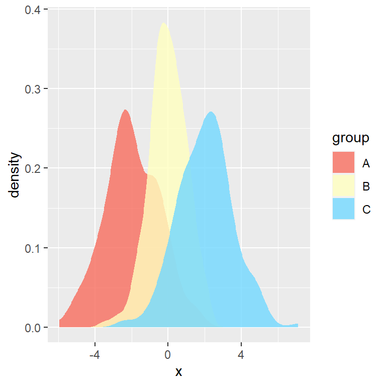
Remove the lines
If you want to get rid of the lines and only show the area you can set color = NA inside geom_density.
# install.packages("ggplot2")
library(ggplot2)

cols <- c("#F76D5E", "#FFFFBF", "#72D8FF")

# Density areas without lines
ggplot(df, aes(x = x, fill = group)) +
  geom_density(alpha = 0.8, color = NA) +
  scale_fill_manual(values = cols)
Legend customization
Custom title
The default title (the name of the categorical variable) can be customized with the following code.
# install.packages("ggplot2")
library(ggplot2)

# Basic density plot in ggplot2
ggplot(df, aes(x = x, fill = group)) +
  geom_density() +
  guides(fill = guide_legend(title = "Title"))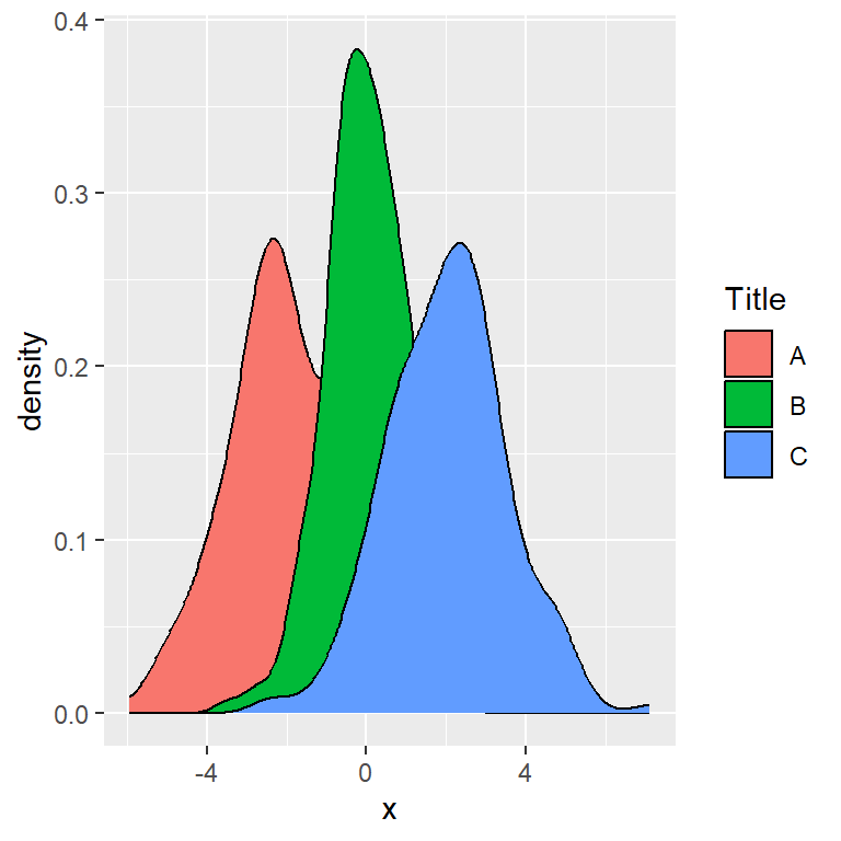
Custom labels
You can also set custom key labels if you don’t want to use the name of your categories. Note that you can use scale_fill_hue if you only want to change the labels, but use the labels argument of scale_fill_manual if you also need to change the fill colors.
# install.packages("ggplot2")
library(ggplot2)

# Custom legend labels
ggplot(df, aes(x = x, fill = group)) +
  geom_density() +
  scale_fill_hue(labels = c("G1", "G2", "G3"))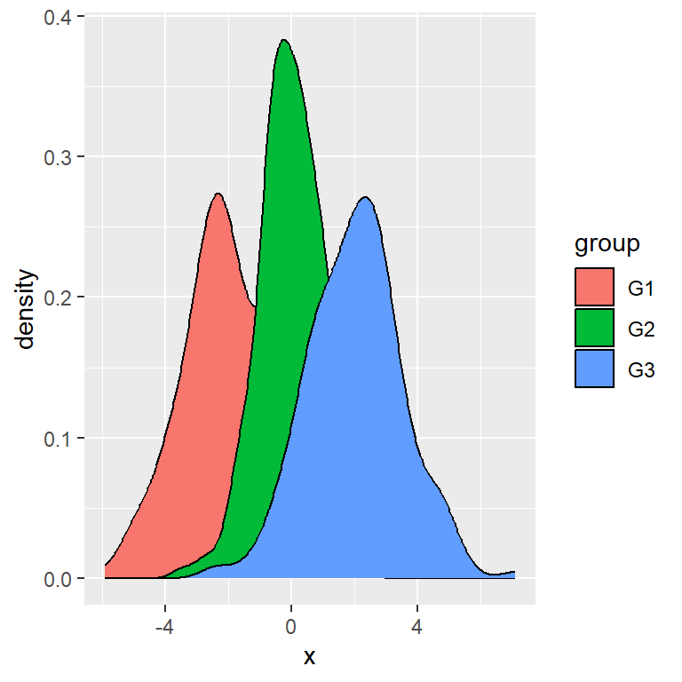
Remove the legend
If you want to get rid of the legend, which appears by default, you can set its position to "none".
# install.packages("ggplot2")
library(ggplot2)

# Basic density plot in ggplot2
ggplot(df, aes(x = x, fill = group)) +
  geom_density() +
  theme(legend.position = "none")