Sample data
Consider the ToothGrowth data set and transform the dose column into a factor.
# Sample data set
df <- ToothGrowth
df$dose <- as.factor(df$dose)
Adding the mean with stat_summary
In order to add the mean to the violin plots you need to use the stat_summary function and specify the function to be computed, the geom to be used and the arguments for the geom.
Mean as a point
In case you want to display the mean with points you can pass the mean function and set "point" as a geom. Recall that you can customize other arguments such as shape and size.
# install.packages("ggplot2")
library(ggplot2)

ggplot(df, aes(x = dose, y = len)) +
  geom_violin() +
  stat_summary(fun = "mean",
               geom = "point",
               color = "red")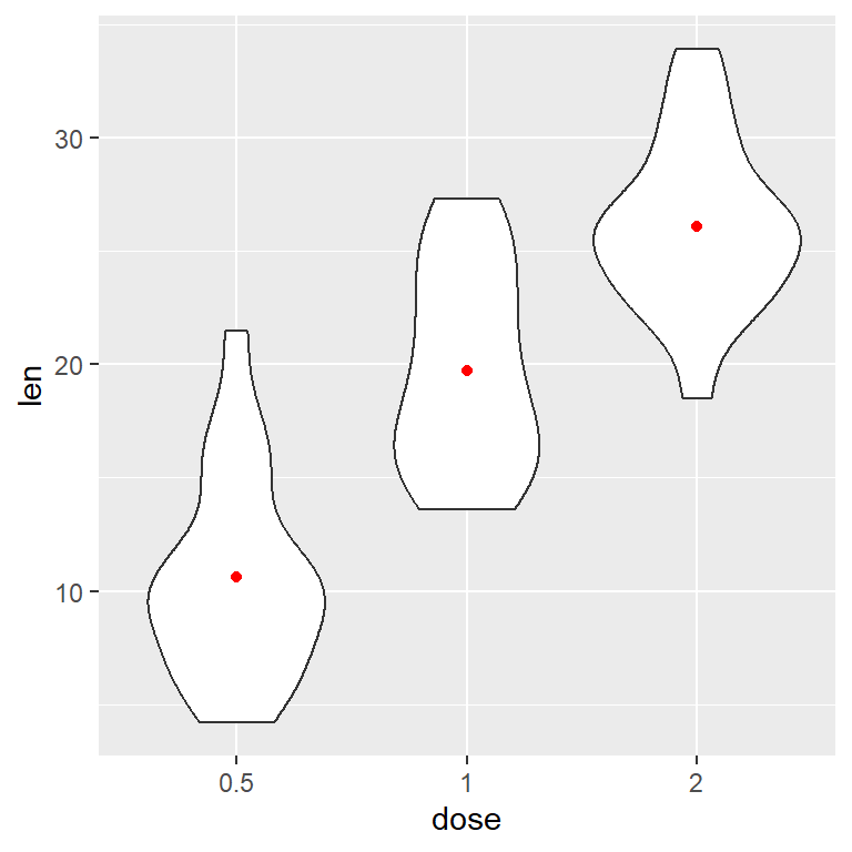
Mean as a line
If you prefer a horizontal line set geom = "crossbar". In this case you can also specify a width for the lines.
# install.packages("ggplot2")
library(ggplot2)

ggplot(df, aes(x = dose, y = len)) +
  geom_violin() +
  stat_summary(fun = "mean",
               geom = "crossbar",
               width = 0.5,
               colour = "red")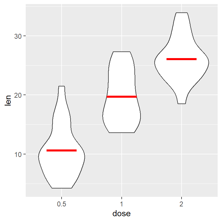
Mean as a crossbar
You can also add the confidence intervals for the mean. For that purpose you have to pass a function (to fun.data) that computes the standard deviation, such as mean_cl_boot for nonparametric boostrap. Type ?mean_cl_boot for more related functions.
# install.packages("ggplot2")
library(ggplot2)

ggplot(df, aes(x = dose, y = len)) +
  geom_violin() +
  stat_summary(fun.data = "mean_cl_boot", geom = "crossbar",
               colour = "red", width = 0.2)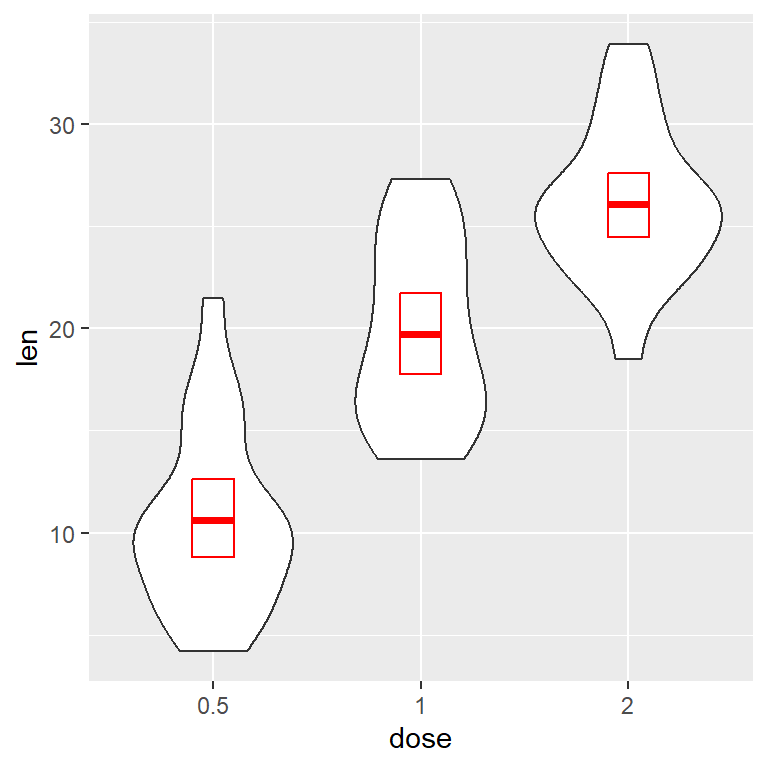
Mean as a pointrange
The standard deviation can be displayed with a pointrange instead of a crossbow.
# install.packages("ggplot2")
library(ggplot2)

ggplot(df, aes(x = dose, y = len)) +
  geom_violin() +
  stat_summary(fun.data = "mean_cl_boot", geom = "pointrange",
               colour = "red")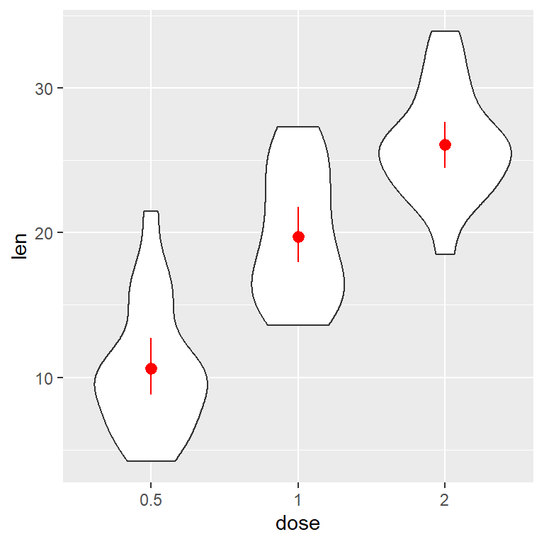
Mean and median
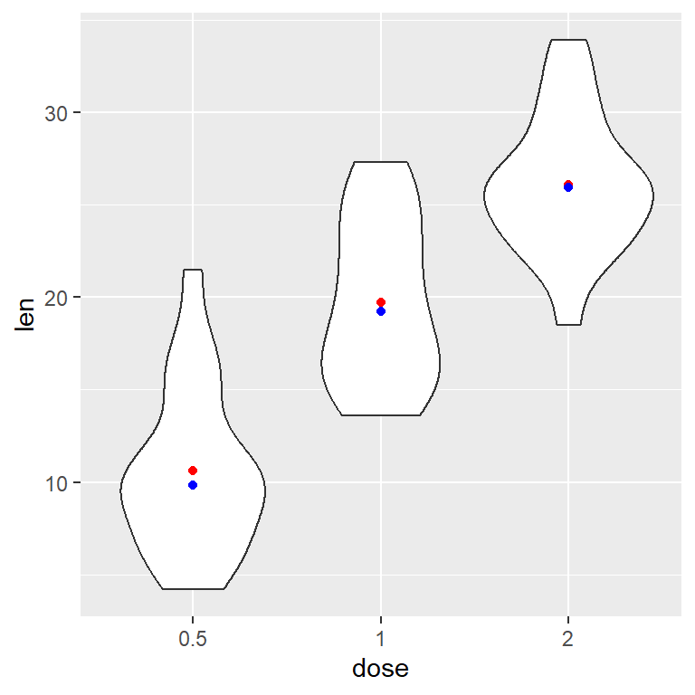
Mean and median
If you add other stat_summary function but with the median you can have both metrics. You can set the geom you desire as in the previous section.
# install.packages("ggplot2")
library(ggplot2)

ggplot(df, aes(x = dose, y = len)) +
  geom_violin() +
  stat_summary(fun = "mean",
               geom = "point",
               color = "red") +
  stat_summary(fun = "median",
               geom = "point",
               color = "blue")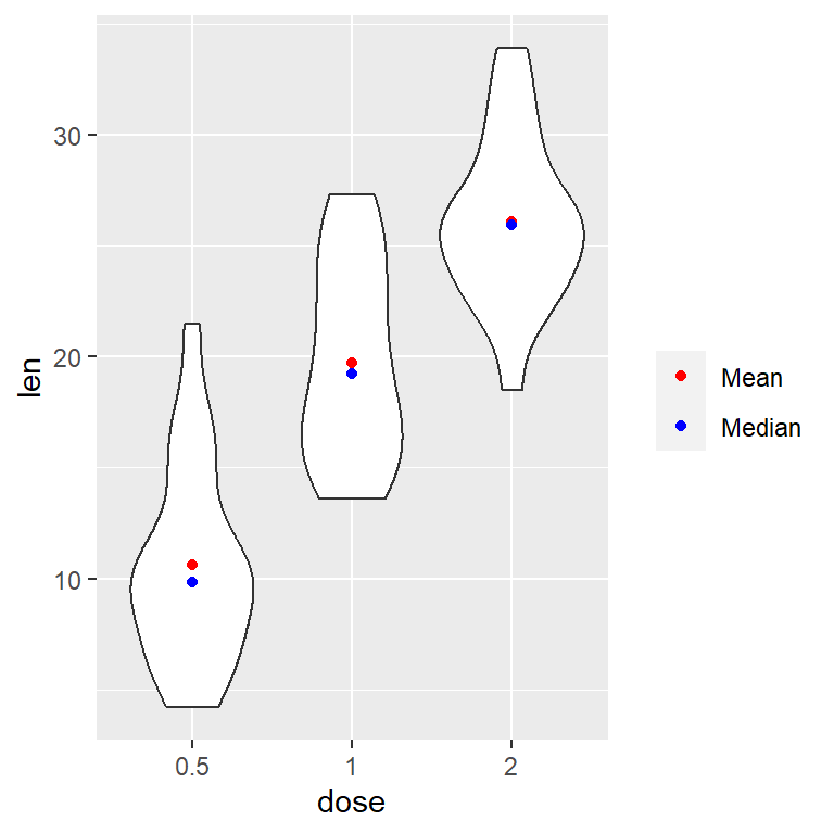
Mean and median (with legend)
Note that setting an aes will create a legend. This legend can be customized, for instance, with scale_color_manual.
# install.packages("ggplot2")
library(ggplot2)

ggplot(df, aes(x = dose, y = len)) +
  geom_violin() +
  stat_summary(fun = "mean",
               geom = "point",
               aes(color = "Mean")) +
  stat_summary(fun = "median",
               geom = "point",
               aes(color = "Median")) +
  scale_colour_manual(values = c("red", "blue"), # Colors
                      name = "") # Remove the legend title
Master Statistics
Learn statistics from the basics to advanced techniques, clearly explained
Go to site