A dumbbell plot is a type of a dot plot where the two points for each group are connected with straight lines. This chart can be used to display the changes of a variable between two different points of time or to show the range of a variable across several groups, such as the growth of population at two different years across several countries or the difference between the current and potential customers of different companies.
The applications of this type of chart are wide, as it can be used to analyze the distribution of the groups based on their range, to create a ranking or even to analyze correlations across groups.
Sample data sets
Depending on your data you can create a dumbbell plot in a different way. Sometimes it is easier just to transform your data to a more suitable format, but in this tutorial we are going to review how to create a dumbbell chart in ggplot2 both with long (df) and wide (df2) data frames, so two sample data frames are provided.
We encourage you to always use long format when working with ggplot2, as it was designed for it.
Wide data frame
The following data frame contains the current and potential customers of different companies. Note that each row represents a different company.
# Seed
set.seed(1)

# Data
customers <- sample(50:150, 10)
potential_customers <- sample(150:500, 10)
company <- LETTERS[1:10]

# Data frame
df <- data.frame(company = company,
                 x = customers,
                 y = potential_customers)
Long data frame
The melt function from reshape allows converting a wide data frame into long format. This format displays the variables as subgroups of the main groups, so each group will have as many rows as variables and the numerical values will all be in the same column instead of splited into different columns.
library(reshape)

# Seed
set.seed(1)

# Data
customers <- sample(50:150, 10)
potential_customers <- sample(150:500, 10)
company <- LETTERS[1:10]

# Data frame
df2 <- data.frame(company = company,
                 customers = customers,
                 potential_customers = potential_customers)

# Long, ordered data frame
df2 <- melt(df2, id.vars = "company")
df2 <- df2[order(df2$company), ]
Dumbbell chart with geom_segment and geom_point
Depending on your data frame you will need a different approach to create a dumbbell plot in ggplot2.
Option 1: wide data frame
If you are working with a wide data frame you can create a dumbbell chart by adding the straight lines with geom_segment, specifying the start and end for both axis. Then, you will need to use the geom_point function twice to add the points. Note that you won’t be able to add a legend in a straightforward way using this format.
# install.packages("ggplot2")
library(ggplot2)

ggplot(df) +
  geom_segment(aes(x = customers, xend = potential_customers,
                   y = company, yend = company)) +
  geom_point(aes(x = customers, y = company), size = 3) +
  geom_point(aes(x = potential_customers, y = company), size = 3)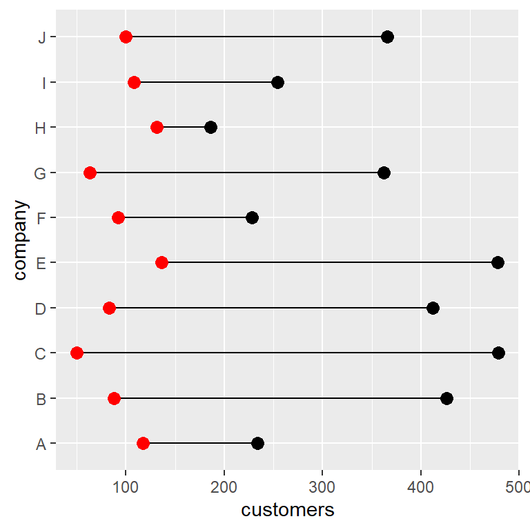
Option 2: long data frame
The long data frame format is the most recommended to create this type of visualization. You just need to input the names of the columns that represents values and groups to x and y inside aes and use the geom_line and geom_point functions. If you want to display a legend for the points you just need to input the name of the column representing subgroups to color inside aes. Recall that you can customize the legend position with legend.position.
# install.packages("ggplot2")
library(ggplot2)

ggplot(df2, aes(x = value, y = company)) +
  geom_line() +
  geom_point(aes(color = variable), size = 3) +
  theme(legend.position = "bottom")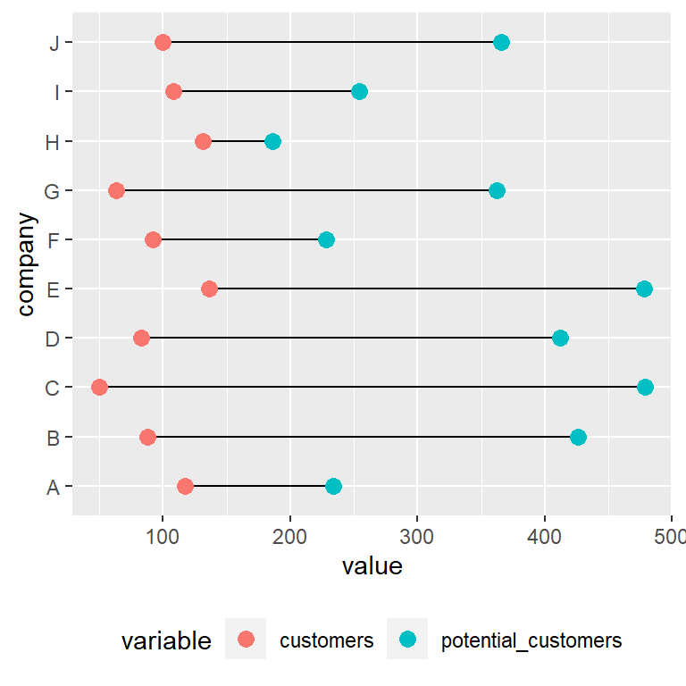
Customizing the color of the points
When working with a long data frame you can override the default colors of the points with a scale color function, such as scale_color_manual or scale_color_brewer.
# install.packages("ggplot2")
library(ggplot2)

ggplot(df2, aes(x = value, y = company)) +
  geom_line() +
  geom_point(aes(color = variable), size = 3) +
  scale_color_brewer(palette = "Set1", direction = -1) +
  theme(legend.position = "bottom")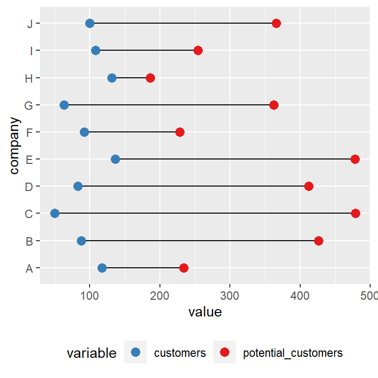
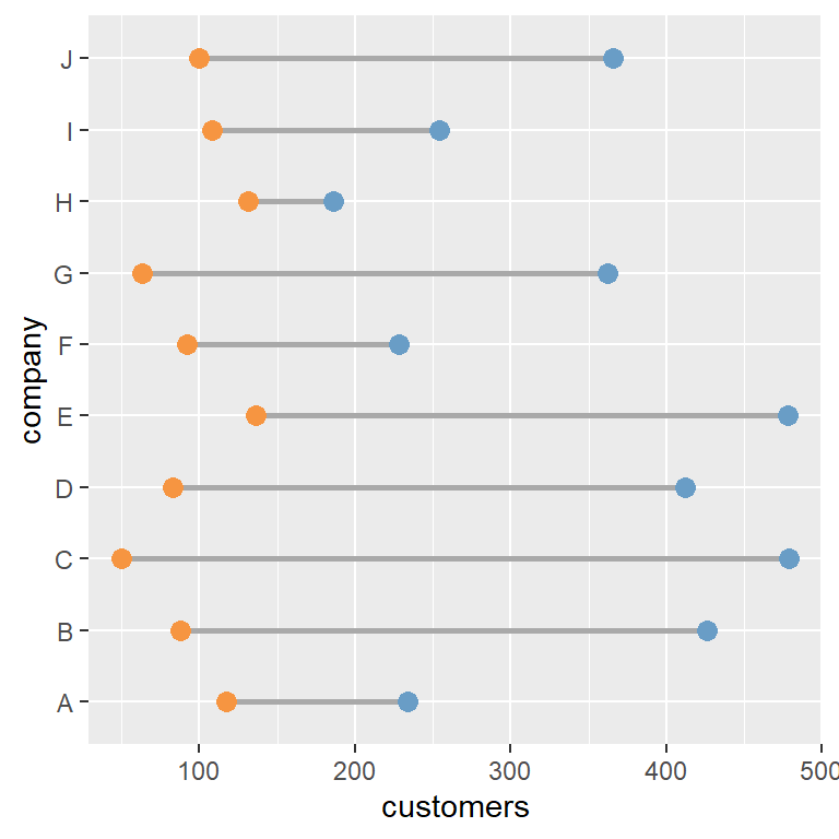
Dumbbell plot with ggalt and geom_dumbbell
An alternative to geom_segment and geom_point to create a dumbbell plot is the geom_dumbbell function from ggalt package. Using this function is straightforward, but the input data frame must be in wide format.
The function requires the groups (x or y), the start value (x or y) and the end positions (xend or yend). In addition, the function provides several arguments to customize the width and color of the lines and markers.
# install.packages("ggplot2")
# install.packages("ggalt")
library(ggplot2)
library(ggalt)

ggplot(df, aes(y = company, x = customers, xend = potential_customers)) +
  geom_dumbbell(color = "darkgray",  # Color of the line
                size = 1,            # Line width
                dot_guide = FALSE,   # Whether to add a guide from origin to X or not
                size_x = 3,          # Size of the X point
                size_xend = 3,       # Size of the X end point
                colour_x = "#F69541",    # Color of the X point
                colour_xend = "#699DC6") # Color of the X end point
The main drawback of this function is that if you want to add a legend you will need to transform the data to long format and add the points again as we did in the previous example.
Ordered dumbbell plot
A dumbbell plot can be ordered in different ways: by the start value, by the end value or by other metric, such as the mean of values for each group.
You can use the reorder function to reorder the groups. In the following example we are using the wide format sample data frame and we are ordering the values by the number of current customers of the companies.
# install.packages("ggplot2")
library(ggplot2)

ggplot(df, aes(y = reorder(company, customers))) +
  geom_segment(aes(x = customers, xend = potential_customers, yend = company)) +
  geom_point(aes(x = customers), size = 3, color = "red") +
  geom_point(aes(x = potential_customers), size = 3)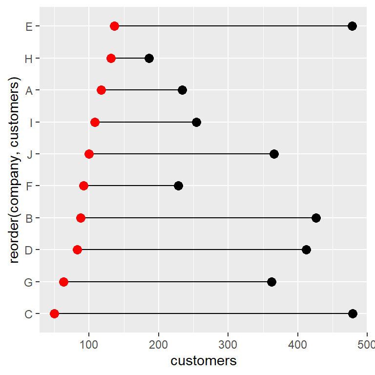
Order by the mean
With the sample data frame in long format if you reorder the companies by value the groups will be ordered by default by its mean. Nonetheless, the reorder function allows specifying other functions with FUN, such as min or max, to reorder the values based on the minimum or maximum value, respectively.
# install.packages("ggplot2")
library(ggplot2)

ggplot(df2, aes(x = value, y = reorder(company, value))) +
  geom_line() +
  geom_point(aes(color = variable), size = 3) +
  scale_color_brewer(palette = "Set1", direction = -1) +
  theme(legend.position = "bottom")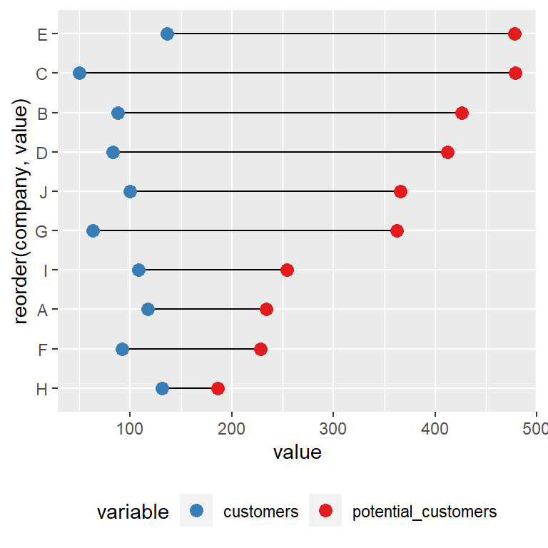
Use reorder(company, value, FUN = min) or reorder(company, value, FUN = max) to reorder the data based on the minimum or máximum value for each group, respectively.
Finally, when using geom_dumbbell, as it works with wide format data frames the process is the same as the one used on the first example of this section. However, in the following example we are ordering the groups based on the potential_customers column.
# install.packages("ggplot2")
library(ggplot2)

ggplot(df, aes(y = reorder(company, potential_customers))) +
  geom_dumbbell(aes(x = customers, xend = potential_customers),
                color = "darkgray",
                size = 1, dot_guide = FALSE,
                size_x = 3,  size_xend = 3,
                colour_x = "#F69541", colour_xend = "#699DC6")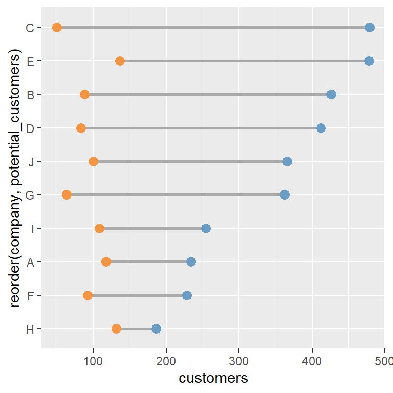

Master Statistics
Learn statistics from the basics to advanced techniques, clearly explained
Go to site