Sample data set
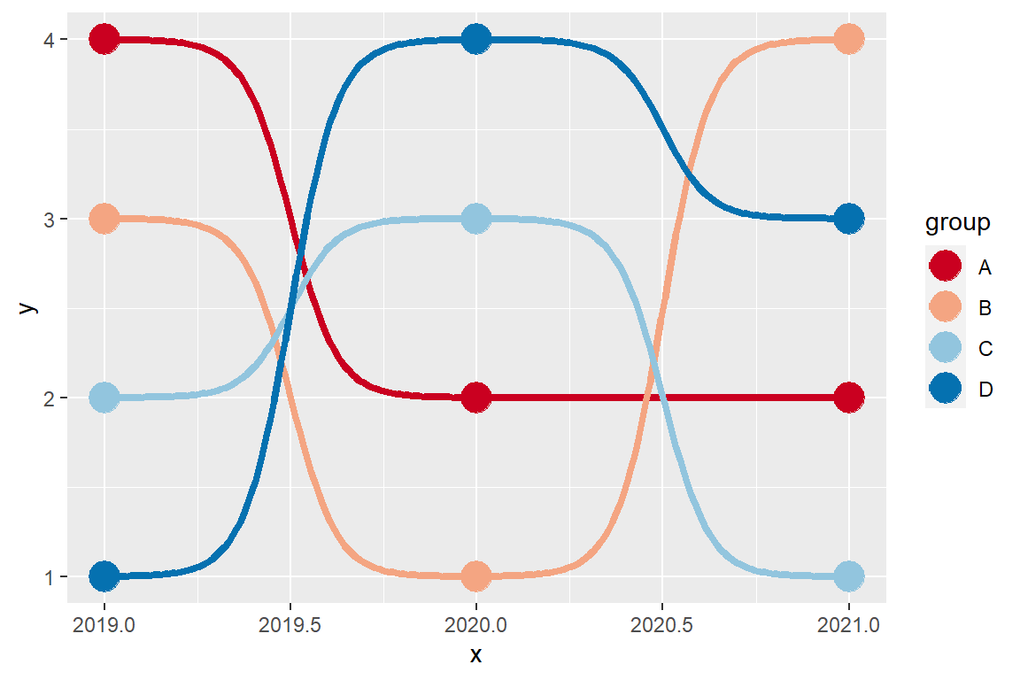
The following data set represents the ranking position (y) of some tennis players (group) over the years (x). This data will be used in the following examples.
year <- rep(2019:2021, 4)
position <- c(4, 2, 2, 3, 1, 4, 2, 3, 1, 1, 4, 3)
player <- c("A", "A", "A",
            "B", "B", "B",
            "C", "C", "C",
            "D", "D", "D")

df <- data.frame(x = year,
                 y = position,
                 group = player)
Most basic bump chart
In order to create a bump chart in ggplot2 you will need to load the ggbump package and the tidyverse.
# install.packages("tidyverse")
# install.packages("ggbump")
library(tidyverse)
library(ggbump)

ggplot(df, aes(x = x, y = y, color = group)) +
  geom_bump()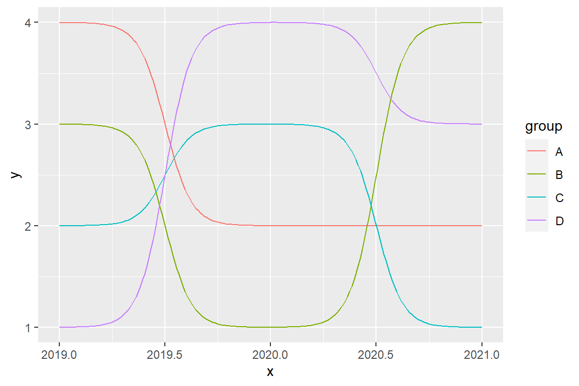
Bump chart customization
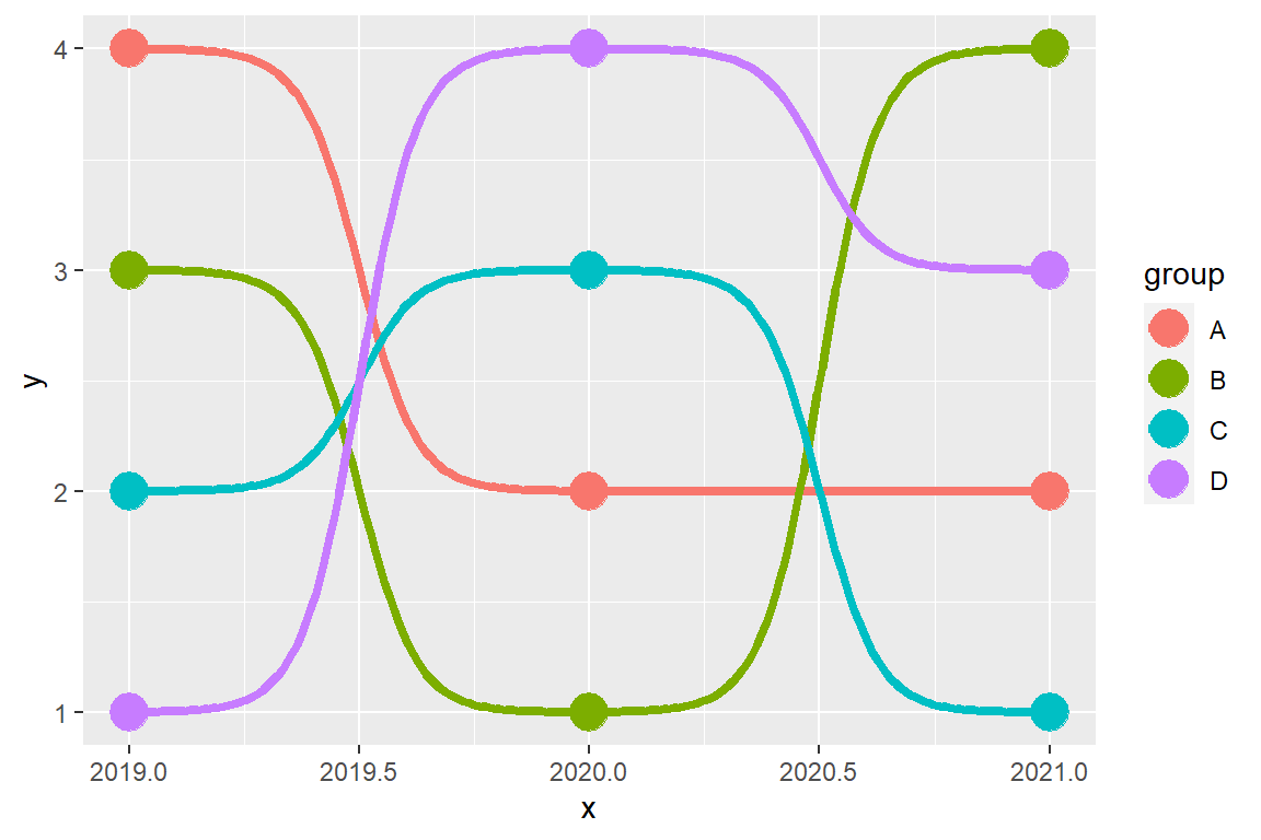
You can add points over the lines with geom_point.
# install.packages("tidyverse")
# install.packages("ggbump")
library(tidyverse)
library(ggbump)

ggplot(df, aes(x = x, y = y, color = group)) +
  geom_bump(size = 1.5) +
  geom_point(size = 6)
The colors of the lines and points can be changed with a predefined color scale, such as scale_color_brewer or setting custom colors with scale_color_manual.
# install.packages("tidyverse")
# install.packages("ggbump")
library(tidyverse)
library(ggbump)
ggplot(df, aes(x = x, y = y, color = group)) +
geom_bump(size = 1.5) +
geom_point(size = 6) +
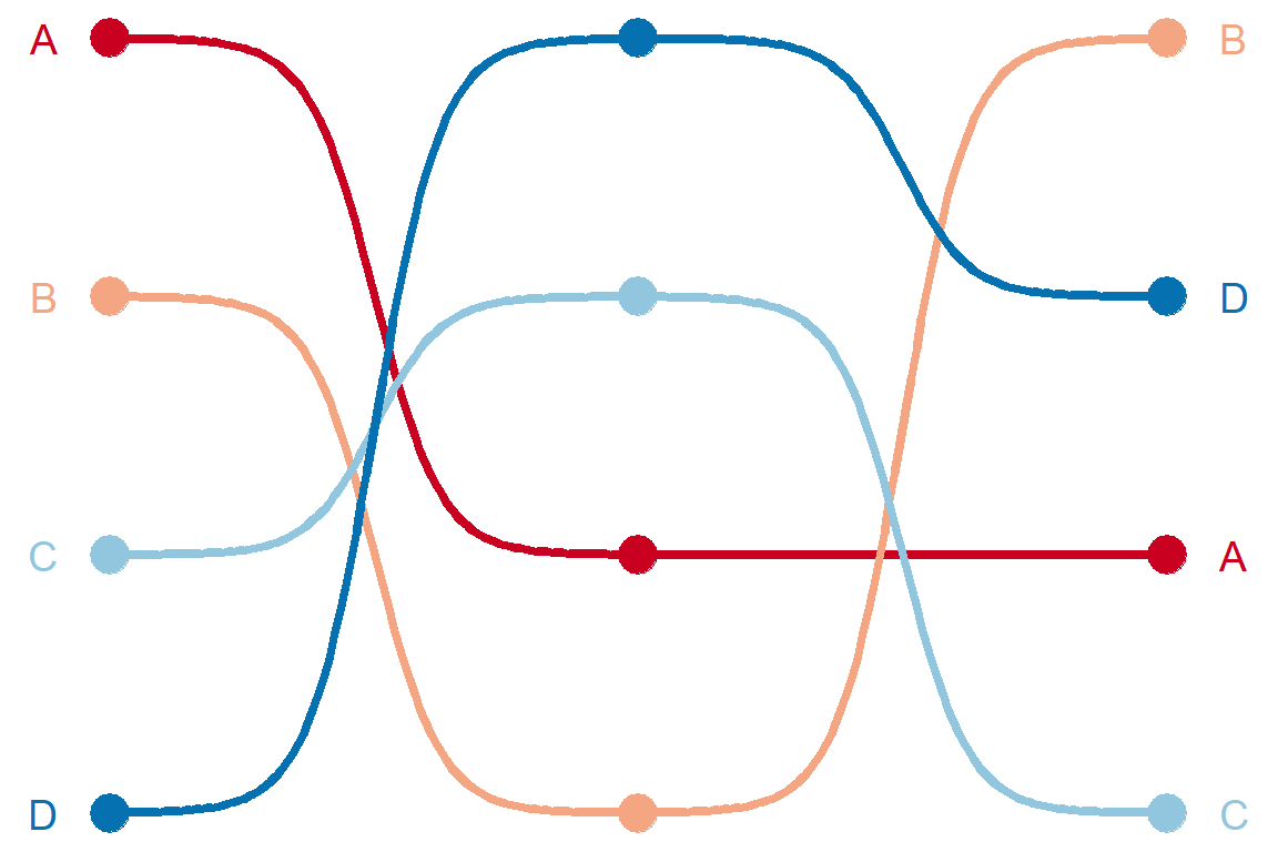
scale_color_brewer(palette = "RdBu")A further customization can be applied. In the following example we are adding the texts on the vertical sides of the plot to display the change in the rankings.
# install.packages("tidyverse")
# install.packages("ggbump")
library(tidyverse)
library(ggbump)

ggplot(df, aes(x = x, y = y, color = group)) +
  geom_bump(size = 1.5) +
  geom_point(size = 6) +
  geom_text(data = df %>% filter(x == min(x)),
            aes(x = x - 0.1, label = group),
            size = 5, hjust = 1) +
  geom_text(data = df %>% filter(x == max(x)),
            aes(x = x + 0.1, label = group),
            size = 5, hjust = 0) +
  scale_color_brewer(palette = "RdBu") +
  theme_void() +
  theme(legend.position = "none")
Master Statistics
Learn statistics from the basics to advanced techniques, clearly explained
Go to site