Sample data set
The ggradar package contains a function of the same name which needs a data frame as input, where the first column is the name of the groups and each column represents a variable. Note that all columns must have the same scale.
set.seed(4)
df <- data.frame(matrix(runif(30), ncol = 10))
df[, 1] <- paste0("G", 1:3)
colnames(df) <- c("Group", paste("Var", 1:9))
Most basic radar chart
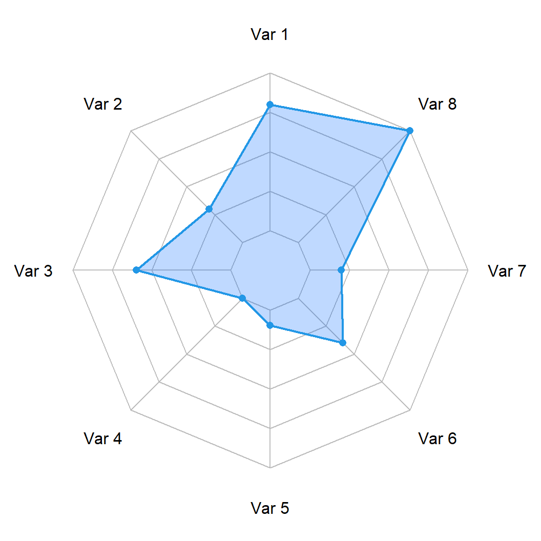
Passing your data frame to the ggradar function will create the following visualization. Note that if the values of your columns are not between 0 and 1 you will need to specify the minimum value with grid.min and the maximum value with grid.max.
Basic radar chart
# install.packages("devtools")
# devtools::install_github("ricardo-bion/ggradar")
library(ggradar)

ggradar(df)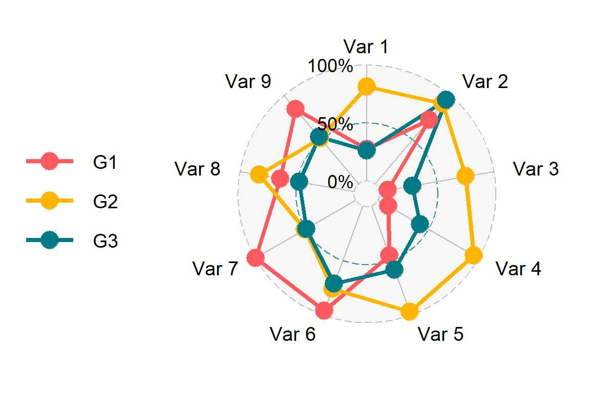
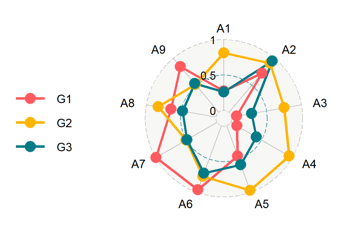
Radar chart labels
The labels of the grid can be customized with values.radar and the labels of each variable with axis.labels.
# install.packages("devtools")
# devtools::install_github("ricardo-bion/ggradar")
library(ggradar)

ggradar(df,
        values.radar = c(0, 0.5, 1),
        axis.labels = paste0("A", 1:9))
Radar chart colors and line types
The function provides several arguments to customize the colors, such as background.circle.colour for the background color, group.colours for the colors of the lines and gridline.X.colour to customize the grid lines color, being X min, max or mid.
# install.packages("devtools")
# devtools::install_github("ricardo-bion/ggradar")
library(ggradar)

# Color for the lines
lcols <- c("#EEA236", "#5CB85C", "#46B8DA")

ggradar(df,
        background.circle.colour = "white",
        axis.line.colour = "gray60",
        gridline.min.colour = "gray60",
        gridline.mid.colour = "gray60",
        gridline.max.colour = "gray60",
        group.colours = lcols)
Similarly, the line types of each grid line can be customized with gridline.X.linetype.
# install.packages("devtools")
# devtools::install_github("ricardo-bion/ggradar")
library(ggradar)

# Color for the lines
lcols <- c("#EEA236", "#5CB85C", "#46B8DA")

ggradar(df,
        background.circle.colour = "white",
        gridline.min.linetype = 1,
        gridline.mid.linetype = 1,
        gridline.max.linetype = 1,
        group.colours = lcols)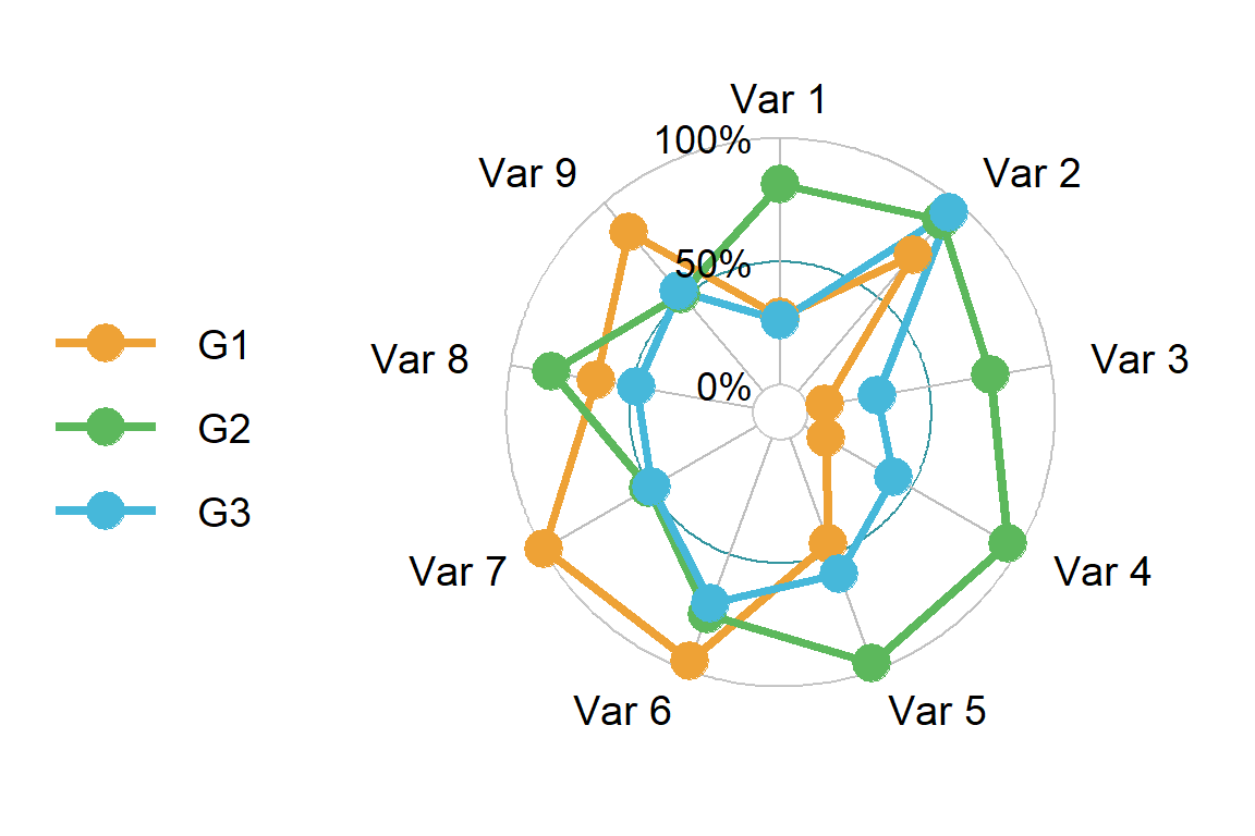
Legend
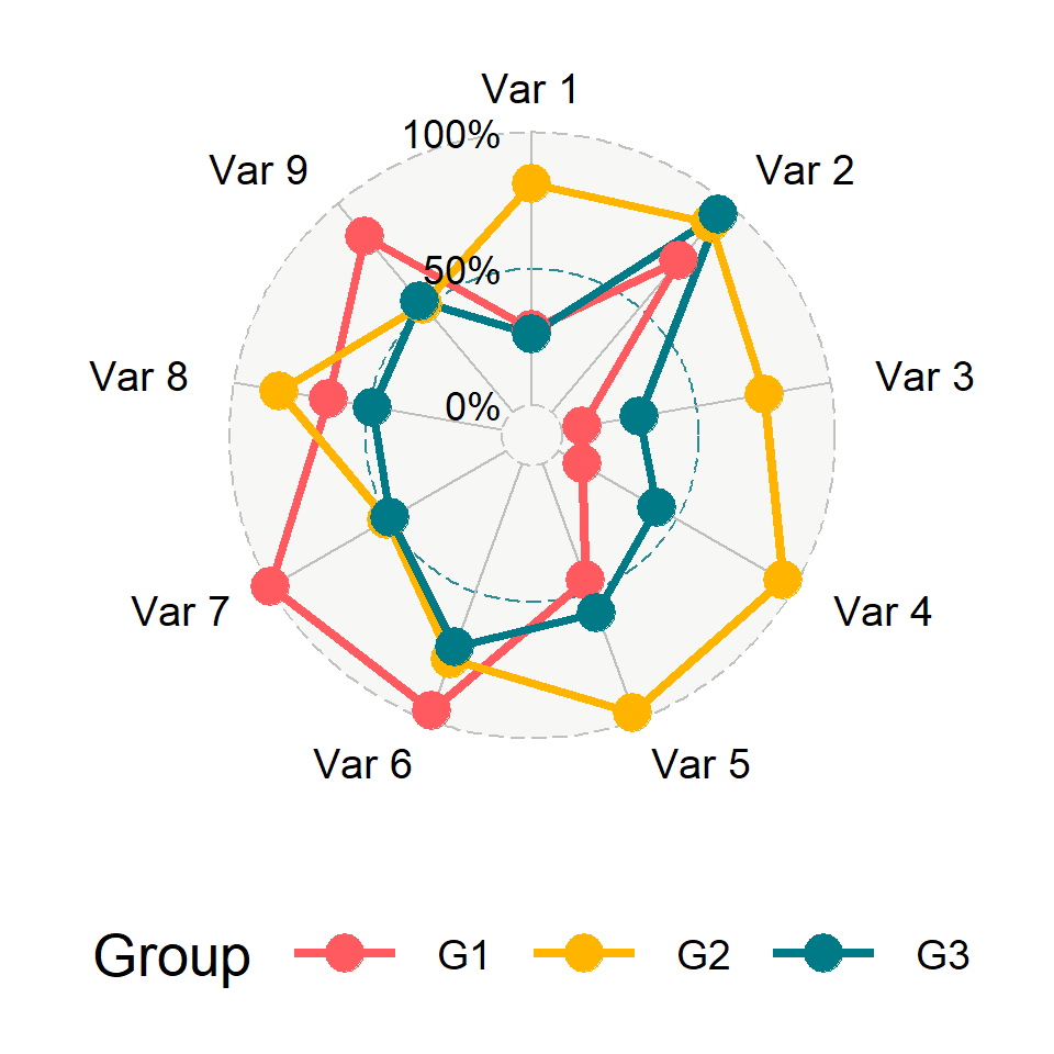
Legend position
It is possible to change the legend position with the legend.position argument and to change the legend title with legend.title.
# install.packages("devtools")
# devtools::install_github("ricardo-bion/ggradar")
library(ggradar)

ggradar(df,
        legend.title = "Group",
        legend.position = "bottom")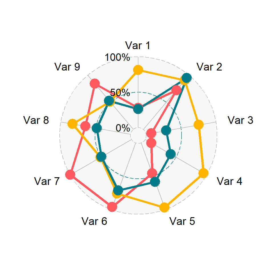
Remove the legend
Finally, if you want to get rid of the legend you can set plot.legend = FALSE or legend.position = "none".
# install.packages("devtools")
# devtools::install_github("ricardo-bion/ggradar")
library(ggradar)

ggradar(df,
        plot.legend = FALSE)
Note that the function provides more arguments to fine tune some details, such as adding custom fonts or changing the text size. Recall to type ?ggradar for further details.

Master Statistics
Learn statistics from the basics to advanced techniques, clearly explained
Go to site