Sample data sets
The radarchart function from fmsb package needs a data frame where the first row represents the maximum values of the data (10) and the second row the minimum values (0). Otherwise, you will need to set maxmin = FALSE. Note that the number of columns must be greater than two.
Each column is a variable and the additional rows represents groups or individuals. In df we have only one group and 8 different variables.
Data set with one group
set.seed(1)
df <- data.frame(rbind(rep(10, 8), rep(0, 8),
                       matrix(sample(0:10, 8),
                              nrow = 1)))
colnames(df) <- paste("Var", 1:8)
If you want to add more groups or individuals append more rows to the data frame. In df2 we have 8 variables of tree different groups.
Data set with several groups
set.seed(1)
df2 <- data.frame(rbind(rep(10, 8), rep(0, 8),
                       matrix(sample(0:10, 24,
                                     replace = TRUE),
                              nrow = 3)))
colnames(df2) <- paste("Var", 1:8)
Basic radar chart
The default radar chart can be created passing the data frame to the radarchart function of the package.
# install.packages("fmsb")
library(fmsb)

radarchart(df)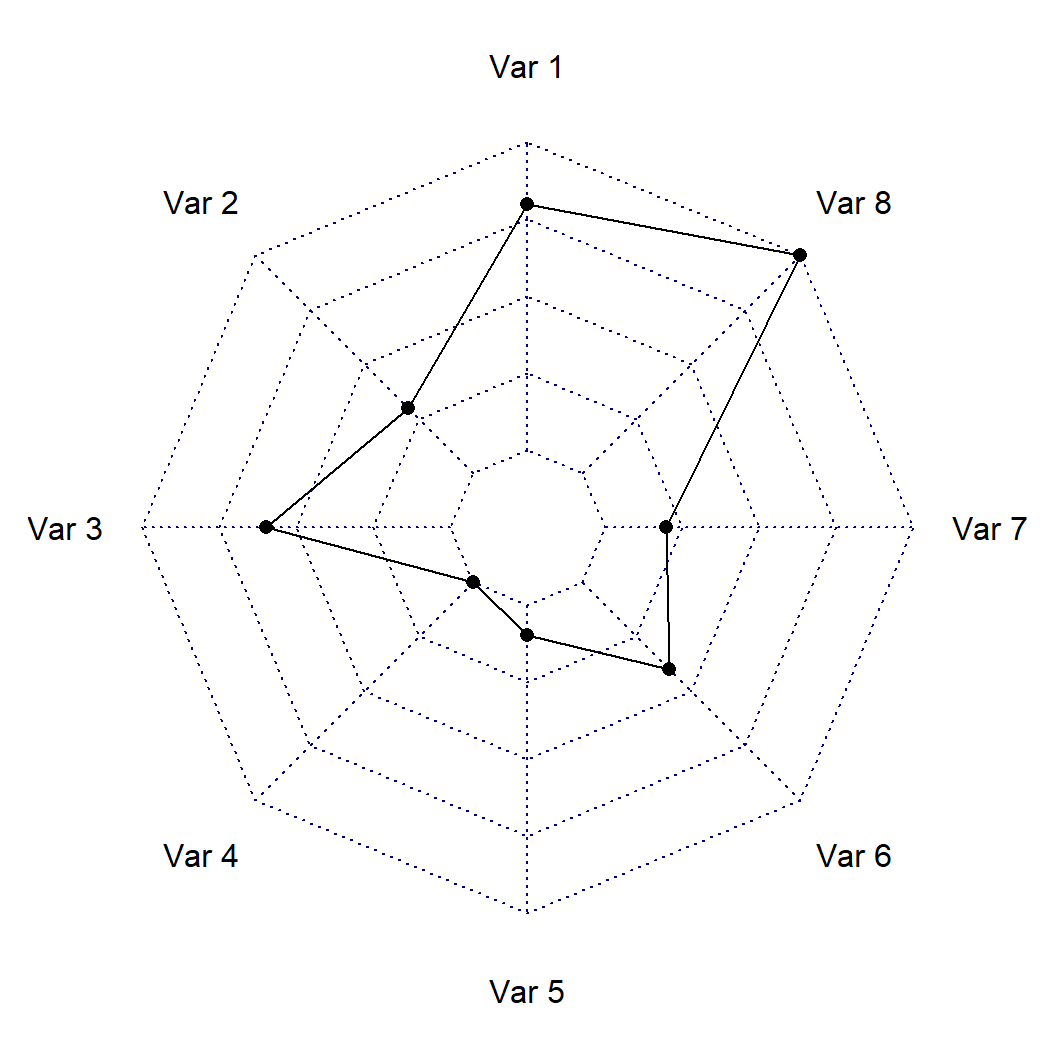
If you don’t like the default styling of the plot you can customize it. The cglty, cglcol and cglwd arguments can be used to change the line type, color and line width of the grid lines and pcol, plwd and plty to change the color, line width and linetype of the line representing the values of the variables.
# install.packages("fmsb")
library(fmsb)

radarchart(df,
           cglty = 1,       # Grid line type
           cglcol = "gray", # Grid line color
           cglwd = 1,       # Line width of the grid
           pcol = 4,        # Color of the line
           plwd = 2,        # Width of the line
           plty = 1)        # Line type of the line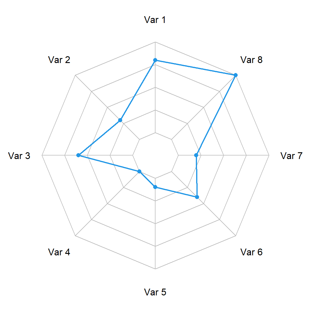
Fill the area
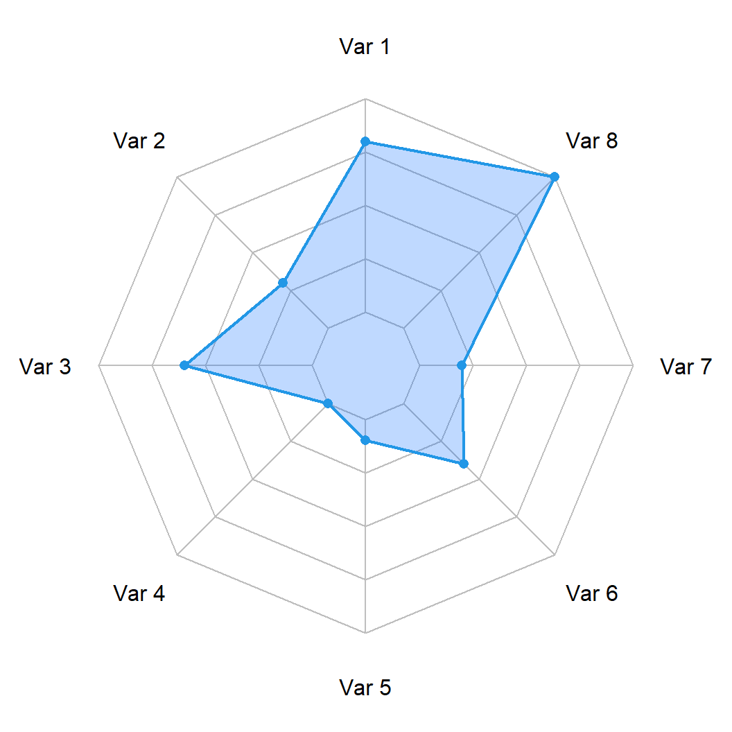
You can also fill the area of the polygon created making use of the pfcol argument. It is recommended to use a color with transparency for a better result.
# install.packages("fmsb")
library(fmsb)

radarchart(df,
           cglty = 1, cglcol = "gray",
           pcol = 4, plwd = 2,
           pfcol = rgb(0, 0.4, 1, 0.25))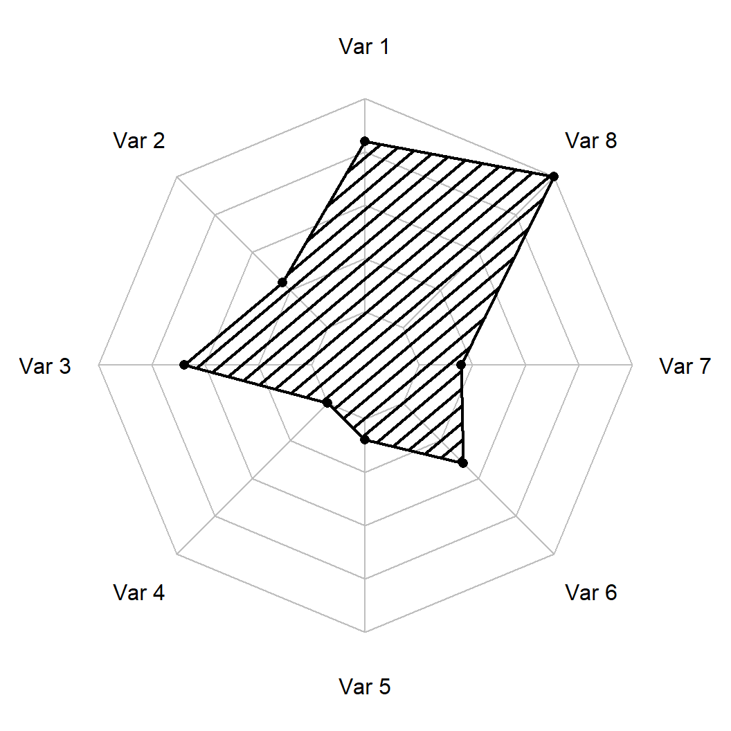
Shading lines
Alternatively, you can add shading lines to the polygon with pdensity and change their angle with pangle argument.
# install.packages("fmsb")
library(fmsb)

radarchart(df,
           cglty = 1, cglcol = "gray",
           pcol = 1, plwd = 2,
           pdensity = 10,
           pangle = 40)
Radar chart of several groups
The process for creating a radar chart for several groups or individuals is the same as in the previous section, you just need to pass the data frame with several variables we created on the first section.
# install.packages("fmsb")
library(fmsb)

radarchart(df2) 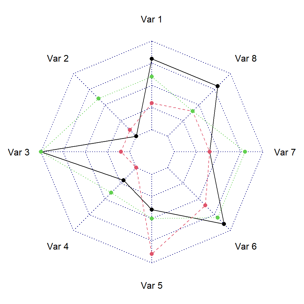
Lines customization
In this scenario you can customize the colors, line styles and line widths for each group.
# install.packages("fmsb")
library(fmsb)

radarchart(df2,
           cglty = 1,       # Grid line type
           cglcol = "gray", # Grid line color
           pcol = 2:4,      # Color for each line
           plwd = 2,        # Width for each line
plty = 1) # Line type for each line 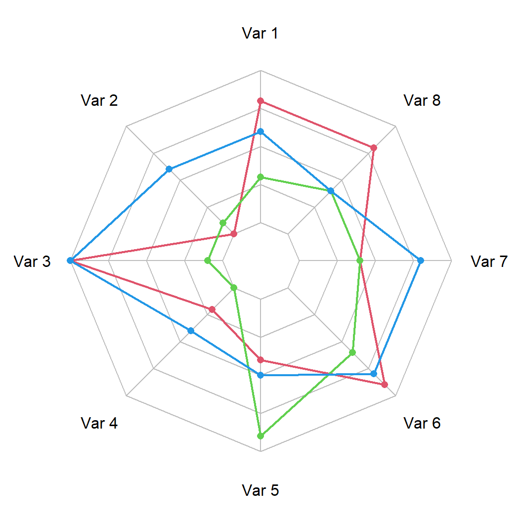
Fill areas
You can also set a fill color for each group.
# install.packages("fmsb")
library(fmsb)

# Fill colors
areas <- c(rgb(1, 0, 0, 0.25),
           rgb(0, 1, 0, 0.25),
           rgb(0, 0, 1, 0.25))

radarchart(df2,
           cglty = 1,       # Grid line type
           cglcol = "gray", # Grid line color
           pcol = 2:4,      # Color for each line
           plwd = 2,        # Width for each line
           plty = 1,        # Line type for each line
pfcol = areas) # Color of the areas 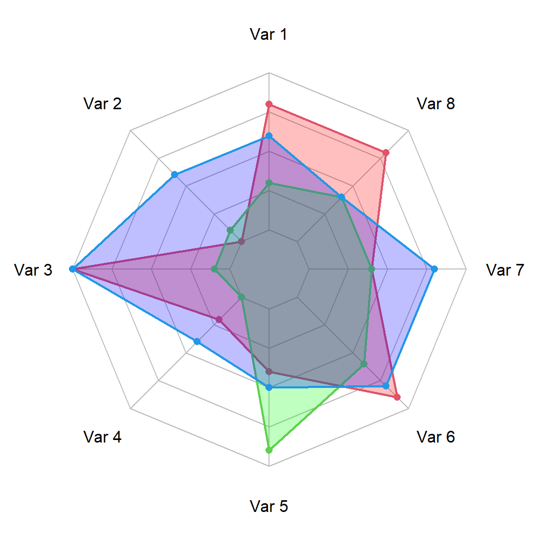
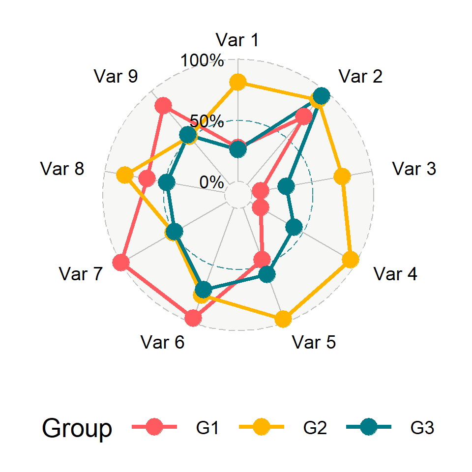
Finally, it is recommended to add a legend when displaying several groups making use of the legend function, as shown in the following example.
# install.packages("fmsb")
library(fmsb)

areas <- c(rgb(1, 0, 0, 0.25),
           rgb(0, 1, 0, 0.25),
           rgb(0, 0, 1, 0.25))

radarchart(df2,
           cglty = 1,       # Grid line type
           cglcol = "gray", # Grid line color
           pcol = 2:4,      # Color for each line
           plwd = 2,        # Width for each line
           plty = 1,        # Line type for each line
           pfcol = areas)   # Color of the areas

legend("topright",
       legend = paste("Group", 1:3),
       bty = "n", pch = 20, col = areas,
       text.col = "grey25", pt.cex = 2)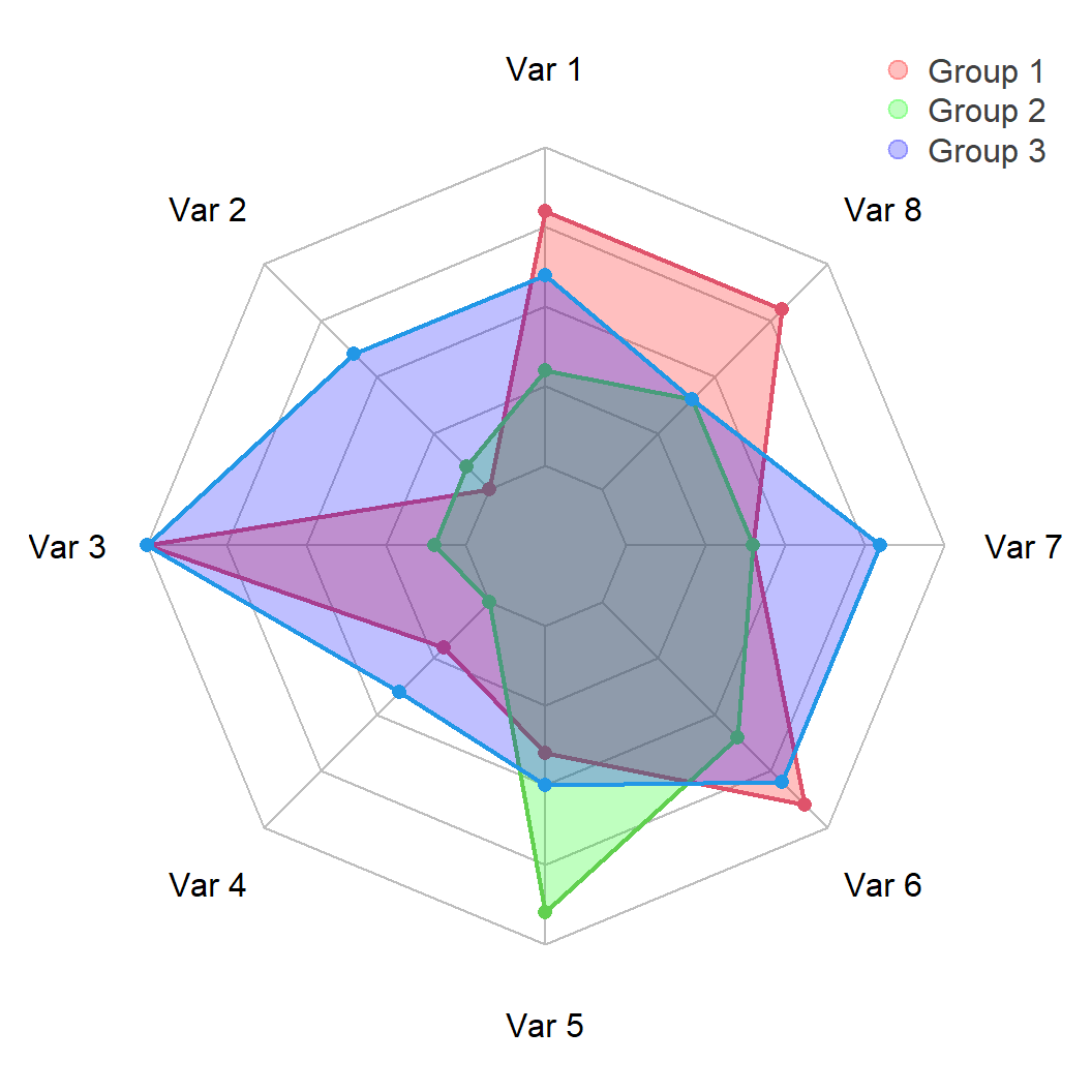

Master Statistics
Learn statistics from the basics to advanced techniques, clearly explained
Go to site