Sample data
Given a numerical matrix you will need to transform it into a data frame that ggplot2 can understand. For that purpose you can use the melt function from reshape package.
# install.packages("reshape")
library(reshape)

# Data
set.seed(8)
m <- matrix(round(rnorm(200), 2), 10, 10)
colnames(m) <- paste("Col", 1:10)
rownames(m) <- paste("Row", 1:10)

# Transform the matrix in long format
df <- melt(m)
colnames(df) <- c("x", "y", "value")
Heat map with geom_tile
A heap map in ggplot2 can be created with geom_tile, passing the categorical variables to x and y arguments and the continuous variable to fill argument of aes.
# install.packages("ggplot2")
library(ggplot2)

ggplot(df, aes(x = x, y = y, fill = value)) +
  geom_tile()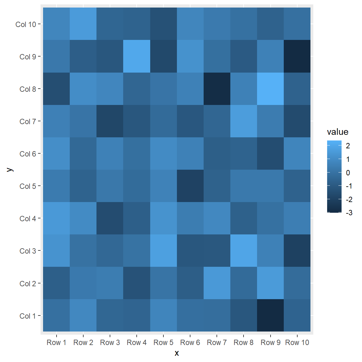
Square tiles
Note that depending on the plotting windows size the tiles might not be squared. If you want to keep them squared use cood_fixed.
# install.packages("ggplot2")
library(ggplot2)

ggplot(df, aes(x = x, y = y, fill = value)) +
  geom_tile() +
  coord_fixed()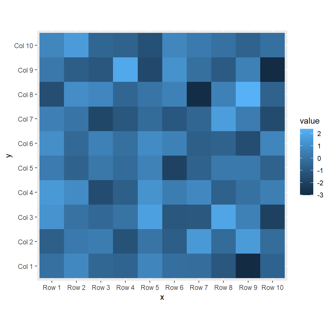
Border customization
You can customize the border color, line width and line style of the tiles with color, lwd and linetype, respectively.
# install.packages("ggplot2")
library(ggplot2)

ggplot(df, aes(x = x, y = y, fill = value)) +
  geom_tile(color = "white",
            lwd = 1.5,
            linetype = 1) +
  coord_fixed()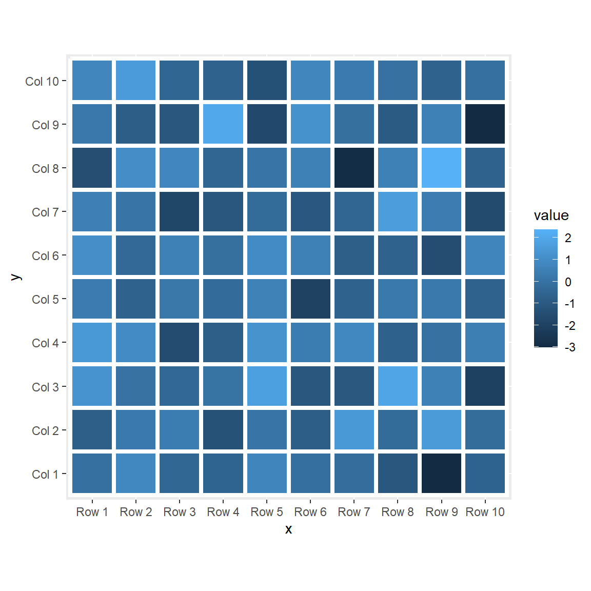
Adding the values
In addition, you can add the values over the tiles with geom_text, passing the numerical variable to the label argument of the aes function.
# install.packages("ggplot2")
library(ggplot2)

ggplot(df, aes(x = x, y = y, fill = value)) +
  geom_tile(color = "black") +
  geom_text(aes(label = value), color = "white", size = 4) +
  coord_fixed()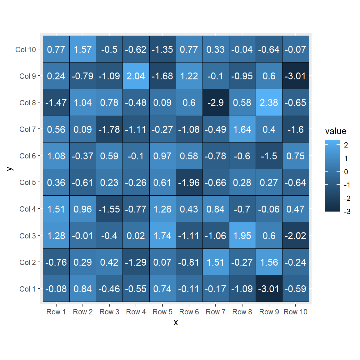
Color palette
There three ways to change the default color palette used when creating the heat map: using scale_fill_gradient, scale_fill_gradient2 or scale_fill_gradientn.
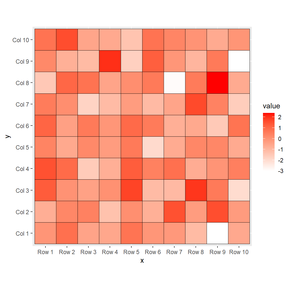
scale_fill_gradient
This function allows changing the colors, setting a lower and a higher color to represent the values of the heat map.
# install.packages("ggplot2")
library(ggplot2)

ggplot(df, aes(x = x, y = y, fill = value)) +
  geom_tile(color = "black") +
  scale_fill_gradient(low = "white", high = "red") +
  coord_fixed()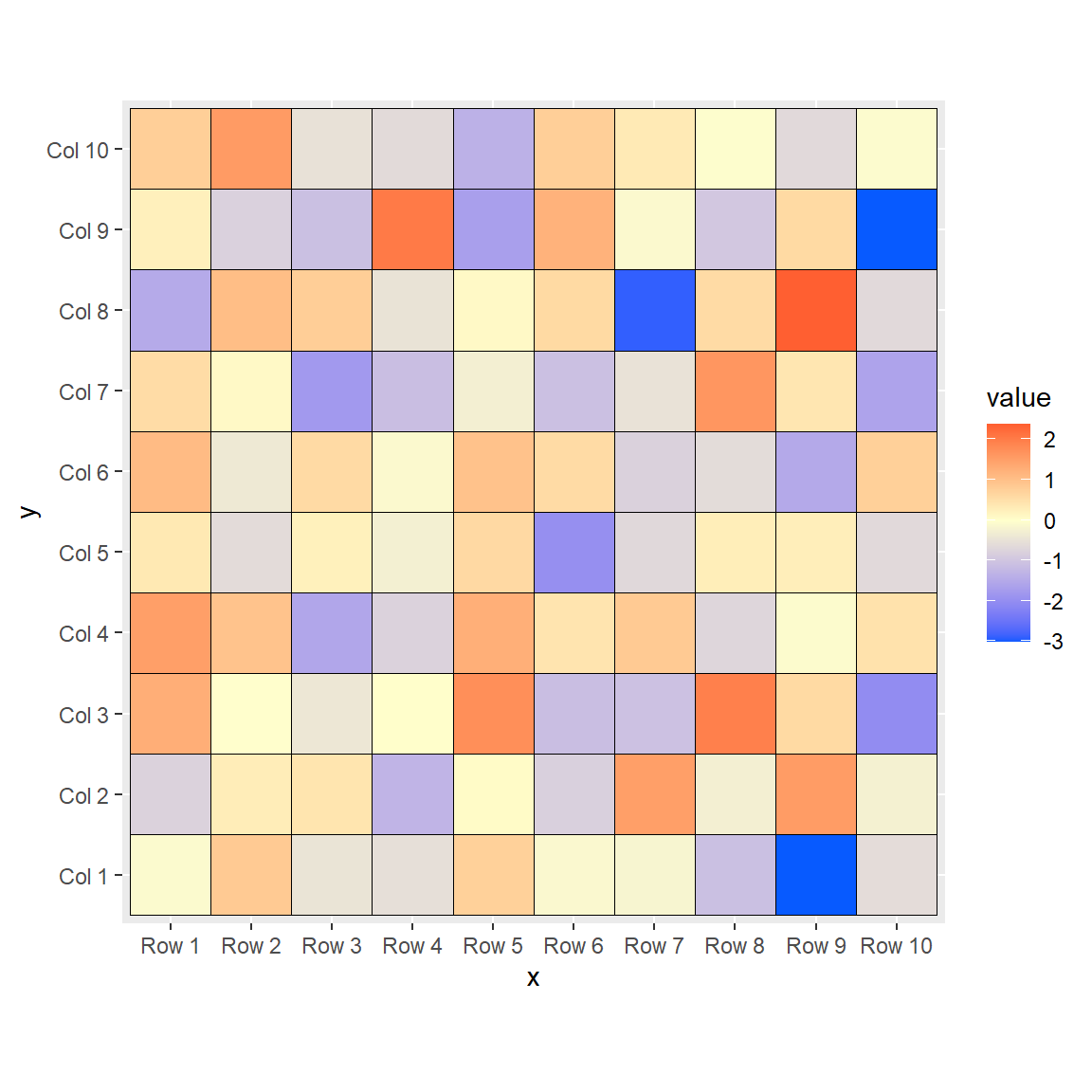
scale_fill_gradient2
If you want to add a mid color you can use scale_fill_gradient2, which includes the mid argument.
# install.packages("ggplot2")
library(ggplot2)

ggplot(df, aes(x = x, y = y, fill = value)) +
  geom_tile(color = "black") +
  scale_fill_gradient2(low = "#075AFF",
                       mid = "#FFFFCC",
                       high = "#FF0000") +
  coord_fixed()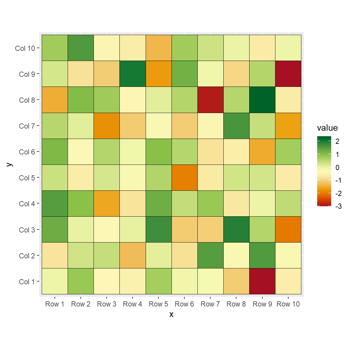
scale_fill_gradientn
Finally, you can also use a custom color palette with scale_fill_gradientn, which allows passing n colors to the colors argument. In this example we are passing 20 colors of the "RdYlGn" palette.
# install.packages("ggplot2")
library(ggplot2)

ggplot(df, aes(x = x, y = y, fill = value)) +
  geom_tile(color = "black") +
  scale_fill_gradientn(colors = hcl.colors(20, "RdYlGn")) +
  coord_fixed()
Legend customization
Width and height
You can change the width and the height of the legend color bar with the following code:
# install.packages("ggplot2")
library(ggplot2)

ggplot(df, aes(x = x, y = y, fill = value)) +
  geom_tile(color = "black") +
  coord_fixed() +
  guides(fill = guide_colourbar(barwidth = 0.5,
                                barheight = 20))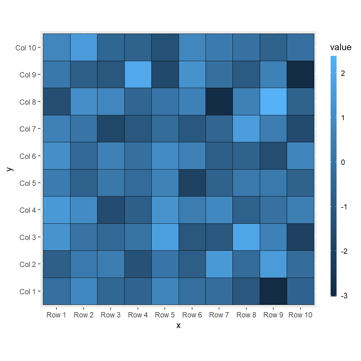
Change the title
The default title of the legend is the name of the continuous variable of the data frame. If you want to change it pass a string to the title argument of the guide_colourbar function.
# install.packages("ggplot2")
library(ggplot2)

ggplot(df, aes(x = x, y = y, fill = value)) +
  geom_tile(color = "black") +
  coord_fixed() +
  guides(fill = guide_colourbar(title = "Title"))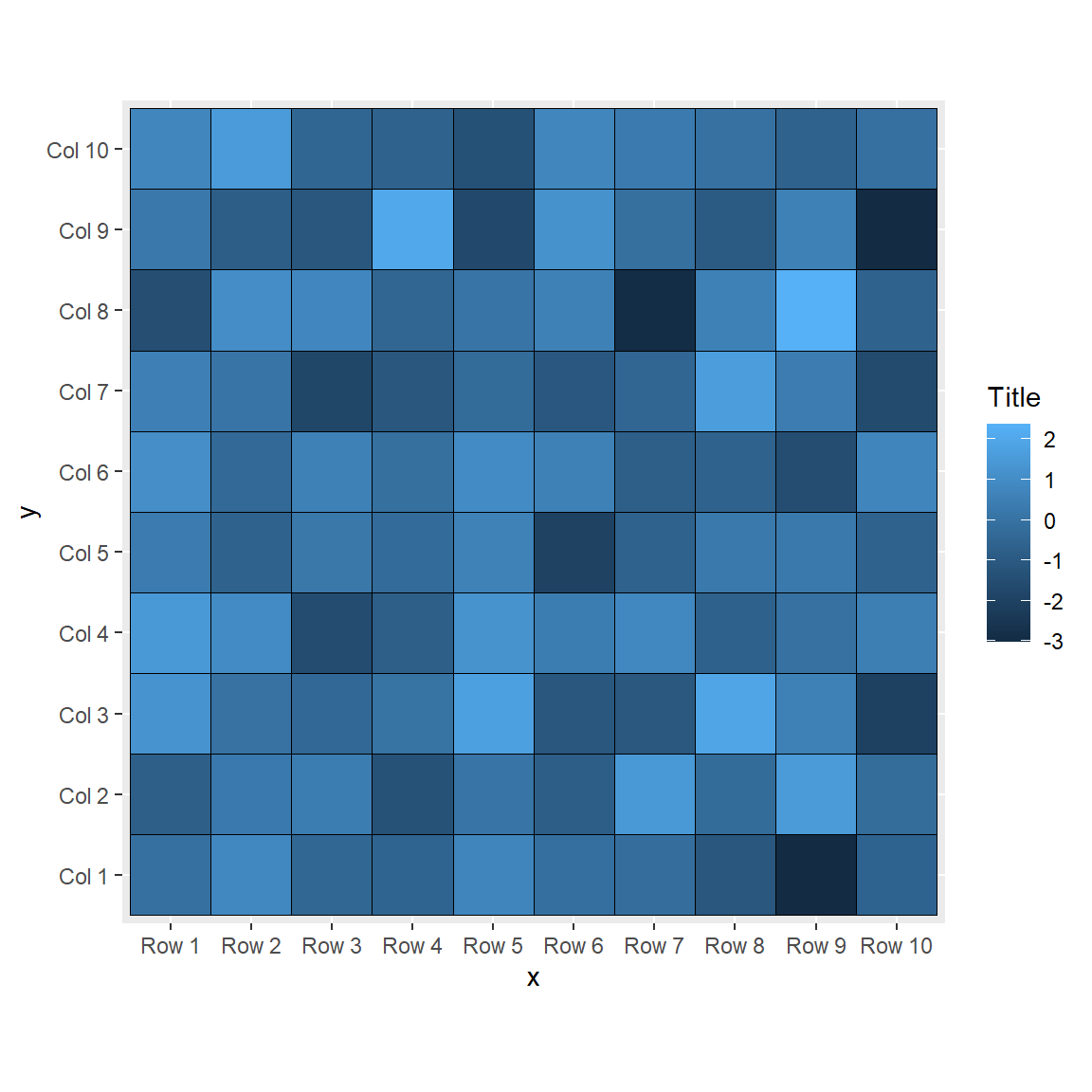
Remove the labels and the ticks
You can also remove the labels and/or the ticks of the legend, setting the corresponding arguments to FALSE.
# install.packages("ggplot2")
library(ggplot2)

ggplot(df, aes(x = x, y = y, fill = value)) +
  geom_tile(color = "black") +
  coord_fixed() +
  guides(fill = guide_colourbar(label = FALSE,
                                ticks = FALSE))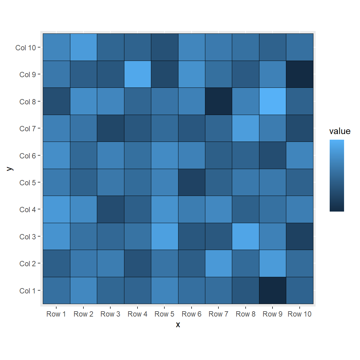
Remove the legend
Finally, it you want to get rid of the legend you can set its position to "none".
# install.packages("ggplot2")
library(ggplot2)

ggplot(df, aes(x = x, y = y, fill = value)) +
  geom_tile(color = "black") +
  coord_fixed() +
  theme(legend.position = "none")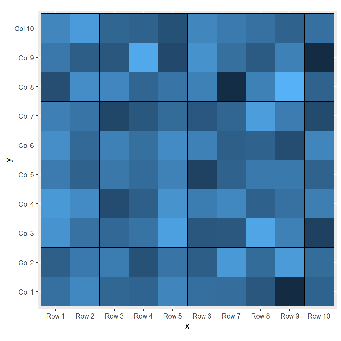

Master Statistics
Learn statistics from the basics to advanced techniques, clearly explained
Go to site