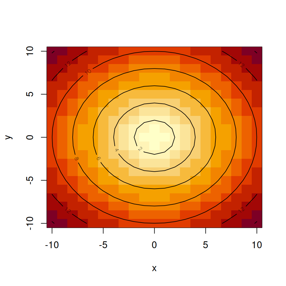
The geom_density_2d function
A 2D density contour plot can be created in ggplot2 with geom_density_2d. You just need to pass your data frame and indicate the x and y variable inside aes.
# install.packages("ggplot2")
library(ggplot2)

# Data
set.seed(1)
df <- data.frame(x = rnorm(200), y = rnorm(200))

ggplot(df, aes(x = x, y = y)) +
  geom_density_2d()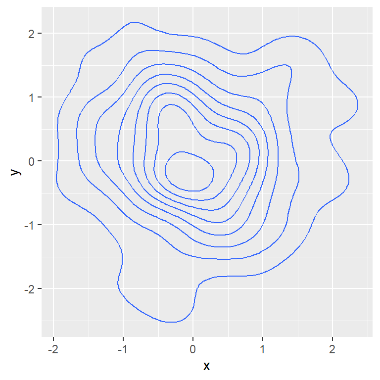
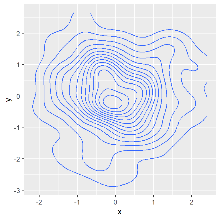
Number of levels
It is possible to increase or decrease the number of levels with bins.
# install.packages("ggplot2")
library(ggplot2)

# Data
set.seed(1)
df <- data.frame(x = rnorm(200), y = rnorm(200))

ggplot(df, aes(x = x, y = y)) +
  geom_density_2d(bins = 15)
Type ?geom_contour for additional details.
Scatter plot with contour lines
Note that you can add the points with geom_point and then geom_density_2d to create a scatter plot with their corresponding contour lines.
# install.packages("ggplot2")
library(ggplot2)

# Data
set.seed(1)
df <- data.frame(x = rnorm(200), y = rnorm(200))

ggplot(df, aes(x = x, y = y)) +
  geom_point() +
  geom_density_2d()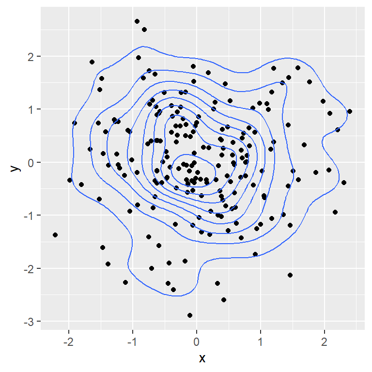
Color
You can customize the lines in several ways, changing the color, line type of size of the lines, as in other plots.
# install.packages("ggplot2")
library(ggplot2)

# Data
set.seed(1)
df <- data.frame(x = rnorm(200), y = rnorm(200))

ggplot(df, aes(x = x, y = y)) +
  geom_density_2d(color = "red")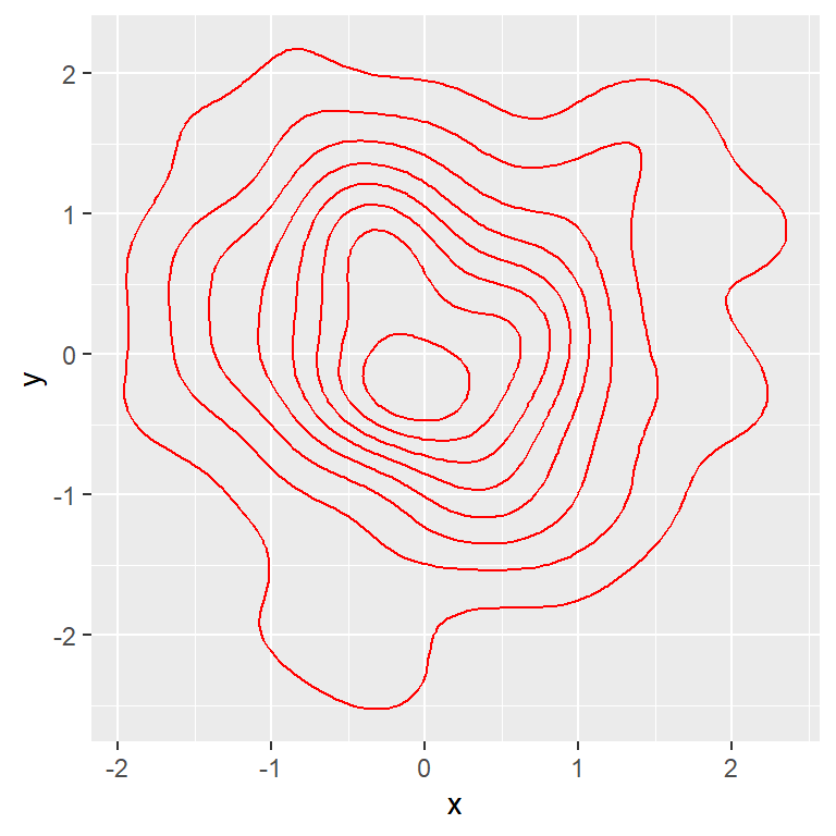
Color based on the level
Passing ..level.. to the color argument of the aes will colorize each contour line based on the level. This will highlight the areas with higher density.
# install.packages("ggplot2")
library(ggplot2)

# Data
set.seed(1)
df <- data.frame(x = rnorm(200), y = rnorm(200))

ggplot(df, aes(x = x, y = y)) +
  geom_density_2d(aes(color = ..level..))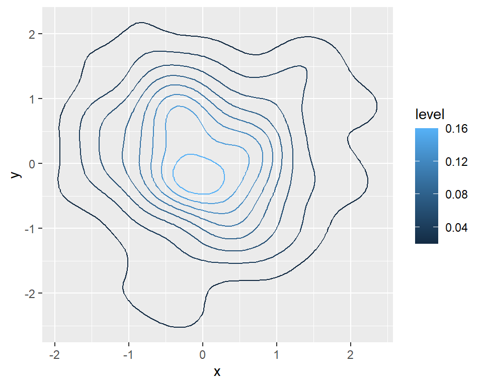
Change the color palette
If the lines are colored based on the level you can change the color palette with a continuous color palette. For instance, you can pass the scale_color_viridis_c to use the viridis palette.
# install.packages("ggplot2")
library(ggplot2)

# Data
set.seed(1)
df <- data.frame(x = rnorm(200), y = rnorm(200))

ggplot(df, aes(x = x, y = y)) +
  geom_density_2d(aes(color = ..level..)) +
  scale_color_viridis_c()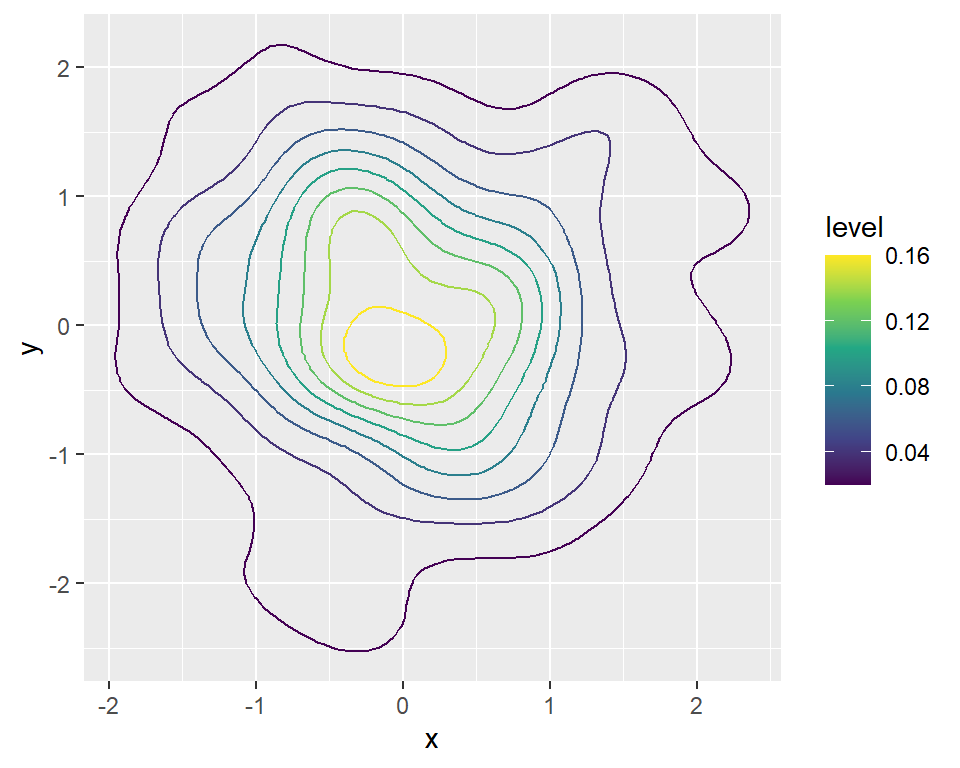
Fill the contour with stat_density_2d
Note that there is a similar function named stat_density_2d that allows changing the geom used. If you set geom = "polygon" you can fill the contour as follows. Alternatively you can use geom_density_2d_filled.
# install.packages("ggplot2")
library(ggplot2)

# Data
set.seed(1)
df <- data.frame(x = rnorm(200), y = rnorm(200))

ggplot(df, aes(x = x, y = y, fill = ..level..)) +
  stat_density_2d(geom = "polygon")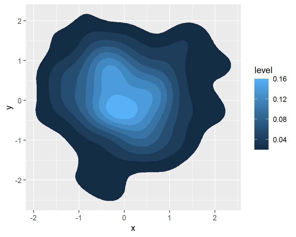
The geom_density_2d_filled function

If you want to fill the areas of the contour based on the level you can use the geom_density_2d_filled function.
# install.packages("ggplot2")
library(ggplot2)

# Data
set.seed(1)
df <- data.frame(x = rnorm(200), y = rnorm(200))

ggplot(df, aes(x = x, y = y)) +
  geom_density_2d_filled()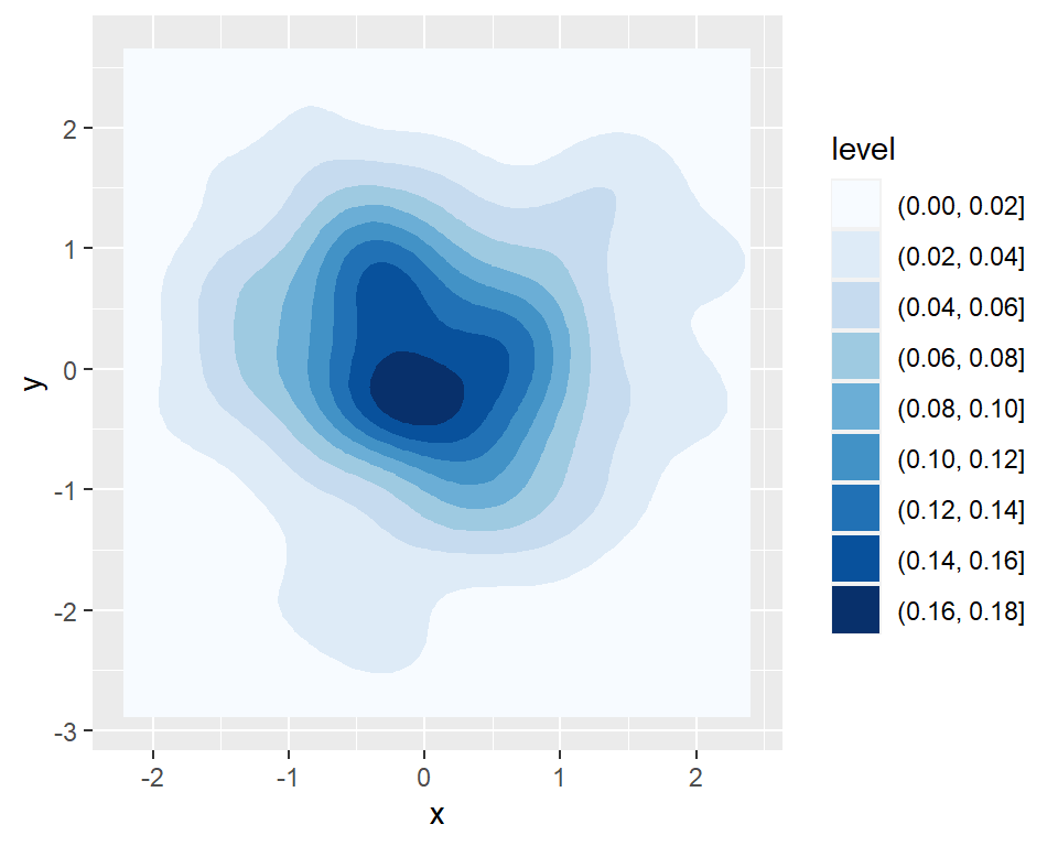
Color palette
You can change the color palette with a fill scale, such as the scale_fill_brewer or scale_fill_manual for custom colors.
# install.packages("ggplot2")
library(ggplot2)

# Data
set.seed(1)
df <- data.frame(x = rnorm(200), y = rnorm(200))

ggplot(df, aes(x = x, y = y)) +
  geom_density_2d_filled() +
  scale_fill_brewer()
Transparency
The alpha argument controls the transparency of the filled areas.
# install.packages("ggplot2")
library(ggplot2)

# Data
set.seed(1)
df <- data.frame(x = rnorm(200), y = rnorm(200))

ggplot(df, aes(x = x, y = y)) +
  geom_density_2d_filled(alpha = 0.75)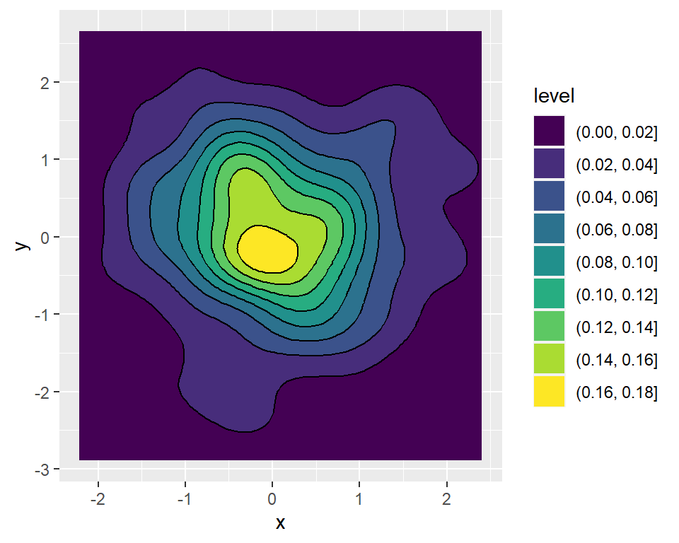
Filled contour with lines
Note that you can also add the contour lines over the filled contour.
# install.packages("ggplot2")
library(ggplot2)

# Data
set.seed(1)
df <- data.frame(x = rnorm(200), y = rnorm(200))

ggplot(df, aes(x = x, y = y)) +
  geom_density_2d_filled() +
  geom_density_2d(colour = "black")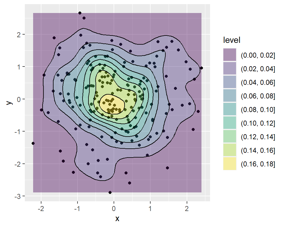
Points and filled contour
It is worth to mention that you can add a filled contour over a scatter plot, setting a low transparency.
# install.packages("ggplot2")
library(ggplot2)

# Data
set.seed(1)
df <- data.frame(x = rnorm(200), y = rnorm(200))

ggplot(df, aes(x = x, y = y)) +
  geom_point() +
  geom_density_2d_filled(alpha = 0.4) +
  geom_density_2d(colour = "black")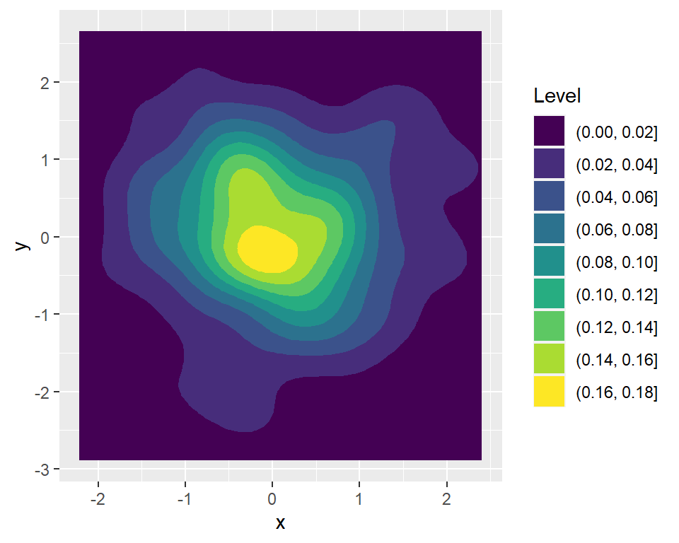
Title of the legend
The legend of the contour plots can be customized. In the following example we are changing the title of the legend.
# install.packages("ggplot2")
library(ggplot2)

# Data
set.seed(1)
df <- data.frame(x = rnorm(200), y = rnorm(200))

ggplot(df, aes(x = x, y = y)) +
  geom_density_2d_filled() +
  guides(fill = guide_legend(title = "Level"))
Master Statistics
Learn statistics from the basics to advanced techniques, clearly explained
Go to site