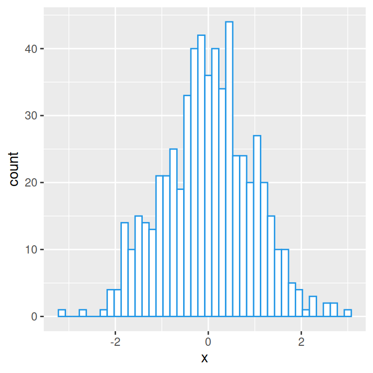
Histogram with kernel density estimation
In order to overlay a kernel density estimate over a histogram in ggplot2 you will need to pass aes(y = ..density..) to geom_histogram and add geom_density as in the example below.
# install.packages("ggplot2")
library(ggplot2)

# Data
set.seed(5)
x <- rnorm(1000)
df <- data.frame(x)

# Histogram with kernel density
ggplot(df, aes(x = x)) +
  geom_histogram(aes(y = ..density..),
                 colour = 1, fill = "white") +
  geom_density()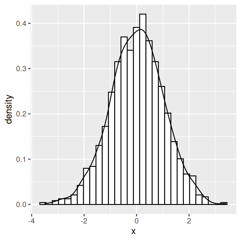
Curve customization
The color, line width and line type of the kernel density curve can be customized making use of colour, lwd and linetype arguments.
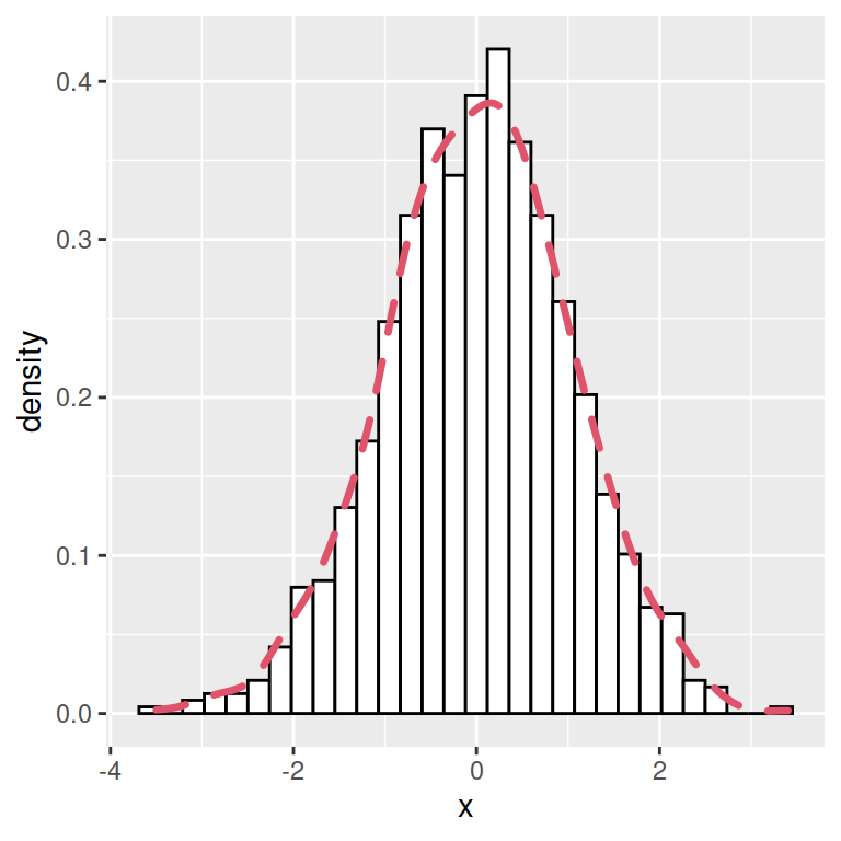
# install.packages("ggplot2")
library(ggplot2)

# Data
set.seed(5)
x <- rnorm(1000)
df <- data.frame(x)

# Histogram with kernel density
ggplot(df, aes(x = x)) +
  geom_histogram(aes(y = ..density..),
                 colour = 1, fill = "white") +
  geom_density(lwd = 1.2,
               linetype = 2,
               colour = 2)
Density curve with shaded area
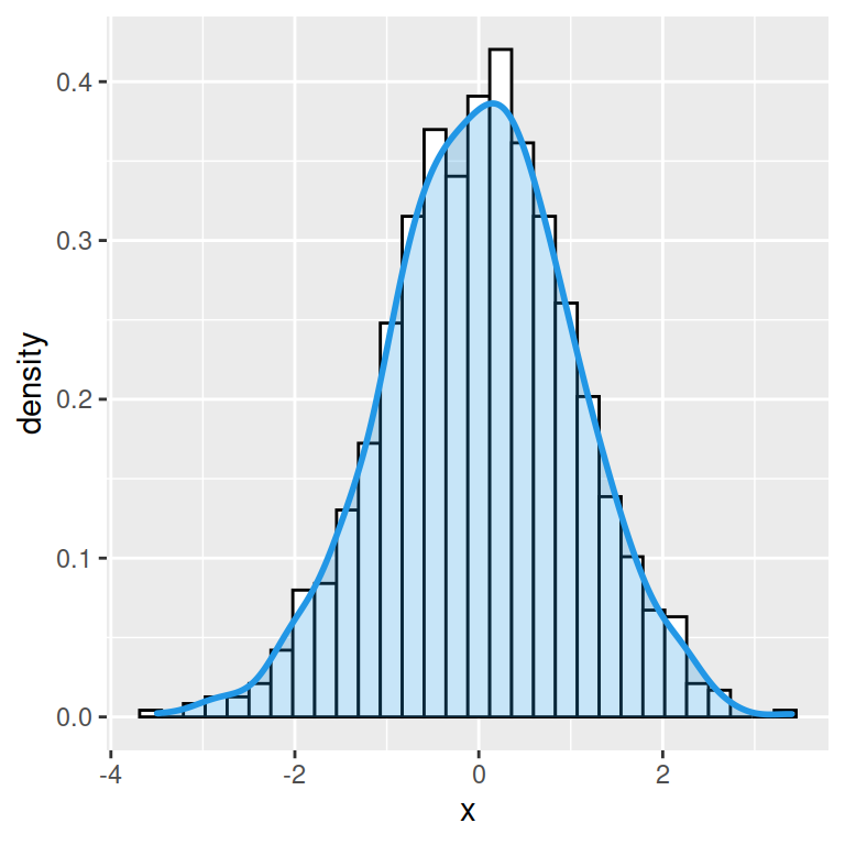
You can also shade the area behind the curve, specifying a fill color with the fill argument of the geom_density function. It is recommended to set a level of transparency (between 0 and 1) with alpha argument, so the histogram will keep visible.
# install.packages("ggplot2")
library(ggplot2)

# Data
set.seed(5)
x <- rnorm(1000)
df <- data.frame(x)

# Histogram with kernel density
ggplot(df, aes(x = x)) +
  geom_histogram(aes(y = ..density..),
                 colour = 1, fill = "white") +
  geom_density(lwd = 1, colour = 4,
               fill = 4, alpha = 0.25)