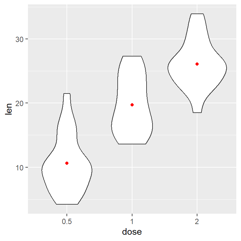
Sample data
The following data set contains the effect of vitamin C on Tooth Growth. The dose column has been converted into a factor to be used as the categorical variable.
# Sample data set
df <- ToothGrowth
df$dose <- as.factor(df$dose)
Adding jittered points
Option 1
The points can be added over a violin plot with geom_point. However, it is recommended to add some jitter with position_jitter, where seed is the pseurodandom number generator seed (optional) and width is the jittering width.
# install.packages("ggplot2")
library(ggplot2)

ggplot(df, aes(x = dose, y = len, fill = dose)) +
  geom_violin(alpha = 0.5) +
  geom_point(position = position_jitter(seed = 1, width = 0.2)) +
  theme(legend.position = "none")
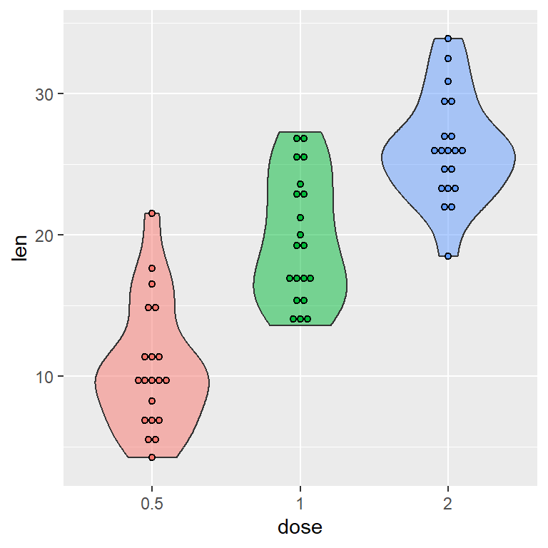
Option 2
You can get the same result using geom_jitter function.
# install.packages("ggplot2")
library(ggplot2)

ggplot(df, aes(x = dose, y = len, fill = dose)) +
  geom_violin(alpha = 0.5) +
  geom_jitter(position = position_jitter(seed = 1, width = 0.2)) +
  theme(legend.position = "none")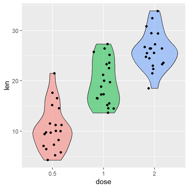
Adding a dot plot
If you want to create a violin plot with dots in ggplot2 you can use geom_dotplot, setting binaxis = "y" and stackdir = "center". Note that dotsize controls the size of the points.
# install.packages("ggplot2")
library(ggplot2)

ggplot(df, aes(x = dose, y = len, fill = dose)) +
  geom_violin(alpha = 0.5) +
  geom_dotplot(binaxis = "y",
               stackdir = "center",
               dotsize = 0.5) +
  theme(legend.position = "none")
The default dots are of the same color of the groups. To override this you can specify a fill color inside geom_dotplot.
# install.packages("ggplot2")
library(ggplot2)

ggplot(df, aes(x = dose, y = len, fill = dose)) +
  geom_violin(alpha = 0.5) +
  geom_dotplot(binaxis= "y",
               stackdir = "center",
               dotsize = 0.5,
               fill = 1) +
  theme(legend.position = "none")
Adding a beeswarm
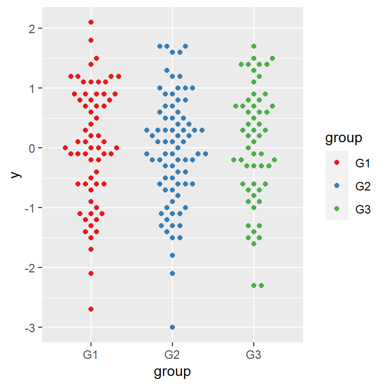
An alternative for adding data points over a violin plot in ggplot is using the geom_beeswarm function from ggbeeswarm library.
# install.packages("ggplot2")
# install.packages("ggbeeswarm")
library(ggplot2)
library(ggbeeswarm)

ggplot(df, aes(x = dose, y = len, fill = dose)) +
  geom_violin(alpha = 0.5) +
  geom_beeswarm() +
  theme(legend.position = "none")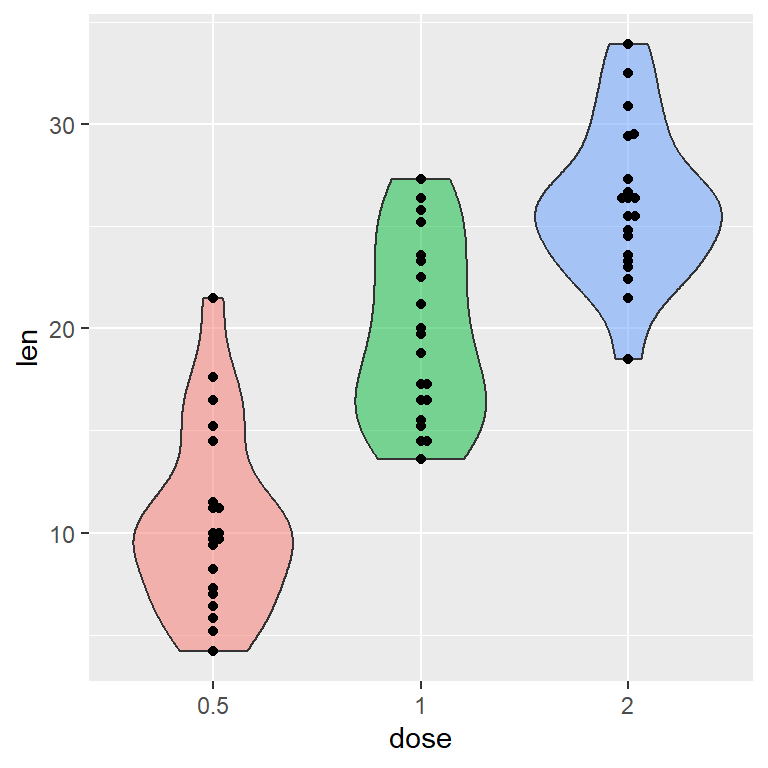
The ggbeeswarm package also contains a function named geom_quasirandom, which can be used to add the points inside the violins, as you can see in the example below.
# install.packages("ggplot2")
# install.packages("ggbeeswarm")
library(ggplot2)
library(ggbeeswarm)

ggplot(df, aes(x = dose, y = len, fill = dose)) +
  geom_violin(alpha = 0.5) +
  geom_quasirandom() +
  theme(legend.position = "none")

Master Statistics
Learn statistics from the basics to advanced techniques, clearly explained
Go to site