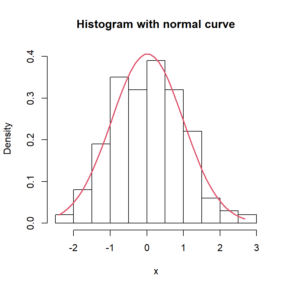
Sample data
A QQ plot (quantile-quantile plot) compares the quantiles of your data against the theoretical quantiles of a distribution — usually normal. Points that fall along the diagonal line indicate the data follows that distribution.
set.seed(1)
df <- data.frame(x = rnorm(200))
Base R: qqnorm() + qqline()
The quickest approach is base R. qqnorm() draws the points and qqline() adds the reference line.
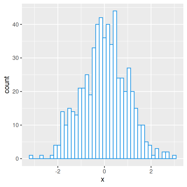
set.seed(1)
x <- rnorm(200)

qqnorm(x)
qqline(x, col = "red")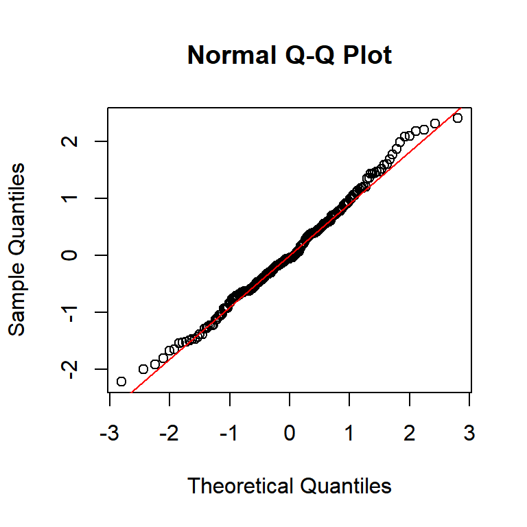
geom_qq() + geom_qq_line()
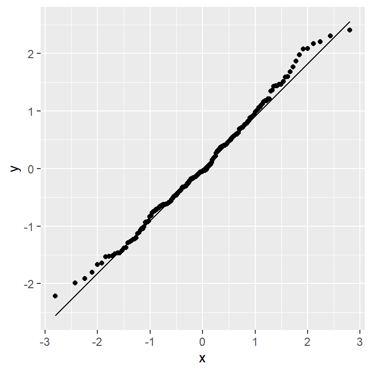
In ggplot2, use aes(sample = ...) — not x or y. geom_qq() plots the points and geom_qq_line() adds the diagonal reference line.
# install.packages("ggplot2")
library(ggplot2)

ggplot(df, aes(sample = x)) +
  geom_qq() +
  geom_qq_line()
Color and line style
Customize the points with color and size in geom_qq(), and the reference line with color and linewidth in geom_qq_line().
# install.packages("ggplot2")
library(ggplot2)

ggplot(df, aes(sample = x)) +
  geom_qq(color = "steelblue", size = 1.5) +
  geom_qq_line(color = "red", linewidth = 0.8)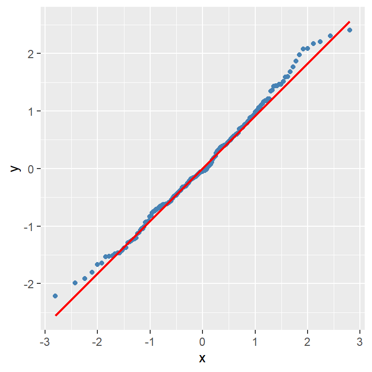
Multiple groups
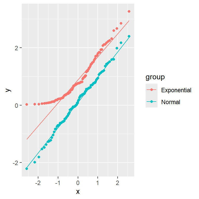
Add color = group inside aes() to draw one QQ plot per group. Here normal data hugs the line while exponential data curves away.
# install.packages("ggplot2")
library(ggplot2)

ggplot(df_groups, aes(sample = x, color = group)) +
  geom_qq() +
  geom_qq_line()
Facets
Use facet_wrap() to give each group its own panel. This makes it easier to judge normality per group independently.
# install.packages("ggplot2")
library(ggplot2)

ggplot(df_groups, aes(sample = x)) +
  geom_qq() +
  geom_qq_line(color = "red") +
  facet_wrap(~group)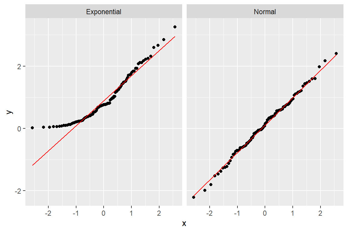
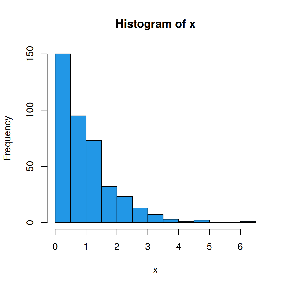
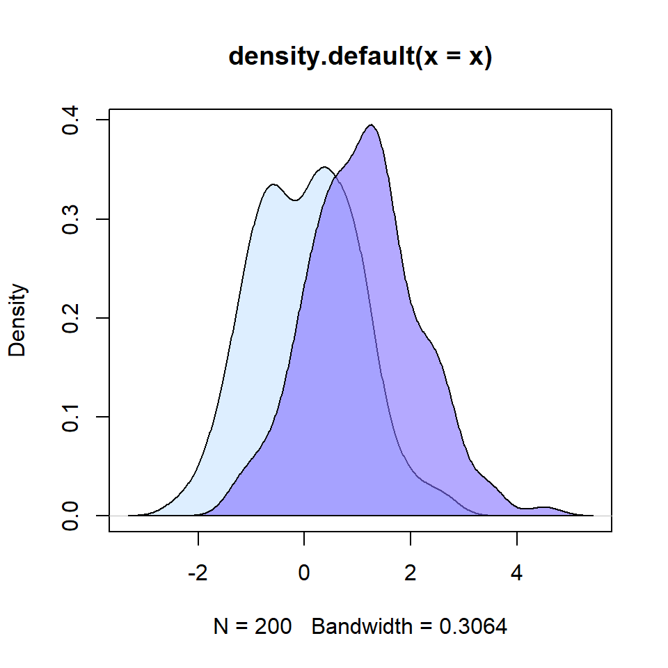
Non-normal data
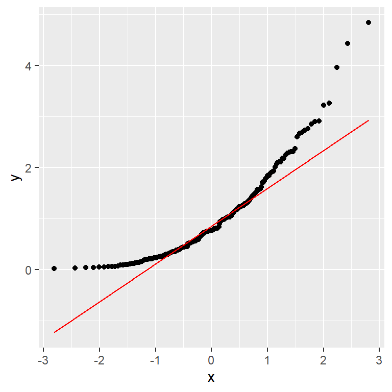
When data is not normal the points curve away from the reference line. Right-skewed data (like exponential) curves upward in the upper tail.
# install.packages("ggplot2")
library(ggplot2)

set.seed(1)
df_exp <- data.frame(x = rexp(200))

ggplot(df_exp, aes(sample = x)) +
  geom_qq() +
  geom_qq_line(color = "red")
Master Statistics
Learn statistics from the basics to advanced techniques, clearly explained
Go to site