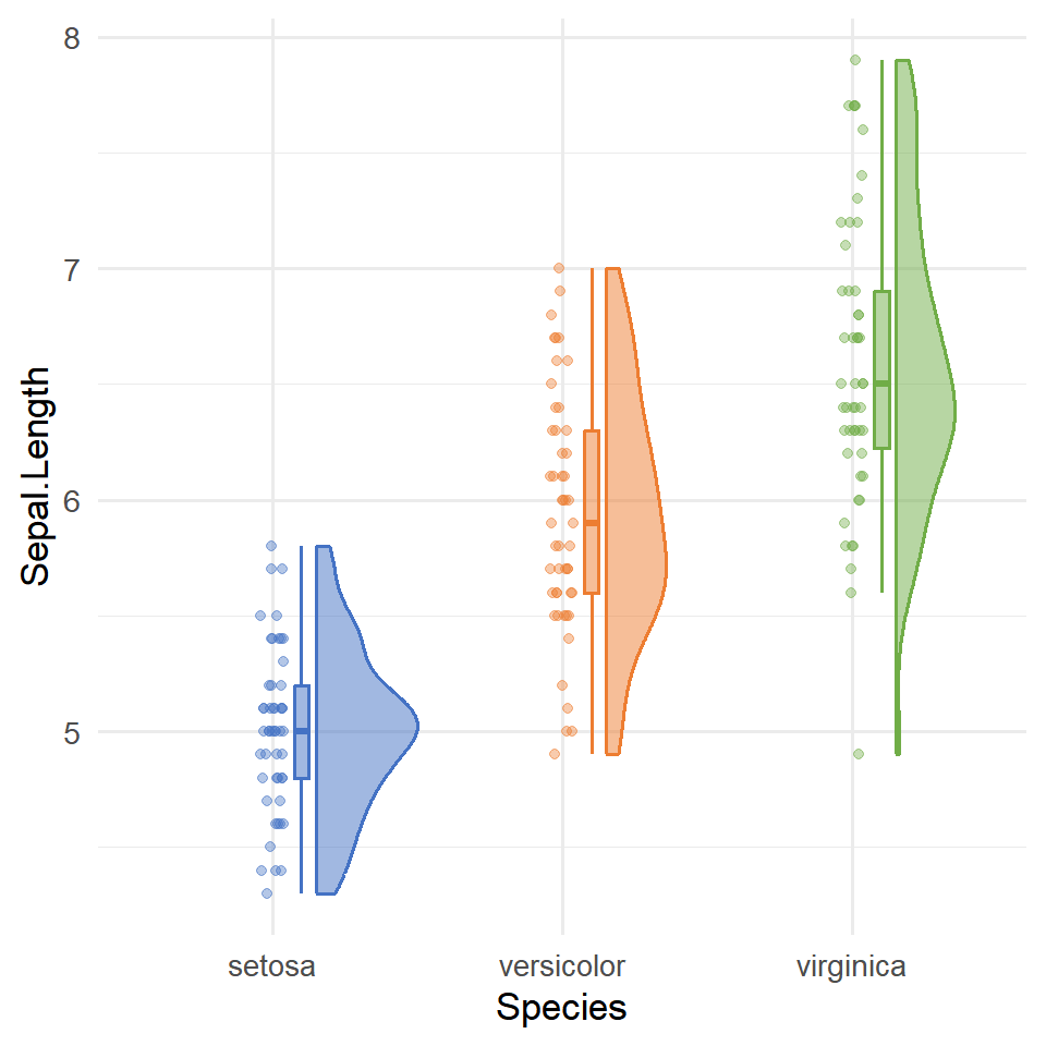
Sample data
geom_errorbar requires a summary data frame with a central value and lower/upper bounds. Here we compute the mean and standard deviation of Sepal.Length per species from the built-in iris dataset.
# install.packages("dplyr")
library(dplyr)

df <- iris |>
  group_by(Species) |>
  summarise(
    mean_sl = mean(Sepal.Length),
    sd_sl   = sd(Sepal.Length)
  )
geom_errorbar()
Map ymin and ymax inside aes() to define the lower and upper bounds of each bar. Here we use mean ± 1 SD.
# install.packages("ggplot2")
library(ggplot2)

ggplot(df, aes(x = Species, y = mean_sl)) +
  geom_errorbar(aes(ymin = mean_sl - sd_sl,
                    ymax = mean_sl + sd_sl))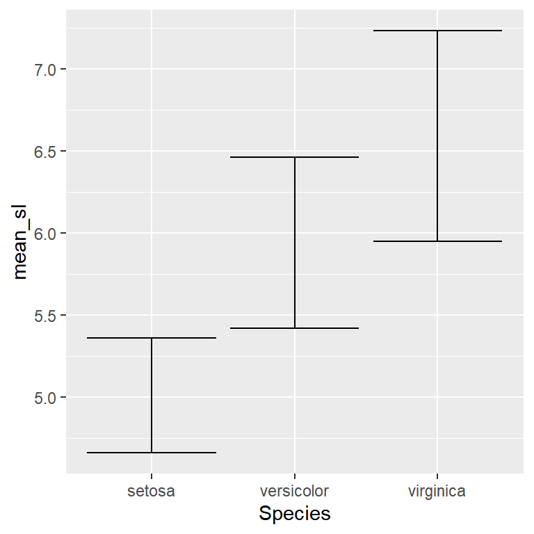
width
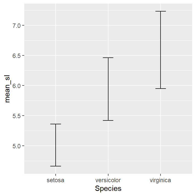
width controls the size of the horizontal caps. The default is relatively wide — 0.2 is a common choice for a cleaner look.
# install.packages("ggplot2")
library(ggplot2)

ggplot(df, aes(x = Species, y = mean_sl)) +
  geom_errorbar(aes(ymin = mean_sl - sd_sl,
                    ymax = mean_sl + sd_sl),
                width = 0.2)
With a bar chart
The most common use of geom_errorbar is on top of a bar chart. Add geom_col() first so the bars sit behind the error bars.
# install.packages("ggplot2")
library(ggplot2)

ggplot(df, aes(x = Species, y = mean_sl)) +
  geom_col(fill = "steelblue", alpha = 0.7) +
  geom_errorbar(aes(ymin = mean_sl - sd_sl,
                    ymax = mean_sl + sd_sl),
                width = 0.2)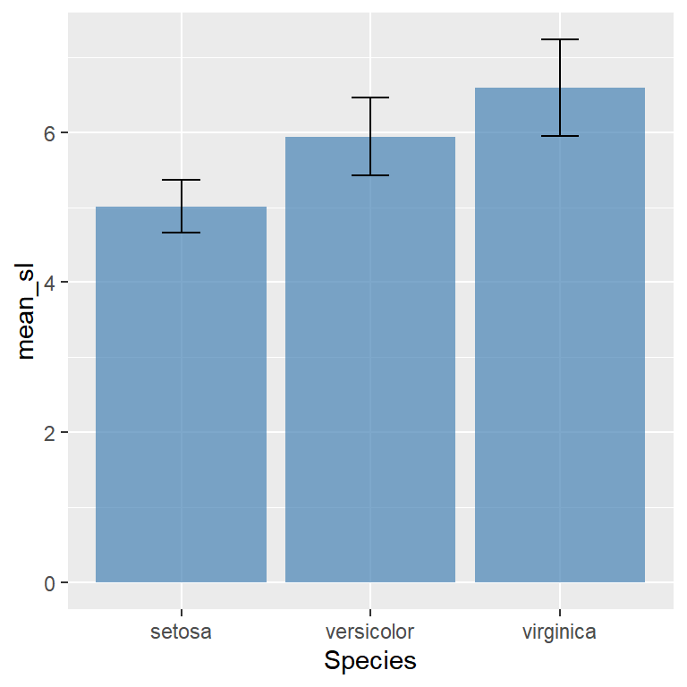
With points
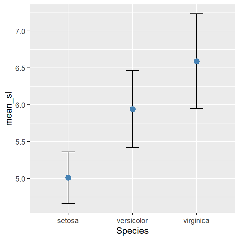
Draw the error bar first and the point on top for a clean dot plot with confidence intervals.
# install.packages("ggplot2")
library(ggplot2)

ggplot(df, aes(x = Species, y = mean_sl)) +
  geom_errorbar(aes(ymin = mean_sl - sd_sl,
                    ymax = mean_sl + sd_sl),
                width = 0.2) +
  geom_point(size = 3, color = "steelblue")
With a line chart
Combine geom_line(), geom_errorbar() and geom_point() to show uncertainty over time.
# install.packages("ggplot2")
library(ggplot2)

df_time <- data.frame(
  year   = 2018:2023,
  mean_y = c(3.2, 3.8, 4.1, 3.9, 4.5, 4.8),
  sd_y   = c(0.5, 0.4, 0.6, 0.5, 0.4, 0.3)
)

ggplot(df_time, aes(x = year, y = mean_y)) +
  geom_line() +
  geom_errorbar(aes(ymin = mean_y - sd_y,
                    ymax = mean_y + sd_y),
                width = 0.2) +
  geom_point(size = 2)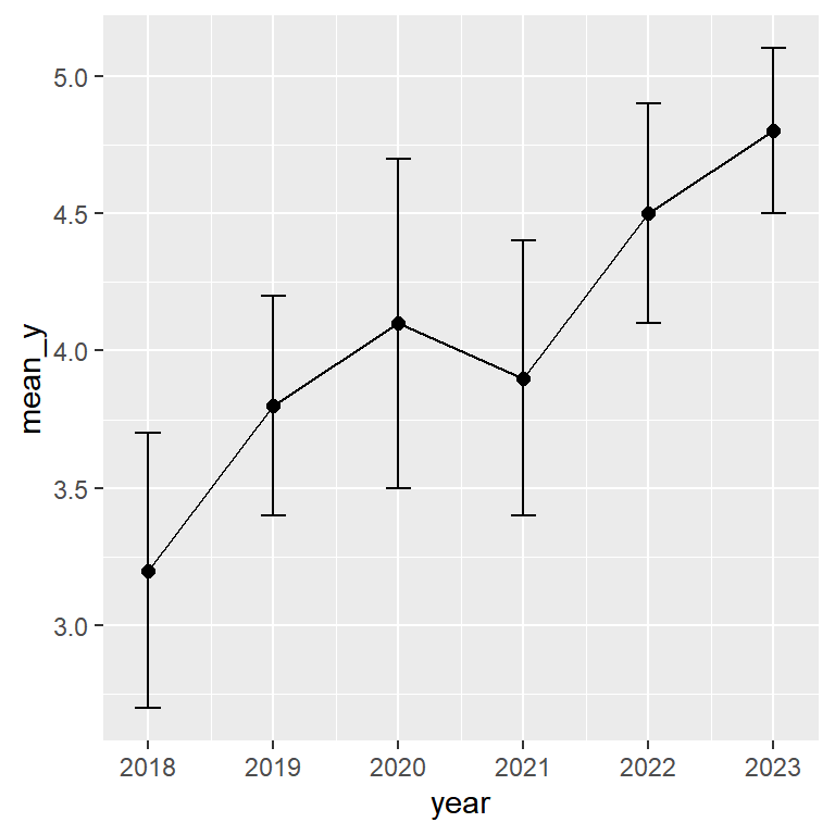
geom_errorbarh()
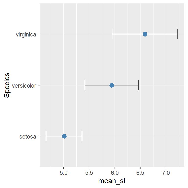
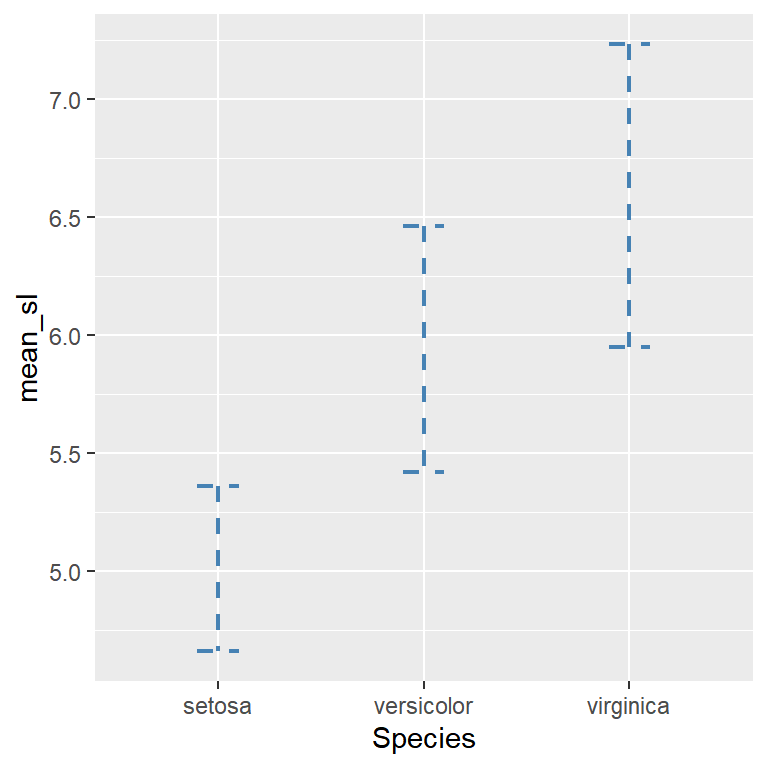
Use geom_errorbarh() for horizontal error bars. Swap x/y in aes() and replace ymin/ymax with xmin/xmax. The cap size is controlled with height instead of width.
# install.packages("ggplot2")
library(ggplot2)

ggplot(df, aes(y = Species, x = mean_sl)) +
  geom_errorbarh(aes(xmin = mean_sl - sd_sl,
                     xmax = mean_sl + sd_sl),
                 height = 0.2) +
  geom_point(size = 3, color = "steelblue")
Grouped error bars
When you have multiple groups per category, use position_dodge() on both geom_errorbar() and geom_point() with the same dodge width so they stay aligned.
# install.packages("ggplot2")
library(ggplot2)

ggplot(df_group, aes(x = group, y = mean_y,
                     color = condition)) +
  geom_errorbar(aes(ymin = mean_y - sd_y,
                    ymax = mean_y + sd_y),
                width = 0.2,
                position = position_dodge(0.5)) +
  geom_point(size = 3,
             position = position_dodge(0.5))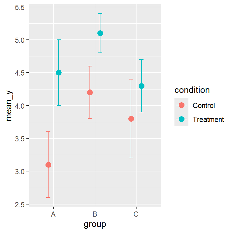
Color, linewidth and linetype
Pass color, linewidth and linetype outside aes() to apply them to all bars at once.
# install.packages("ggplot2")
library(ggplot2)

ggplot(df, aes(x = Species, y = mean_sl)) +
  geom_errorbar(aes(ymin = mean_sl - sd_sl,
                    ymax = mean_sl + sd_sl),
                width = 0.2,
                color = "steelblue",
                linewidth = 0.8,
                linetype = "dashed")
Master Statistics
Learn statistics from the basics to advanced techniques, clearly explained
Go to site