The chartSeries function
The quantmod package allows obtaining, transforming and plotting financial data from different sources. In the following example we are downloading the SP500 data from Yahoo Finance and plotting it with the chartSeries function.
Note that you can transform the daily data into weekly or monthly candles with as.weekly and as.monthly functions, e.g. as.monthly(GSPC).
Default candlestick chart
# install.packages("quantmod")
library(quantmod)

# Dates
start <- "2020-10-01"
end <- "2021-01-01"

# Get the data
getSymbols("^GSPC",
           from = start, to = end,
           src = "yahoo")

# Plot the data
chartSeries(GSPC)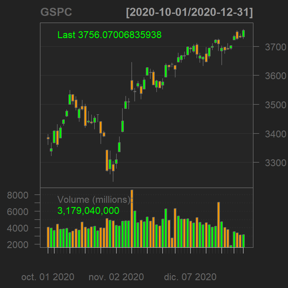
The function provides theming and styling options, such as a white theme, changing the bar type, the colors of the candles among others. Type ?chartSeries for additional options.
Styling
# install.packages("quantmod")
library(quantmod)

# Dates
start <- "2020-10-01"
end <- "2021-01-01"

# Get the data
getSymbols("^GSPC",
           from = start, to = end,
           src = "yahoo")

# Plot the data
chartSeries(GSPC,
            theme = chartTheme("white"), # Theme
            bar.type = "hlc",  # High low close
            up.col = "green",  # Up candle color
            dn.col = "pink")   # Down candle color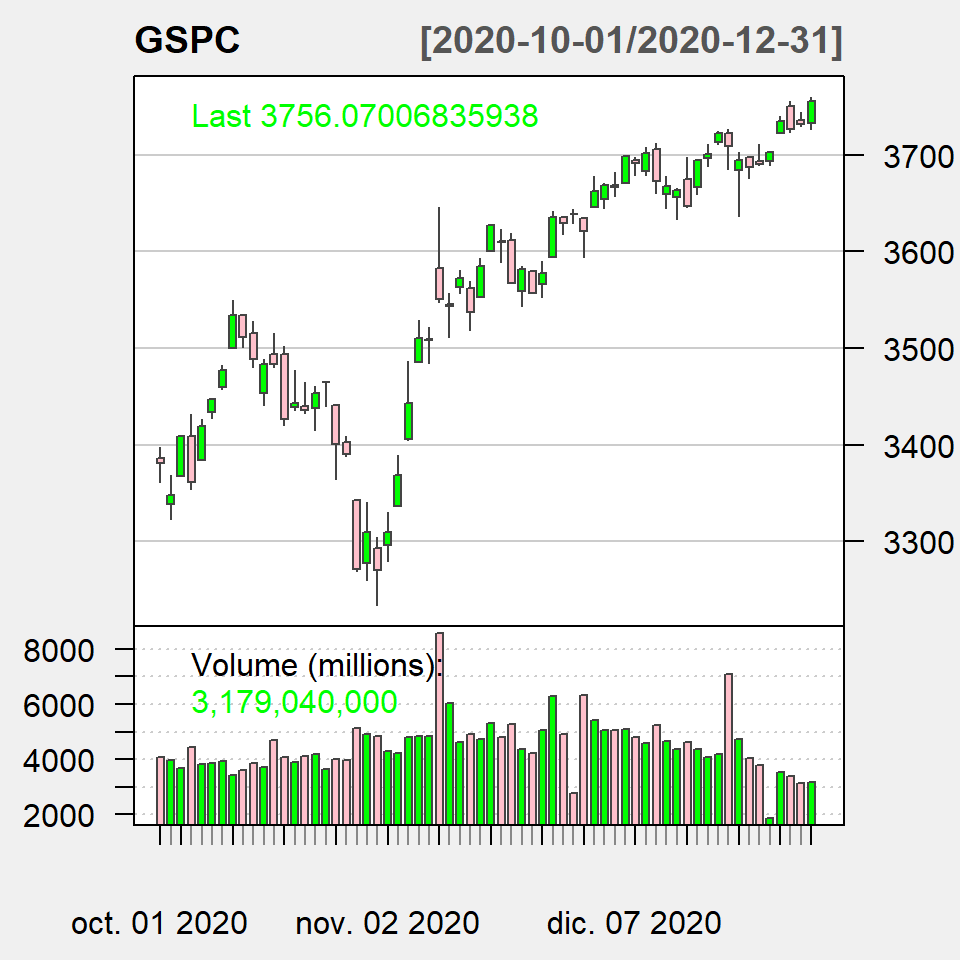
You can also add technical indicators to the chart, such as Bollinger bands or the exponential moving average, among others. Look for the functions that starts with add.
Technical indicators
# install.packages("quantmod")
library(quantmod)

# Dates
start <- "2020-10-01"
end <- "2021-01-01"

# Get the data
getSymbols("^GSPC",
           from = start, to = end,
           src = "yahoo")

# Plot the data
chartSeries(GSPC,
            theme = chartTheme("white"),
            name = "SP500",
            TA = list("addBBands(n = 10)",
                      "addVo()",
                      "addEMA(20)",
                      "addEMA(10, col = 2)"))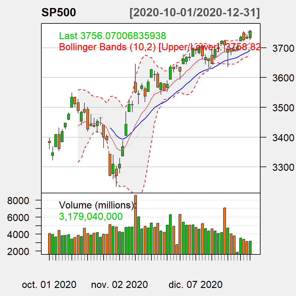
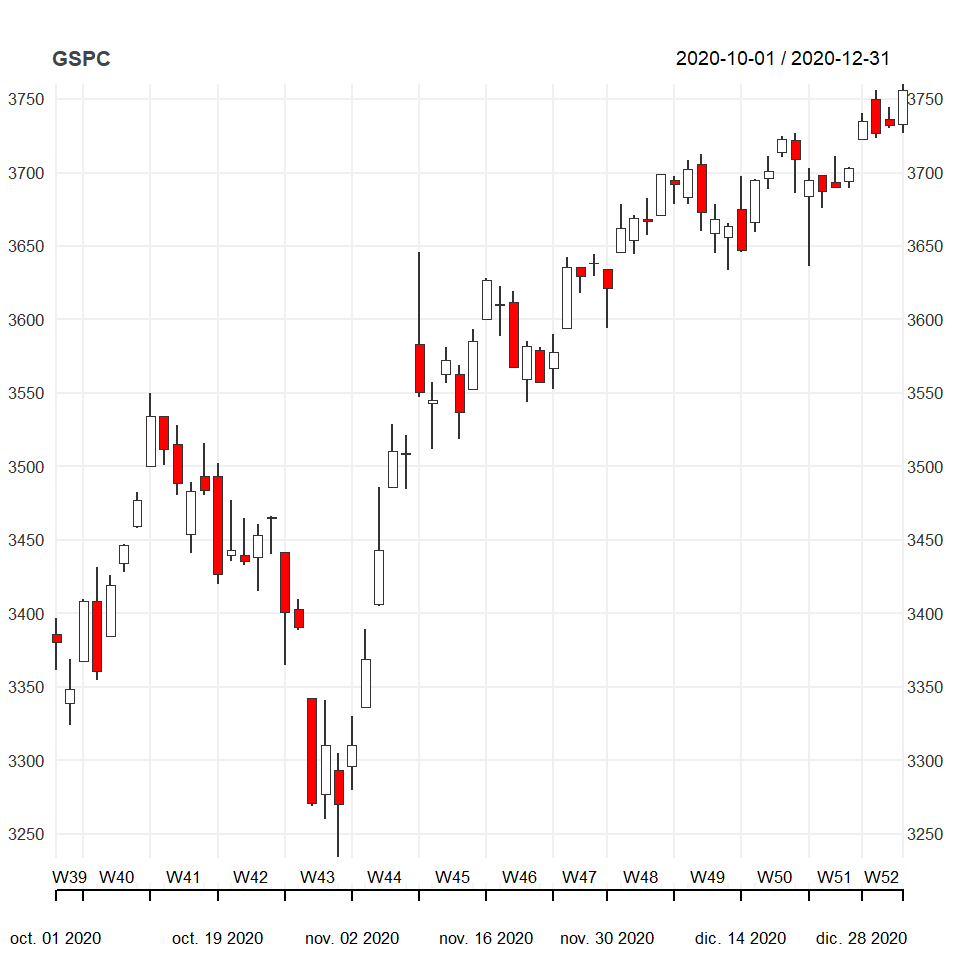
The chart_Series function
The quantmod package has several experimental functions, such as chart_Series. If you pass the financial data this function the default chart is the following:
# install.packages("quantmod")
library(quantmod)
# Dates
start <- "2020-10-01"
end <- "2021-01-01"
# Get the data
getSymbols("^GSPC",
from = start, to = end,
src = "yahoo")
# Plot the data
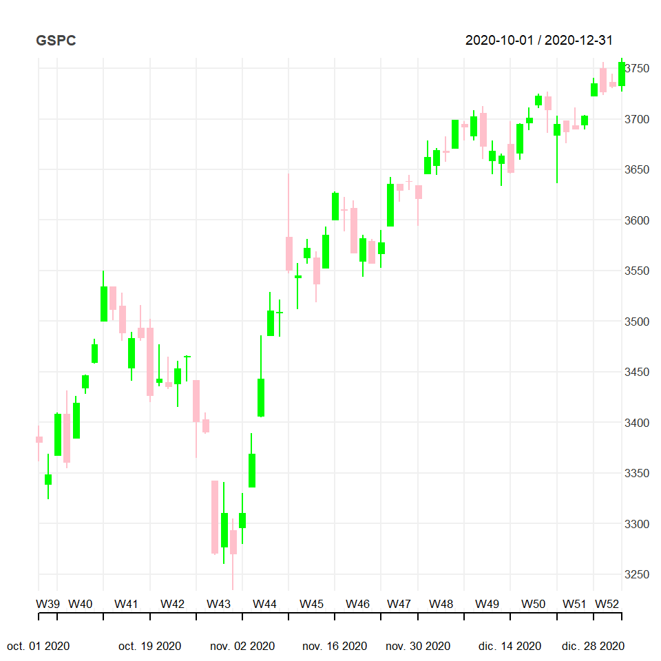
chart_Series(GSPC)The theme of the chart can be customized with the list of arguments provided inside chart_theme.
# install.packages("quantmod")
library(quantmod)
# Dates
start <- "2020-10-01"
end <- "2021-01-01"
# Get the data
getSymbols("^GSPC",
from = start, to = end,
src = "yahoo"
# Custom theme
myTheme <- chart_theme()
myTheme$col$dn.col <- "pink"
myTheme$col$dn.border <- "pink"
myTheme$col$up.col <- "green"
myTheme$col$up.border <- "green"
myTheme$rylab <- TRUE
myTheme$lylab <- FALSE
# Plot the data
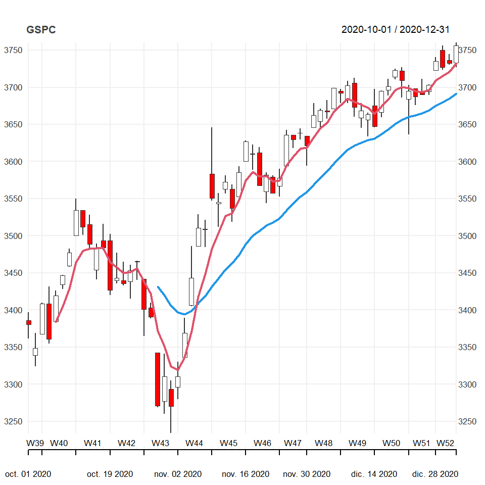
chart_Series(GSPC, theme = myTheme)Finally, you can add technical indicators passing a string as input with the indicators separated by semi-colon.
# install.packages("quantmod")
library(quantmod)

# Dates
start <- "2020-10-01"
end <- "2021-01-01"

# Get the data
getSymbols("^GSPC",
           from = start, to = end,
           src = "yahoo")

# Plot the data
chart_Series(GSPC,
             TA = "add_EMA(n = 20, col = 4, lwd = 2);
                   add_EMA(n = 5, col = 2, lwd = 2)")
Master Statistics
Learn statistics from the basics to advanced techniques, clearly explained
Go to site