Plot one or several time series
A time series is the visual representation of time-dependent data, this is, its a chart that represents the evolution of a variable through time. Generally, the pair of points are connected with lines and the decision of showing the points or not depends on your own and also based on the discretization level.
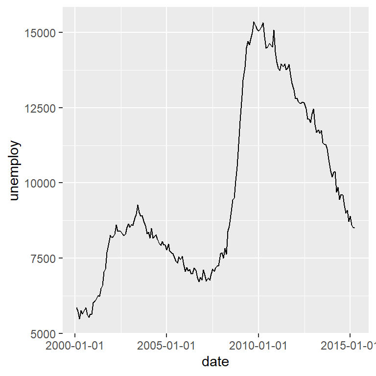
In order to plot a time series in ggplot2 of a single variable you just need a data frame containing dates and the corresponding values of the variable. Note that the date column must be in date format. You will need to input your data and use geom_line or geom_point.
Time series (line)
# install.packages("ggplot2")
library(ggplot2)

# Data with dates and variables. The column 'date' is of class "Date"
df <- economics[economics$date > as.Date("2000-01-01"), ]

ggplot(df, aes(x = date, y = unemploy)) +
  geom_line()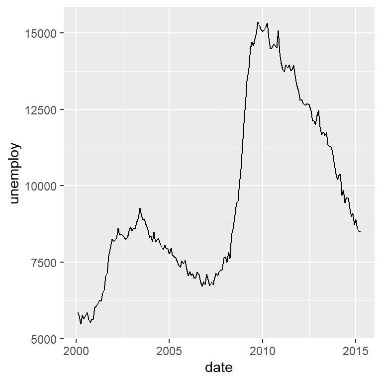
As stated before, you can add the points to the time series chart by using the geom_point function. In this example there are too many points, making the plot less readable, so we are not going to display them in the following examples.
Time series (line and points)
# install.packages("ggplot2")
library(ggplot2)

# Data
df <- economics[economics$date > as.Date("2000-01-01"), ]

ggplot(df, aes(x = date, y = unemploy)) +
  geom_line() +
  geom_point()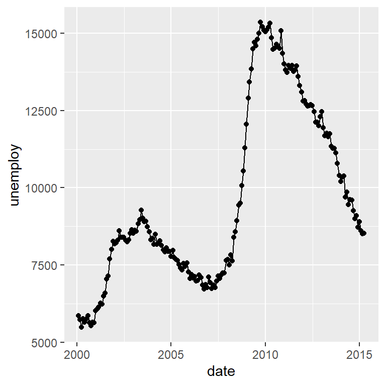
The variable passed to x inside aes must be in a data format. Check the class of the variable with class(df$date) or with str(df). You can use as.Date and as.POSIXct functions to transform dates into date format if needed.
Time series area
Sometimes time series are plotted with a shaded area. You can add it to your visualization making use of the geom_area function.
# install.packages("ggplot2")
library(ggplot2)

# Data
df <- economics[economics$date > as.Date("2000-01-01"), ]

ggplot(df, aes(x = date, y = unemploy)) +
  geom_area(fill = "gray", alpha = 0.9) +
  geom_line()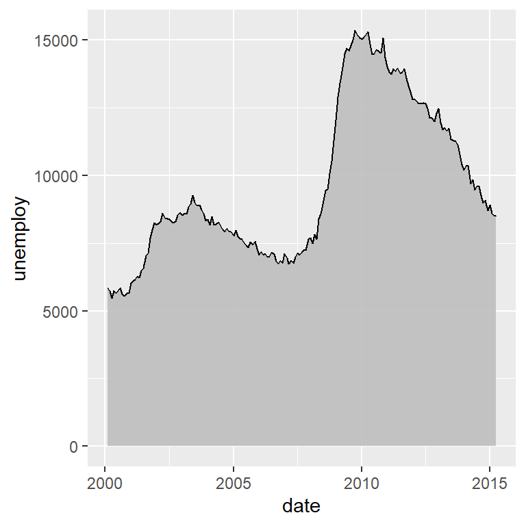
Smoothed time series with stat_smooth
With geom_smooth you can smooth the time series, which can be interesting to analyze trends or patterns. By default, geom_smooth will add a confidence interval of the smoothed line, but you can remove it by setting se = FALSE.
# install.packages("ggplot2")
library(ggplot2)

# Data
df <- economics[economics$date > as.Date("2000-01-01"), ]

ggplot(df, aes(x = date, y = unemploy)) +
  geom_line() +
  geom_smooth(se = FALSE)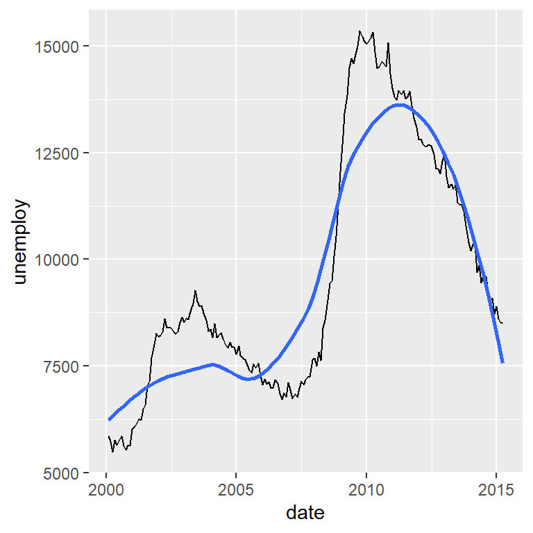
Plotting multiple time series on the same graph
In order to plot several time series at once you will need to have your data frame in long format. For this example we will use a subset of the economics_long ggplot2 sample data frame.
# install.packages("ggplot2")
library(ggplot2)
library(dplyr)

# Data
df2 <- economics_long[economics_long$date > as.Date("2000-01-01"), ] %>%
  filter(variable == "pce" | variable == "unemploy")

ggplot(df2, aes(x = date, y = value, color = variable)) +
  geom_line() +
  theme(legend.position = "bottom")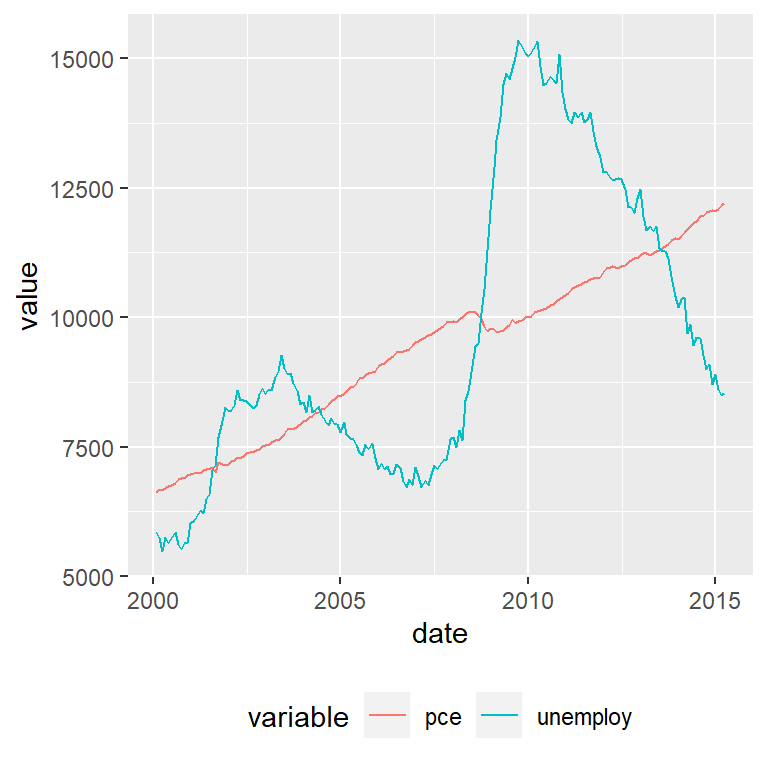
The color for each line can be customized with scale_color_manual, specifying as many colors as lines with the values argument or making used of other discrete color scale function.
Split the time series in several plots by day, week, month, year, …
Making use of ggplot2 facets you can split your time series on predefined intervals. In the following example we are using the year function from lubridate to extract the corresponding year for each observation and use the new column to split the time series. We set scales = "free" to let the axis scales free.
# install.packages("ggplot2")
# install.packages("lubridate")
library(ggplot2)
library(lubridate)

# Data
df <- economics[economics$date > as.Date("2000-01-01"), ]

# New column with the corresponding year for each date
df$year <- year(df$date)

ggplot(df, aes(x = date, y = unemploy)) +
  geom_line() +
  facet_wrap(~year, scales = "free")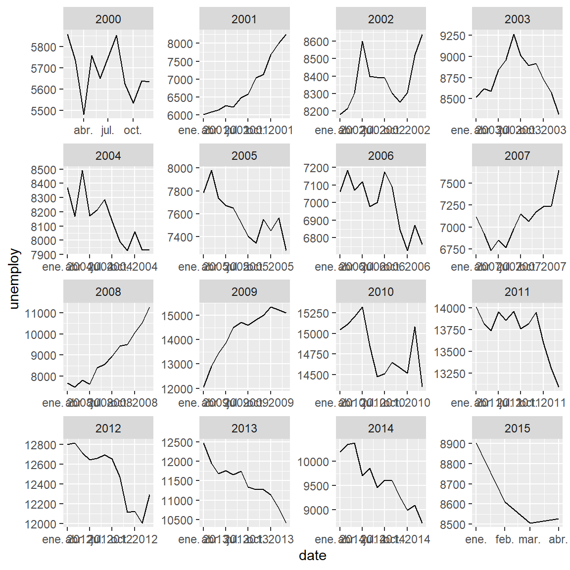
Date format of a time series plot with scale_x_date
With the scale_x_date function you can customize the X-axis scale when its a date. For instance, you will be able to transform the format of the dates, the limits of the plot or the number of breaks and minor breaks of the axis. In the following table you will see a list of common symbols used to specify different date formats. Note that you can combine the symbols the way you want, as in the examples below.
| Symbol | Meaning | Example |
|---|---|---|
| %Y | 4 digits year | 2023 |
| %y | 2 digits year | 23 |
| %B | Full month name | September |
| %b | Abbreviated month name | Sep |
| %m | Month as number | 09 |
| %d | Day of the month | 05 |
| %H | Hour (00-23) | 14 |
| %I | Hour (01-12) | 14 |
| %M | Minute as number | 30 |
| %S | Second as integer | 15 |
| %A | Full weekday name | Tuesday |
| %a | Abbreviated weekday name | Tue |
Date format
The date_labels argument of the scale_x_date function can be used to customize the date format. In the following example we are setting %Y-%m-%d, which will show the year, the month and the day separated by hyphens instead of only the year.
# install.packages("ggplot2")
library(ggplot2)

# Data
df <- economics[economics$date > as.Date("2000-01-01"), ]

ggplot(df, aes(x = date, y = unemploy)) +
  geom_line() +
  scale_x_date(date_labels = "%Y-%m-%d")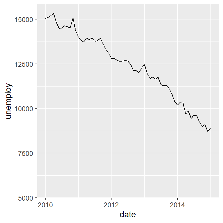
Limits
You can set the limit of the axis based on dates with the limit argument of the function.
# install.packages("ggplot2")
library(ggplot2)

# Data
df <- economics[economics$date > as.Date("2000-01-01"), ]

ggplot(df, aes(x = date, y = unemploy)) +
  geom_line() +
  scale_x_date(limit = c(as.Date("2010-01-01"), as.Date("2015-01-01")))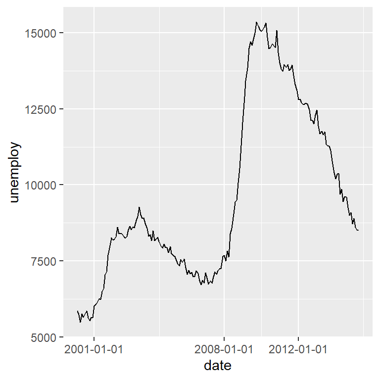
Breaks
You can also specify the breaks with the breaks argument of the function, specifying the dates to be used as axis breaks.
# install.packages("ggplot2")
library(ggplot2)

# Data
df <- economics[economics$date > as.Date("2000-01-01"), ]

ggplot(df, aes(x = date, y = unemploy)) +
  geom_line() +
   scale_x_date(breaks = c(as.Date("2001-01-01"),
                           as.Date("2008-01-01"),
                           as.Date("2012-01-01")))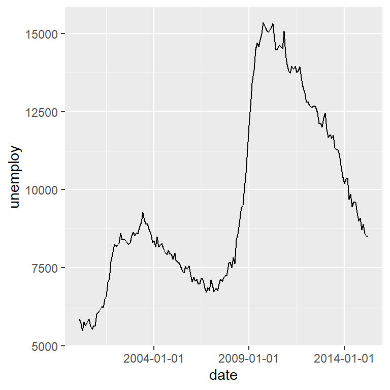
An alternative is to specify the breaks with strings of the format "1 day" (a break each day), "2 months" (a break every two months), "6 years" (a break every six years), …
# install.packages("ggplot2")
library(ggplot2)

# Data
df <- economics[economics$date > as.Date("2000-01-01"), ]

ggplot(df, aes(x = date, y = unemploy)) +
  geom_line() +
   scale_x_date(date_breaks = "5 years")
The function also provides an argument named date_minor_breaks to set the minor breaks of the axis. This argument behaves the same as date_breaks.
# install.packages("ggplot2")
library(ggplot2)

df <- economics[economics$date > as.Date("2000-01-01"), ]

ggplot(df, aes(x = date, y = unemploy)) +
  geom_line() +
   scale_x_date(date_breaks = "5 years",
                date_minor_breaks = "1 year")
Highlight changes, peaks and valleys
You can add lines to highlight breakpoints or structural changes with the geom_vline or geom_hline functions to add vertical or horizontal lines, respectively.
# install.packages("ggplot2")
# install.packages("ggpmisc")
library(ggplot2)
library(ggpmisc)

# Data
df <- economics[economics$date > as.Date("2000-01-01"), ]

ggplot(df, aes(x = date, y = unemploy)) +
  geom_line() +
  geom_vline(xintercept = as.Date("2007-09-15"),
             linetype = 2, color = 2, linewidth = 1)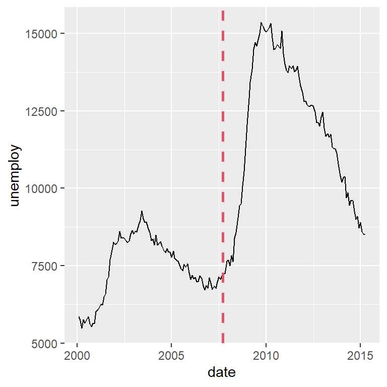
Peaks and valleys
With the stat_peaks and stat_valleys functions from the ggpmisc package you can highlight local maximum or local minimum values based on a span (by default, span = 5). Both functions behave the same way and the geom used to represent the data can be passed to the geom argument, which defaults to "point". In the following examples we add the peaks and valleys of the series, showing labels and a rug plot to display where the values are.
# install.packages("ggplot2")
# install.packages("ggpmisc")
library(ggplot2)
library(ggpmisc)

# Data
df <- economics[economics$date > as.Date("2000-01-01"), ]

ggplot(df, aes(x = date, y = unemploy)) +
  geom_line() +
  stat_peaks(geom = "point", span = 15, color = "steelblue3", size = 2) +
  stat_peaks(geom = "label", span = 15, color = "steelblue3", angle = 0,
             hjust = -0.1, x.label.fmt = "%Y-%m-%d") +
  stat_peaks(geom = "rug", span = 15, color = "blue", sides = "b")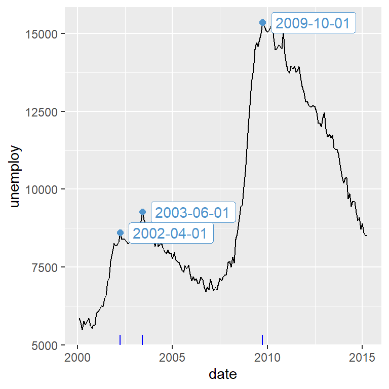
# install.packages("ggplot2")
# install.packages("ggpmisc")
library(ggplot2)
library(ggpmisc)

# Data
df <- economics[economics$date > as.Date("2000-01-01"), ]

ggplot(df, aes(x = date, y = unemploy)) +
  geom_line() +
  stat_valleys(geom = "point", span = 11, color = "red", size = 2) +
  stat_valleys(geom = "label", span = 11, color = "red", angle = 0,
               hjust = -0.1, x.label.fmt = "%Y-%m-%d") +
  stat_valleys(geom = "rug", span = 11, color = "red", sides = "b")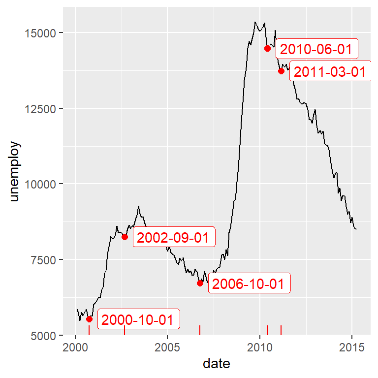
Highlight shading areas
With geom_rect it is possible to shade some areas of the time series. This is specially interesting to highlight trends, recessions, etc.
# install.packages("ggplot2")
# install.packages("ggpmisc")
library(ggplot2)
library(ggpmisc)

# Data
df <- economics[economics$date > as.Date("2000-01-01"), ]

# Shade from 2000 to 2004 and from 2010 to 2015
shade <- data.frame(x1 = c(as.Date("2000-01-01"), as.Date("2010-01-01")),
                    x2 = c(as.Date("2004-01-01"), as.Date("2015-01-01")),
                    min = c(-Inf, -Inf), max = c(Inf, Inf))

ggplot() +
  geom_line(data = df, aes(x = date, y = unemploy)) +
  geom_rect(data = shade, aes(xmin = x1, xmax = x2, ymin = min, ymax = max),
            fill = c("green", "red"), alpha = 0.2)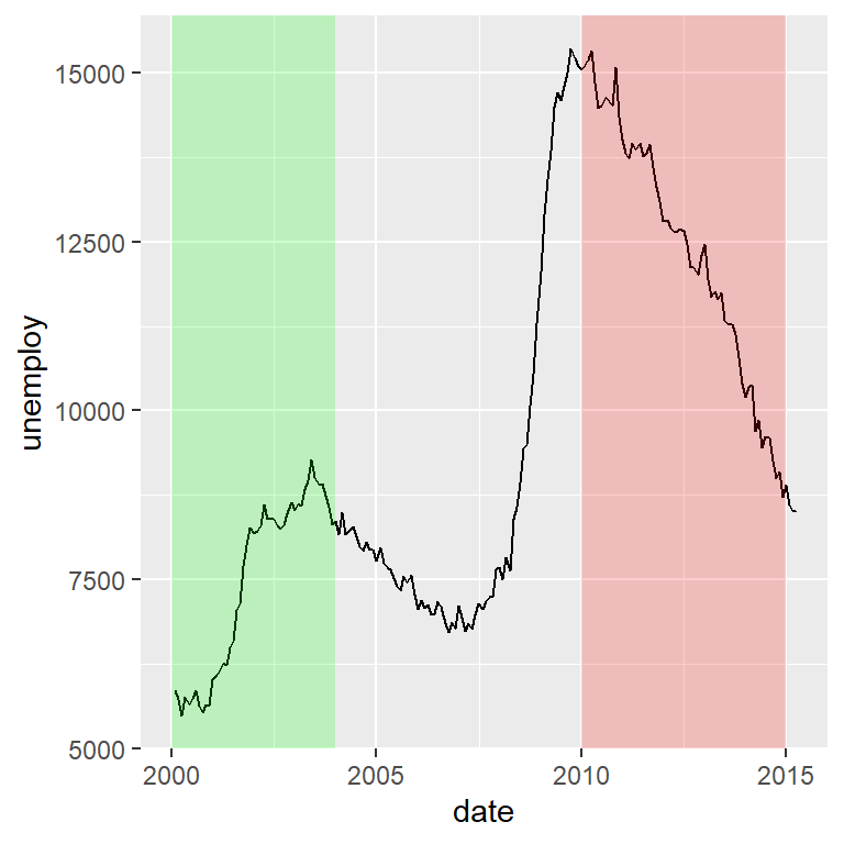

Master Statistics
Learn statistics from the basics to advanced techniques, clearly explained
Go to site