Sample data
A Gantt chart needs a data frame with at least three columns: the task name, the start date and the end date. An optional phase or category column allows coloring tasks by group.
tasks <- data.frame(
  task  = c("Requirements", "UI Design", "Backend", "Frontend",
            "Integration", "Testing", "Bug fixes", "Deployment"),
  start = as.Date(c("2024-01-08", "2024-01-15", "2024-01-22", "2024-02-05",
                    "2024-03-04", "2024-03-11", "2024-03-25", "2024-04-08")),
  end   = as.Date(c("2024-01-19", "2024-02-02", "2024-03-01", "2024-03-08",
                    "2024-03-22", "2024-04-05", "2024-04-05", "2024-04-12")),
  phase = c("Planning", "Design", "Development", "Development",
            "Development", "QA", "QA", "Launch")
)
geom_segment()
Map start to x, end to xend, and task to both y and yend. geom_segment() draws a horizontal bar for each row. Increase linewidth to make the bars tall enough to read.
# install.packages("ggplot2")
library(ggplot2)

ggplot(tasks, aes(x = start, xend = end,
                  y = task,  yend = task)) +
  geom_segment(linewidth = 8) +
  labs(x = NULL, y = NULL) +
  theme_minimal()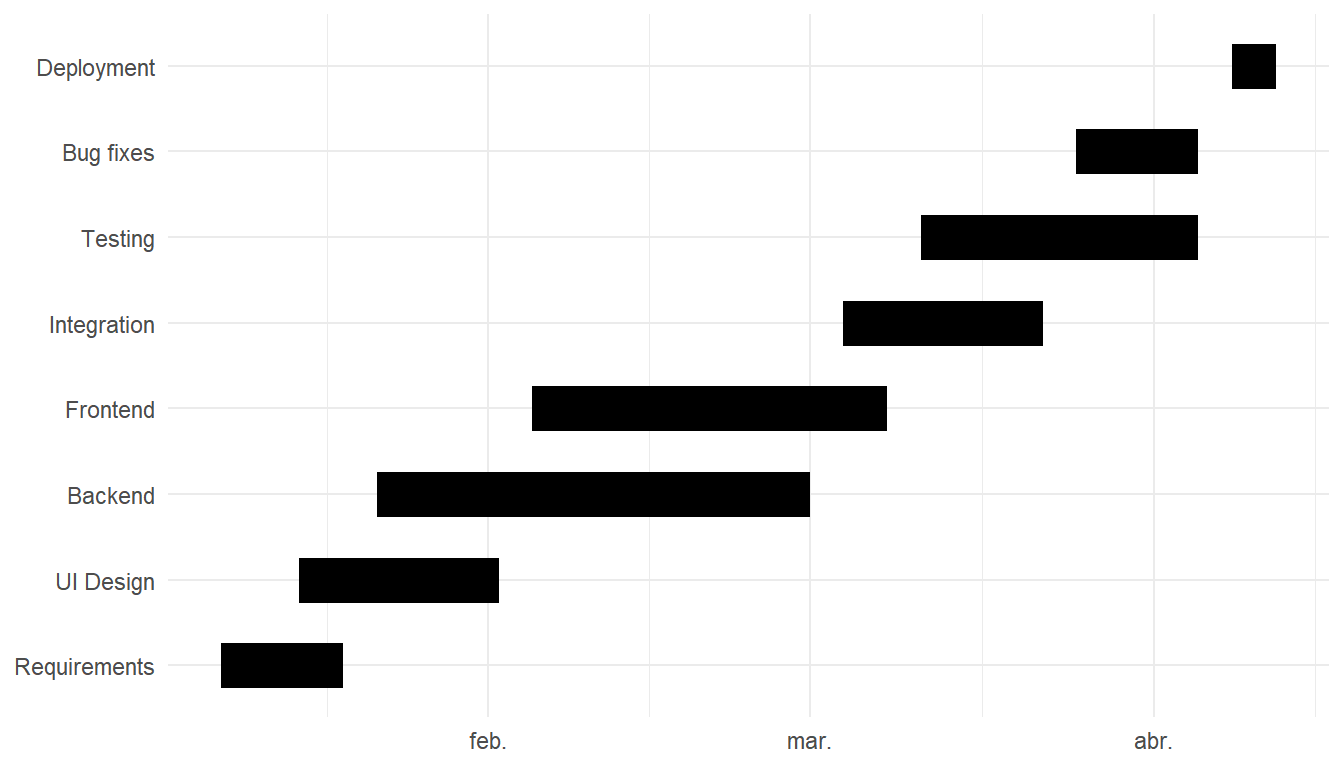
Color by phase
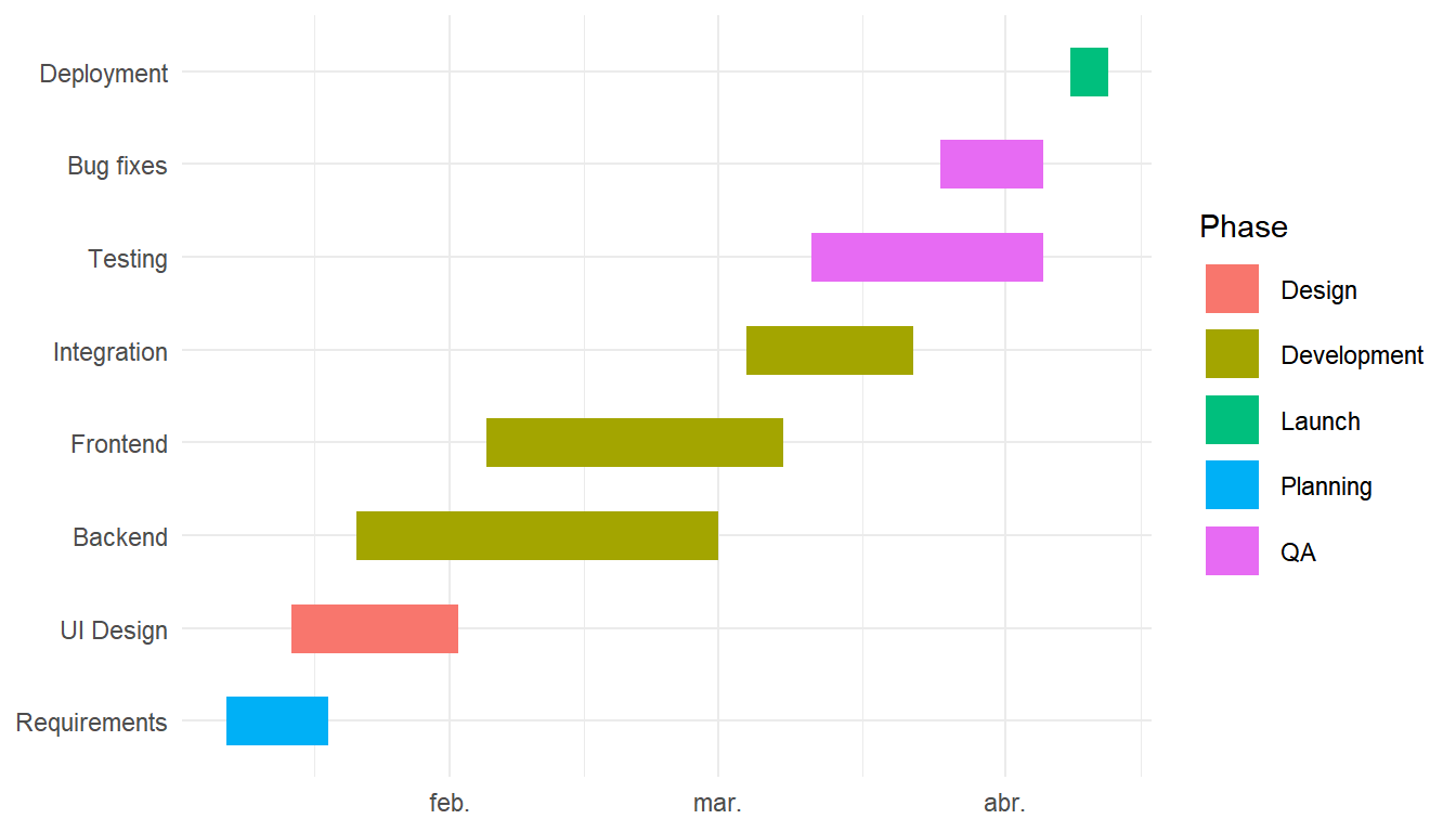
Add color = phase to aes() to color each task by its project phase. Use scale_color_manual() to assign specific colors to each phase name.
# install.packages("ggplot2")
library(ggplot2)

ggplot(tasks, aes(x = start, xend = end,
                  y = task,  yend = task,
                  color = phase)) +
  geom_segment(linewidth = 8) +
  labs(x = NULL, y = NULL, color = "Phase") +
  theme_minimal()
Task order
By default tasks appear in alphabetical order. Use reorder() to sort them by start date so the timeline reads top-to-bottom in chronological order.
# install.packages("ggplot2")
library(ggplot2)

tasks$task <- reorder(tasks$task,
                      tasks$start)

ggplot(tasks, aes(x = start, xend = end,
                  y = task,  yend = task,
                  color = phase)) +
  geom_segment(linewidth = 8) +
  theme_minimal()
Task labels
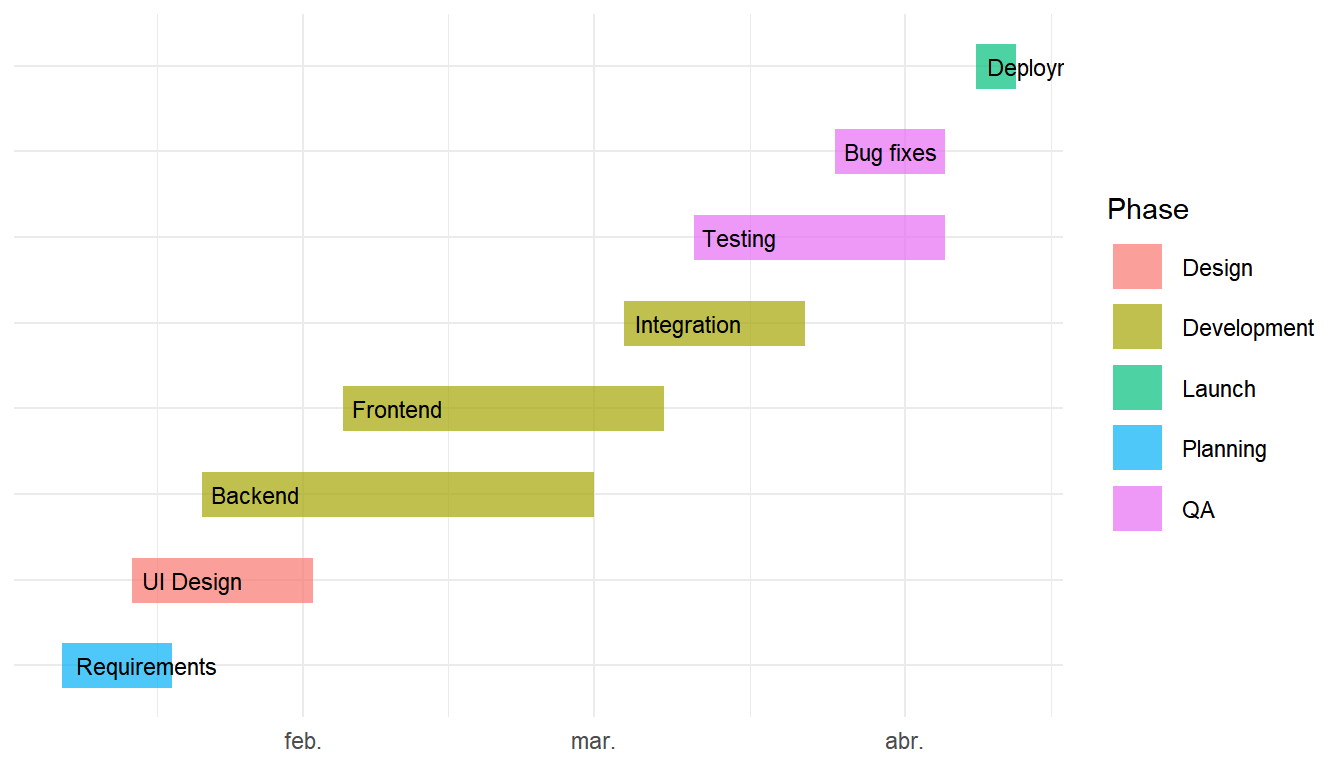
Add geom_text() to print the task name at the start of each bar. Set hjust = -0.1 to push the label just past the left edge and hide the y-axis labels with axis.text.y = element_blank() to avoid duplication.
# install.packages("ggplot2")
library(ggplot2)

ggplot(tasks, aes(x = start, xend = end,
                  y = task,  yend = task,
                  color = phase)) +
  geom_segment(linewidth = 8, alpha = 0.7) +
  geom_text(aes(label = task, x = start),
            hjust = -0.1,
            color = "black",
            size  = 3) +
  theme_minimal() +
  theme(axis.text.y = element_blank())
Date formatting and today line
Use scale_x_date() to control the axis label format and tick frequency. Add a geom_vline() at any date to mark a milestone or the current date.
# install.packages("ggplot2")
library(ggplot2)

ggplot(tasks, aes(x = start, xend = end,
                  y = task,  yend = task,
                  color = phase)) +
  geom_segment(linewidth = 8, alpha = 0.85) +
  geom_vline(xintercept = as.Date("2024-03-01"),
             linetype = "dashed", color = "grey40") +
  scale_x_date(date_labels = "%b %Y",
               date_breaks = "1 month") +
  labs(x = NULL, y = NULL, color = "Phase") +
  theme_minimal()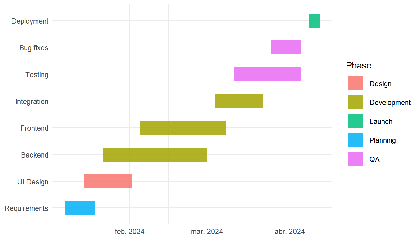

Master Statistics
Learn statistics from the basics to advanced techniques, clearly explained
Go to site