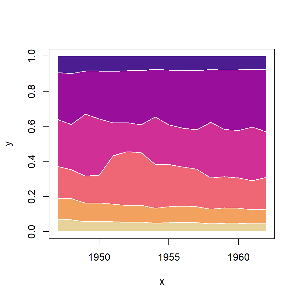
Data transformation
Consider the following data frame where each column represents the path of a brownian motion.
# Brownian motion
set.seed(2)

# Grid
t <- seq(0, 1, by = 0.001)
p <- length(t) - 1

# 5 paths
n <- 5
I <- matrix(rnorm(n * p, 0, 1 / sqrt(p)), n, p)

# Data frame
df1 <- data.frame(apply(I, 1, cumsum))
In order to use your data frame in ggplot2 you will need to transform it into long format. You can achieve it making use of the melt function of the reshape package.
# install.packages("reshape")
library(reshape)
df <- data.frame(x = seq_along(df1[, 1]),
df1)
# Long format
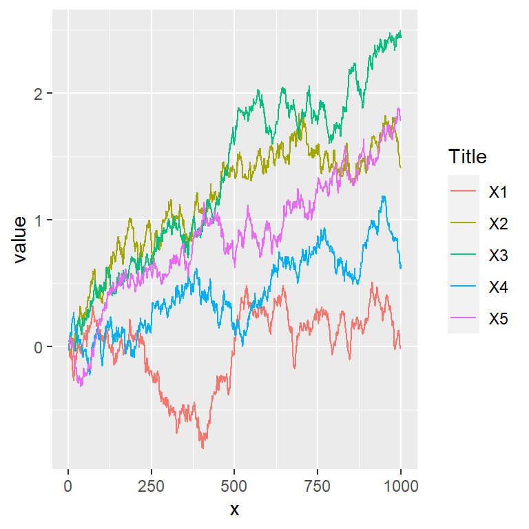
df <- melt(df, id.vars = "x")Line chart of several variables
Given a data frame in long format like df it is possible to create a line chart with multiple lines in ggplot2 with geom_line the following way.
# install.packages("ggplot2")
library(ggplot2)

ggplot(df, aes(x = x, y = value, color = variable)) +
  geom_line()
Lines width and style
The styling of the lines can be changed making use of the arguments of geom_line, like linetype for changing the style of the line or lwd to change its width.
# install.packages("ggplot2")
library(ggplot2)

ggplot(df, aes(x = x, y = value, color = variable)) +
  geom_line(linetype = 3,
            lwd = 1.1)
Color customization
The default color palette can be changed passing a vector of colors to the values argument of the scale_color_manual function.
# install.packages("ggplot2")
library(ggplot2)

# Color selection
cols <- c("#D43F3A", "#EEA236", "#5CB85C", "#46B8DA", "#9632B8")

ggplot(df, aes(x = x, y = value, color = variable)) +
  geom_line() +
  scale_color_manual(values = cols)
Highlight some lines
Note that using the previous method you can also highlight some lines of the chart, using the same color for all lines but some.
# install.packages("ggplot2")
library(ggplot2)

# Color selection
cols <- c("gray", "gray", "gray", "#5CB85C", "gray")

ggplot(df, aes(x = x, y = value, color = variable)) +
  geom_line() +
  scale_color_manual(values = cols)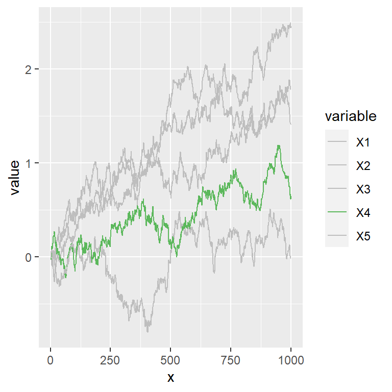
Legend customization
Title
You can change the default title for the legend of the line chart with guide_legend as shown below.
# install.packages("ggplot2")
library(ggplot2)

ggplot(df, aes(x = x, y = value, color = variable)) +
  geom_line() +
  guides(color = guide_legend(title = "Title"))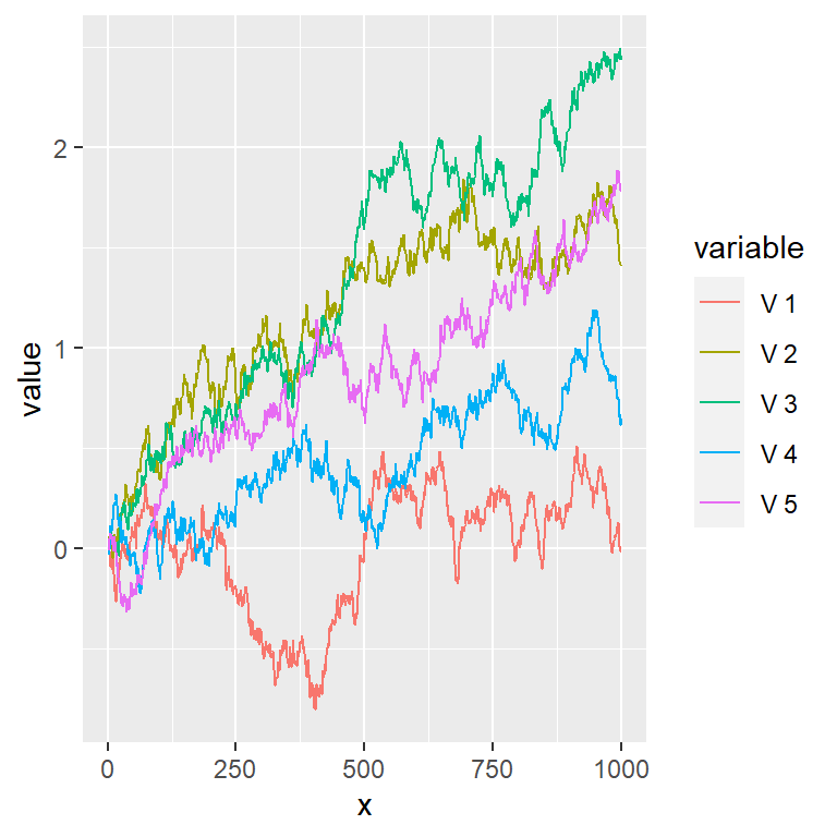
Legend labels
The labels of the legend can be modified making use of the labels argument of scale_color_discrete.
# install.packages("ggplot2")
library(ggplot2)

ggplot(df, aes(x = x, y = value, color = variable)) +
  geom_line() +
  scale_color_discrete(labels = paste("V", 1:5))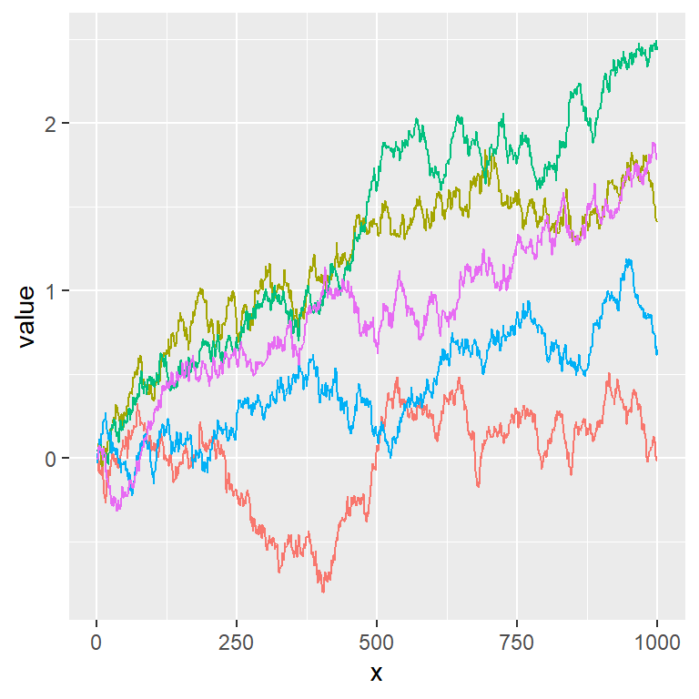
Remove the legend
You can also get rid of the legend making use of legend.position = "none".
# install.packages("ggplot2")
library(ggplot2)

ggplot(df, aes(x = x, y = value, color = variable)) +
  geom_line() +
  theme(legend.position = "none")
Master Statistics
Learn statistics from the basics to advanced techniques, clearly explained
Go to site