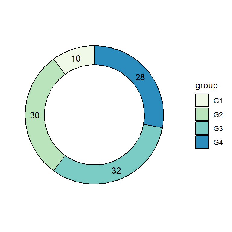
Donut chart with lessR package
Donut or doughnut charts are an alternative chart for pie charts, which have a hole in the middle, making them cleaner to read than pie charts. In base R it is possible to create this type of visualizations with PieChart function from lessR package.
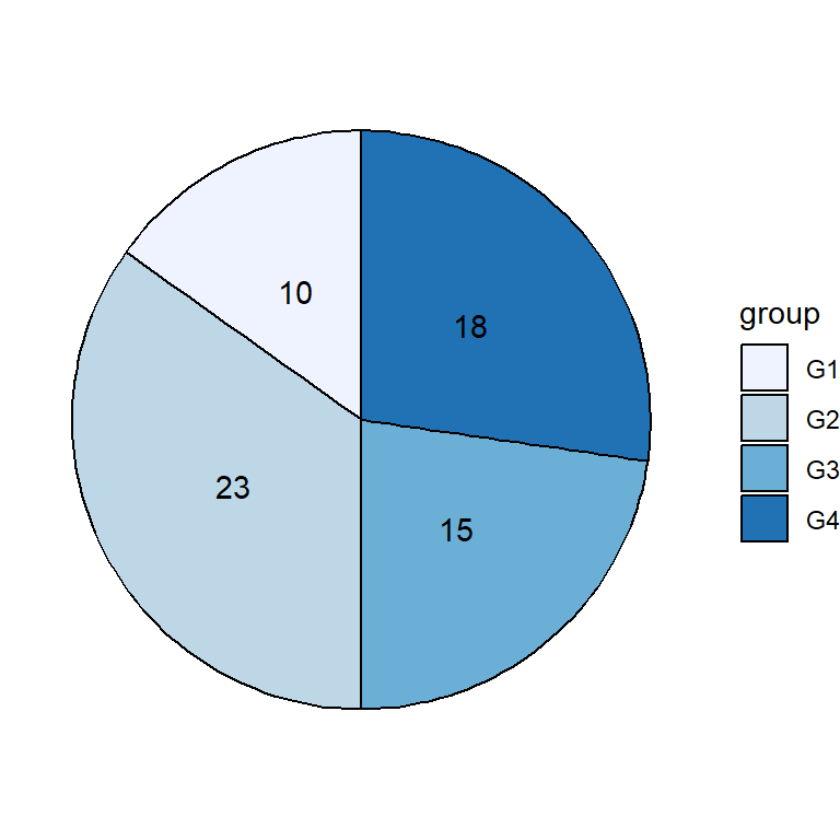
Consider the "Employee" data (provided by the package) and pass the Dept (department) column to the function, indicating the name of the data set. We have set main = NULL to remove the default title. Note that you can also use pc function as a shorthand.
# install.packages(lessR)
library(lessR)

# Sample data of the package
data <- rd("Employee")

# Donut chart
PieChart(Dept, data = data,
         main = NULL)

# Equivalent to:
pc(Dept, data = data,
   main = NULL)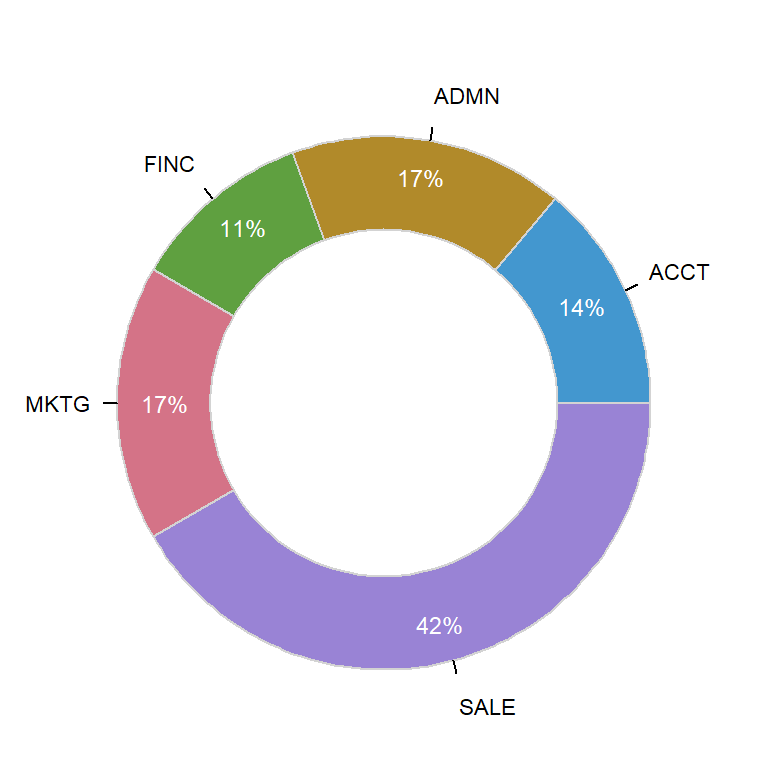
The function also provides an argument named rows, which allows you to make a subset of your data. In this example we are selecting only females with a salary higher than 45000.
# install.packages(lessR)
library(lessR)

# Sample data of the package
data <- rd("Employee")

# Donut chart
PieChart(Dept, data = data,
         rows = (Gender == "W" & Salary > 45000),
         main = NULL)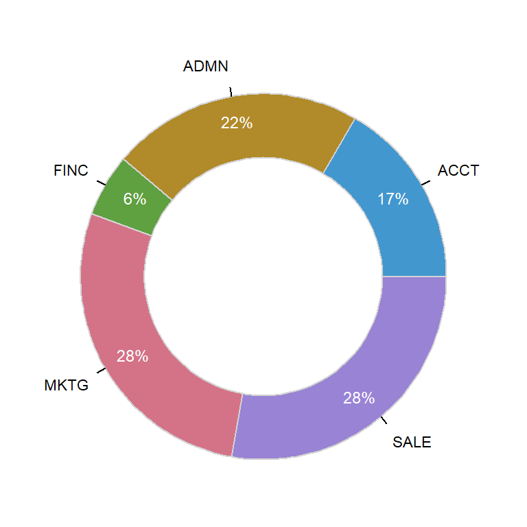
Hole size
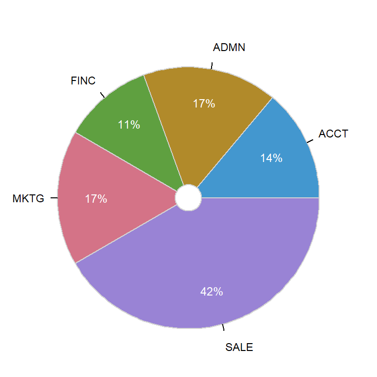
The hole argument controls the size of the hole, from 0 (a pie chart) to 0.99. Default value is 0.65.
# install.packages(lessR)
library(lessR)

# Sample data of the package
data <- rd("Employee")

# Donut chart
PieChart(Dept, data = data,
         hole = 0.1,
         main = NULL)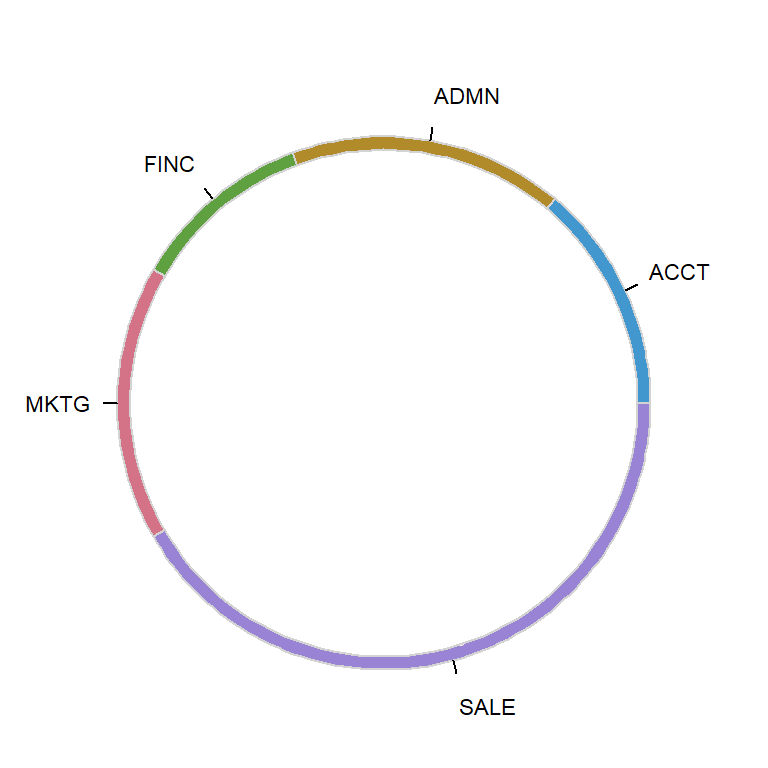
If you set a value closer to 1 you can create a thick donut chart as in the example of the following block of code.
# install.packages(lessR)
library(lessR)

# Sample data of the package
data <- rd("Employee")

# Donut chart
PieChart(Dept, data = data,
         hole = 0.95,
         main = NULL)
Donut colors
You can change the color of the slices with fill. In this example we are using the "Zissou 1" palette, but you can choose your own. Note that the color palette must be of the same length of the number of slices.
# install.packages(lessR)
library(lessR)

# Sample data of the package
data <- rd("Employee")

# Color palette
cols <- hcl.colors(length(unique(data$Dept)), "Zissou 1")

# Donut chart
PieChart(Dept, data = data,
         fill = cols,
         main = NULL)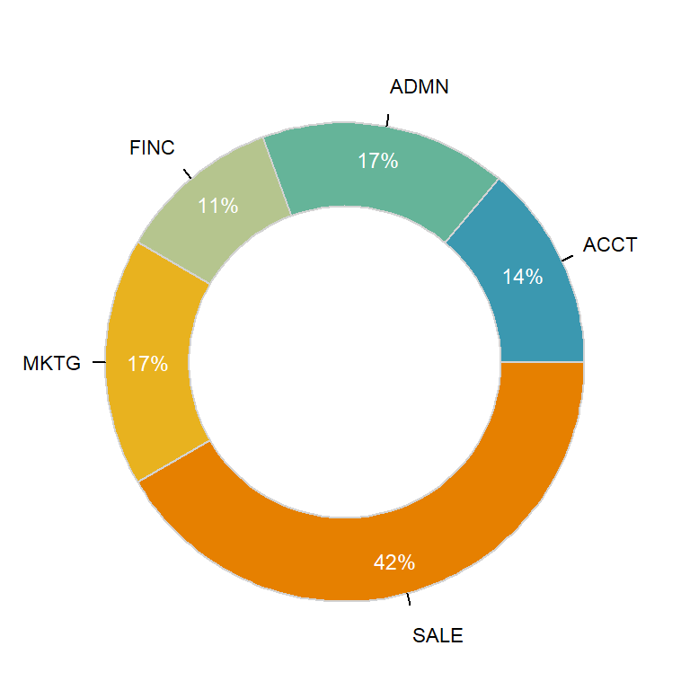
The fill argument also admits some pre-specified color palettes, such as "viridis", "blues" or "heat", among others.
# install.packages(lessR)
library(lessR)

# Sample data of the package
data <- rd("Employee")

# Donut chart
PieChart(Dept, data = data,
         fill = "viridis",
         main = NULL)
The default border color (lightgray) can also be modified. Pass the desired color to color argument and choose a line width and type with lwd and lty.
# install.packages(lessR)
library(lessR)

# Sample data of the package
data <- rd("Employee")

# Donut chart
PieChart(Dept, data = data,
         fill = "viridis",
         color = "black",
         lwd = 2,
         lty = 1,
         main = NULL)
You can also change the fill color of the hole, which defaults to white. This is specially useful if you change the background color of the plot.
# install.packages(lessR)
library(lessR)

# Sample data of the package
data <- rd("Employee")

# Donut chart
PieChart(Dept, data = data,
         fill = "blues",
         hole_fill = "#B7E3E0",
         main = NULL)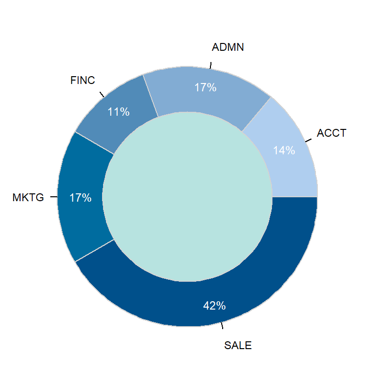
Values customization
The labels argument can be used to remove the values, to set them as proportions or as they are. Note that the function show percentages by default. You can also use values_size, values_digits, values_color and values_position to customize them. Possible options are the displayed below.
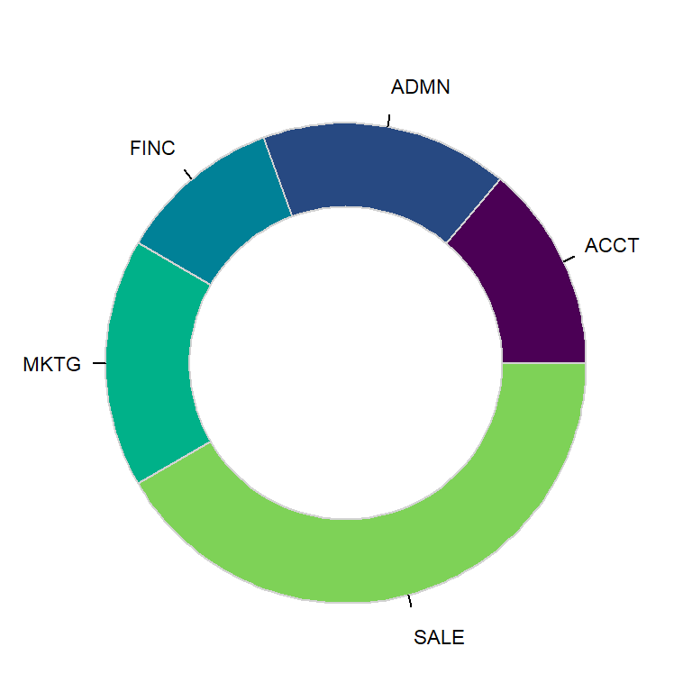
Remove values
# install.packages(lessR)
library(lessR)

# Sample data of the package
data <- rd("Employee")

# Donut chart
PieChart(Dept, data = data,
         fill = "viridis",
         values = "off",
         main = NULL)
Values as a proportion
# install.packages(lessR)
library(lessR)

# Sample data of the package
data <- rd("Employee")

# Donut chart
PieChart(Dept, data = data,
         fill = "viridis",
         values = "prop",
         main = NULL)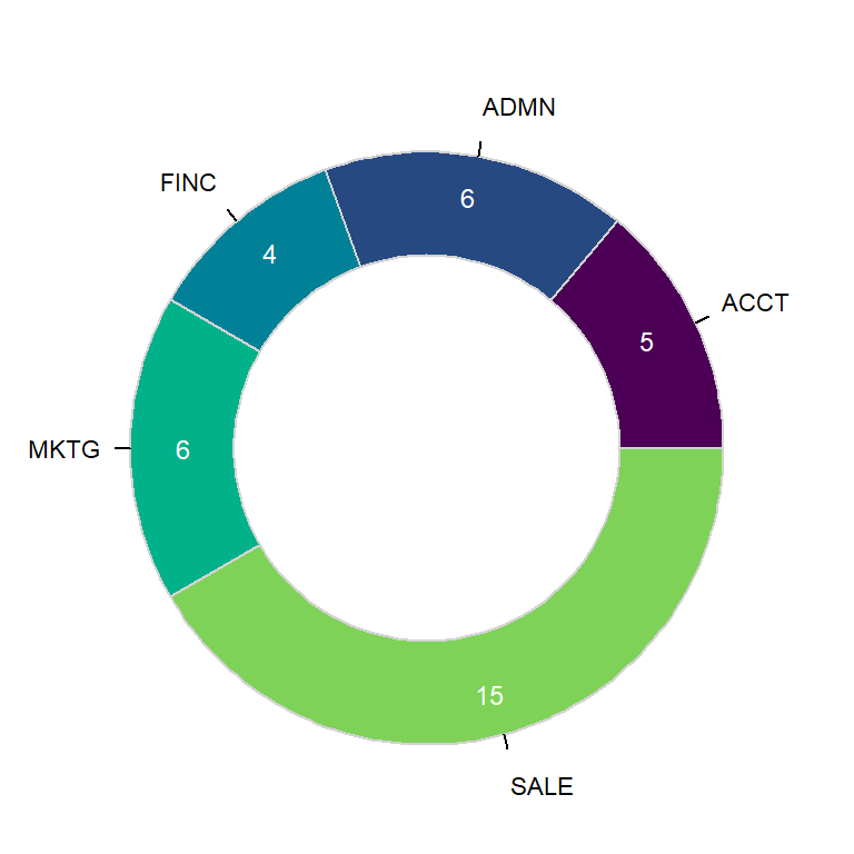
Values as input data
# install.packages(lessR)
library(lessR)

# Sample data of the package
data <- rd("Employee")

# Donut chart
PieChart(Dept, data = data,
         fill = "viridis",
         values = "input",
         main = NULL)
Values customization
# install.packages(lessR)
library(lessR)

# Sample data of the package
data <- rd("Employee")

# Donut chart
PieChart(Dept, data = data,
         fill = "viridis",
         main = NULL,
         color = "black",
         lwd = 1.5,
         values_color = c(rep("white", 4), 1),
         values_size = 0.85)
Master Statistics
Learn statistics from the basics to advanced techniques, clearly explained
Go to site