Data
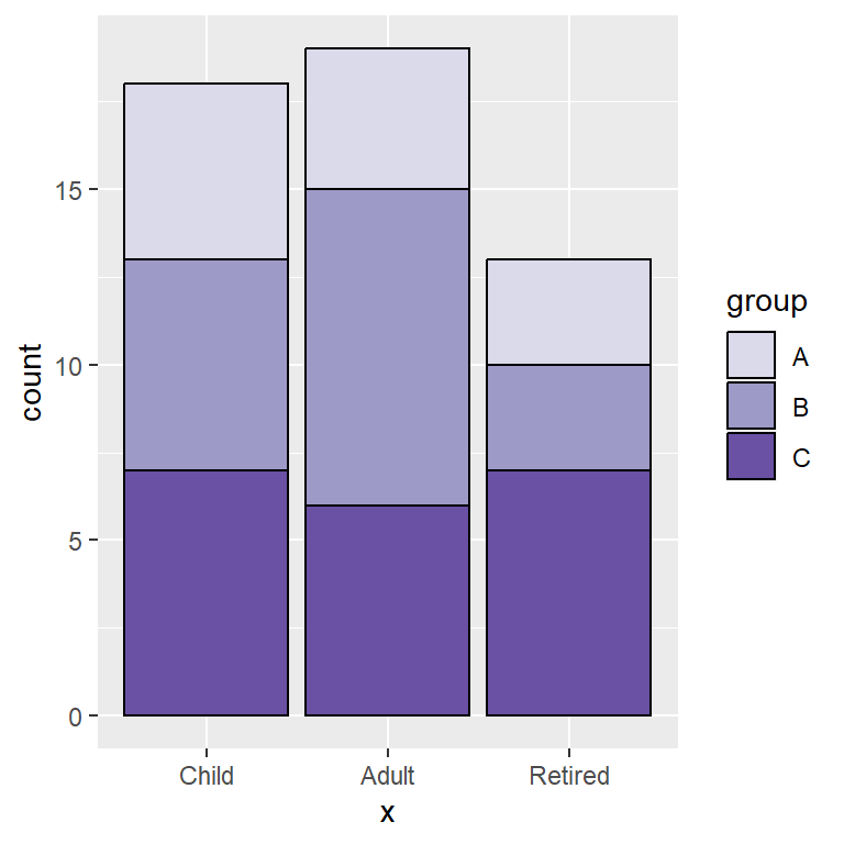
Consider the data of the following table, which shows the count of the values of the variable x within three different groups.
# Data
set.seed(1)
x <- sample(1:4, size = 50, replace = TRUE)
g <- sample(c("Group 1", "Group 2", "Group 3"),
            size = 50, replace = TRUE)

# Create a table from your data
tabl <- table(x, g)
tabl| x | Group 1 | Group 2 | Group 3 |
|---|---|---|---|
| 1 | 3 | 8 | 5 |
| 2 | 5 | 7 | 4 |
| 3 | 4 | 3 | 4 |
| 4 | 4 | 1 | 2 |
Stacked bar chart
In order to create a stacked bar chart, also known as stacked bar graph or stacked bar plot, you can use barplot from base R graphics. Note that you can add a title, a subtitle, the axes labels with the corresponding arguments or remove the axes setting axes = FALSE, among other customization arguments.
barplot(tabl,
        main = "Stacked bar chart",
        sub = "Subtitle",
        xlab = "X-lab",
        ylab = "Y-lab",
        axes = TRUE)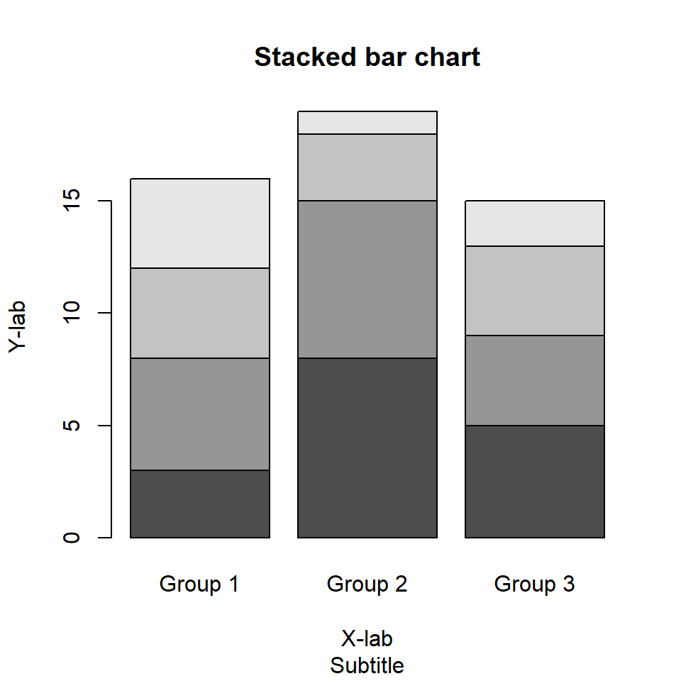
Horizontal bar chart
If you prefer a horizontal stacked bar chart rather than vertical set horiz = TRUE.
barplot(tabl,
        horiz = TRUE)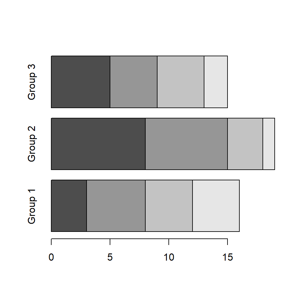
Custom group names
The function also allows modifying the names of the groups displayed along the X-axis (Y-axis for horizontal bar plots) with names.arg argument.
barplot(tabl,
        names.arg = c("G1", "G2", "G3"))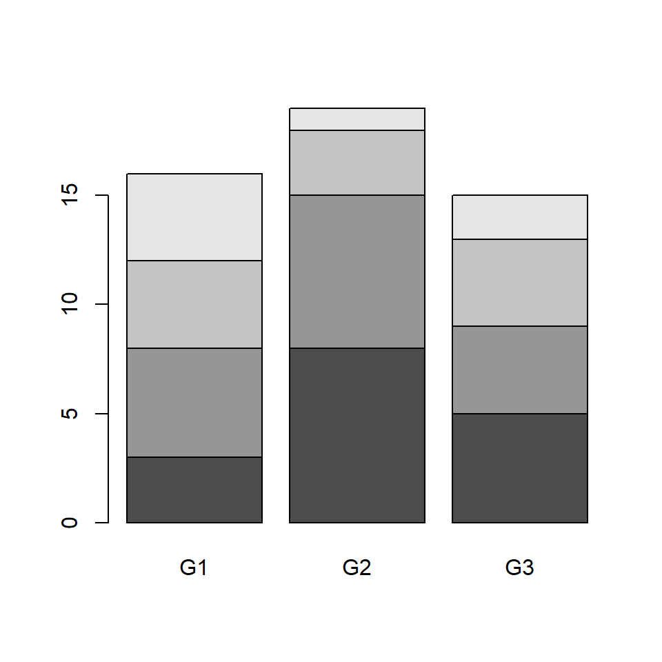
Fill color and borders
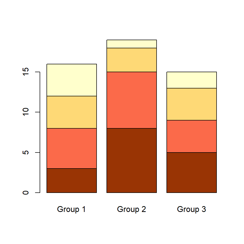
Color palette
If you want to customize the color palette use col argument. You will need to specify as many colors as rows your table has. Check the color palette section to choose your palette.
barplot(tabl, col = c("#993404", "#FB6A4A",
                      "#FED976", "#FFFFCC"))
Border color
The border color, which defaults to black, can be customized with border argument.
# Stacked bar plot with brown border
barplot(tabl, col = c("#993404", "#FB6A4A",
                      "#FED976", "#FFFFCC"),
        border = "brown")
Remove the borders
If you prefer to remove all the borders set border = NA.
# Stacked bar plot without border
barplot(tabl, col = c("#993404", "#FB6A4A",
                      "#FED976", "#FFFFCC"),
        border = NA)
Adding a legend to the stacked plot
Adding a legend
The barplot function comes with an argument named legend.text, which allows adding a legend to the bar graph without using the legend function.
# Stacked bar plot with legend
barplot(tabl, col = c("#993404", "#FB6A4A",
                      "#FED976", "#FFFFCC"),
        legend.text = rownames(tabl))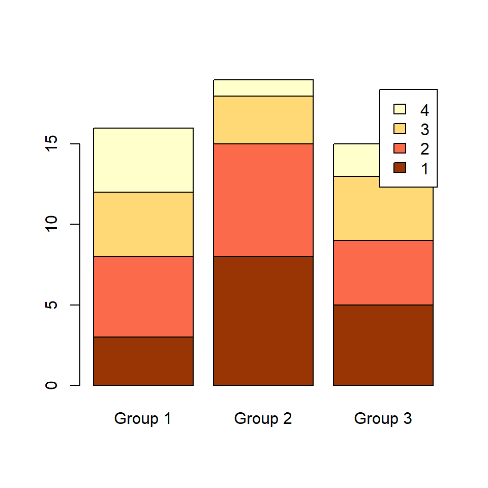
Legend customization
If you want to customize the legend you can pass the arguments of the legend function to args.legend argument as a list.
# Stacked bar plot with legend
barplot(tabl, col = c("#993404", "#FB6A4A",
                      "#FED976", "#FFFFCC"),
        legend.text = rownames(tabl),
        args.legend = list(x = "topleft"))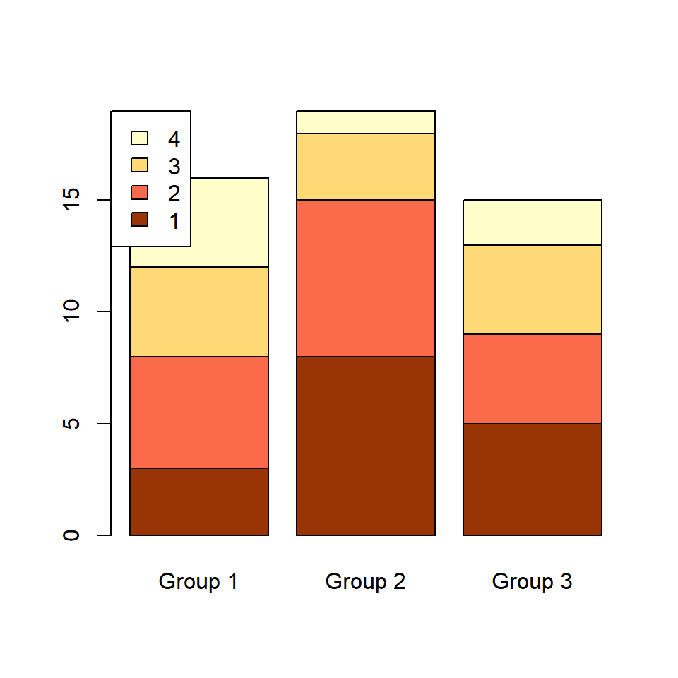
Legend outside the bar chart
You may have noticed that the legend is over the bar chart in our example. If you want to place the legend outside the chart increase the corresponding margin and fine tune the position of the legend with inset as in the following example.
# Increase the right margin
par(mar = c(5.1, 4.1, 4.1, 4))

# Stacked bar chart with legend
barplot(tabl,
        col = c("#993404", "#FB6A4A",
                "#FED976", "#FFFFCC"),
        legend.text = rownames(tabl),
        args.legend = list(x = "topright",
inset = c(-0.2, 0))) 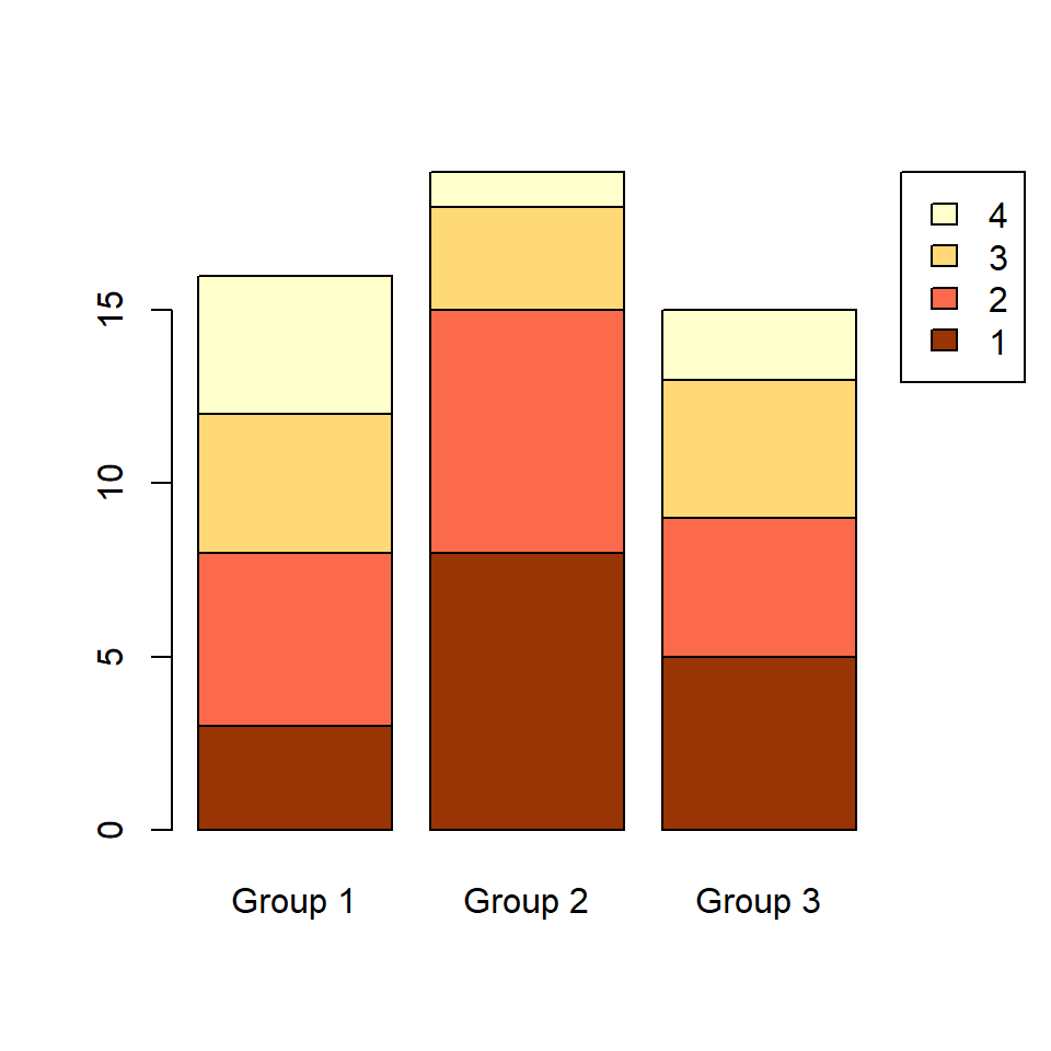

Master Statistics
Learn statistics from the basics to advanced techniques, clearly explained
Go to site