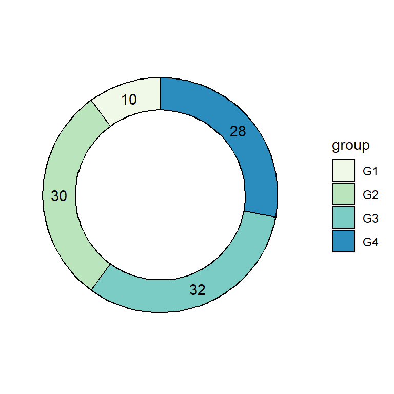
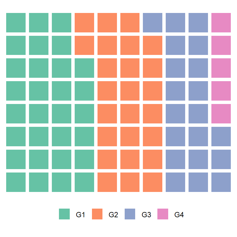
Sample data
The following data frame contains a numerical variable representing the count of some event and the corresponding label for each value.
df <- data.frame(value = c(10, 23, 15, 18),
group = paste0("G", 1:4))| value | group |
|---|---|
| 10 | G1 |
| 23 | G2 |
| 15 | G3 |
| 18 | G4 |
Basic pie chart with geom_bar or geom_col and coord_polar
Basic pie chart
A pie chart in ggplot is a bar plot plus a polar coordinate. You can use geom_bar or geom_col and theta = "y" inside coord_polar.
# install.packages("ggplot2")
library(ggplot2)

ggplot(df, aes(x = "", y = value, fill = group)) +
  geom_col() +
  coord_polar(theta = "y")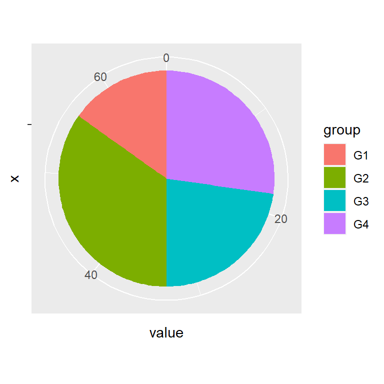
Color of the lines
The borders of the pie can be changed with the color argument of the geom_bar or geom_col function.
# install.packages("ggplot2")
library(ggplot2)

ggplot(df, aes(x = "", y = value, fill = group)) +
  geom_col(color = "black") +
  coord_polar(theta = "y")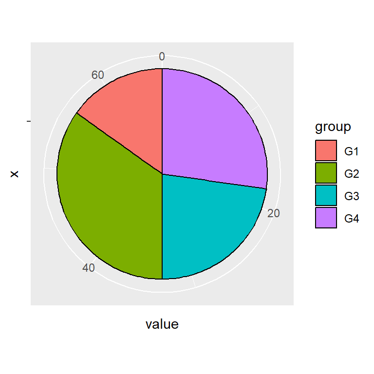
Text and labels
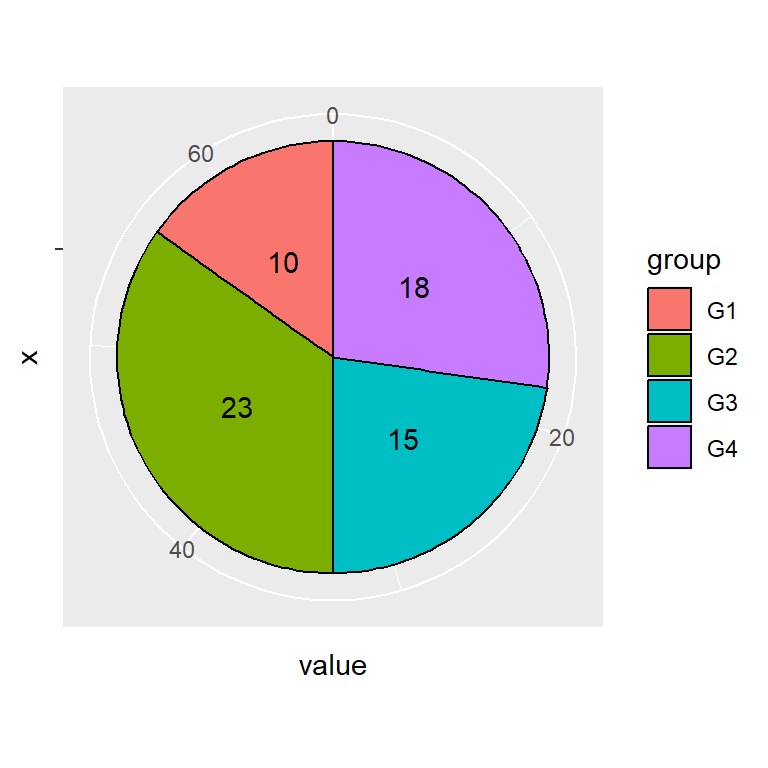
Adding text
By default, the values are not displayed inside each slice. You can add them with geom_text. Note that position_stack(vjust = 0.5) will place the labels in the correct position.
# install.packages("ggplot2")
library(ggplot2)

ggplot(df, aes(x = "", y = value, fill = group)) +
  geom_col(color = "black") +
  geom_text(aes(label = value),
            position = position_stack(vjust = 0.5)) +
  coord_polar(theta = "y")
Adding labels
An alternative to geom_text is using geom_label, which adds a border around the values. If you set this the legend will display the letter “a” inside the boxes, so we have overridden this behavior with show.legend = FALSE.
# install.packages("ggplot2")
library(ggplot2)

ggplot(df, aes(x = "", y = value, fill = group)) +
  geom_col(color = "black") +
  geom_label(aes(label = value),
             position = position_stack(vjust = 0.5),
             show.legend = FALSE) +
  coord_polar(theta = "y")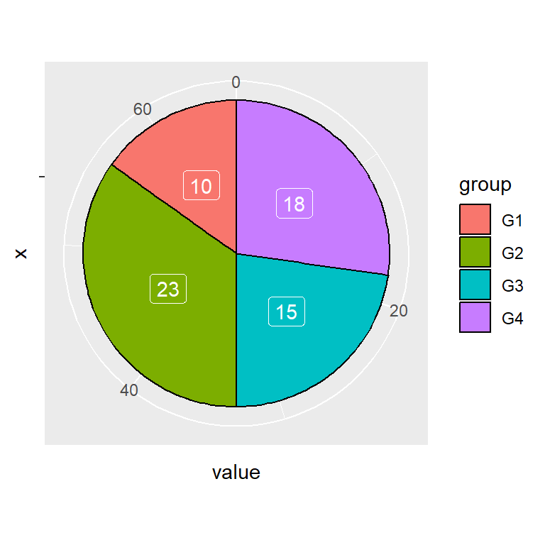
Labels color
Note that you can change the color of the labels with color.
# install.packages("ggplot2")
library(ggplot2)

ggplot(df, aes(x = "", y = value, fill = group)) +
  geom_col(color = "black") +
  geom_label(aes(label = value),
             color = "white",
             position = position_stack(vjust = 0.5),
             show.legend = FALSE) +
  coord_polar(theta = "y")
Color customization
Color palette
The default color palette can be changed with a predefined color palette, such as the scale_fill_brewer or scale_fill_viridis_d.
# install.packages("ggplot2")
library(ggplot2)

ggplot(df, aes(x = "", y = value, fill = group)) +
  geom_col(color = "black") +
  geom_text(aes(label = value),
            position = position_stack(vjust = 0.5)) +
  coord_polar(theta = "y") +
  scale_fill_brewer()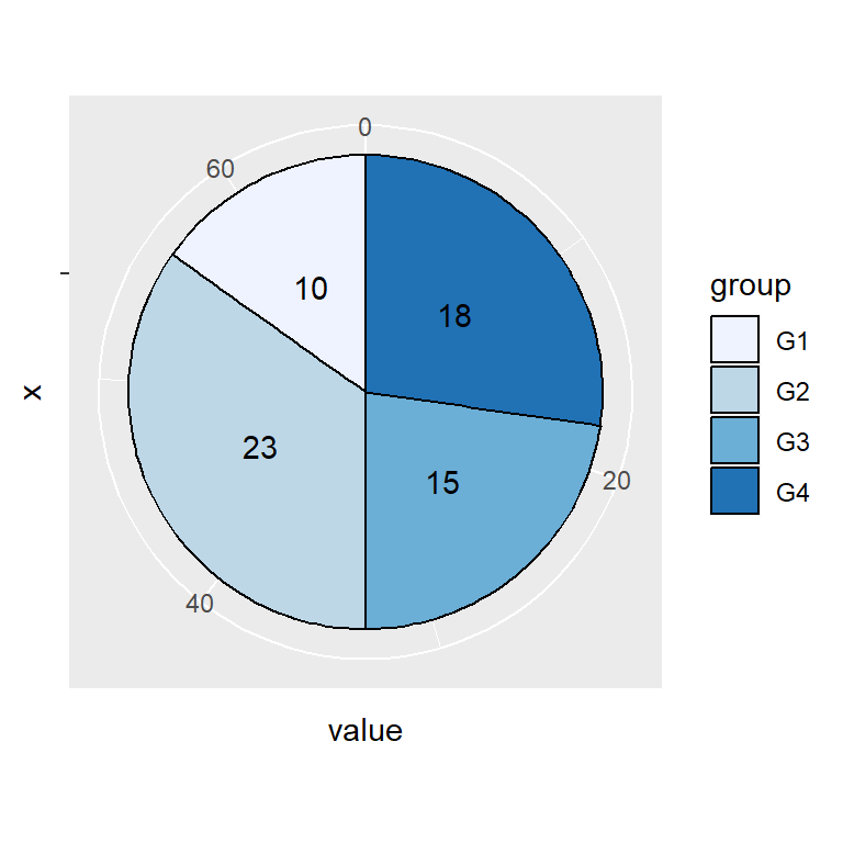
Custom colors
If you prefer setting your own colors you can make use of scale_fill_manual and set the corresponding colors.
# install.packages("ggplot2")
library(ggplot2)

ggplot(df, aes(x = "", y = value, fill = group)) +
  geom_col(color = "black") +
  geom_text(aes(label = value),
            position = position_stack(vjust = 0.5)) +
  coord_polar(theta = "y") +
  scale_fill_manual(values = c("#BE2A3E", "#EC754A",
                               "#EACF65", "#3C8D53"))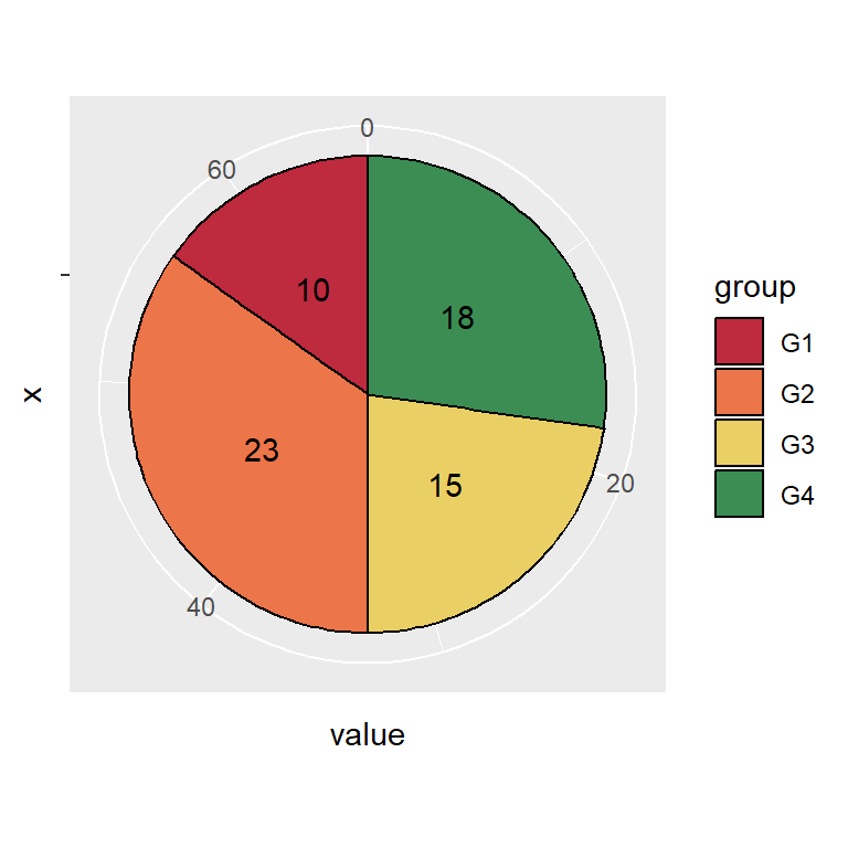
Theme customization
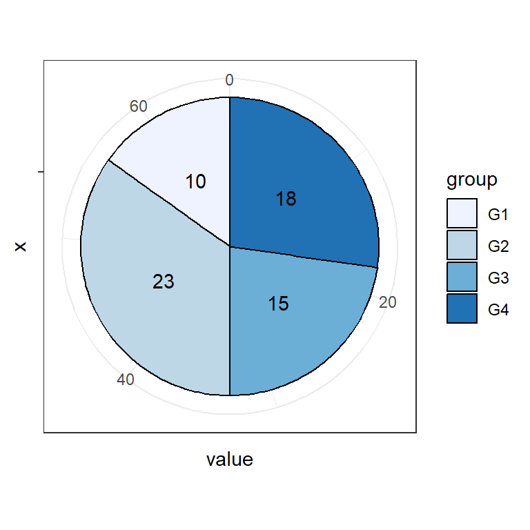
The default pie chart styling can be changed in ggplot2 making use of themes.
# install.packages("ggplot2")
library(ggplot2)

ggplot(df, aes(x = "", y = value, fill = group)) +
  geom_col(color = "black") +
  geom_text(aes(label = value),
            position = position_stack(vjust = 0.5)) +
  coord_polar(theta = "y") +
  scale_fill_brewer() +
  theme_bw()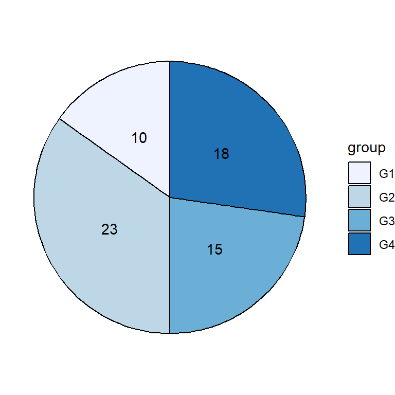
You can also remove the whole theme with theme_void.
# install.packages("ggplot2")
library(ggplot2)

ggplot(df, aes(x = "", y = value, fill = group)) +
  geom_col(color = "black") +
  geom_text(aes(label = value),
            position = position_stack(vjust = 0.5)) +
  coord_polar(theta = "y") +
  scale_fill_brewer() +
  theme_void()
You can get a customized style customizing the theme components. Note that you can create your custom theme if you want to reproduce the styling.
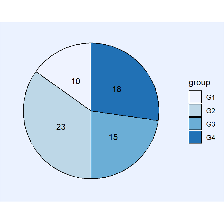
# install.packages("ggplot2")
library(ggplot2)

ggplot(df, aes(x = "", y = value, fill = group)) +
  geom_col(color = "black") +
  geom_text(aes(label = value),
            position = position_stack(vjust = 0.5)) +
  coord_polar(theta = "y") +
  scale_fill_brewer() +
  theme(axis.text = element_blank(),
        axis.ticks = element_blank(),
        axis.title = element_blank(),
        panel.grid = element_blank(),
        panel.background = element_rect(fill = "#ebf2ff"),
        plot.background = element_rect(fill = "#ebf2ff"),
        legend.background = element_rect(fill = "#ebf2ff"))
Legend customization
Legend title
The default legend title is the name of the categorical variable of the input data frame. Change it following the example below.
# install.packages("ggplot2")
library(ggplot2)

ggplot(df, aes(x = "", y = value, fill = group)) +
  geom_col(color = "black") +
  geom_text(aes(label = value),
            position = position_stack(vjust = 0.5)) +
  coord_polar(theta = "y") +
  guides(fill = guide_legend(title = "Title"))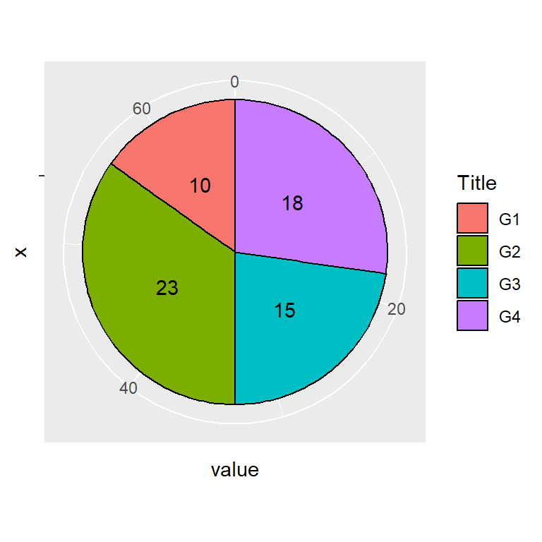
Legend labels
The labels of the lagend can also be modified. Use the labels argument of scale_fill_discrete or scale_fill_manual.
# install.packages("ggplot2")
library(ggplot2)

ggplot(df, aes(x = "", y = value, fill = group)) +
  geom_col(color = "black") +
  geom_text(aes(label = value),
            position = position_stack(vjust = 0.5)) +
  coord_polar(theta = "y") +
  scale_fill_discrete(labels = c("A", "B", "C", "D"))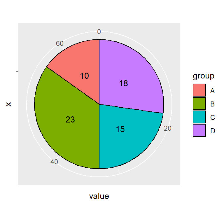
Legend position
The legend can be placed in several positions with the legend.position component of the theme function. Possible placement values are "bottom", "left", "top" and "right" (default).
# install.packages("ggplot2")
library(ggplot2)

ggplot(df, aes(x = "", y = value, fill = group)) +
  geom_col(color = "black") +
  geom_text(aes(label = value),
            position = position_stack(vjust = 0.5)) +
  coord_polar(theta = "y") +
  theme(legend.position = "bottom")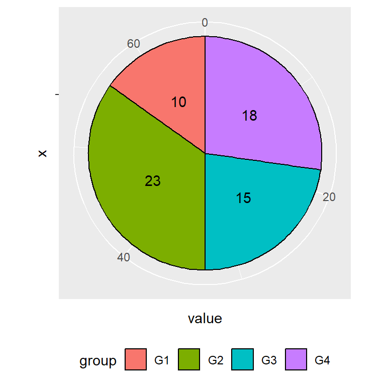
Remove the legend
If you prefer removing the legend set the position component to "none".
# install.packages("ggplot2")
library(ggplot2)

ggplot(df, aes(x = "", y = value, fill = group)) +
  geom_col(color = "black") +
  geom_text(aes(label = value),
            position = position_stack(vjust = 0.5)) +
  coord_polar(theta = "y") +
  theme(legend.position = "none")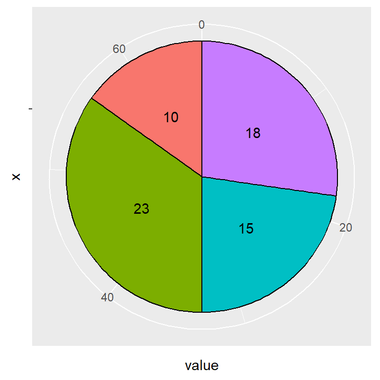

Master Statistics
Learn statistics from the basics to advanced techniques, clearly explained
Go to site