Sample data
The following data frame contains two variables. The first is a categorical variable which represents unique groups (labels, years, …) while the second represents the corresponding value for each label. This data will be used along this tutorial.
# Data
set.seed(6)
df <- data.frame(group = LETTERS[1:20],
                 value = rnorm(20))
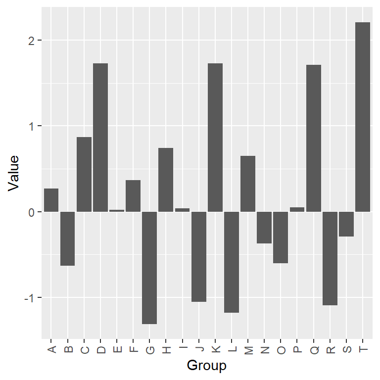
Diverging bar graph with geom_bar
Diverging bar charts are a type of bar charts which can be used to visualize the spread between values, generally positive and negative.
Default diverging bar chart in ggplot2
In order to create a diverging bar plot in ggplot2 you can use the geom_bar function with your data.
# install.packages("ggplot2")
library(ggplot2)

ggplot(df, aes(x = group, y = value)) +
  geom_bar(stat = "identity",
           show.legend = FALSE) + # Remove the legend
  xlab("Group") +
  ylab("Value")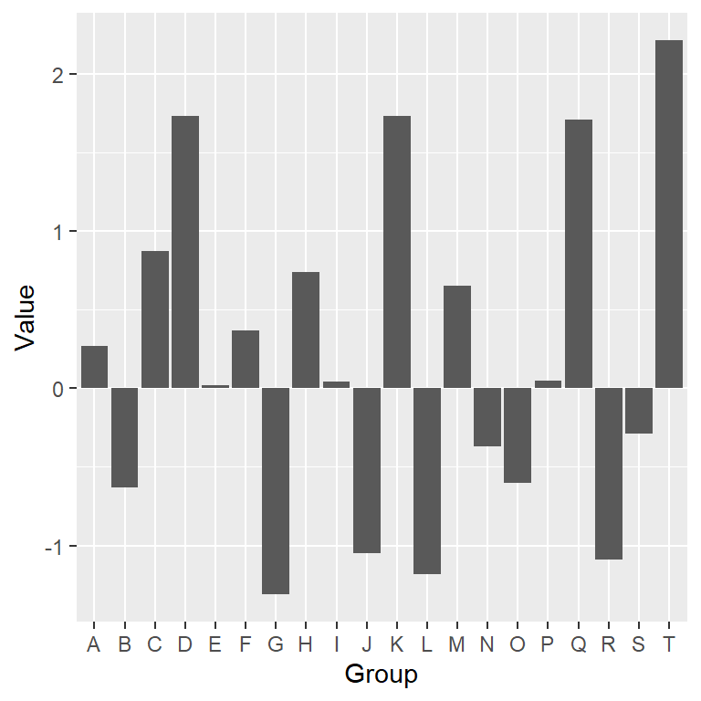
Reorder the values
Note that for better visualization it is recommended to reorder the bars based on the value they represent. For that purpose you can use the reorder function as shown below.
# install.packages("ggplot2")
library(ggplot2)

ggplot(df, aes(x = reorder(group, value), y = value)) +
  geom_bar(stat = "identity",
           show.legend = FALSE) +
  xlab("Group") +
  ylab("Value")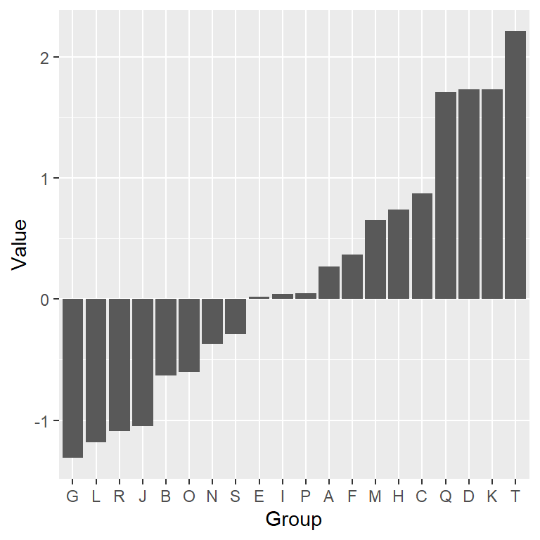
Vertical diverging bar chart
Diverging bar charts can both be vertical or horizontal. If you prefer a vertical diverging bar plot change the order of the variables inside aes or use coord_flip to rotate the axes.
# install.packages("ggplot2")
library(ggplot2)

ggplot(df, aes(x = reorder(group, value), y = value)) +
  geom_bar(stat = "identity",
           show.legend = FALSE) +
  xlab("Group") +
  ylab("Value") +
  coord_flip()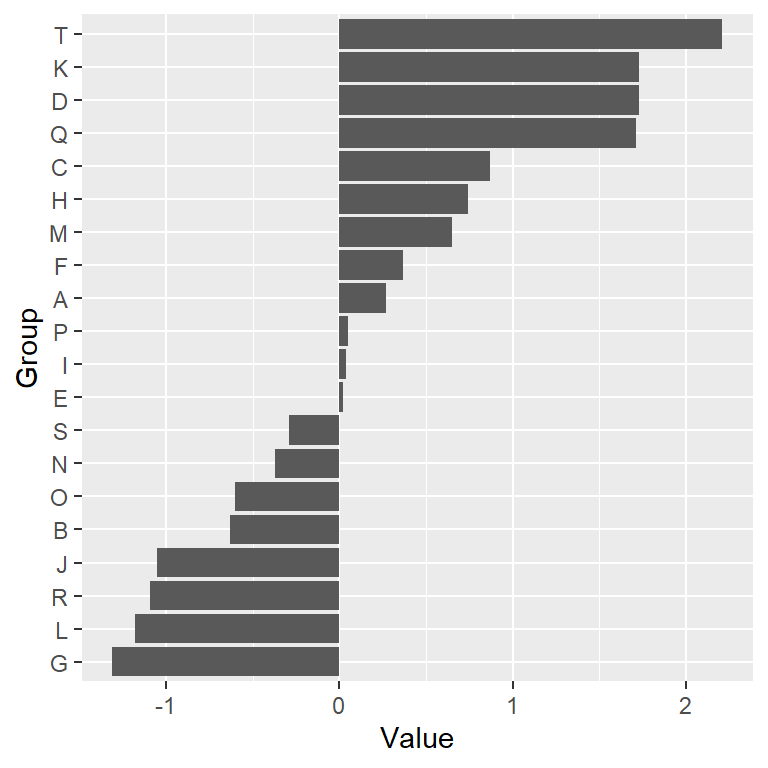
Adding or customizing text labels
You will probably need to rotate the labels of your plot if they are too long or just add additional information to the bars. In this scenario you will need to use the arguments of the theme function, modify the axes limits or use the geom_text function for adding additional texts, as shown in the following examples
Flipping the names of the categorical variable
# install.packages("ggplot2")
library(ggplot2)

ggplot(df, aes(x = group, y = value)) +
  geom_bar(stat = "identity",
           show.legend = FALSE) +
  xlab("Group") +
  ylab("Value") +
  theme(axis.text.x = element_text(angle = 90,
                                   hjust = 1,
                                   vjust = 0.5))
Adding text for each bar (vertical text)
# install.packages("ggplot2")
library(ggplot2)

ggplot(df, aes(x = reorder(group, value), y = value)) +
  geom_bar(stat = "identity",
           show.legend = FALSE) +
  geom_text(aes(label = round(value, 1),
                angle = 90,
                hjust = ifelse(value < 0, 1.25, -0.25),
                vjust = 0.5),
            size = 3) +
  xlab("Group") +
  ylab("Value") +
  scale_y_continuous(limits = c(min(df$value) - 0.2,
                                max(df$value) + 0.2))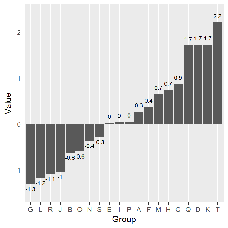
Adding text for each bar (horizontal text)
# install.packages("ggplot2")
library(ggplot2)

ggplot(df, aes(x = reorder(group, value), y = value)) +
  geom_bar(stat = "identity",
           show.legend = FALSE) +
  geom_text(aes(label = round(value, 1),
                hjust = 0.5,
                vjust = ifelse(value < 0, 1.5, -1)),
            size = 2.5) +
  xlab("Group") +
  ylab("Value") +
  scale_y_continuous(limits = c(min(df$value) - 0.2,
                                max(df$value) + 0.2))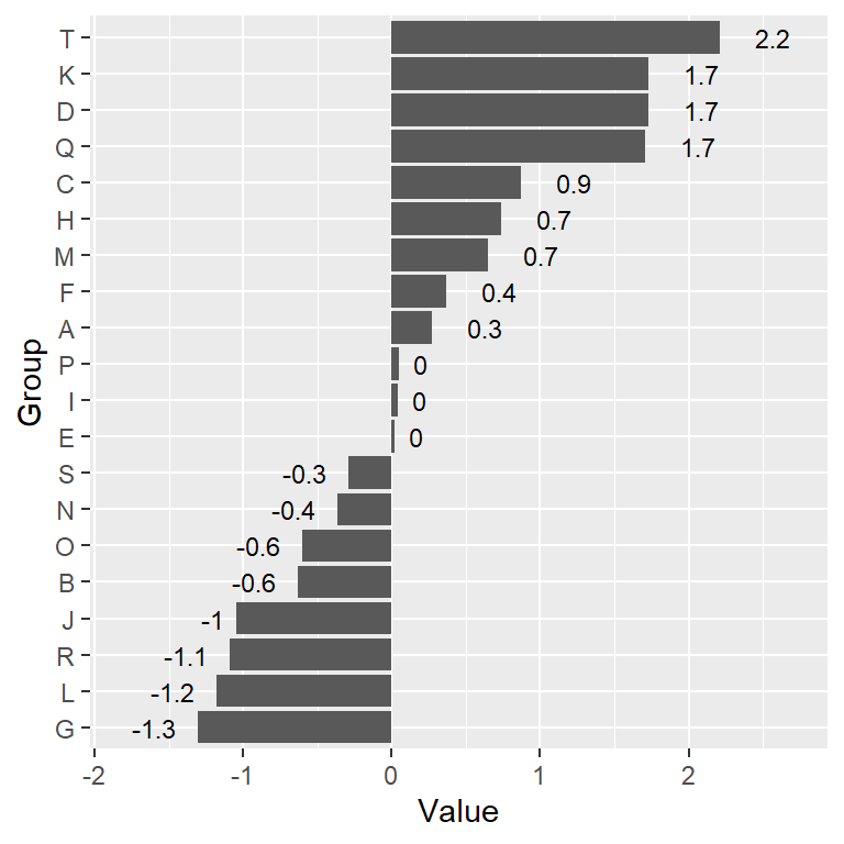
Adding text for each bar (vertical plot)
# install.packages("ggplot2")
library(ggplot2)

ggplot(df, aes(x = reorder(group, value), y = value)) +
  geom_bar(stat = "identity",
           show.legend = FALSE) +
  geom_text(aes(label = round(value, 1),
                hjust = ifelse(value < 0, 1.5, -1),
                vjust = 0.5),
            size = 3) +
  xlab("Group") +
  ylab("Value") +
  coord_flip() +
  scale_y_continuous(breaks= seq(-2, 2, by = 1),
                                limits = c(min(df$value) - 0.5,
                                           max(df$value) + 0.5))
Color customization
By default, the bars of the diverging bar chart are dark gray. However, it is very easy to customize the fill color of the bars and its border color in several ways.
Overriding the default bars color
In order to change the background and the border color for all the bars just pass the desired colors to fill and color arguments of geom_bar, respectively.
# install.packages("ggplot2")
library(ggplot2)

ggplot(df, aes(x = reorder(group, value), y = value)) +
  geom_bar(stat = "identity",
           show.legend = FALSE,
           fill = 4,          # Background color
           color = "white") + # Border color
  xlab("Group") +
  ylab("Value")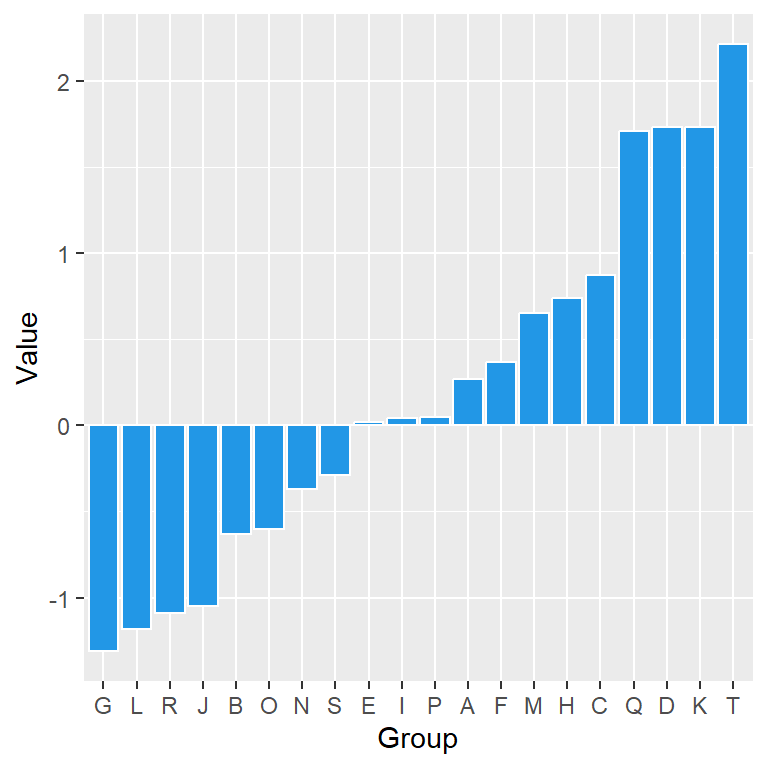
Color based on value
It is very common to set a different color based on the break point. To achieve a different color you can create a new categorical variable based on the desired value and pass it to the fill argument.
# install.packages("ggplot2")
library(ggplot2)

# Color based on value
color <- ifelse(df$value < 0, "pink", "lightblue")

ggplot(df, aes(x = reorder(group, value), y = value)) +
  geom_bar(stat = "identity",
           show.legend = FALSE,
           fill = color,      # Background color
           color = "white") + # Border color
  xlab("Group") +
  ylab("Value")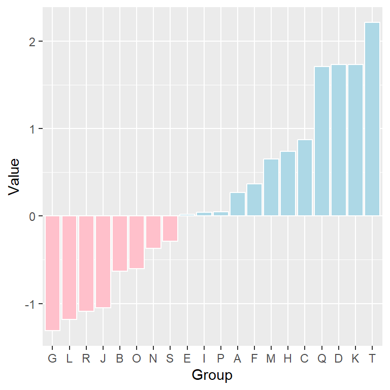
Gradient color
Note that you can also pass a numerical variable to fill. The default gradient colors of the bars can be modified making use of the scale_fill_gradient functions.
# install.packages("ggplot2")
library(ggplot2)

ggplot(df, aes(x = reorder(group, value), y = value)) +
  geom_bar(stat = "identity",
           show.legend = FALSE,
           aes(fill = value),  # Background color
           color = "gray30") + # Border color
  xlab("Group") +
  ylab("Value") +
  scale_fill_gradient2(low = "#F4A460",
                       mid = "aliceblue",
                       high = "#6495ED")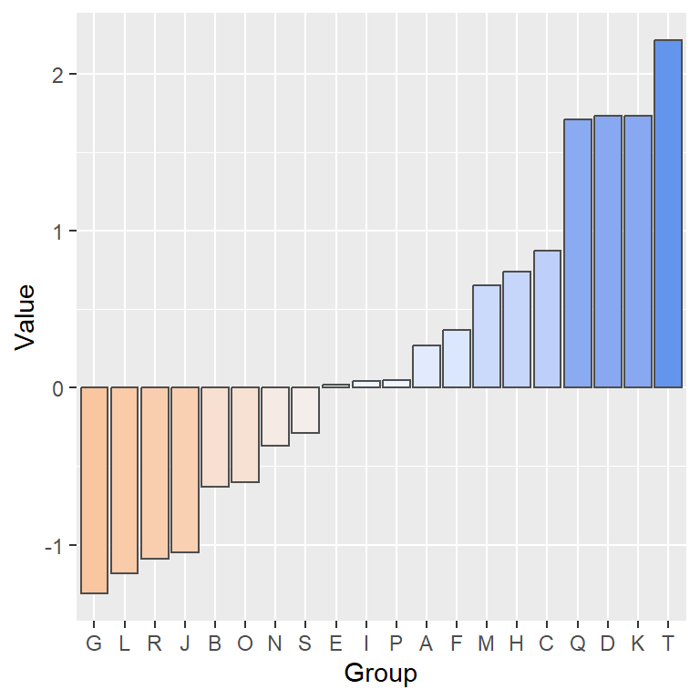
Advanced diverging bar plot in ggplot2
Finally, we are going to create a couple of more advanced examples of diverging bar charts in ggplot2, customizing the theme, the colors, the axes limits and the grid.
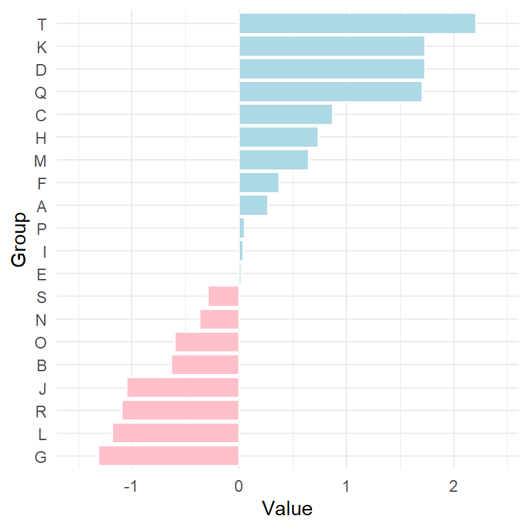
Example 1: axis limits, color and theme
# install.packages("ggplot2")
library(ggplot2)

# Color based on value
color <- ifelse(df$value < 0, "pink", "lightblue")

ggplot(df, aes(x = reorder(group, value), y = value)) +
  geom_bar(stat = "identity",
           show.legend = FALSE,
           fill = color,      # Background color
           color = "white") + # Border color
  xlab("Group") +
  ylab("Value") +
  scale_y_continuous(breaks= seq(-2, 2, by = 1),
                     limits = c(min(df$value) - 0.2,
                                max(df$value) + 0.2)) +
  coord_flip() +
  theme_minimal() # Theme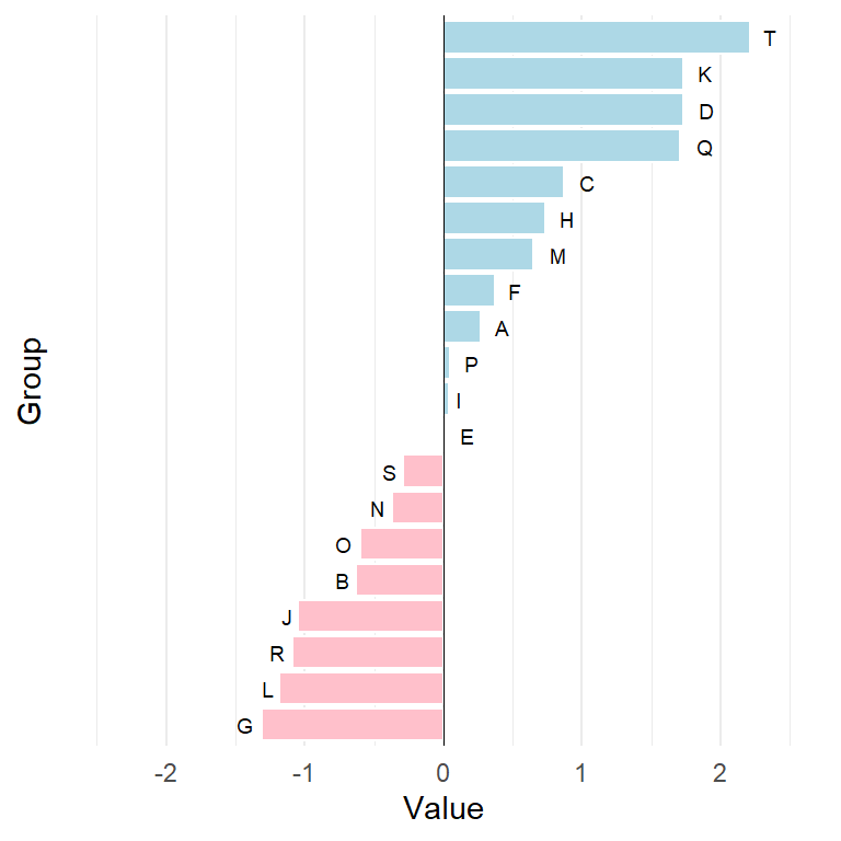
Example 2: names for each bar, vertical grid and vertical line
# install.packages("ggplot2")
library(ggplot2)

# Color based on value
color <- ifelse(df$value < 0, "pink", "lightblue")

ggplot(df, aes(x = reorder(group, value), y = value)) +
  geom_bar(stat = "identity",
           show.legend = FALSE,
           fill = color,
           color = "white") +
  geom_hline(yintercept = 0, color = 1, lwd = 0.2) +
  geom_text(aes(label = group, # Text with groups
                hjust = ifelse(value < 0, 1.5, -1),
                vjust = 0.5), size = 2.5) +
  xlab("Group") +
  ylab("Value") +
  scale_y_continuous(breaks = seq(-2, 2, by = 1),
                     limits = c(-2.5, 2.5)) +
  coord_flip() +
  theme_minimal() +
  theme(axis.text.y = element_blank(),  # Remove Y-axis texts
        axis.ticks.y = element_blank(), # Remove Y-axis ticks
        panel.grid.major.y = element_blank()) # Remove horizontal grid
Master Statistics
Learn statistics from the basics to advanced techniques, clearly explained
Go to site