Data transformation
The data set below contains the answers (Yes, No or N/A) of a poll. This data will be transformed an used in the examples of this tutorial.
set.seed(11022021)

# Variables
ans <- sample(c("Yes", "No", "N/A"),
              size = 100, replace = TRUE,
              prob = c(0.4, 0.35, 0.25))
gen <- sample(c("Male", "Female"),
              size = 100, replace = TRUE)

# Change the levels of the variable
# so "Yes" appears first in the legend
ans <- factor(ans, levels = c("Yes", "No", "N/A"))

# Data frame
data <- data.frame(answer = ans,
                   gender = gen)
Making use of dplyr you can get the percentage for each type of answer or for each gender. In the following example we are calculating the percentage by type of answer and adding a new column with percentages, making use of the percent function of the scales library.
# install.packages("dplyr")
# install.packages("scales")
library(dplyr)

# Data transformation
df <- data %>%
  group_by(answer) %>% # Variable to be transformed
  count() %>%
  ungroup() %>%
  mutate(perc = `n` / sum(`n`)) %>%
  arrange(perc) %>%
  mutate(labels = scales::percent(perc))
In the previous table the first column represents the possible answers, the second the absolute frequency, the third the relative frequency and the fourth the percentage with the symbol.
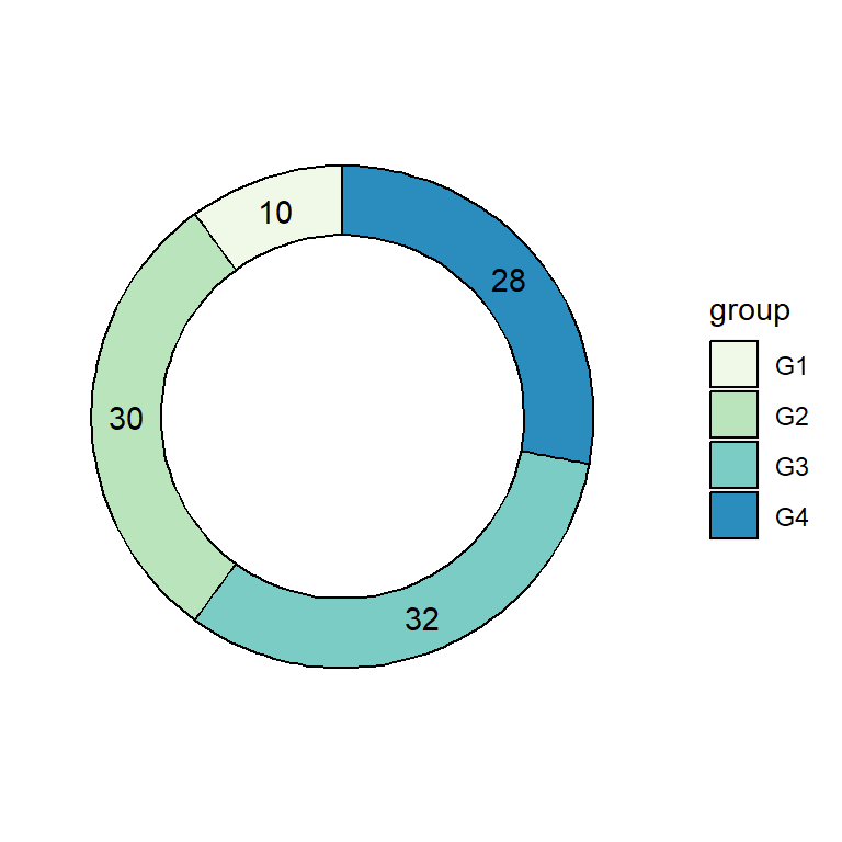
Pie chart with percentages
Once you have transformed your data, you can pass the column containing the relative frequency to y and fill by the categorical variable representing groups.
# install.packages("ggplot2")
library(ggplot2)

ggplot(df, aes(x = "", y = perc, fill = answer)) +
  geom_col() +
  coord_polar(theta = "y")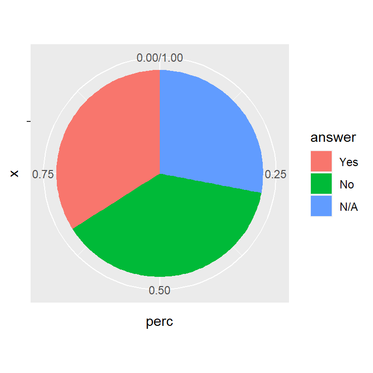
Adding the percentage labels of the pie chart

The labels column allows you to add the labels with percentages. In this example we are adding them with geom_text.
# install.packages("ggplot2")
library(ggplot2)

ggplot(df, aes(x = "", y = perc, fill = answer)) +
  geom_col() +
  geom_text(aes(label = labels),
            position = position_stack(vjust = 0.5)) +
  coord_polar(theta = "y")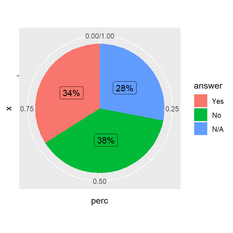
An alternative to geom_text is geom_label. Note that we had to override the aesthetic of the legend with show.legend = FALSE, or a letter will appear over the legend fill colors.
# install.packages("ggplot2")
library(ggplot2)

ggplot(df, aes(x = "", y = perc, fill = answer)) +
  geom_col() +
  geom_label(aes(label = labels),
             position = position_stack(vjust = 0.5),
             show.legend = FALSE) +
  coord_polar(theta = "y")
Further customization
The pie charts can be customized in several ways. You can customize the legend, the colors or the themes. In the following example we removed the default theme with theme_void. See the article about pie charts in ggplot2 for additional customization of the ggplot2 pie charts and its legend.
# install.packages("ggplot2")
library(ggplot2)

ggplot(df, aes(x = "", y = perc, fill = answer)) +
  geom_col(color = "black") +
  geom_label(aes(label = labels), color = c(1, "white", "white"),
            position = position_stack(vjust = 0.5),
            show.legend = FALSE) +
  guides(fill = guide_legend(title = "Answer")) +
  scale_fill_viridis_d() +
  coord_polar(theta = "y") +
  theme_void()

Master Statistics
Learn statistics from the basics to advanced techniques, clearly explained
Go to site