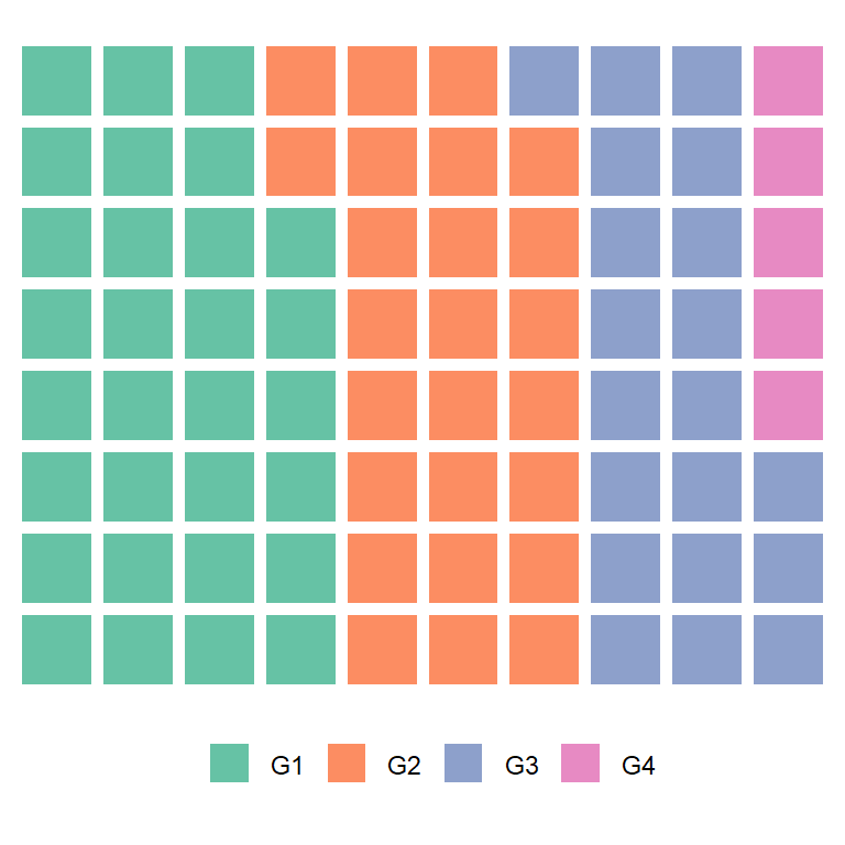
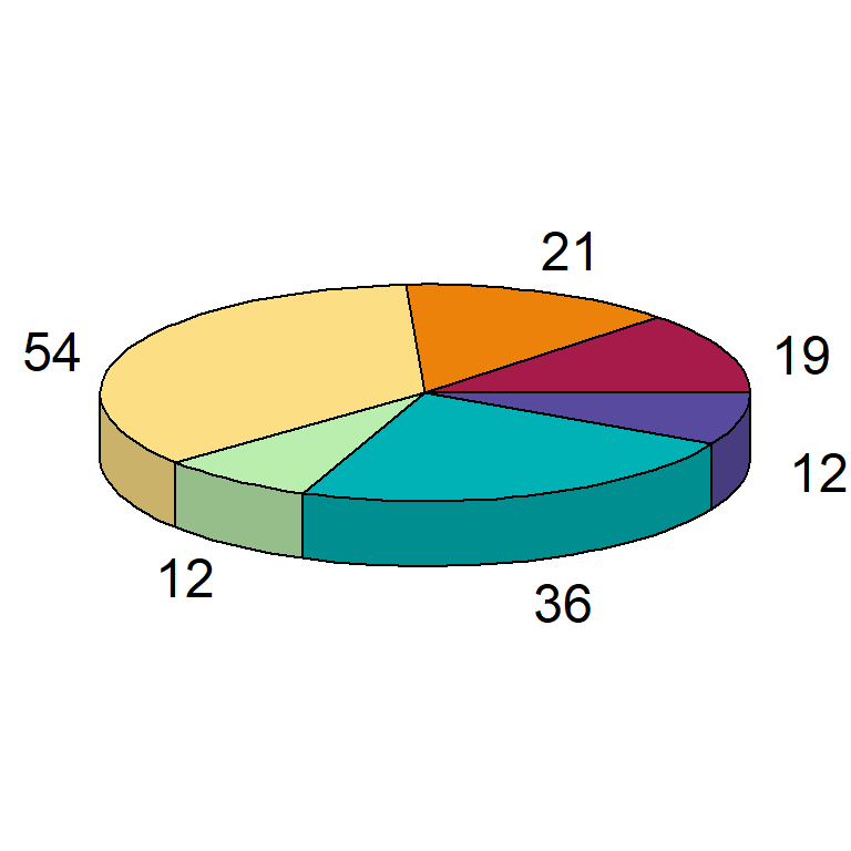
Sample data set
The data frame below contains a numerical variable representing a percentage and a categorical variable representing groups. This data frame will be used in the following examples.
df <- data.frame(value = c(15, 25, 32, 28),
                 group = paste0("G", 1:4))
Pie chart with values outside using ggrepel
If you need to display the values of your pie chart outside for styling or because the labels doesn’t fit inside the slices you can use the geom_label_repel function of the ggrepel package after transforming the original data frame as in the example below.
# install.packages("ggplot2")
# install.packages("ggrepel")
# install.packages("tidyverse")
library(ggplot2)
library(ggrepel)
library(tidyverse)

# Get the positions
df2 <- df %>%
  mutate(csum = rev(cumsum(rev(value))),
         pos = value/2 + lead(csum, 1),
         pos = if_else(is.na(pos), value/2, pos))

ggplot(df, aes(x = "" , y = value, fill = fct_inorder(group))) +
  geom_col(width = 1, color = 1) +
  coord_polar(theta = "y") +
  scale_fill_brewer(palette = "Pastel1") +
  geom_label_repel(data = df2,
                   aes(y = pos, label = paste0(value, "%")),
                   size = 4.5, nudge_x = 1, show.legend = FALSE) +
  guides(fill = guide_legend(title = "Group")) +
  theme_void()
Note that you can display the percentage, the values, the groups or any labels using this method.
Pie chart with values inside and labels outside
An alternative to the previous example is adding the values inside the slices but labeling each slice with a text. You can achieve this passing the calculated positions to the breaks argument of scale_y_continuous and adding the labels.

# install.packages("ggplot2")
# install.packages("tidyverse")
library(ggplot2)
library(tidyverse)

# Get the positions
df2 <- df %>%
  mutate(csum = rev(cumsum(rev(value))),
         pos = value/2 + lead(csum, 1),
         pos = if_else(is.na(pos), value/2, pos))

ggplot(df, aes(x = "", y = value, fill = fct_inorder(group))) +
  geom_col(width = 1, color = 1) +
  geom_text(aes(label = value),
            position = position_stack(vjust = 0.5)) +
  coord_polar(theta = "y") +
  guides(fill = guide_legend(title = "Group")) +
  scale_y_continuous(breaks = df2$pos, labels = df$group) +
  theme(axis.ticks = element_blank(),
        axis.title = element_blank(),
        axis.text = element_text(size = 15),
        legend.position = "none", # Removes the legend
        panel.background = element_rect(fill = "white"))
Master Statistics
Learn statistics from the basics to advanced techniques, clearly explained
Go to site