Data
The following table contains the count the number of Titanic survivals based of their economic status (class). This data will be used in the examples below.
# Data
dat <- apply(Titanic, c(1, 4), sum)| class \ Survived | No | Yes |
|---|---|---|
| 1st | 122 | 203 |
| 2nd | 167 | 118 |
| 3rd | 528 | 178 |
| Crew | 673 | 212 |
Spineplot
Spineplots are a generalization of stacked bar charts. The spineplot function allows creating this type of graph in base R (actually a mosaic plot, which is a spineplot for two or more variables). See ?spineplot to know more about the possible input options.
spineplot(dat)
Transpose the variables
The spineplot can be flipped transposing the data, as in the example below.
spineplot(t(dat))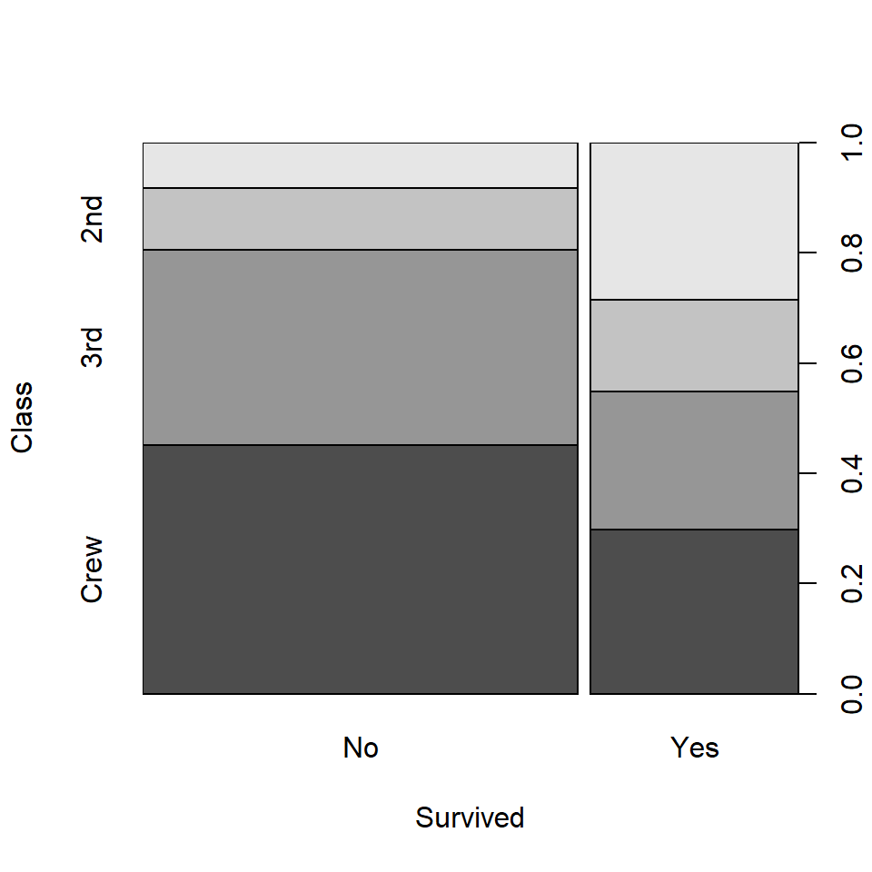
Color customization

Fill color
You can pass a vector of colors to col to customize the default gray scale colors. Pass as many colors as classes on the Y-axis.
spineplot(dat, col = c("#07798D", "#7BCB9F"))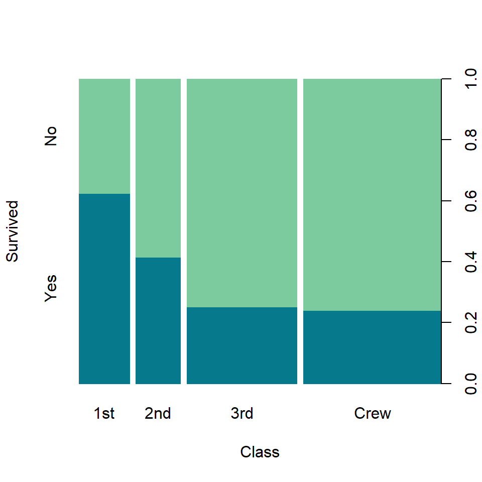
Border color
You can also customize the border color with border. In this example we are setting it to the fill color.
spineplot(dat, col = c("#07798D", "#7BCB9F"),
          border = c("#07798D", "#7BCB9F"))
Spinogram
Spinogram
Spinograms are a generalization of histograms. The default spineplot function creates a spineplot, but setting off = 0 a spinogram will be created, removing the offset between the bars.
spineplot(dat, off = 0)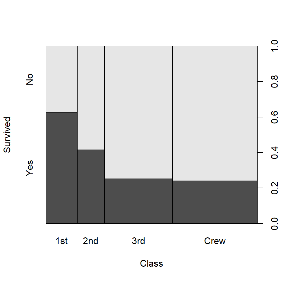

Master Statistics
Learn statistics from the basics to advanced techniques, clearly explained
Go to site