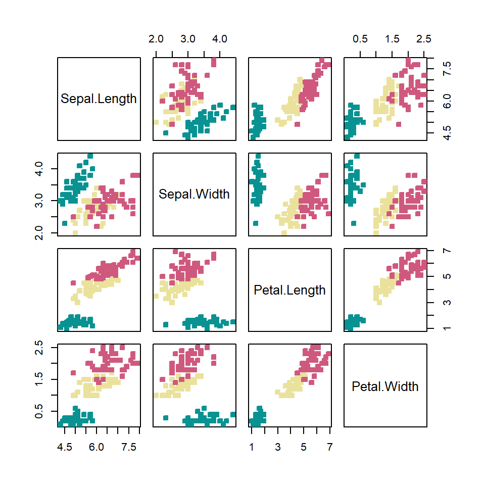
Running PCA
Use prcomp() to run PCA on the numeric columns of your data. Set scale. = TRUE to standardize variables to the same scale — essential when variables have different units or magnitudes.
pca <- prcomp(iris[, 1:4], scale. = TRUE)
Base R: biplot()
The quickest approach is base R. biplot() overlays the observations (row labels) and variables (arrows) on the same axes.
pca <- prcomp(iris[, 1:4], scale. = TRUE)

biplot(pca)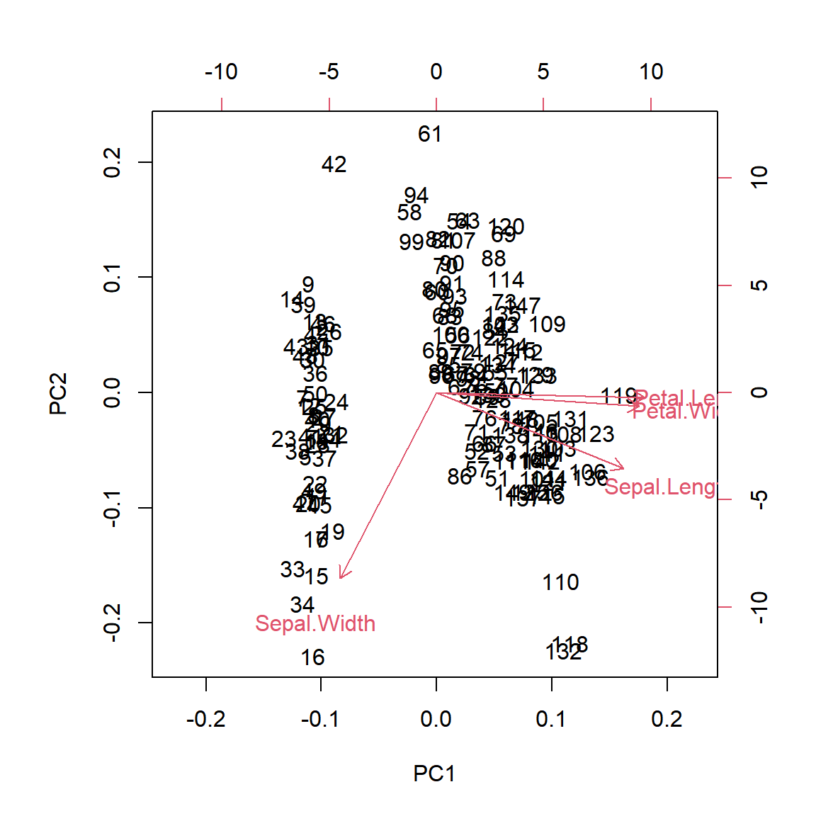
ggfortify::autoplot()
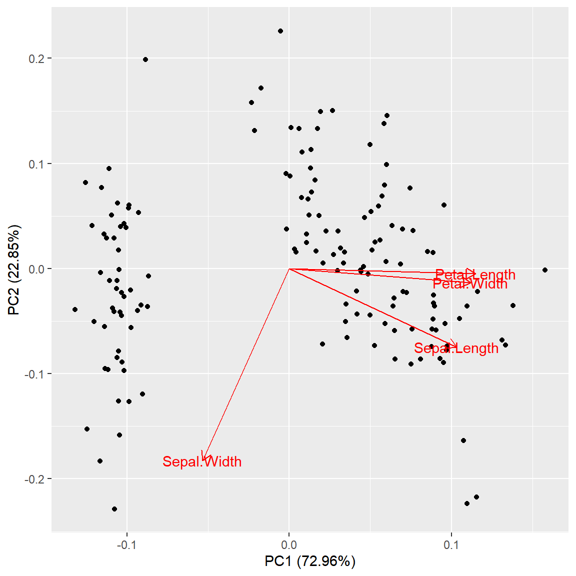
ggfortify adds a prcomp method to ggplot2’s autoplot(). Set loadings = TRUE to draw the variable arrows and loadings.label = TRUE to label them.
# install.packages("ggfortify")
library(ggfortify)

autoplot(pca,
         loadings       = TRUE,
         loadings.label = TRUE)
Color by group
Pass the original data frame to data and map a grouping column to colour to color the observations. The loadings arrows are drawn on top.
# install.packages("ggfortify")
library(ggfortify)

autoplot(pca,
         data           = iris,
         colour         = "Species",
         loadings       = TRUE,
         loadings.label = TRUE)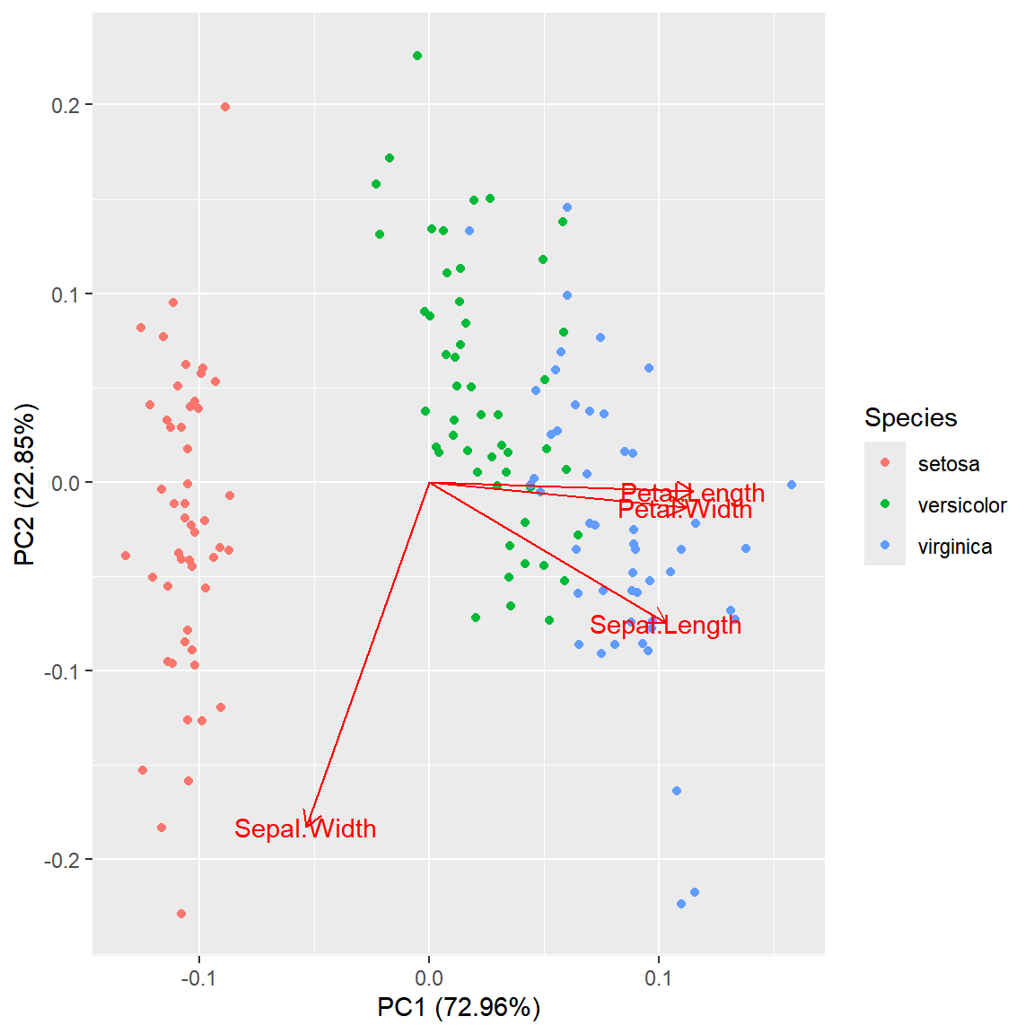
factoextra::fviz_pca_biplot()
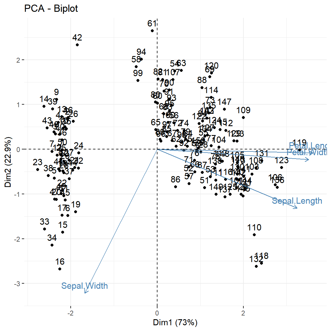
factoextra is the most popular package for PCA visualization. fviz_pca_biplot() produces a polished ggplot2 biplot out of the box with labeled arrows and variance explained on the axes.
# install.packages("factoextra")
library(factoextra)

fviz_pca_biplot(pca)
Groups and confidence ellipses
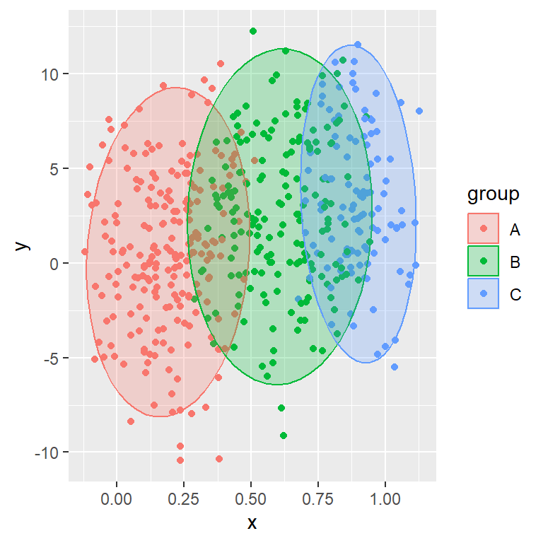
Pass a grouping factor to habillage and set addEllipses = TRUE to draw confidence ellipses around each group. This is the most common way to present PCA results in publications.
# install.packages("factoextra")
library(factoextra)

fviz_pca_biplot(pca,
                habillage   = iris$Species,
                addEllipses = TRUE)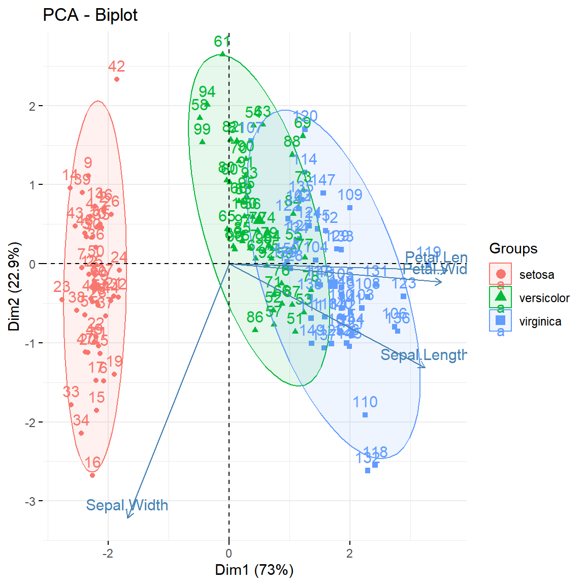
Variable plot
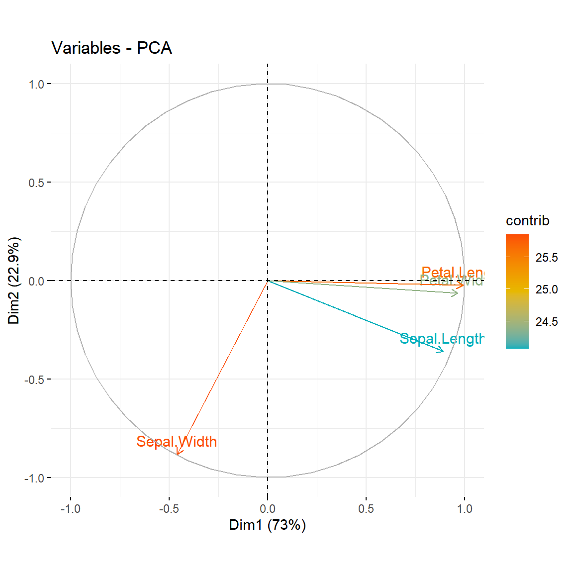
fviz_pca_var() shows only the variable arrows. Set col.var = "contrib" to color each variable by its percentage contribution to the principal components.
# install.packages("factoextra")
library(factoextra)

fviz_pca_var(pca,
             col.var       = "contrib",
             gradient.cols = c("#00AFBB", "#E7B800", "#FC4E07"))
Master Statistics
Learn statistics from the basics to advanced techniques, clearly explained
Go to site