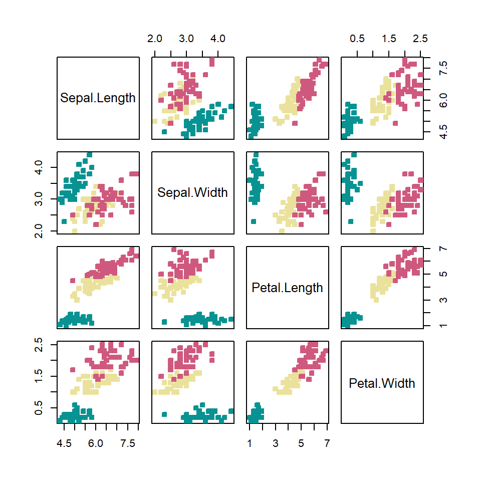
Sample data
The data used in this tutorial are the following random vectors. Copy and paste them in your console to run the examples below.
# Data
set.seed(34)
x <- runif(300)
y <- 5 * x ^ 2 + rnorm(length(x), sd = 2)
group <- ifelse(x < 0.4, "Group 1",
                 ifelse(x > 0.8, "Group 2",
                        "Group 3"))
# Some noise after defining the groups
x <- x + runif(length(x), -0.2, 0.2)
Scatter plot by group
If you have a grouping variable you can create a scatter plot by group passing the variable (as factor) to the col argument of the plot function, so each group will be displayed with a different color.
# Scatter plot
plot(x, y,
     pch = 19,
     col = factor(group))

# Legend
legend("topleft",
       legend = levels(factor(group)),
       pch = 19,
       col = factor(levels(factor(group))))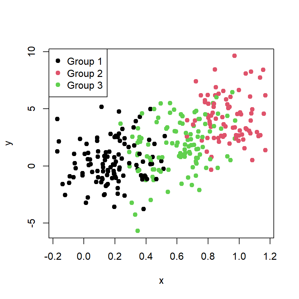
Note that internally the function will store the factors as integers (1 = "black", 2 = "red", 3 = "green", …).
Change the default colors
If you want to change the default colors you can create a vector of colors and pass them to the function as in the following block of code.

# Color selection
colors <- c("#FDAE61", # Orange
            "#D9EF8B", # Light green
            "#66BD63") # Darker green

# Scatter plot
plot(x, y,
     pch = 19,
     col = colors[factor(group)])

# Legend
legend("topleft",
       legend = c("Group 1", "Group 2", "Group 3"),
       pch = 19,
       col = colors)
However, the colors displayed in the graph doesn’t follow the order of your vector of colors, but the order of the levels of the factor (orange for group 1, light green for group 2 and dark green for group 3).
Reorder the colors of the groups
As the displayed color is based on the levels of the grouping variable you can reorder the levels to change the order of the colors as in the following example.
# Color selection
colors <- c("#FDAE61", # Orange
            "#D9EF8B", # Light green
            "#66BD63") # Darker green

# Reorder the factor levels
reordered_groups <- factor(group, levels = c("Group 2",
                                             "Group 1",
                                             "Group 3"))
# Scatter plot
plot(x, y,
     pch = 19,
     col = colors[reordered_groups])

# Legend
legend("topleft",
       legend = c("Group 1", "Group 2", "Group 3"),
       pch = 19,
       col = colors[factor(levels(reordered_groups))])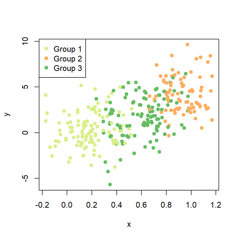
Now the first color (orange) is for group 2, light green for group 1 and dark green for group 3.

Master Statistics
Learn statistics from the basics to advanced techniques, clearly explained
Go to site