Sample plots
In this tutorial we are going to use the following sample plots and then customize their axes. Note that the axes can be continuous if the variable is numerical, discrete for categories or groups or date if the axis represents dates.
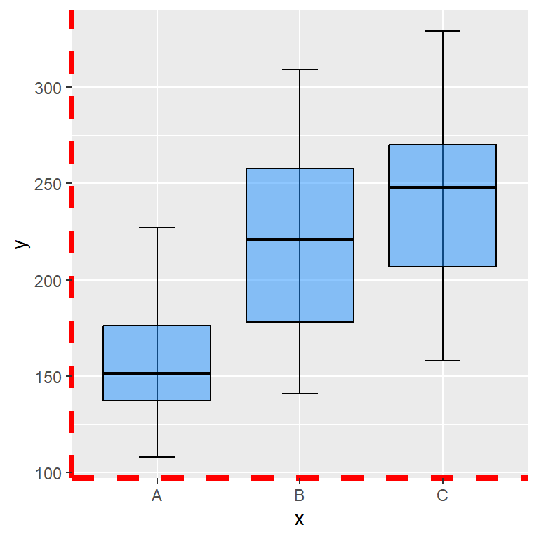
The following sample plot is a box plot by group has a discrete X-axis and a continuous Y-axis:
# install.packages("ggplot2")
library(ggplot2)

# Sample data
x <- droplevels(chickwts$feed[1:36])
levels(x) <- LETTERS[1:3]
y <- chickwts$weight[1:36]
df <- data.frame(x = x, y = y)

# Plot
p <- ggplot(df, aes(x = x, y = y)) +
      stat_boxplot(geom = "errorbar",
                   width = 0.25) +
      geom_boxplot(fill = "dodgerblue1",
                   colour = "black",
                   alpha = 0.5,
                   outlier.colour = "tomato2")
p
The other sample plot we are going to use is a scatter plot, so both axis are continuous.
# install.packages("ggplot2")
library(ggplot2)

# Sample plot with continuous axes
ggplot(cars, aes(x = speed, y = dist)) +
geom_point() 
The sample plot with the box plots has a discrete X-axis and a continuous Y-axis, so you might need to adapt some functions of the examples of this tutorial depending on your data. For instance, if the X-axis of your plot is continuous and you want to change the labels you will need to use scale_x_continuous instead of scale_x_discrete.
Axis titles
labs function
By default, the axis titles are the name of the variables assigned to each axis inside aes, but you can change the default axis labels with the labs function as follows.
p + labs(x = "X-axis title", y = "Y-axis title")
xlab and ylab functions
Alternatively, you can use xlab and ylab functions to set the axis titles individually.
p + xlab("X-axis title") +
    ylab("Y-axis title")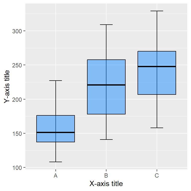
Size, style and colors
The style of the axis titles can be modified through the axis.title component of the theme function. You will need to pass an element_text and customize the style with the corresponding arguments, such as size, color or face.
p + labs(x = "X-axis title", y = "Y-axis title") +
  theme(axis.title = element_text(size = 15,
                                  color = "blue",
                                  face = "bold"))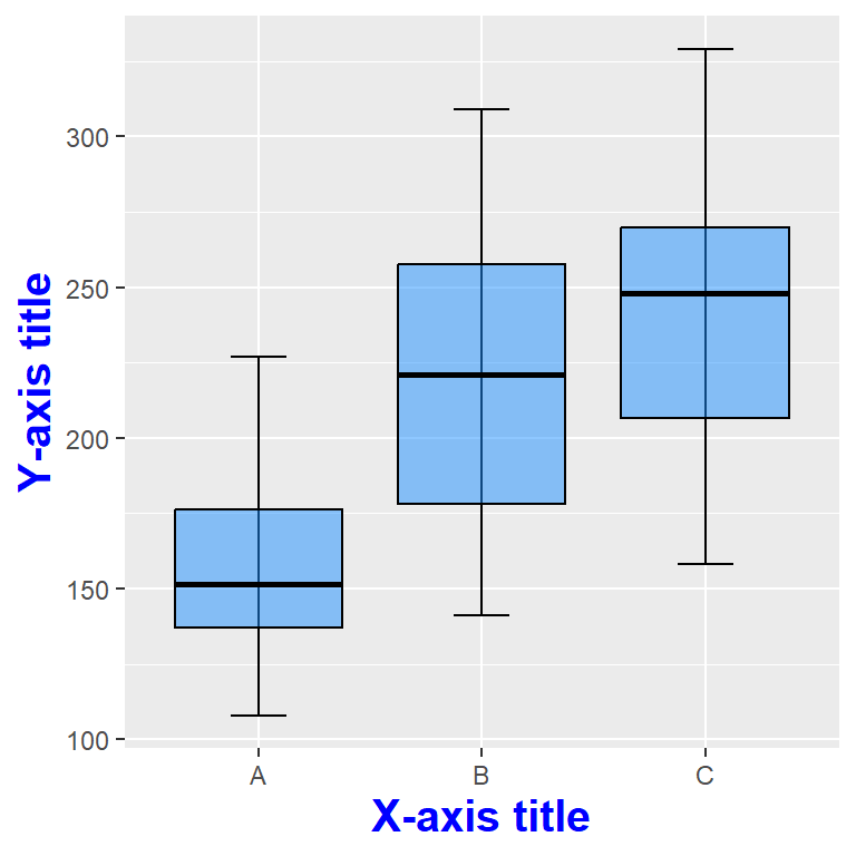
Note that you can also customize each axis title appending .x or .y to axis.title as follows. Recall that if you don’t specify one of them it will inherit the default aesthetics.
p + labs(x = "X-axis title", y = "Y-axis title") +
 theme(axis.title.x = element_text(size = 15,
                                   color = "blue",
                                   face = "bold"),
       axis.title.y = element_text(size = 10,
                                   color = "red",
                                   face = "italic"))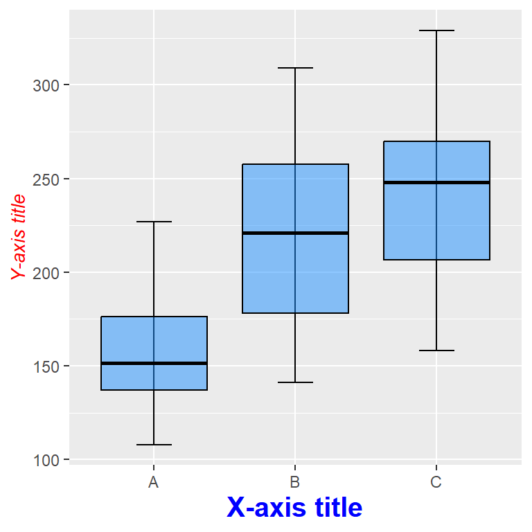
Remove axis titles
Remove both axis titles
Setting a theme component to element_blank() will remove the corresponding element. In order to remove the axis titles you can pass the element_blank function to the axis.title component, even if you have already specified the titles, as long as you don’t add them again.
p + xlab("X-axis title") +
    ylab("Y-axis title") +
    theme(axis.title = element_blank())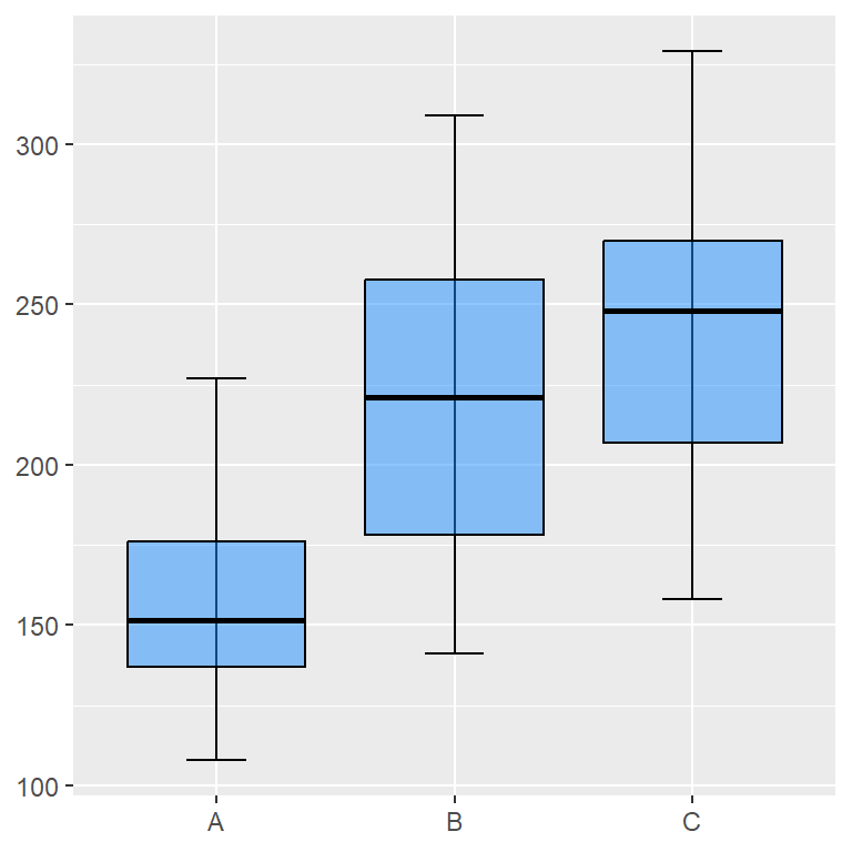
Remove one of the axis titles
If you append .x or .y to the axis.title component you can remove only one of the axis titles. This is, you can remove the X-axis title setting axis.title.x = element_blank() and the Y axis title with axis.title.y = element_blank().
p + xlab("X-axis title") +
    ylab("Y-axis title") +
    theme(axis.title.x = element_blank())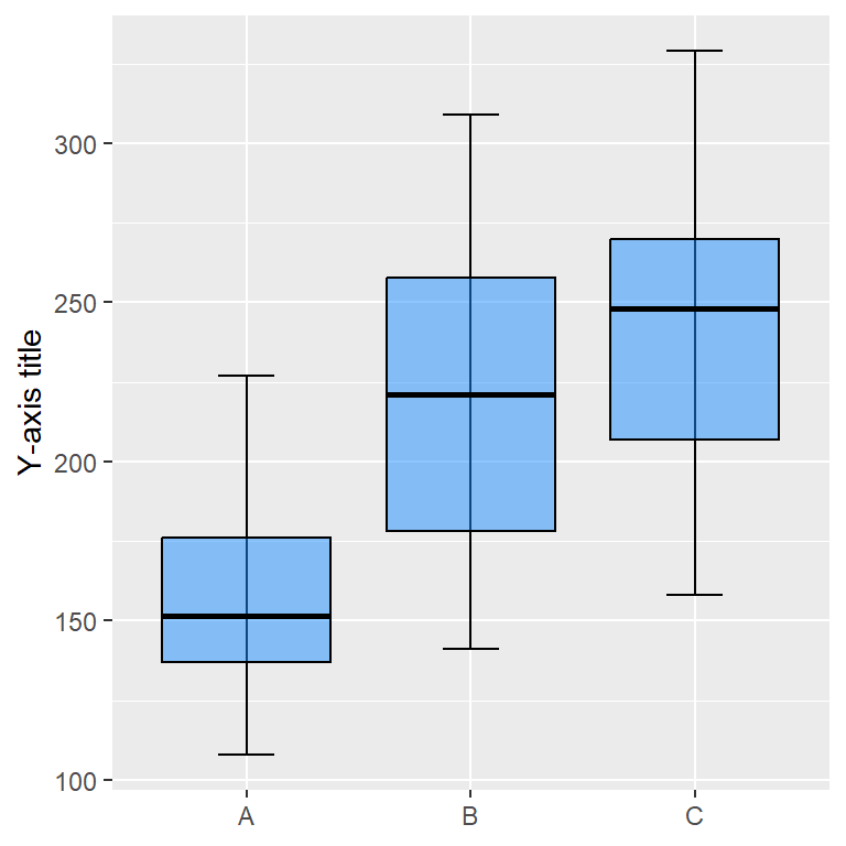
Axis labels
Each axis will have automatic axis labels or texts. For instance, the default axis labels for the Y-axis of our example ranges from 100 to 300 with a step size of 50 and the labels of the X-axis are the names of the different groups (A, B and C). These labels can be customized with scale_(x|y)_continuous if the axis (x or y) is continuous, scale_(x|y)_discrete if the axis is discrete or other variants, such as scale_(x|y)_datetime, scale_(x|y)_date, scale_(x|y)_reverse, scale_(x|y)_log10 etc.
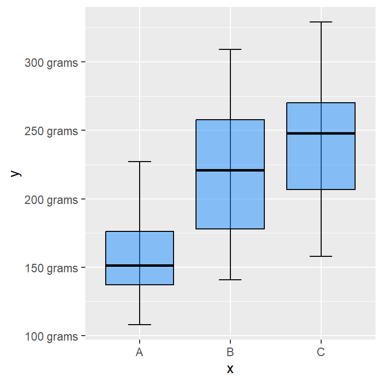
Custom Y-axis labels
As the Y-axis of our sample plot is continuous we can use the scale_y_continuous function to customize it. The labels argument is the one used to customize the labels, where you can input a vector with the new labels or a custom labeller function as in the example below.
# Custom Y-axis labels
labels <- function(x) {
  paste(x, "grams")
}

p + scale_y_continuous(label = labels)
The length of the vector passed to labels must equal the number of breaks or ticks of the axis. See the following section for further clarification.

Custom X-axis labels
As the X-axis of our sample plot represents groups, is discrete, so we can use the scale_x_discrete function to customize the labels for the X-axis. You can pass a function or a vector with the new names to labels.
# Custom X-axis labels
labels <- c("Group 1", "Group 2", "Group 3")

p + scale_x_discrete(label = labels)
Size, colors and style of the axis labels
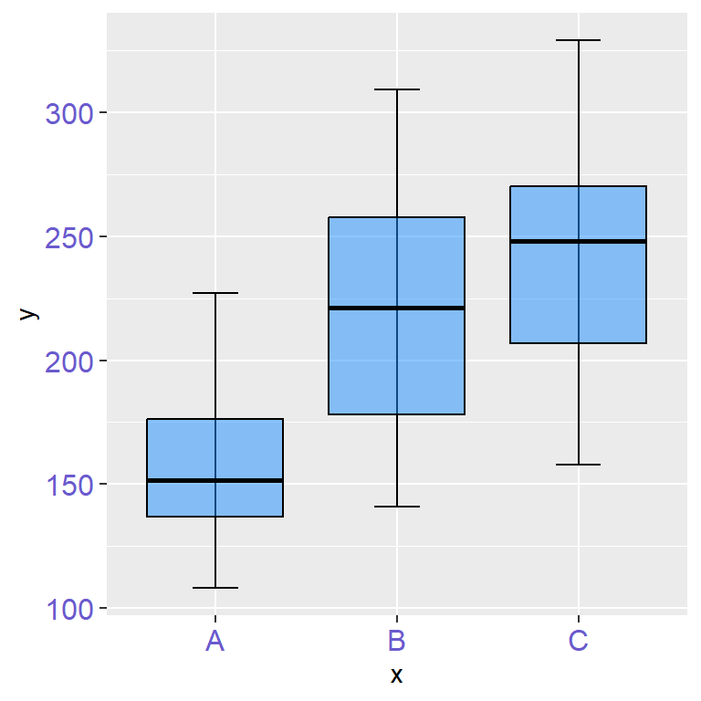
Color of the axis texts
With the axis.text component of the theme function you can control the style of the axis labels. If you pass an element_text you will be able to customize the style of the texts with its arguments, such as its color, size, angle…
p +
 theme(axis.text = element_text(color = "slateblue",
                                size = 12))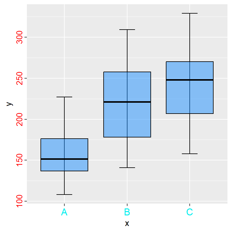
Different color for each axis text
Recall that you can apply a different styling for each axis just appending .x or .y to the corresponding component, this is, with axis.text.x and with axis.text.y.
p +
 theme(axis.text.x = element_text(color = "cyan2",
                                  size = 12),
       axis.text.y = element_text(color = "red",
                                  size = 10,
                                  hjust = 1))
Axis ticks (breaks)
The ticks are the marks that divide the axes. These marks are adjusted automatically by ggplot2 based on your data, but you can also customize them. It is possible to increase or decrease the number of ticks, customize its style, increase its size or remove them.
Increase the number of ticks
The number of ticks can be customized passing a vector with the desired values to the breaks argument of the scale_y_continuous function. In the following example we are passing a sequence of values that ranges from 120 to 320 with step size of 20.
p +
  scale_y_continuous(breaks = seq(120, 320, by = 20))
Increase the size of the ticks
The theme function provides a component named axis.ticks.length to increase or decrease the size of the axis ticks. In order to accomplish that you will need to pass the unit function and specify the desired size in the unit you want. Recall to use axis.ticks.length.x or axis.ticks.length.y to customize only one axis ticks.
p +
  theme(axis.ticks.length  = unit(0.5, "cm"))
Modify the style of the ticks
You can customize the style of the ticks passing an element_line to the axis.ticks component of the theme function, specifying the desired color, size, line style, etc. Recall to append .x or .y to customize only one axis.
p +
  theme(axis.ticks = element_line(color = 2,
                                  linewidth = 2))
Remove the ticks
As with other components, passing the element_blank function to the axis.ticks component will remove the ticks from both axis. If you want to remove the ticks only for one axis pass the function to axis.ticks.x or to axis.ticks.y.
p +
  theme(axis.ticks = element_blank())
The theme function also provides the axis.ticks.x.top, axis.ticks.x.bottom, axis.ticks.y.left, axis.ticks.y.right, axis.ticks.length.x, axis.ticks.length.x.top, axis.ticks.length.x.bottom, axis.ticks.length.y, axis.ticks.length.y.left and axis.ticks.length.x.right components.
Axis limits
The range or limits of the axes are adjusted automatically by ggplot2 based on the range of your data. Nonetheless, you can override the automatic settings and customize the limits to zoom in or zoom out or to subset the data.
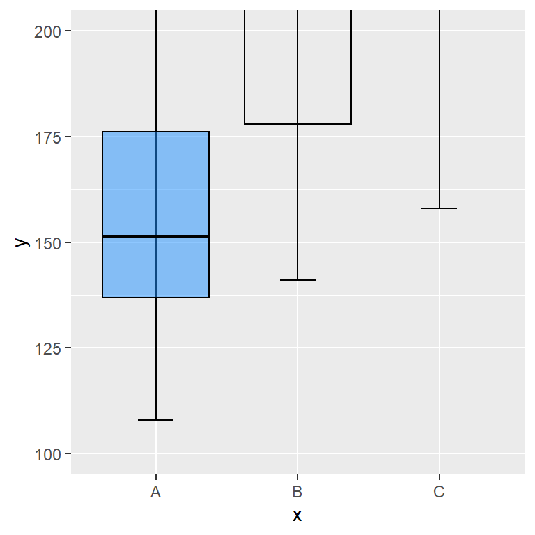
coord_cartesian (zooming in)
In case you want to zoom in or zoom out the plot without removing data you will need to use the ylim and xlim arguments of the coord_cartesian function.
p +
   coord_cartesian(ylim = c(100, 200))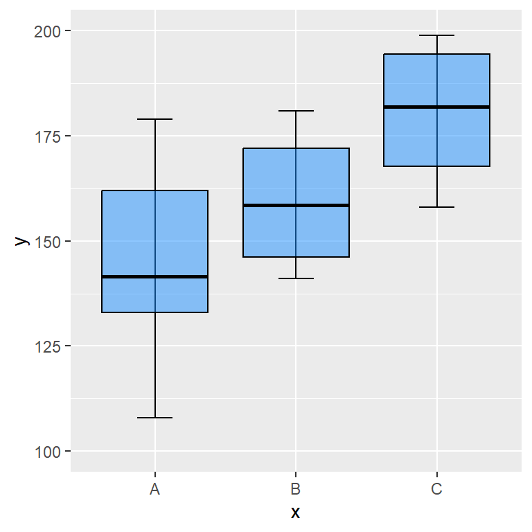
ylim and xlim functions (subsetting)
The xlim and ylim functions subset the data to the specified range and then calculate the stats again. It is really important to understand that these functions doesn’t zoom in, they subset the data.
p +
   ylim(c(100, 200))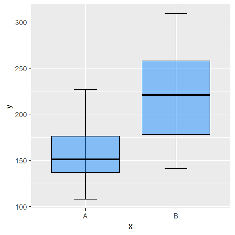
Note that if one of your axes is discrete you can subset the data passing a vector with the names of the desired groups.
p +
   xlim(c("A", "B"))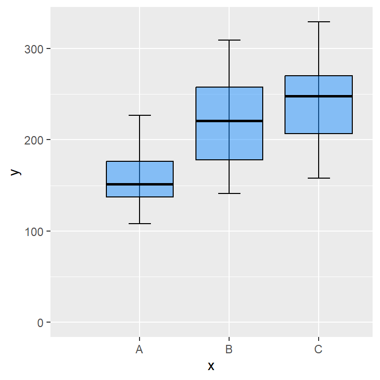
Start at the origin
You can force the plot to start at the origin with the expand_limits function, which will force the axis to include the value or values passed to the x or y arguments of the function.
p +
  expand_limits(x = 0, y = 0)
Axis scales
The scales of the axes are automatically set by ggplot2 based on the data, but sometimes you might need to customize them. For instance, if the numbers are too big, ggplot2 will use a scientific notation format for the axis labels and you might want to remove it, or you might want to customize the decimal or thousands separator, change the format of the axis and treat them as currencies or maybe you want to transform the scale into a logarithmic scale.
Remove the scientific notation
If the numbers of the axis are too big, ggplot2 will show them by default in scientific notation. However, you can use the function from the following block of code and set the new labels without scientific notation and with marks.
# Function to set numbers with marks and without scientific notation
marks_no_sci <- function(x) format(x, big.mark = ".", decimal.mark = ",", scientific = FALSE)

ggplot(cars, aes(x = speed, y = dist * 1000000)) +
  geom_point() +
  scale_y_continuous(labels = marks_no_sci)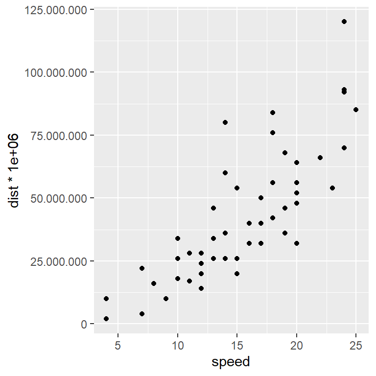
Remove the scientific notation with scales
The scales package is a package that provides automatic methods to set breaks and labels for the axes. In order to remove the scientific notation, you just need to pass the function you want to use (label_number or label_comma in this scenario) to labels.
# install.packages("scales")
library(scales)

ggplot(cars, aes(x = speed, y = dist * 1000000)) +
  geom_point() +
  scale_y_continuous(labels = label_number())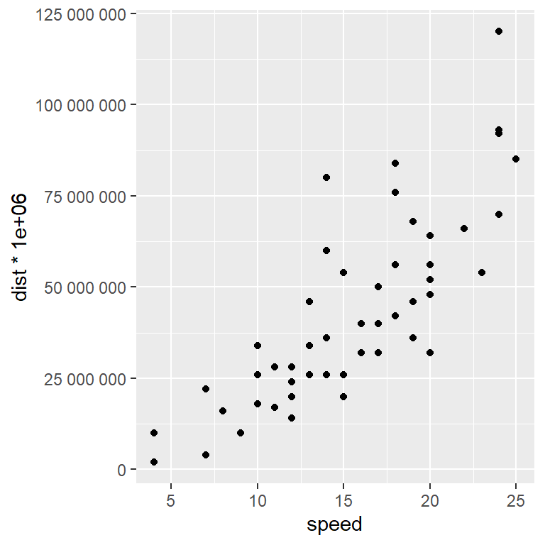
Other alternative is to set something like options(scipen = -10). Recall that the integer passed is based on a penalty mechanism to decide whether to print in scientific notation or not.
Dollar format
If your axis represents dollars you can use the label_dollar function to treat the axis as currency and hence a dollar sign will appear as prefix of the number.
# install.packages("scales")
library(scales)

ggplot(cars, aes(x = speed, y = dist)) +
  geom_point() +
  scale_y_continuous(labels = label_dollar())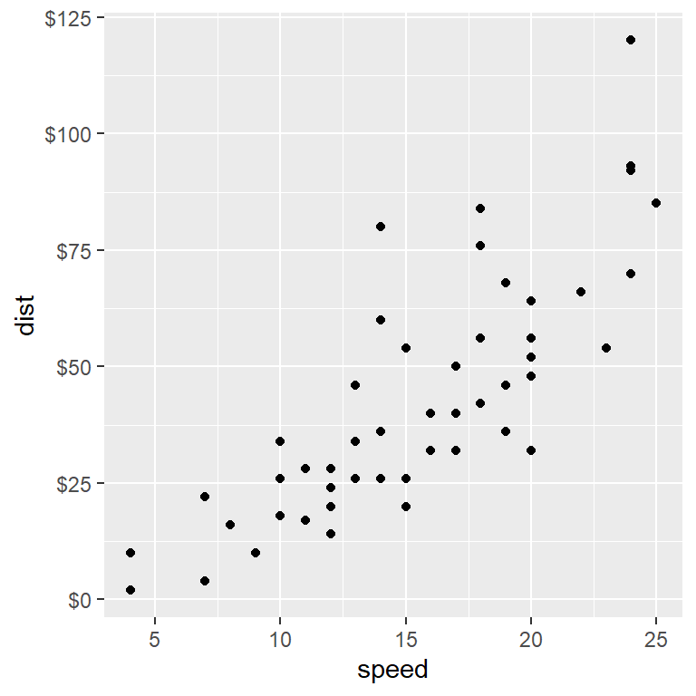
Axis with other currencies (euros, pesos, yens …)
If you need other currency, such as euros, pesos or yens, you can also use the label_dollar function, but you will need to specify the desired symbol inside the suffix and prefix arguments. Note that by default, prefix = "$".
# install.packages("scales")
library(scales)

ggplot(cars, aes(x = speed, y = dist)) +
  geom_point() +
  scale_y_continuous(labels = label_dollar(suffix = "€", prefix = ""))
Other interesting scales provided by scales are label_bytes, label_date, label_date_short, label_math, label_percent, label_pvalue or label_scientific, among others.
Scale log 10
ggplot2 also provides some functions for scale transformations, such as scale_y_log10 or scale_x_log10 that will transform the axis into a logarithmic scale.
ggplot(cars, aes(x = speed, y = dist)) +
  geom_point() +
  scale_y_log10()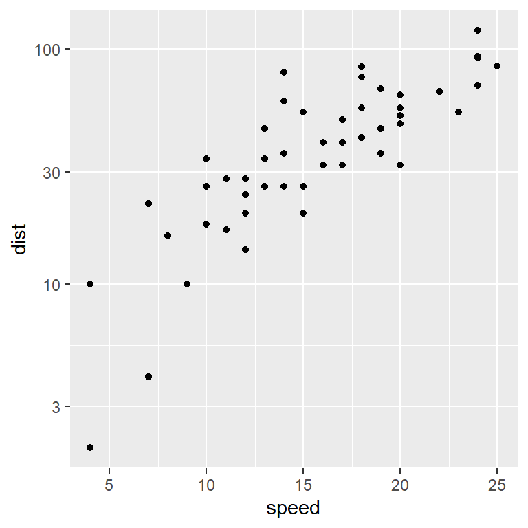
Square root scale
The scale_y_sqrt and scale_x_sqrt functions will transform the corresponding axis applying the square root to its values.
ggplot(cars, aes(x = speed, y = dist)) +
  geom_point() +
  scale_y_sqrt()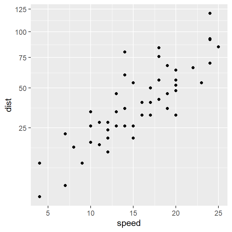
Reversed scale
The scale_y_reverse and scale_x_reverse functions will reverse the Y and X axis, respectively.
ggplot(cars, aes(x = speed, y = dist)) +
  geom_point() +
  scale_y_reverse()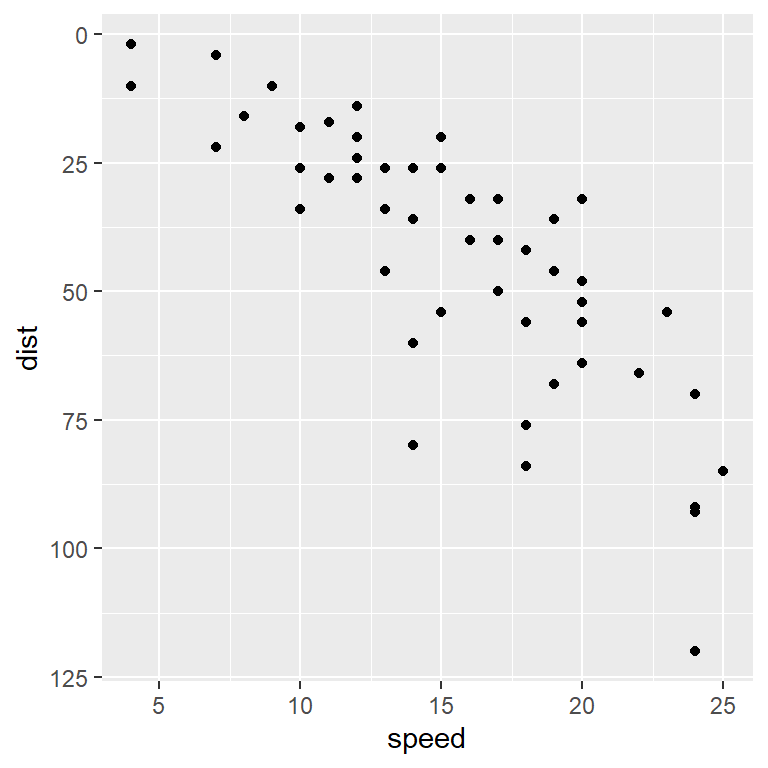
Style of the axis lines
The default ggplot2 theme doesn’t show axis lines, but if you are using other theme or you want to add lines to the axis you can pass an element_line to the axis.line component of the theme function. Then, you can set the width, color, line type, etc, or leave the default arguments.
p +
  theme(axis.line = element_line(color = "red",
                                 linewidth = 1.5,
                                 linetype = 2))
Recall that if you want to customize or set only one axis you will need to append .x or .y to the axis.line component to customize the X-axis or Y-axis line, respectively.
p +
  theme(axis.line.x = element_line(color = "blue",
                                   linewidth = 1.5,
linetype = 3))![]()
Adding arrows to the axis lines
Arrows can be added to the axis lines passing the arrow function to the arrow argument of the element_line function. You can customize the angle, the length, the position ("last", the default, "first" or "both") and the type of arrow ("open", the default or "closed").
p +
  theme(axis.line = element_line(arrow = arrow(angle = 30,
                                               length = unit(0.15, "inches"),
                                               ends = "last",
                                               type = "closed")))
Dual axis
It is possible to add a dual axis in ggplot2 making use of the sec.axis argument from scale_(x|y)_continuous and the sec_axis function. This function needs a formula or function of transformation and the name of the new axis.
ggplot(cars, aes(x = speed, y = dist)) +
  geom_col() +
  geom_smooth(data = cars, aes(x = speed, y = dist * 2)) +
  scale_y_continuous(sec.axis = sec_axis(trans = ~.* 2, name = "Z-axis title"))
Secondary axis breaks
The function also provides the breaks argument to customize the default breaks or tick marks of the secondary axis. In the following example we are placing only three tick marks.
ggplot(cars, aes(x = speed, y = dist)) +
  geom_col() +
  geom_smooth(data = cars, aes(x = speed, y = dist * 2)) +
  scale_y_continuous(sec.axis = sec_axis(~.* 2, name = "Z-axis title",
                                         breaks = c(100, 200, 300)))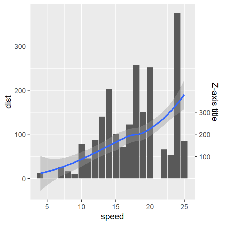
Secondary axis labels
The axis labels of the dual axis plot can be customized through the labels argument. Remember that the length of breaks must equal the length of labels.
ggplot(cars, aes(x = speed, y = dist)) +
  geom_col() +
  geom_smooth(data = cars, aes(x = speed, y = dist * 2)) +
  scale_y_continuous(sec.axis = sec_axis(~.* 2, name = "Z-axis title",
                                         breaks = c(100, 200, 300),
                                         labels = c("A", "B", "C")))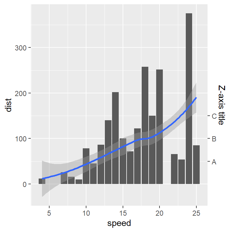
Further customization of the dual axis plot
The right axis can be customized making use of the corresponding components. With axis.title.y.right you can style the axis title text, such as its color or size, with axis.text.y.right the color and size of the secondary axis labels and with axis.line.y.right you can customize the axis line.
ggplot(cars, aes(x = speed, y = dist)) +
  geom_col() +
  geom_smooth(data = cars, aes(x = speed, y = dist * 2)) +
  scale_y_continuous(sec.axis = sec_axis(~.* 2, name = "Z-axis title")) +
  theme(axis.title.y.right = element_text(color = "red",
                                          size = 15,
                                          face = "bold"),
        axis.text.y.right = element_text(color = "blue", size = 10),
        axis.line.y.right = element_line(color = "orange"))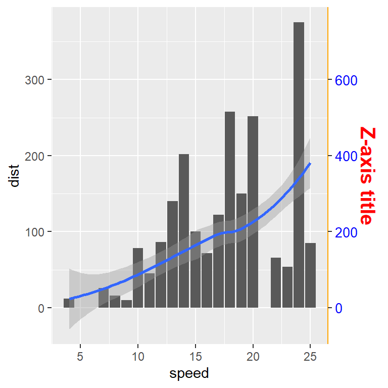

Master Statistics
Learn statistics from the basics to advanced techniques, clearly explained
Go to site