Sample data
In this tutorial we are going to use the following sample data categorized into two groups.
# Data
set.seed(1)
df <- data.frame(x = c(rnorm(300, -3, 1.5),
                       rnorm(300, 0, 1)),
                 group = c(rep("A", 300),
                           rep("B", 300)))
Adding a legend
If you want to add a legend to a ggplot2 chart you will need to pass a categorical (or numerical) variable to color, fill, shape or alpha inside aes. Depending on which argument you use to pass the data and your specific case the output will be different.
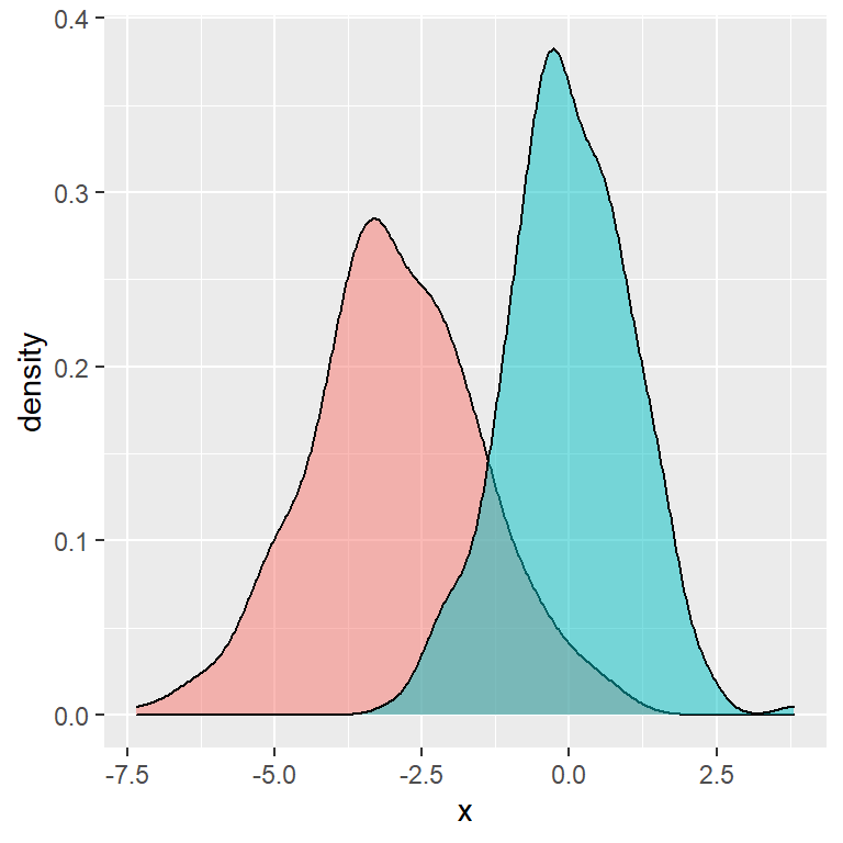
Color
Passing the categorical variable to color inside aes the data will be plotted based on groups and an automatic legend will you up.
# install.packages("ggplot2")
library(ggplot2)

ggplot(df, aes(x = x, color = group)) +
  geom_density(alpha = 0.5)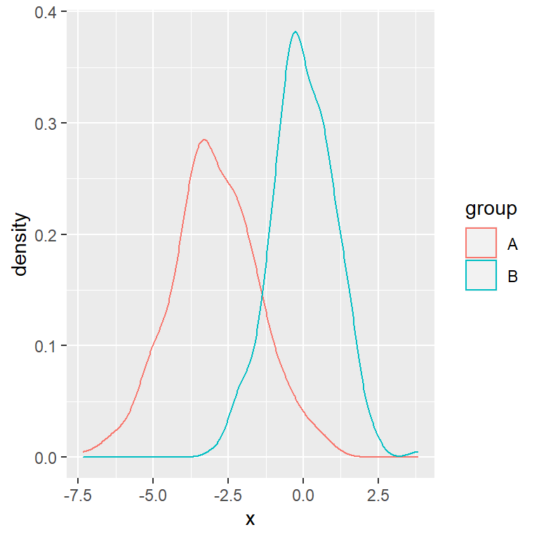
Note that this is the argument you should use if you want to create a plot that doesn’t admit a fill color, such as a scatter plot. You can pass a categorical or a numerical variable.
# install.packages("ggplot2")
library(ggplot2)

# Data
x <- runif(200)
y <- 3 * x ^ 2 + rnorm(length(x), sd = 2.5)
group <- ifelse(x < 0.5, "A", "B")
df2 <- data.frame(x = x, y = y, group = group)

ggplot(df2, aes(x = x, y = y, color = group)) +
  geom_point()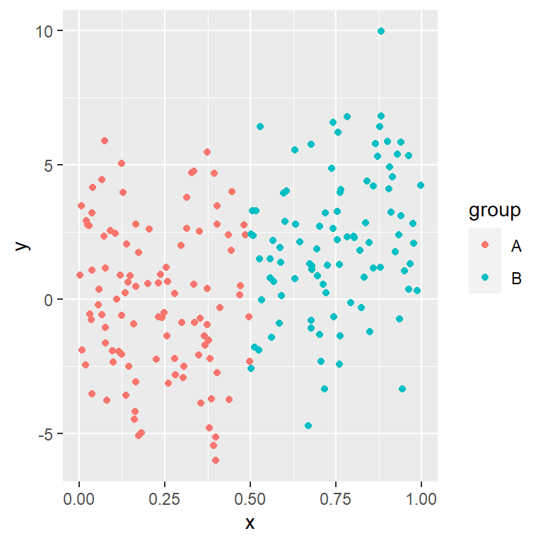
Alpha
# install.packages("ggplot2")
library(ggplot2)

# Data
x <- runif(200)
y <- 3 * x ^ 2 + rnorm(length(x), sd = 2.5)
group <- ifelse(x < 0.5, "A", "B")
df2 <- data.frame(x = x, y = y)

ggplot(df2, aes(x = x, y = y, alpha = y)) +
  geom_point(colour = 4)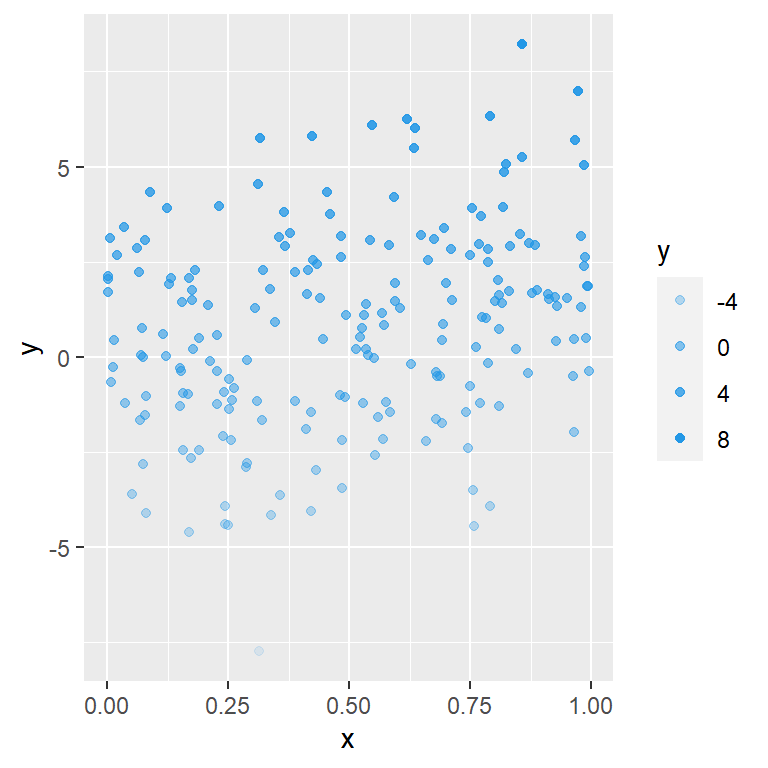
Fill
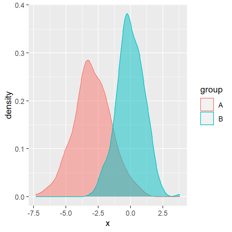
If the plot you are creating allows adding a fill color you can use the fill argument inside aes, so the boxes of the legend will be colored.
# install.packages("ggplot2")
library(ggplot2)

ggplot(df, aes(x = x, fill = group)) +
  geom_density(alpha = 0.5)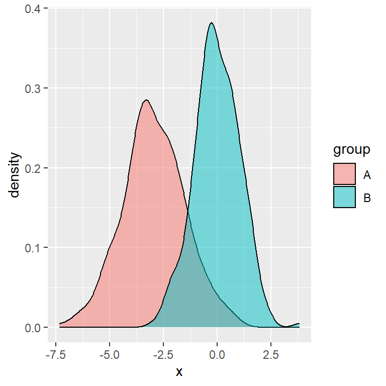
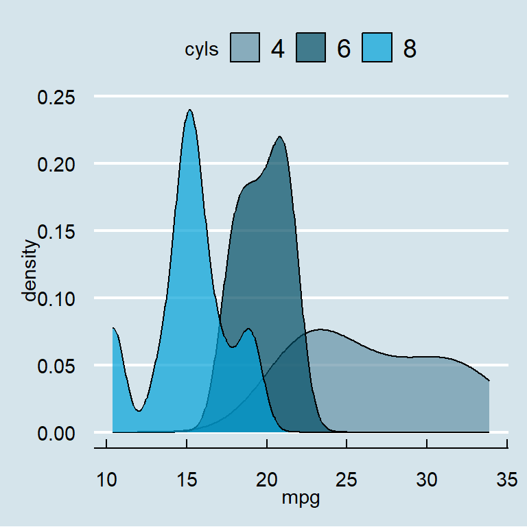
Color and fill at the same time
In the previous scenario you can also use both arguments (fill and color), so the legend will be a box filled with the correspoding color and the border will also have the corresponding color of the group.
# install.packages("ggplot2")
library(ggplot2)

ggplot(df, aes(x = x, fill = group, color = group)) +
  geom_density(alpha = 0.5)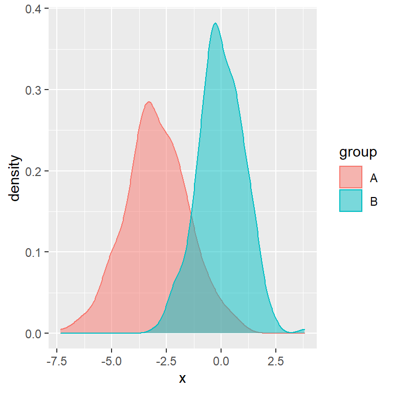
If you want to change the fill or border colors of the chart (and automatically of the legend) take a look to other tutorials, such as the density plot by group tutorial.
Change or remove the title of the legend
There are several ways to change the title of the legend of your plot. Note that the chosen option will depend on your chart type and your preferences.
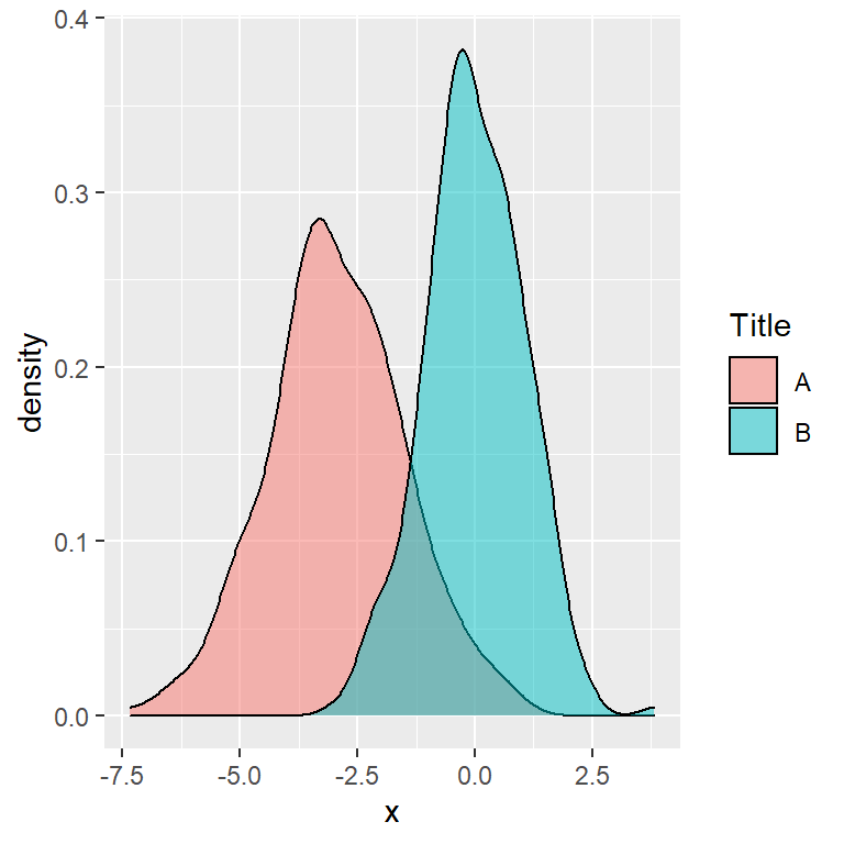
Option 1
The first option is using the guides function and passing guide_legend to fill or to color, depending on your plot.
# install.packages("ggplot2")
library(ggplot2)

ggplot(df, aes(x = x, fill = group)) +
  geom_density(alpha = 0.5) +
  guides(fill = guide_legend(title = "Title"))
Option 2
The second option is passing the new title to the fill or color argument of the labs function.
# install.packages("ggplot2")
library(ggplot2)

ggplot(df, aes(x = x, fill = group)) +
  geom_density(alpha = 0.5) +
  labs(fill = "Title")
Option 3
The third option is passing the new title to the name argument of the corresponding “scale_x_y” functions, such as scale_fill_discrete or scale_color_discrete, if you are using them in your plot.
# install.packages("ggplot2")
library(ggplot2)

ggplot(df, aes(x = x, fill = group)) +
  geom_density(alpha = 0.5) +
  scale_fill_discrete(name = "Title")
Removing the title
Finally, if you prefer removing the title of the legend just pass the element_blank function to the legend.title argument of theme.
# install.packages("ggplot2")
library(ggplot2)

ggplot(df, aes(x = x, fill = group)) +
  geom_density(alpha = 0.5) +
  theme(legend.title = element_blank())
Change or reorder the labels of the legend
If you want to change the group names of the legend you can customize the data frame column representing the groups.
Other option is passing the new labels to the labels argument of the scale_color_hue or scale_fill_hue functions to modify only the labels or using scale_color_discrete or scale_fill_discrete functions if you also want to change the colors.
New legend group labels
# install.packages("ggplot2")
library(ggplot2)

ggplot(df, aes(x = x, fill = group)) +
  geom_density(alpha = 0.5) +
  scale_fill_hue(labels = c("G1", "G2"))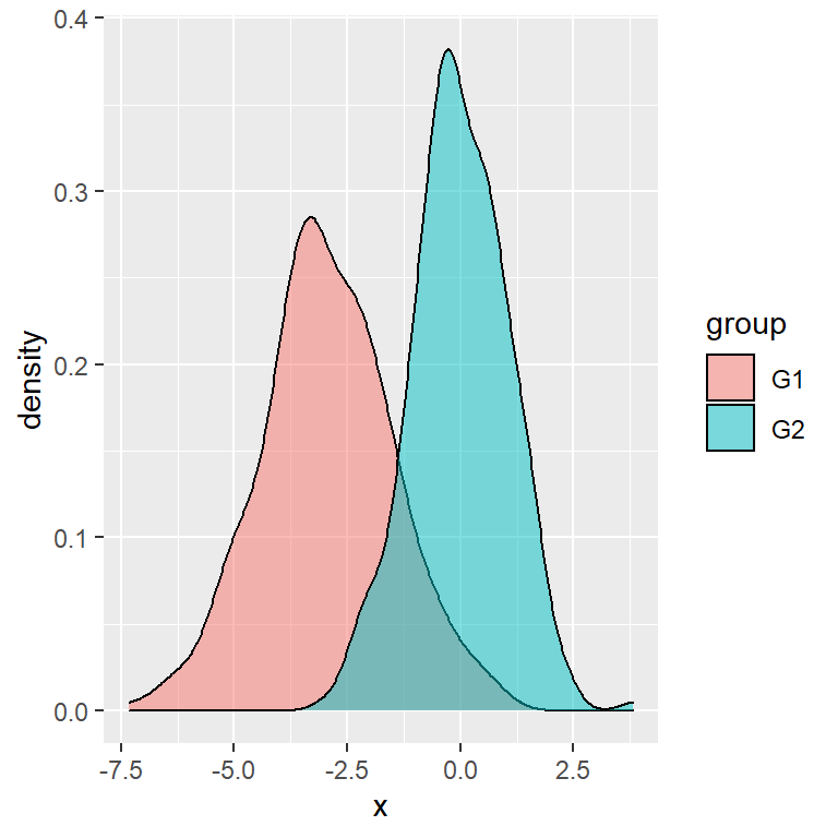
Reorder the labels
In case you want to reorder the labels of the legend you will need to reorder the factor variable. In this example we have created a new variable with the new order.
# install.packages("ggplot2")
library(ggplot2)

# Create a new variable with other levels
df$group2 <- factor(df$group,
                    levels = c("B", "A"))

ggplot(df, aes(x = x, fill = group2)) +
  geom_density(alpha = 0.5)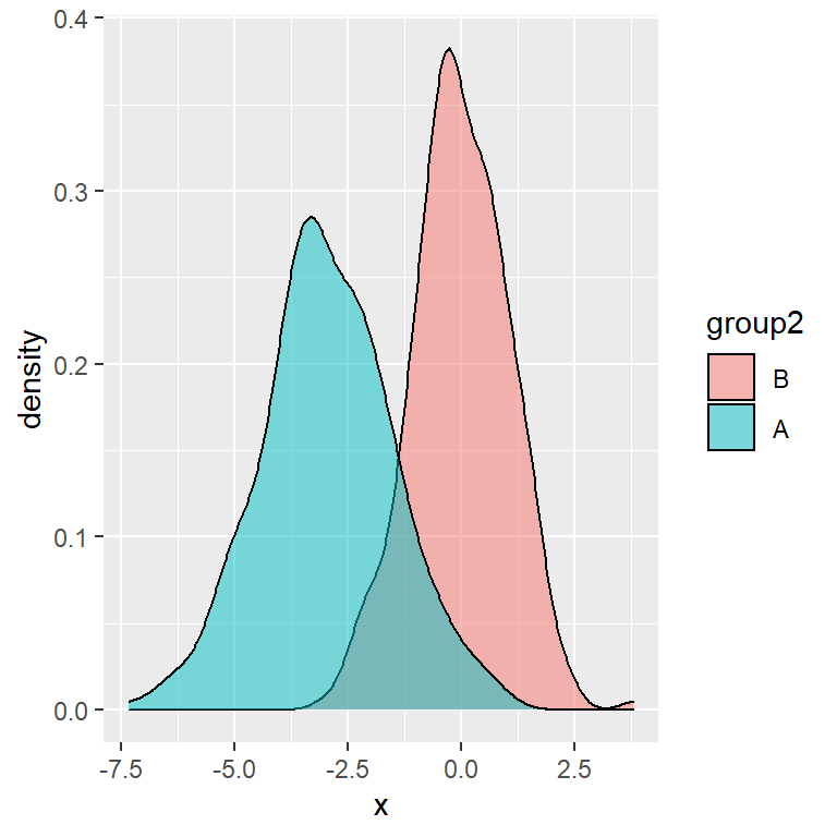
Change the position of the legend
By default, the automatic legend of a ggplot2 chart is displayed on the right of the plot. However, making use of the legend.position argument of the theme function you can modify its position. Possible values are "right" (default), "top", "left", "bottom" and "none".

Top
# install.packages("ggplot2")
library(ggplot2)

ggplot(df, aes(x = x, fill = group)) +
  geom_density(alpha = 0.5) +
  theme(legend.position = "top")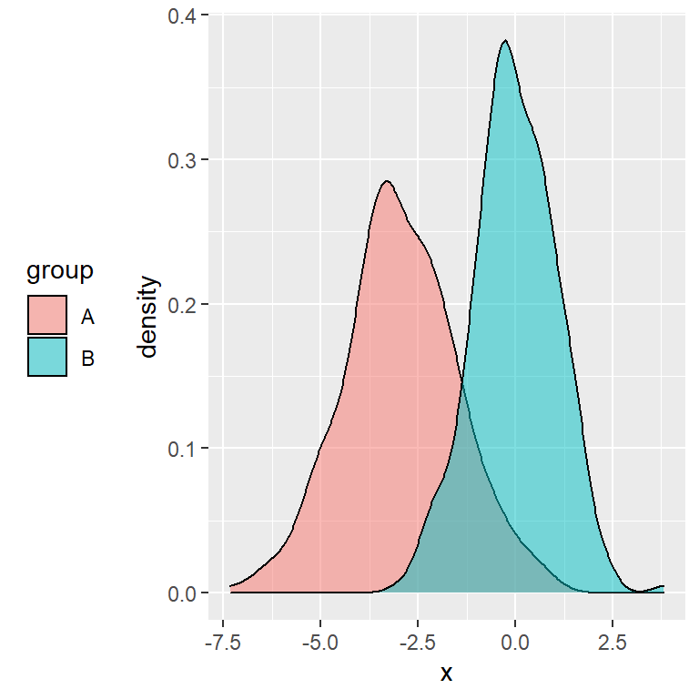
Left
# install.packages("ggplot2")
library(ggplot2)

ggplot(df, aes(x = x, fill = group)) +
  geom_density(alpha = 0.5) +
  theme(legend.position = "left")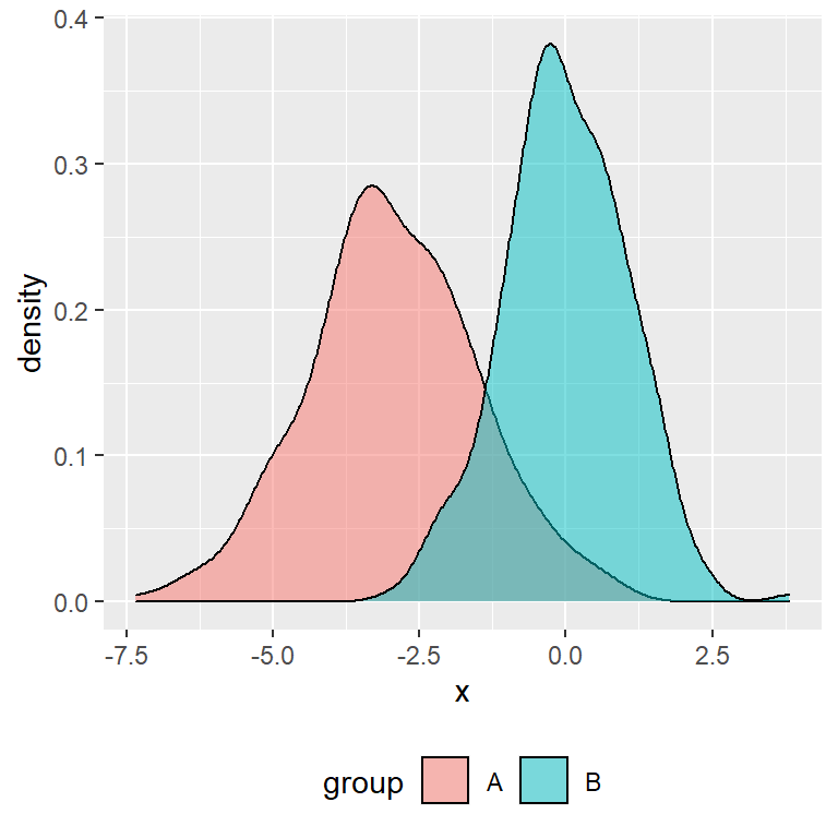
Bottom
# install.packages("ggplot2")
library(ggplot2)

ggplot(df, aes(x = x, fill = group)) +
  geom_density(alpha = 0.5) +
  theme(legend.position = "bottom")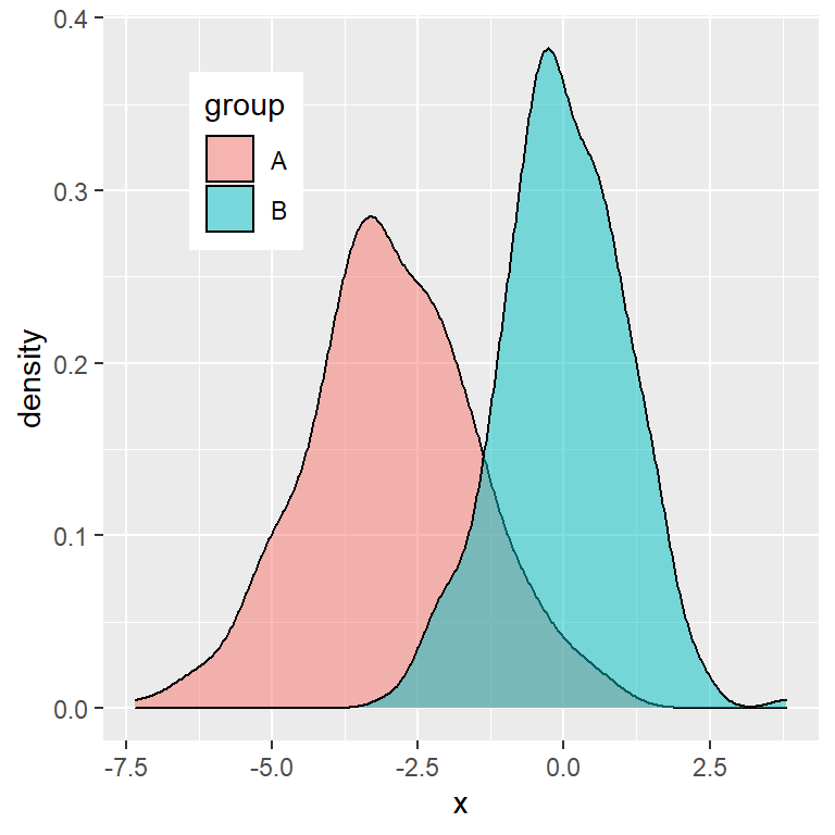
Custom position
Note that you can even set a custom position to place the ggplot2 legend inside the plot. You will need to set the coordinates between 0 an 1 with the legend.position argument of the theme function. Moreover, you can also change the background color of the legend with legend.background.
# install.packages("ggplot2")
library(ggplot2)

ggplot(df, aes(x = x, fill = group)) +
  geom_density(alpha = 0.5) +
  theme(legend.position = c(0.2, 0.8),
        legend.background = element_rect(fill = "white"))
See also legend.justification, legend.direction and legend.box.just for further customization.
Legend customization
There exist lots of arguments that allow customizing the ggplot2 legends. You will need to use the arguments of the theme function which starts with legend., such as legend.title, legend.background, legend.margin, …
Customizing the title
# install.packages("ggplot2")
library(ggplot2)

ggplot(df, aes(x = x, fill = group)) +
  geom_density(alpha = 0.5) +
  theme(legend.title = element_text(family = "Roboto",
                                    color = "blue",
                                    size = 10,
                                    face = 2))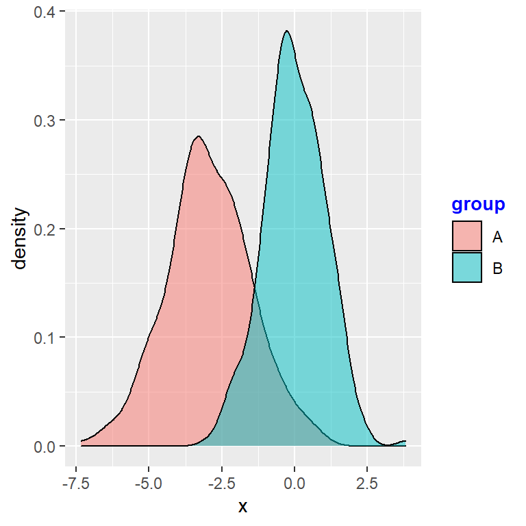
Customizing the legend background and border
# install.packages("ggplot2")
library(ggplot2)

ggplot(df, aes(x = x, fill = group)) +
  geom_density(alpha = 0.5) +
  theme(legend.background = element_rect(fill = "lightblue", # Background
                                         colour = 1))        # Border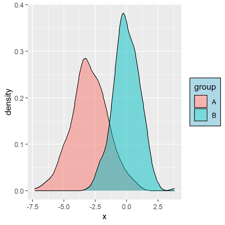
Customizing the legend keys
In this example we are increasing the size of the boxes, but if you have for instance a scatter plot, you can change the size of the symbols with guides(color = guide_legend(override.aes = list(size = 4))), being 4 the new size.
# install.packages("ggplot2")
library(ggplot2)

ggplot(df, aes(x = x, fill = group)) +
  geom_density(alpha = 0.5) +
  theme(legend.key.size = unit(1, units = "cm"))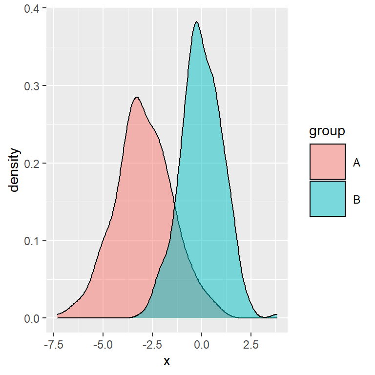
Remove the legend
Finally, in case you want to turn off the default legend you can set its position to "none", as shown below:
Removing the legend
# install.packages("ggplot2")
library(ggplot2)

ggplot(df, aes(x = x, fill = group)) +
  geom_density(alpha = 0.5) +
  theme(legend.position = "none")
In addition, if your chart has several legends or you have mapped a variable to several arguments you can get rid of a specific legend setting that argument to "none" inside guides. In the following example we are removing the fill legend of the chart, letting only the color legend available.
Removing a part of the legend
# install.packages("ggplot2")
library(ggplot2)

ggplot(df, aes(x = x, fill = group, color = group)) +
  geom_density(alpha = 0.5) +
  guides(fill = "none")
Master Statistics
Learn statistics from the basics to advanced techniques, clearly explained
Go to site